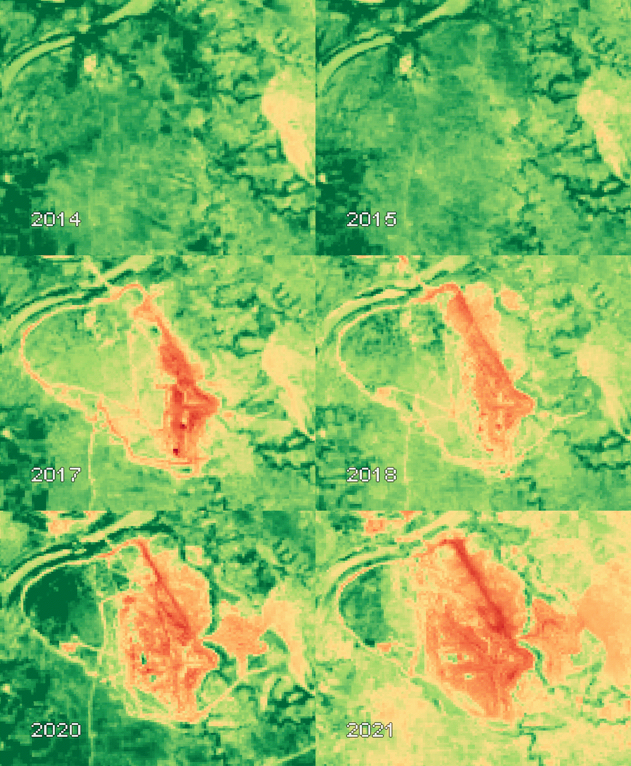
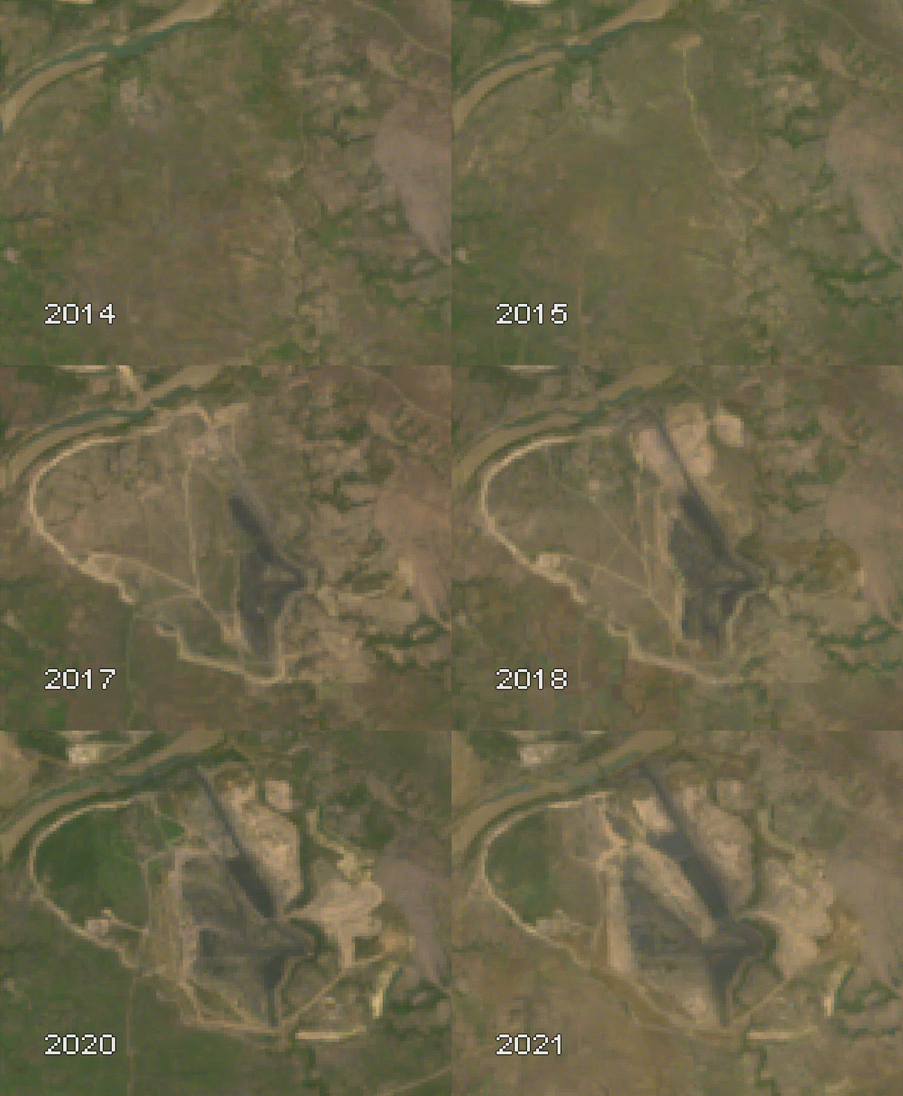
A visualization tool created on Google Earth engine (GEE) to help analyze the coal mining area and predict the period of mining operation.
GEE is an open-source platform for geospatial data analysis and its visualization. We all know how tedious it is to download each satellite data tile and then curate it according to our need for further analysis. And if the area is large, say you are working on the entire country or on time series analysis, then downloading the satellite data (Landsat or Sentinel) for each and every region in a particular time range will take hours or days and require high density data storage. Even their analysis might need high end system with fast computing software. All this could be done in just few minutes and within 10-15 lines of code on GEE. Geospatial data computation on GEE not only saves time and storage but also provides flexibility. They have open-source data catalog including Landsat datasets, Sentinel datasets, MODIS Datasets, NAIP data, precipitation data, sea surface temperature data, CHIRPS climate data, and elevation data. You can check out this paper to know more about GEE platform. - Google Earth Engine: Planetary-scale geospatial analysis for everyone
For our current visualization we will import the Landsat 8 OLI/TIRS sensors tier 2 data, which is atmospherically corrected surface reflectance dataset. After applying cloud mask and cloud shadow mask, and filtering it from the year 2014 to 2021, image is clipped for the study area by extracting the pixels from the entire area and for each year. But in order to access GEE one will need to sign up on Google Earth Engine using your google account.
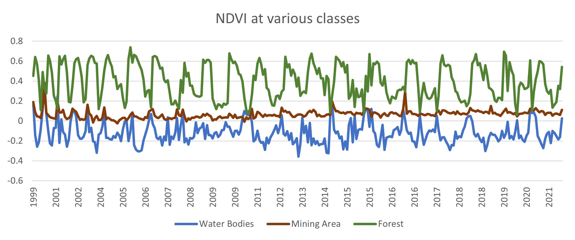
git clone https://github.com/saumyatas/Coal_Mines_Visualization.gitWith the help of the surrounding areas of the mining area a NDVI reference graph is created to distinguish forest and water bodies from the mining area.
With the help of change in NDVI we can predict that the period of operation for this mine started in early 2016 or late 2015.
The expansion of mining area and change in operation can be visualized using Landsat series satellite data.
- The code in python is built on geemap, a python package for interactive mapping with GEE, created by Qiusheng Wu
This project is licensed under the MIT License - see the LICENSE file for details


