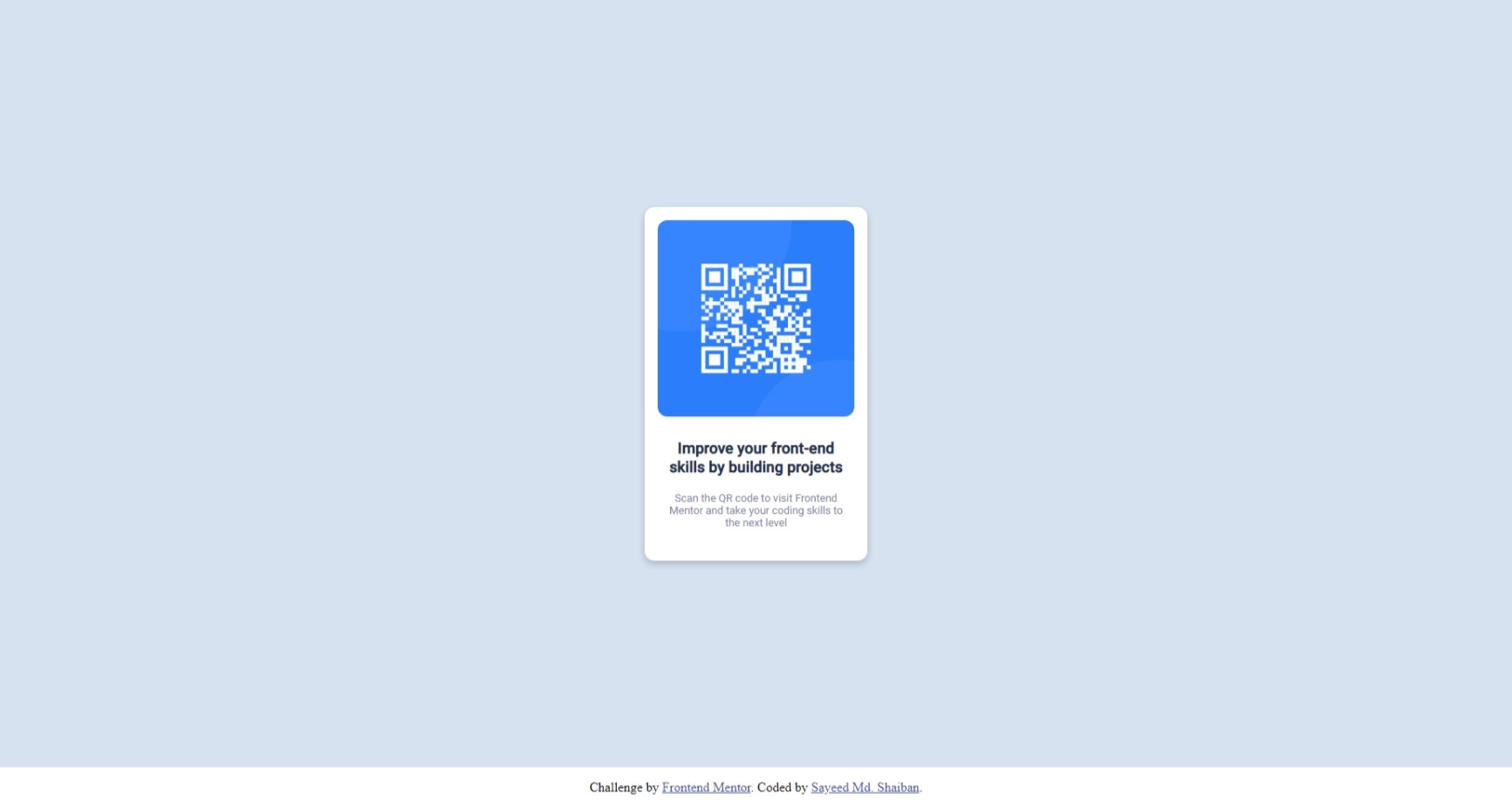
This is a solution to the QR code component challenge on Frontend Mentor. Frontend Mentor challenges help you improve your coding skills by building realistic projects.
- Solution URL: git repo
- Live Site URL: live site URL
- HTML5
- CSS
Learned to center a div vertically and horizontally. Used margin to center div horizontally and flexbox to center div vertically
<div class="card">
  <div class="imageFrame">
    <img
      src="F:\qr-code-component-main\images\image-qr-code.png"
      alt="qrcode"
    />
  </div>
  <div class="bodyText">
    <h3>Improve your front-end skills by building projects</h3>
    <br />
    <p>
      Scan the QR code to visit Frontend Mentor and take your coding skills to
      the next level
    </p>
  </div>
</div>
main {
background-color: hsl(212, 45%, 89%);
min-height: 100vh;
display: flex;
justify-content: center;
font-family: 'Roboto', sans-serif;;
}
.card {
background-color: hsl(0, 0%, 100%);
width: 15rem;
min-height: 25rem;
border-radius: 0.75rem;
margin: auto;
padding: 1rem;
text-align: center;
display: grid;
box-shadow: 0px 4px 8px 0px rgba(0, 0, 0, 0.2);
}Want to get more confortable with using grid
- Example resource 1 - This helped with the alignment.
- Website - Sayeed Md Shaiban
- Frontend Mentor - @sayeedk06
- Twitter - @evrydaywannabe
