ChromaColorPicker 🎨
An intuitive iOS color picker built in Swift.
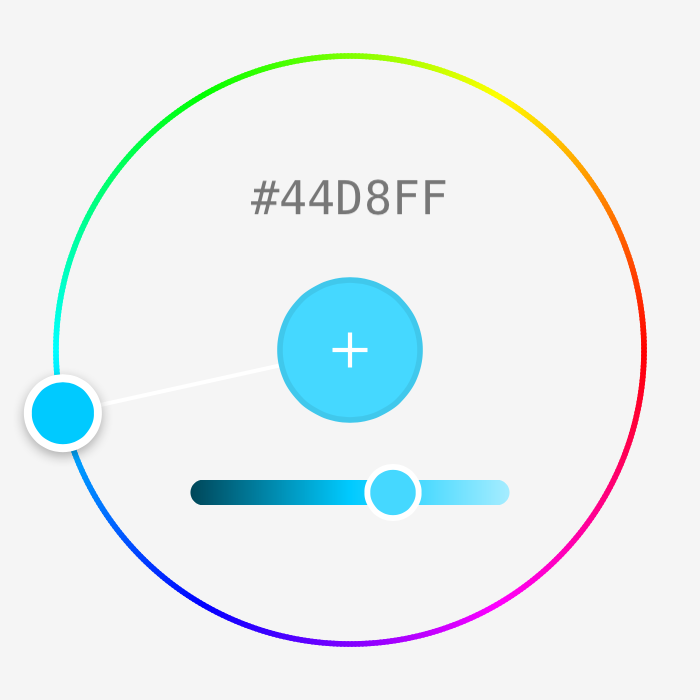
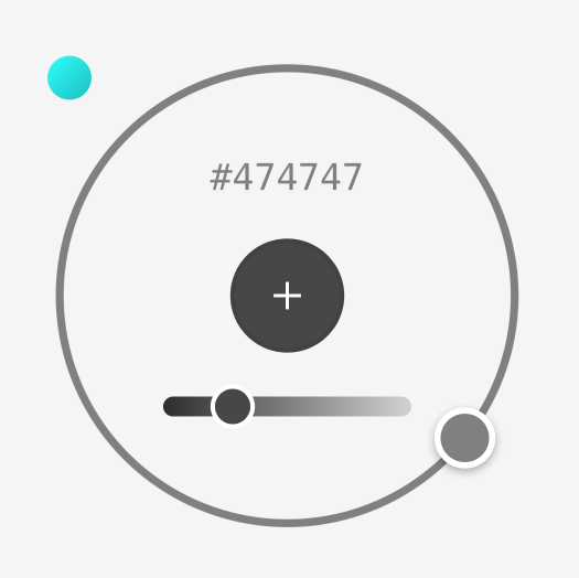
Supports hue and grayscale modes to make choosing the right color easy and fun!
Installation
Carthage
github "joncardasis/ChromaColorPicker"
Cocoapods
pod 'ChromaColorPicker'
Manually
Add all files from the ChromaColorPicker folder to your project.
Examples
let neatColorPicker = ChromaColorPicker(frame: CGRect(x: 0, y: 0, width: 300, height: 300))
neatColorPicker.delegate = self //ChromaColorPickerDelegate
neatColorPicker.padding = 5
neatColorPicker.stroke = 3
neatColorPicker.hexLabel.textColor = UIColor.white

view.addSubview(neatColorPicker)
If the ChromaColorPicker or any of its properties are later updated after being added to a view, the layout() function should be called to update the view.
let neatColorPicker = ChromaColorPicker(frame: CGRect(x: 0, y: 0, width: 300, height: 300))
view.addSubview(neatColorPicker)

neatColorPicker.padding = 0
neatColorPicker.hexLabel.hidden = true

neatColorPicker.layout()
You can also set the color of the picker anytime by using the adjustToColor(color:) function.
let neatColorPicker = ChromaColorPicker(frame: CGRect(x: 0, y: 0, width: 300, height: 300))
...
neatColorPicker.adjustToColor(UIColor.green)
...
Enable Grayscale Support
A toggle button can be enabled/disabled to allow for grayscale selections by using the supportsShadesOfGray property.
let neatColorPicker = ChromaColorPicker(frame: CGRect(x: 0, y: 0, width: 300, height: 300))
...
neatColorPicker.supportsShadesOfGray = true // Normally false be default
Customization
Properties
| Property | Description |
|---|---|
| delegate | ChromaColorPickerDelegate |
| padding | The padding on each side of the view (default=10) |
| stroke | The stroke of the rainbow track (default=1) |
| currentColor | The currently set color by the control. It is displayed in the add button. Use adjustToColor(color: UIColor) to update the color. |
| currentAngle | The angle which the handle is currently sitting at. Can be changed and the view can be re-drawn using layout() to show the change. |
| handleSize | Returns the size of the handle. |
| supportsShadesOfGray | True/False if a toggle for supporting grayscale colors should be shown. |
Functions
| Function | Description |
|---|---|
| layout() | Layout the entire picker and all its subviews. |
| adjustToColor(color: ) | Updates the picker to a specific color. |
Sub-Components
Sub-Components can be hidden and customized to the preferred liking.
| Component | Description |
|---|---|
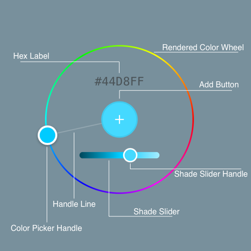
| hexLabel | A UILabel which displays the hex value of the current color. |
| shadeSlider | A custom slider which adjusts the shade of the current color. |
| addButton | A custom UIButton in the center of the control. The colorPickerDidChooseColor(colorPicker: color:) delegate function is called when this is tapped. |
| handleView | A ChromaHandle (custom UIView) which displays the current color and can be moved around the circle. |
| handleLine | A line which is drawn from the addButton to the handleView. |
| colorToggleButton | A custom UIButton which appears if supportsShadesOfGray is set to true and will switch the picker to a grayscale mode if pressed. |
Supported UIControlEvents
.touchDown -> called when the handle is first grabbed
.touchUpInside -> called when handle is let go
.valueChanged -> called whenever the color has changed hue or shade
.touchDragInside -> called when the handle has moved by a drag action
.editingDidEnd -> called when either the handle is let go or slider is let go
Additional Info
Check out the Wiki if you're interested in reading into how the color wheel was created.
License
ChromaColorPicker is available under the MIT license. See the LICENSE file for more info.


