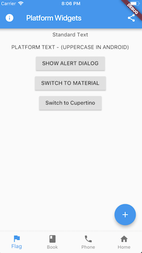
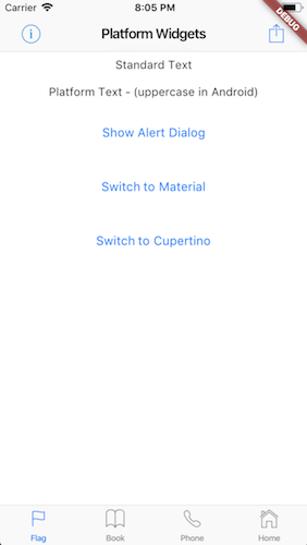
This project is an attempt to see if it is possible to create widgets that are platform aware. Currently in order to render targeted Material or Cupertino device specific styles, you need to either conditionaly check the platform or create a set of widgets to render differently depending on the running platform.
This package supports the Stable release as a full released version.
Beta or Dev channels might be supported when there is a pre-release version. Please check the CHANGELOG for version compatibility version.
Due to Master being in rapid development this package is unable to support Master. If this support is required then it is best to fork the repo and locally reference the forked version where changes can be made appropriately.
The flutter ThemeData object used with the Theme widget has a platform property. This defaults to TargetPlatform.android on Android and TargetPlatform.ios on iOS (also for macos etc), but when creating a ThemeData object, it can be set programmatically. Calling Theme.of(context).platform will return the current platform. Several Flutter library widgets use this field to change how they are rendered, and all of the Flutter Platform Widgets library widgets use this field to render the platform specific versions of things.
See PlatformProvider for configuration options.
These set of widgets allow for rendering based on the target platform using a single cross platform set of widget.
Each PlatformWidget provides common properties directly as constructor arguments. If required further customization can be achieved by using the platform widget builder. See the Enhance section of each widget.
- PlatformWidget
- PlatformText
- PlatformSwitch
- PlatformSlider
- PlatformTextField
- PlatformButton
- PlatformIconButton
- PlatformApp
- PlatformScaffold
- PlatformTabScaffold
- PlatformAppBar
- PlatformNavBar
- PlatformAlertDialog
- PlatformDialogAction
- PlatformCircularProgressIndicator
- PlatformPageRoute
- ShowPlatformModalSheet
- PlatformProvider
- PlatformIcons
- PlatformWidgetBuilder
A widget that will render either the material widget or cupertino widget based on the target platform. The widgets themselves do not need to be specifically Material or Cupertino.
return PlatformWidget(
  cupertino: (_, __) => Icon(CupertinoIcons.flag),
  material: (_, __)  => Icon(Icons.flag),
);A widget that will render uppercase for material. Cupertino will remain unchanged.
return PlatformText('Cancel');A switch widget that will use a Switch for material or a CupertinoSwitch for cupertino.
return PlatformSwitch(
  onChanged: (bool value) {},
  value: value,
);return PlatformSwitch(
onChanged: (bool value) {},
value: value,
material: (_, __) => MaterialSwitchData(...),
cupertino: (_, __) => CupertinoSwitchData(...)
);A slider widget that will use a Slider for material or a CupertinoSlider for cupertino
return PlatformSlider(
  onChanged: (bool value) {},
  value: value,
);return PlatformSlider(
onChanged: (bool value) {},
value: value,
material: (_, __) => MaterialSliderData(...),
cupertino: (_, __) => CupertinoSliderData(...)
);A text field widget that will use a TextField for material or a CupertinoTextField for cupertino.
return PlatformTextField();return PlatformTextField(
material: (_, __) => MaterialTextFieldData(...),
cupertino: (_, __) => CupertinoTextFieldData(...)
);A button that will render a RaisedButton or FlatButton for material or a CupertinoButton for cupertino.
return PlatformButton(
  onPressed: () => print('send'),
  child: PlatformText('Send'),
);Extend with WidgetBuilder for material or cupertino.
return PlatformButton(
  onPressed: () => print('send'),
  child: PlatformText('Send'),
  material: (_, __)  => MaterialRaisedButtonData(...),
  cupertino: (_, __) => CupertinoButtonData(...)
);
Note: For material you can use the
FlatButtoninstead. To do this use theMaterialFlatButtonDataon thematerialFlatargument.
NoteL For cupertino you can use the
CupertinoButton.filledinstead. To do this use theCupertinoFilledButtonDataon thecupertinoFilledargument.
return PlatformButton(
 onPressed: () => print('send'),
 child: PlatformText('Send'),
 materialFlat: (_, __)    => MaterialFlatButtonData(),
 cupertinoFilled: (_, __) => CupertinoFilledButtonData(),
);A clickable (tappable) button with an icon. Uses IconButton for material or CupertinoButton for cupertino.
return PlatformIconButton(
  onPressed: () => print('info pressed'),
  materialIcon: Icon(Icons.info),
  cupertinoIcon: Icon(
    CupertinoIcons.info,
    size: 28.0,
  ),
);Extend with WidgetBuilder for material or cupertino.
Widget infoIconButton() {
  return PlatformIconButton(
    onPressed: () => print('info pressed'),
    materialIcon: Icon(Icons.info),
    cupertinoIcon: Icon(CupertinoIcons.info),
    material: (_, __)  => MaterialIconButtonData(...),
    cupertino: (_, __) => CupertinoIconButtonData(...),
  );
}A top level widget for the applciation that uses MaterialApp for material or CupertinoApp for cupertino.
return PlatformApp(
  title: 'Flutter Demo',
  home: ...
);Extend with WidgetBuilder for material or cupertino.
return PlatformApp(
  home:  ...
  material: (_, __)  => MaterialAppData(...)
  cupertino: (_, __) => CupertinoAppData(...)
);A Scaffold that provides the correctly hosted header (AppBar) and navigation bar (Bottom Bar) for each platform. Uses Scaffold for material or CupertinoTabScaffold for cupertino with bottom tabs or CupertinoPageScaffold for cupertino without bottom tabs.
return PlatformScaffold(
  appBar: PlatformAppBar()
  body: _buildContent(),
  bottomNavBar: PlatformNavBar(),
  iosContentPadding: false,
  iosContentBottomPadding: false
);
Note that the use of
iosContentPadding = trueis only required if the content is being obstruced behind the appBar.iosContentBottomPaddingis used if the content needs to be above the navBar and not go behind it. This will not have the translucent effect for iOS when these are set totrue. If that is desirable, then the scrolling and content alignment need to be managed yourself.
Extend with WidgetBuilder for material or cupertino.
return PlatformScaffold(
  appBar: PlatformAppBar()
  body: _buildContent(),
  bottomNavBar: PlatformNavBar(),
  material: (_, __)  => MaterialScaffoldData(...)
  cupertino: (_, __) => CupertinoPageScaffoldData(...);
);
Both the material and cupertino builders are optional. If not provided the
Containerplaceholder widget will be returned.
Note: Using
PlatformTabScaffoldprovides a more refined and flexible experience than usingPlatformScaffold.
A Scaffold that provides the correctly hosted header (AppBar) and navigation bar (Bottom Bar) for each platform. Uses Scaffold for material or CupertinoTabScaffold for cupertino with bottom tabs.
return PlatformTabScaffold(
  tabController: tabController,
  appBarBuilder: (_, index) => PlatformAppBar(),
  bodyBuilder: (context, index) => _buildContent(index),
  items: _items(context),
);
More more detailed example look at:
Note that the use of
iosContentPadding = trueis only required if the content is being obstruced behind the appBar.iosContentBottomPaddingis used if the content needs to be above the navBar and not go behind it. This will not have the translucent effect for iOS when these are set totrue. If that is desirable, then the scrolling and content alignment need to be managed yourself.
Extend with WidgetBuilder for material or cupertino.
return PlatformTabScaffold(
  tabController: tabController,
  appBarBuilder: (_, index) => PlatformAppBar(),
  bodyBuilder: (context, index) => _buildContent(index),
  items: _items(context),
  material: (_, __)  => MaterialTabScaffoldData(...)
  cupertino: (_, __) => CupertinoTabScaffoldData(...);
  materialtabs: (_, __) => MaterialNavBarData(...)
  cupertinoTabs: (_, __) => CupertinoTabBarData(...);
);
Both the material and cupertino builders are optional. If not provided the
SizedBox.shrink()placeholder widget will be returned.
The AppBar is the top Header bar with a title, leftside or rightside buttons. Uses AppBar for material or CupertinoNavigationBar for cupertino.
return PlatformAppBar(
    title: new Text('Platform Widgets'),
    leading: PlatformIconButton(),
    trailingActions: <Widget>[
      PlatformIconButton(),
    ],
  );
In Cupertino if a solid color header is required and there is a ListView on the page, you would need to add some alpha to the color so that the ListView is not pushed down too far
     appBar: PlatformAppBar(
       title: Text('iOS Colored Header'),
       cupertino: (_, __) => CupertinoNavigationBarData(
             // Issue with cupertino where a bar with no transparency
             // will push the list down. Adding some alpha value fixes it (in a hacky way)
             backgroundColor: Colors.lightGreen.withAlpha(254),
           ),
     ),
Extend with WidgetBuilder for material or cupertino.
return PlatformAppBar(
  title: new Text('Platform Widgets'),
  leading: PlatformIconButton(),
  trailingActions: <Widget>[
    PlatformIconButton(),
  ],
  material: (_, __)  => MaterialAppBarData(...),
  cupertino: (_, __) => CupertinoNavigationBarData(...),
);The NavBar is placed at the bottom of the page with a set of buttons that typically navigate between screens. Implementing this widget requires the parent widget to manage the currentIndex of the page and to set PlatformNavBar.currrentIndex. Uses BottomAppBar with BottomNavigationBar for material or CupertinoTabBar for cupertino.
return PlatformNavBar(
  currentIndex: _selectedTabIndex,
  itemChanged: (index) => setState(
        () {
          _selectedTabIndex = index;
        },
      ),
  items: [
    BottomNavigationBarItem(),
    BottomNavigationBarItem(),
  ],
);Extend with WidgetBuilder for material or cupertino.
return PlatformNavBar(
  currentIndex: _selectedTabIndex,
  itemChanged: (index) => setState(
        () {
          _selectedTabIndex = index;
        },
      ),
  items: [
    BottomNavigationBarItem(),
    BottomNavigationBarItem(),
  ],
  material: (_, __)  => MaterialNavBarData(...),
  cupertino: (_, __) => CupertinoTabBarData(...),
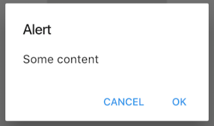
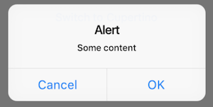
);The AlertDialog will render a caption/title, body/text and a set of action buttons specific for the platform. Uses AlertDialog for material or CupertinoAlertDialog for cupertino.
Note use
showPlatformDialoginstead of eithershowDialogfrom the Material library orshowCupertinoDialogfrom the Cupertino library.
showPlatformDialog(
  context: context,
  builder: (_) => PlatformAlertDialog(
    title: Text('Alert'),
    content: Text('Some content'),
    actions: <Widget>[
      PlatformDialogAction(),
      PlatformDialogAction(),
    ],
  ),
);Extend with WidgetBuilder for material or cupertino.
showDialog(
  context: context,
  builder: (_) => PlatformAlertDialog(...),
  cupertino: (_, __) => CupertinoAlertDialogData(...),
  material: (_, __)  => MaterialAlertDialogData(...),
)The DialogAction widget is used to describe the set of buttons on the AlertDialog. Uses FlatButton for material or CupertinoDialogAction for cupertino.
PlatformDialogAction(
  child: PlatformText('Cancel'),
  onPressed: () => Navigator.pop(context),
),Extend with WidgetBuilder for material or cupertino.
PlatformDialogAction(
  child: PlatformText('Cancel'),
  onPressed: () => Navigator.pop(context),
  material: (_, __)  => MaterialDialogActionData(...),
  cupertino: (_, __) => CupertinoDialogActionData(...),
),A circular looking progress indicator. Uses CircularProgressIndicator for material or CupertinoActivityIndicator for cupertino.
return PlatformCircularProgressIndicator();Extend with WidgetBuilder for material or cupertino.
return PlatformCircularProgressIndicator(
  material: (_, __)  => MaterialProgressIndicatorData(...),
  cupertino: (_, __) => CupertinoProgressIndicatorData(...),
);This function can be used within the Navigator to push either the MaterialPageRoute for material or CupertinoPageRoute for cupertino.
  Navigator.push(
    context,
    platformPageRoute(
      builder: pageToDisplayBuilder,
    ),
);This function is used to either display a ModalBottomSheet for material or CupertinoModalPopup for cupertino.
  showPlatformModalSheet(
      context: context,
      builder: (_) => PlatformWidget(
        material: (_, __)  => _materialPopupContent(),
        cupertino: (_, __) => _cupertinoSheetContent(),
      ),
    );
Note: Since Material and Cupertino content may be quite different it may be useful tl use
PlatformWidget.
A Provider that provides access to the functions of switching platforms which can be accessed from any screen.
Requires to be placed at the root (above MaterialApp, CupertinoApp or PlatformApp).
  return PlatformProvider(
    builder: (BuildContext context) => MaterialApp(...)
);An optional argument initialPlatform can be passed in to force the platform upon startup. This could be useful for development or if the platform is persisted externally (i.e. Shared preferences) and needs to be set on startup.
And to switch platforms...
PlatformProvider.of(context).changeToMaterialPlatform();
or
PlatformProvider.of(context).changeToCupertinoPlatform();
or
PlatformProvider.of(context).changeToPlatform(Platform.fuchsia);
This will set the Theme.of(context).platform but the platform widgets will use the style as defined in the PlatformStyle as set inside the settings object. See below.
The settings argument have been added to assist in configuring Platform Widgets.
iosUsesMaterialWidgets
- If true it will add a Material widget above the CupertinoPageScaffold so that Material widgets can be added to the ios page. This does affect dark mode and some ios rendering so it is best to have it false (default). If you use Material widgets on the page simply add
Material(child: yourWidget).
platformStyle
- Provides a way to set either
MaterialorCupertinostyle on any supported platforms such as android, ios, web, macos, fuchsia, windows amd linux. For example if you wanted to useCupertinowidgets for web you would configure by setting the settings object onPlatformProvider:
PlatformProvider(
  settings: PlatformSettingsData(
    platformStyle: PlatformStyleData(web: PlatformStyle.Cupertino)
  ),
  builder: (context) => PlatformApp(...)
)
Render a Material or Cupertino looking icon
  Icon(context.platformIcons.book)
//or
  Icon(PlatformIcons(context).book)
View the source or screenshots for the list of icons.
Renders a parent widget for either Cupertino or Material while sharing a common child Widget
 PlatformWidgetBuilder(;
   cupertino: (_, child, __) => GestureDetector(child: child, onTap: _handleTap),
   material: (_, child, __) => IniWell(child: child, onTap: _handleTap),
   child: Container(child: Text('Common text')),
);- UI / Unit Tests.
- Code documentation
When importing flutter_platform_widgets you can check isMaterial(context) or isCupertino(context) to determine what style will be used. This is independent to Platform.isAndroid or Platform.isIOS from 'import 'dart:io'
You can call platform(context) to get the current platform. This is an enhancement on the existing TargetPlatform enum which now includes a value for web.
See the example code for how this is used.
Please create an issue to provide feedback or an issue.
Inspired by the example given by Swav Kulinski (https://github.com/swavkulinski/flutter-platform-specific-widgets)


