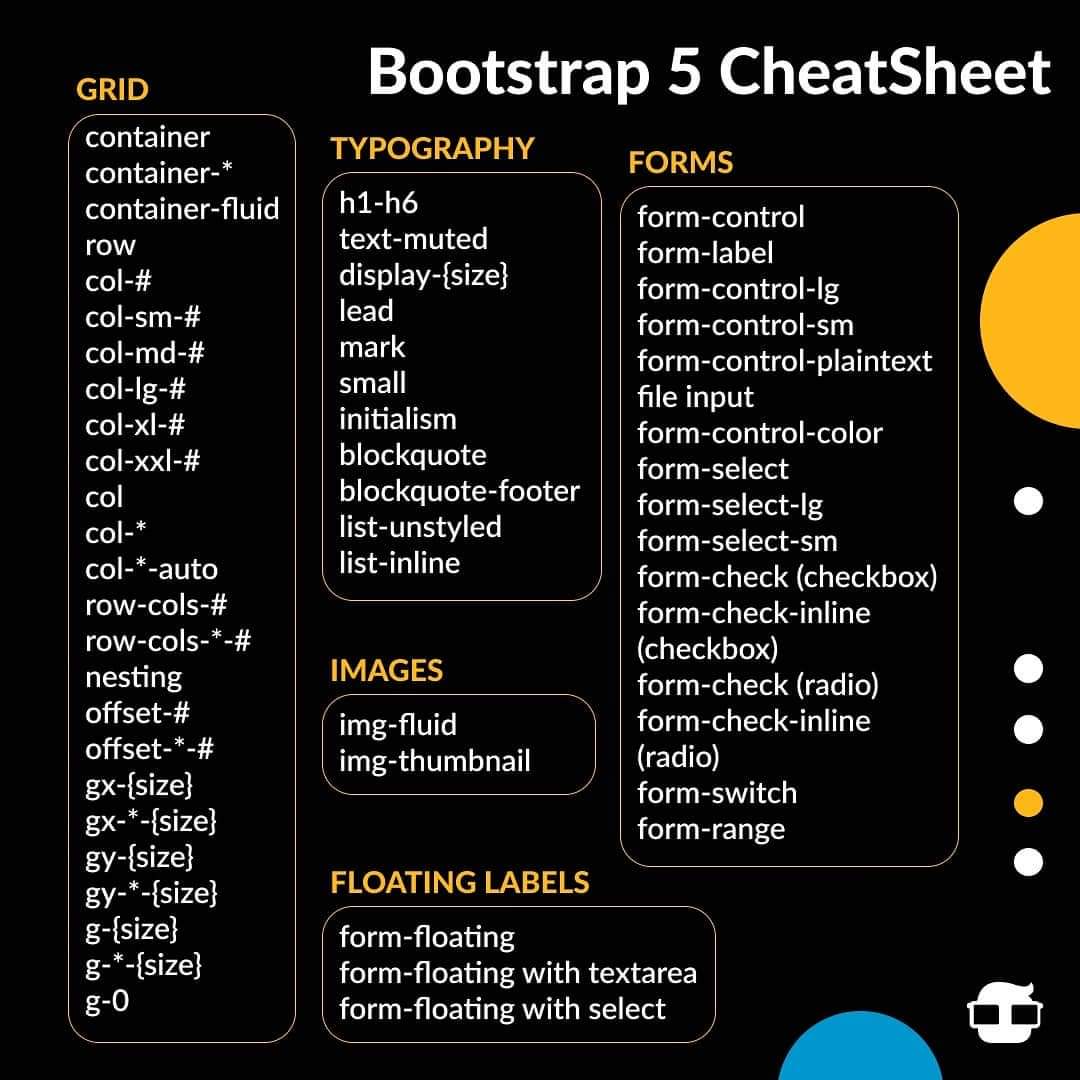
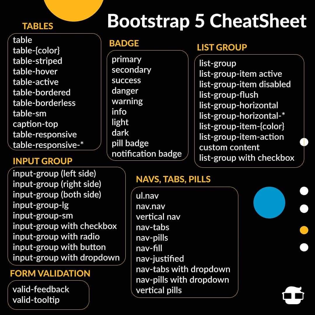
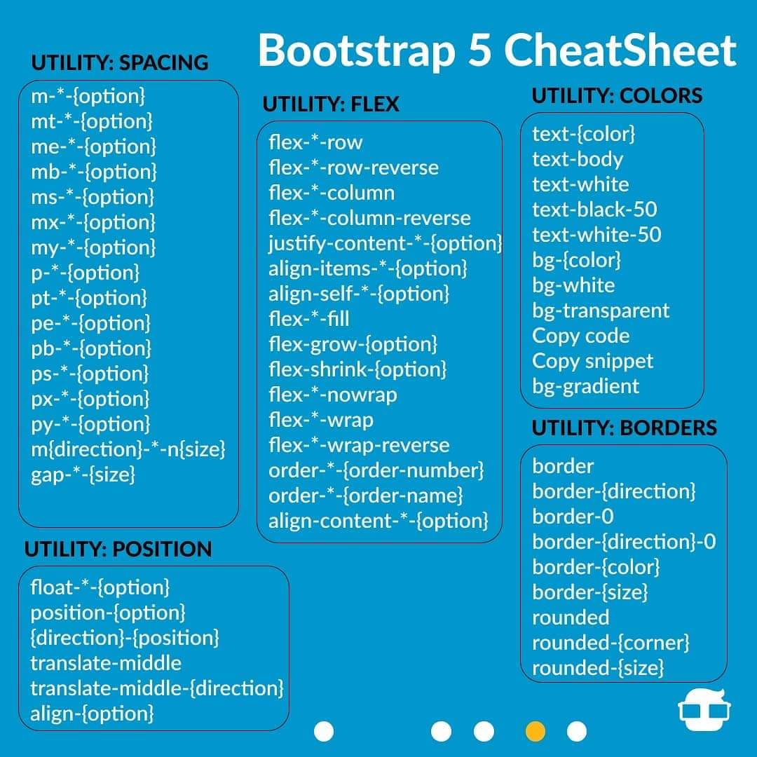
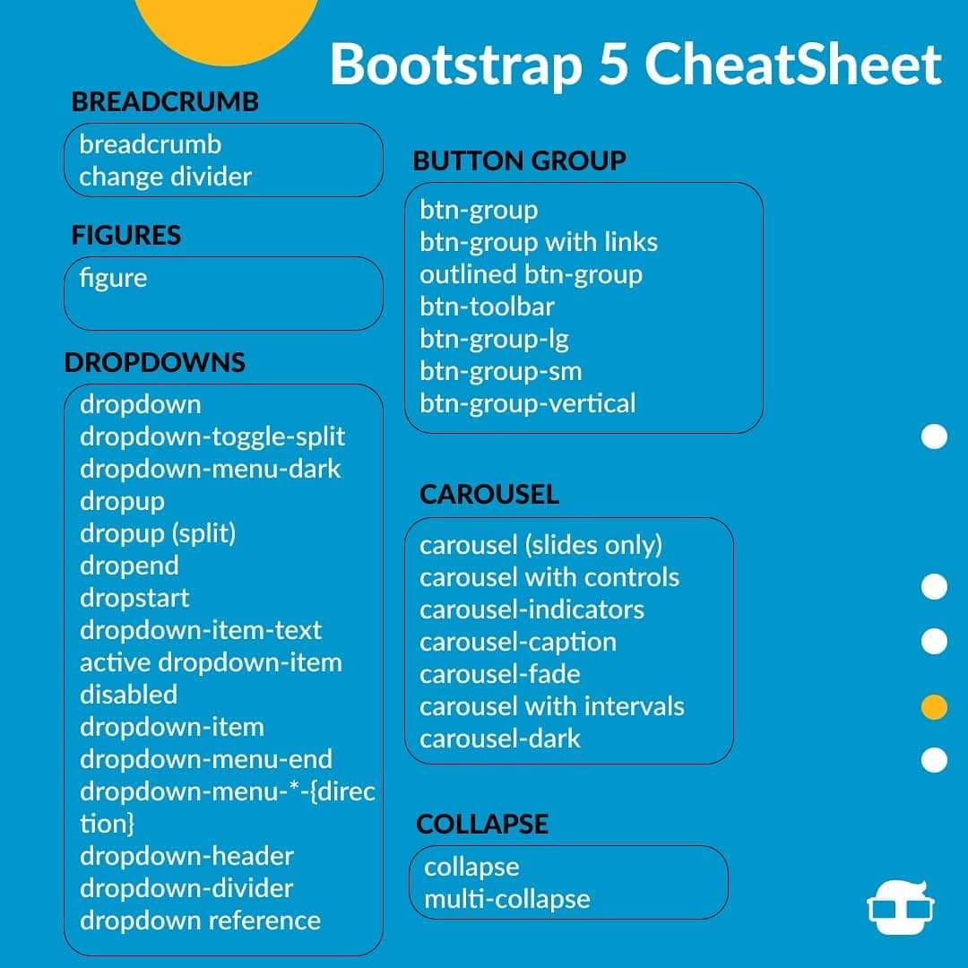
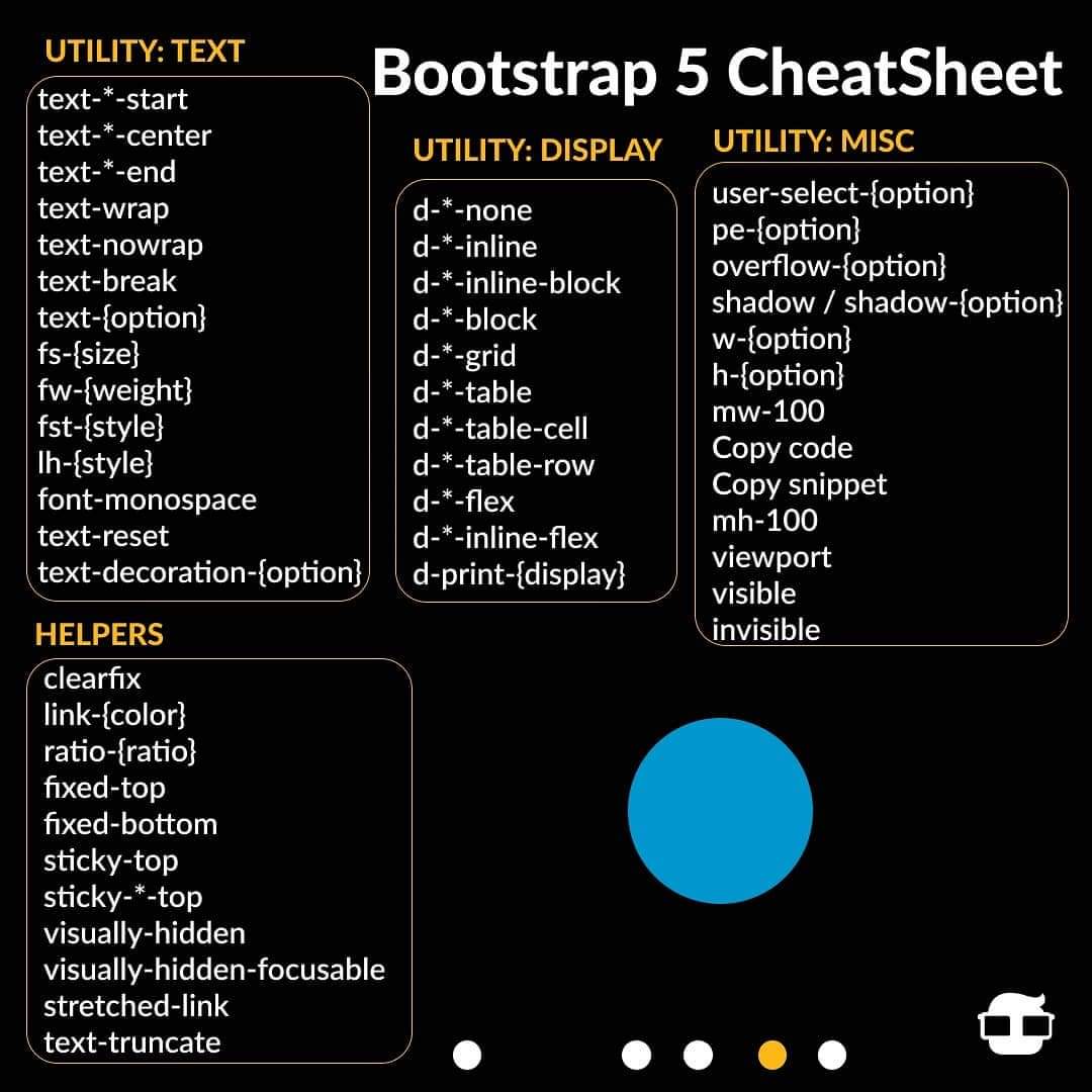
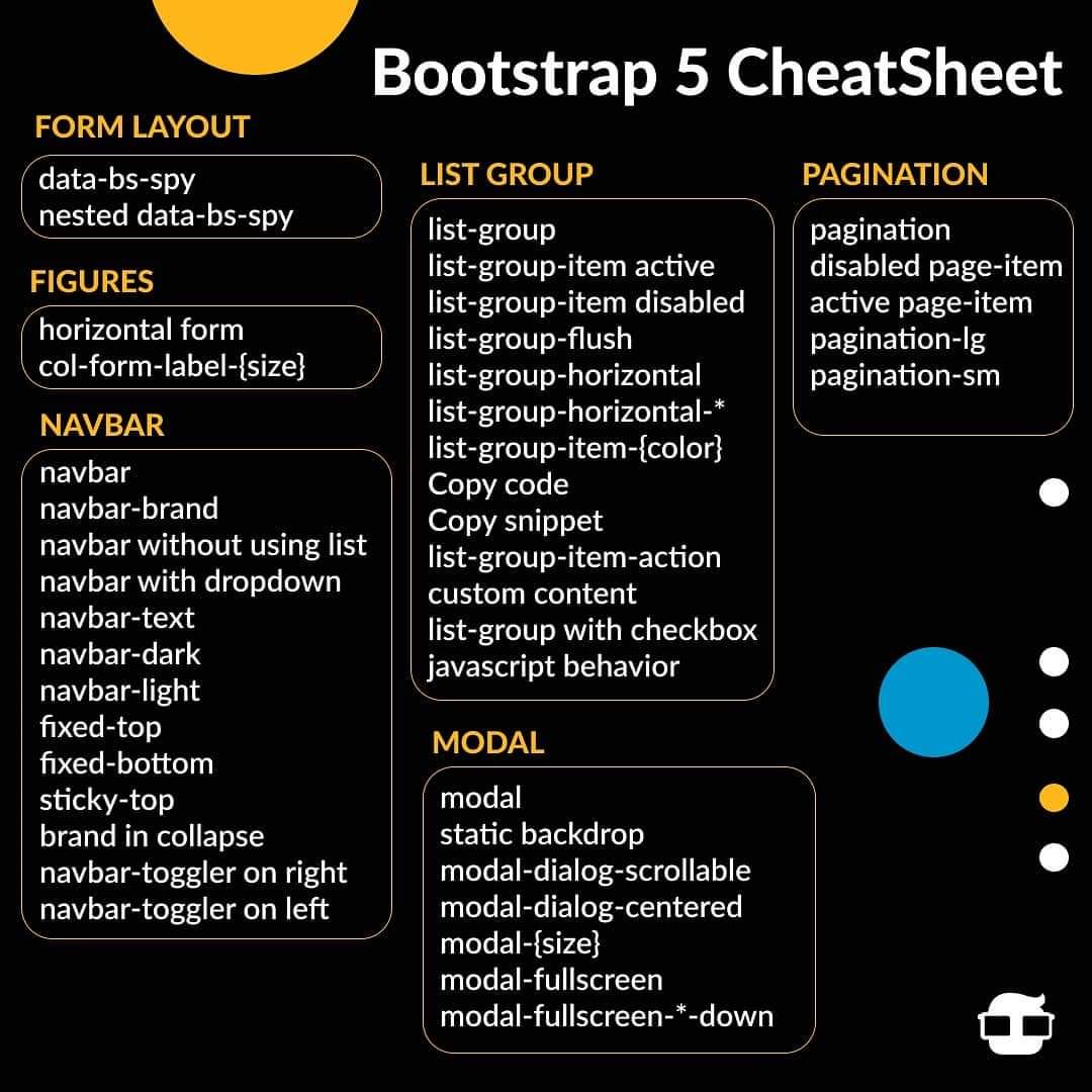
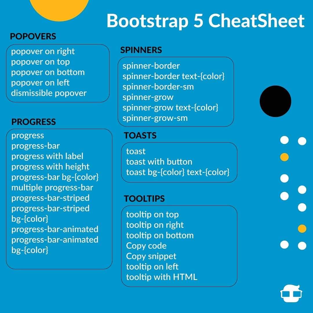
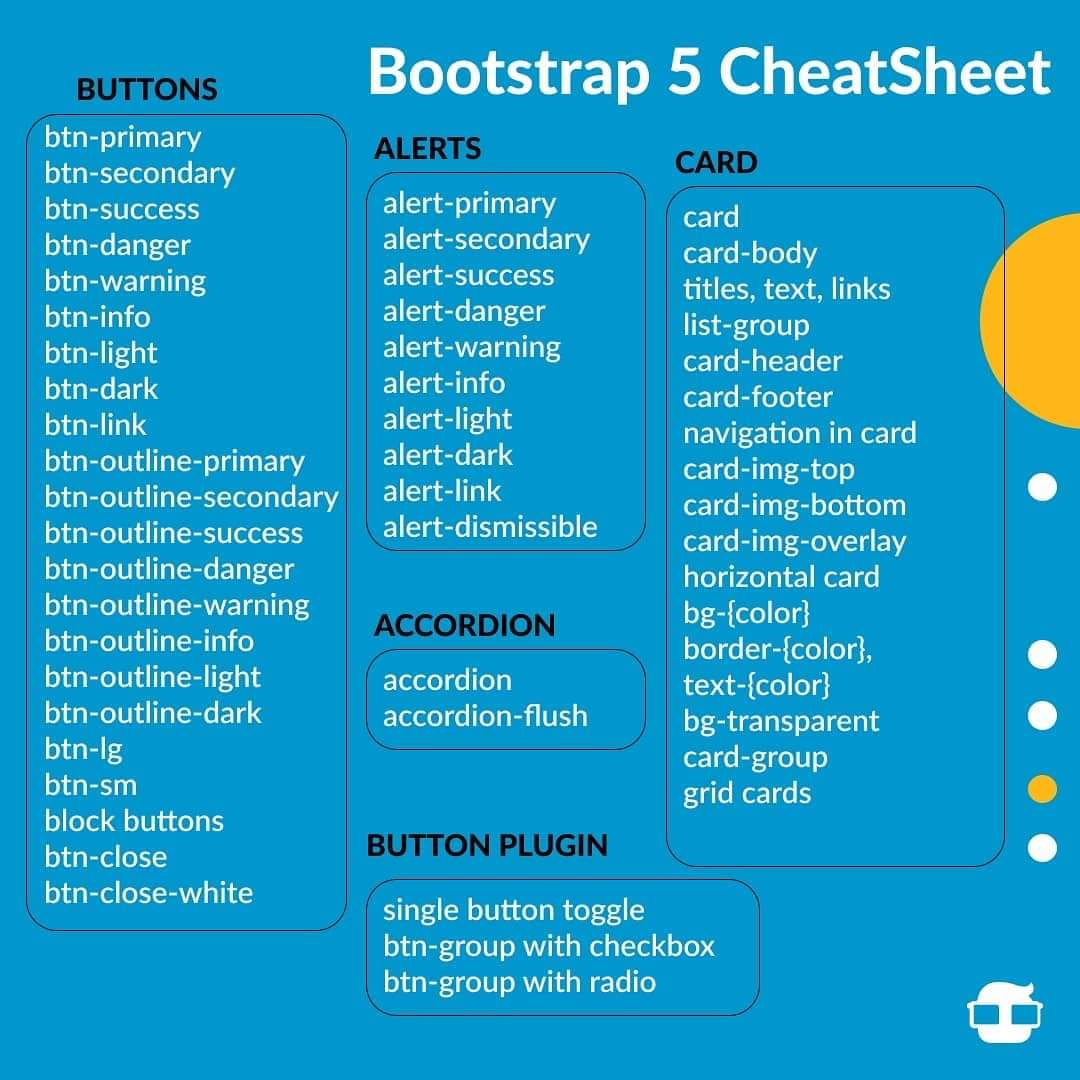
- Bootstrap is a free front-end framework for faster and easier web development
- Bootstrap includes HTML and CSS based design templates for typography, forms, buttons, tables, navigation, modals, image carousels and many other, as well as optional JavaScript plugins
- Bootstrap also gives you the ability to easily create responsive designs
- Increase development speed
- 100% Open Source Framework
- Assure Responsiveness
- Mobile-first approach: In Bootstrap 3, mobile-first styles are part of the core framework
- Browser compatibility: Bootstrap is compatible with all modern browsers
- Bootstrap was developed by Mark Otto and Jacob Thornton at Twitter,
- Released as an open source product in August 2011 on GitHub.
- In June 2014 Bootstrap was the No.1 project on GitHub!
- There are two ways to start using Bootstrap on your own web site.
You can:
- Download Bootstrap from getbootstrap.com
- Include Bootstrap from a CDN
1.Container classes:
container --> The .container class provides a responsive fixed width container
container-fluid --> The .container-fluid class provides a full width container, spanning the entire width of the viewport
container well --> is a background color example
2.Bootstrap Grid System:
Bootstrap grid system allows up to 12 columns across the page.
span 1 span 1 span 1 span 1 span 1 span 1 span 1 span 1 span 1 span 1 span 1 span 1
        span 4	                         span 4	                                 span 4

        span 4	                                              span 8

                          span 6	                                   span 6

                                        span 12
Grid Classes:
The Bootstrap grid system has four classes:
- xs (for phones - screens less than 768px wide)
- sm (for tablets - screens equal to or greater than 768px wide)
- md (for small laptops - screens equal to or greater than 992px wide)
- lg (for laptops and desktops - screens equal to or greater than 1200px wide)
3.Bootstrap Text/Typography:
h1-h6
- By default, Bootstrap will style the HTML headings (
- In Bootstrap the HTML element is used to create a lighter, secondary text in any heading:
Use the mark element to highlight text.
The WHO was founded in 1948.
For 50 years, WWF has been protecting the future of nature. The world's leading conservation organization, WWF works in 100 countries and is supported by 1.2 million members in the United States and close to 5 million globally.
From WWF's website.blockquote-reverse
For 50 years, WWF has been protecting the future of nature. The world's leading conservation organization, WWF works in 100 countries and is supported by 1.2 million members in the United States and close to 5 million globally.
From WWF's website
- Bootstrap will style the HTML
element in the following way:
- Coffee
- - black hot drink
- Milk
- - white cold drink
The following HTML elements:
span,section, anddivdefines a section in a document.
Use ctrl + p to open the Print dialog box.
Text in a pre element is displayed in a fixed-width font, and it preserves both spaces and line breaks.
Contextual Colors and Backgrounds
.text-muted, .text-primary, .text-success, .text-info, .text-warning, .text-
.bg-primary, .bg-success, .bg-info, .bg-warning
