MaterialDayPicker
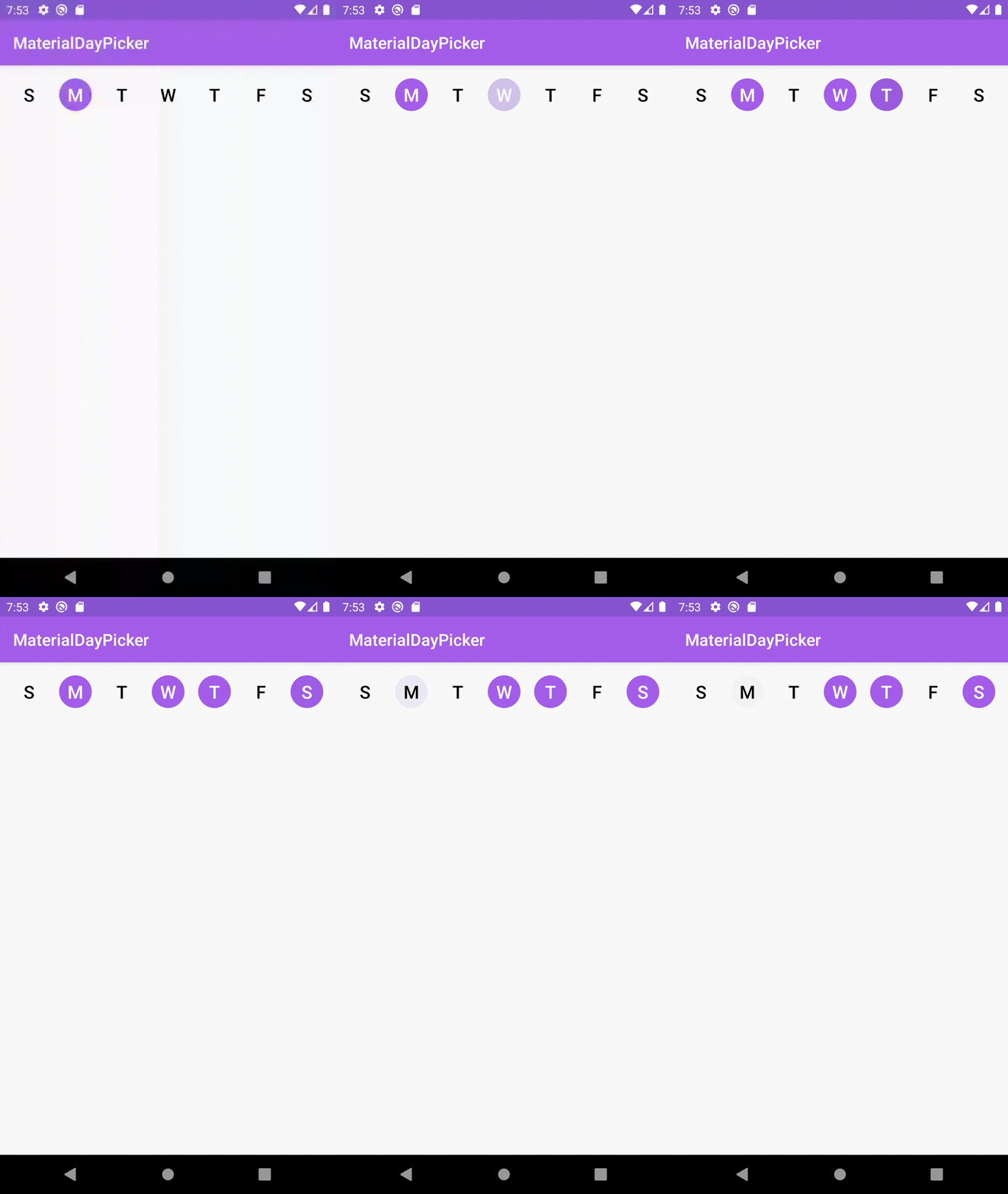
Inspired by the day picker in the builtin Android clock app.
Note: I'm not actively working on new features for this library. I'm only addressing critical bugs. With that being said contributions for new features are more than welcome and I am available to review pull requests. See contributing.md if you're interested in contributing.
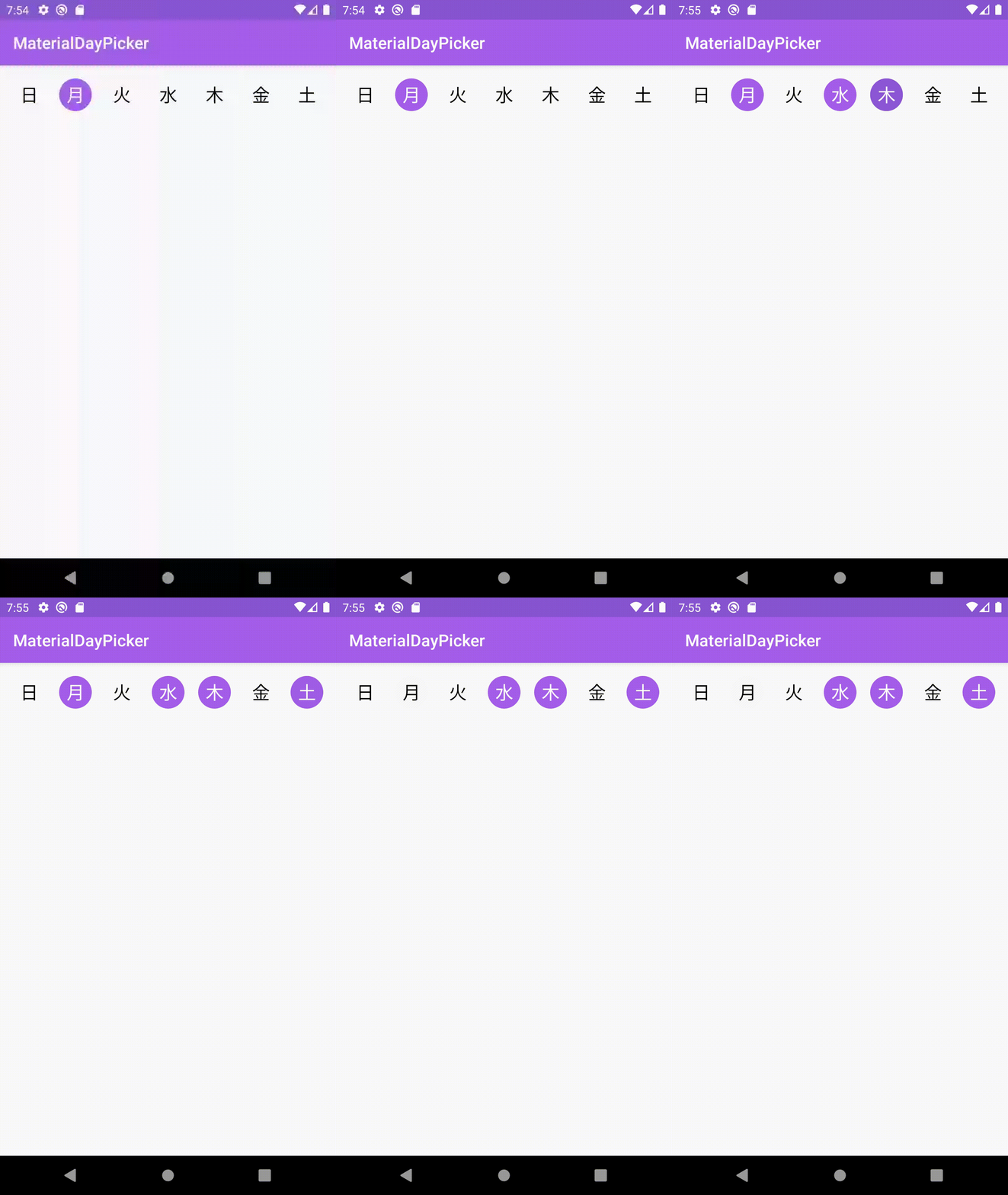
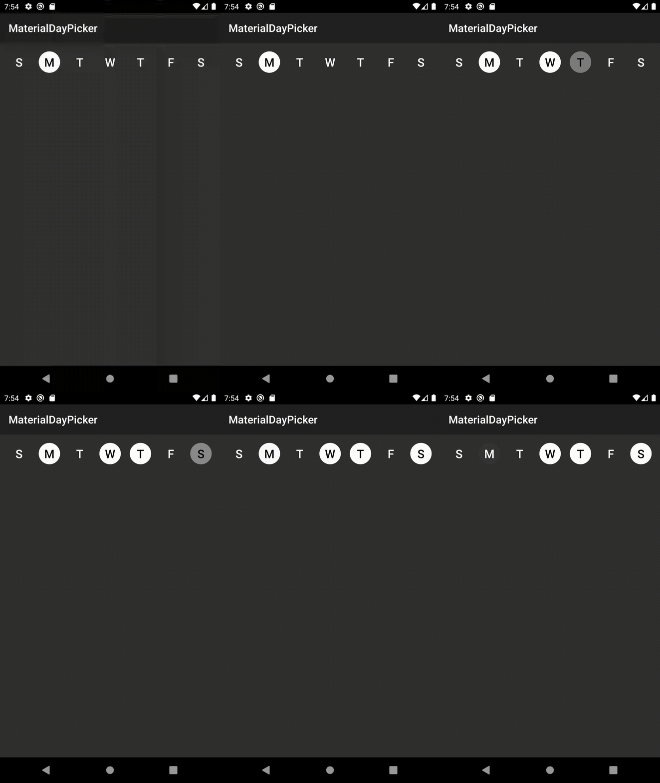
| Normal Usage | Localized Usage | Dark Mode Usage |
|---|---|---|
 |
 |
 |
Features
- 🎨 Customizable theming
- ✅ Easy to use API/hooks
- 🌎 Fully localized
- 👻 Supports dark mode
What's New: Version 0.7.4 - Better Configuration + Bug fixes
- You can now manually override the first day of the week shown in the picker by using the newly added
firstDayOfWeekproperty
Changes from 0.7.3
- Upgraded MaterialDayPicker to target API 30 and upgraded its AndroidX dependencies
Changes from 0.7.2
Bug fixes
- Fixes a bug when using android gradle plugin
3.6.1that would cause building to fail due to not being able to find theselectionModeattribute.
Changes from 0.7.1
Bug fixes
- Fixes an issue where calling
setSelectedDayswould cause selected days to flash off and on.
Changes from 0.7.0
Configuration Improvements
- You can now enable/disable days from being selected using enableDay/disableDay methods. See more below.
- You can now set the selection mode via xml by using the
app:selectionModeattribute.
Download the latest version by adding the following to your project's build.gradle file:
dependencies {
    implementation 'ca.antonious:materialdaypicker:0.7.4'
}
Using MaterialDayPicker in your App
You can just drop the view into your existing xml:
<ca.antonious.materialdaypicker.MaterialDayPicker
    android:id="@+id/day_picker"
    android:layout_width="match_parent"
    android:layout_height="wrap_content"/>
You can get the currently selected days by using:
val selectedDays = materialDayPicker.selectedDays
// returns [MaterialDayPicker.Weekday.TUESDAY, MaterialDayPicker.Weekday.FRIDAY]
You can set the selected days by doing:
val daysToSelect = listOf(MaterialDayPicker.Weekday.TUESDAY, MaterialDayPicker.Weekday.FRIDAY)
materialDayPicker.setSelectedDays(daysToSelect)
If you want to only allow one day to be selected at a time you can do:
materialDayPicker.selectionMode = SingleSelectionMode.create()This can also be set via xml using the selectionMode attribute:
<ca.antonious.materialdaypicker.MaterialDayPicker
    ...
    app:selectionMode="ca.antonious.materialdaypicker.SingleSelectionMode"/>
You can enable/disable days using the following methods. Note if you disable a day when it's selected it cannot be deselected:
materialDayPicker.enableDay(MaterialDayPicker.Weekday.Monday)
materialDayPicker.disableDay(MaterialDayPicker.Weekday.Monday)
materialDayPicker.setDayEnable(MaterialDayPicker.Weekday.Monday, isEnabled = false)
If you want to listen to whenever the day selection is changed you can use:
materialDayPicker.setDaySelectionChangedListener { selectedDays ->
    // handle selection change
}
If you need to know when a specific day is selected/deselected you can use:
materialDayPicker.setDayPressedListener { weekday, isSelected ->
    // handle weekday selection
}
Customizing MaterialDayPicker for your App
You can override these colors to change how MaterialDayPicker looks. You can also update these values in your night color resources directory to update how MaterialDayPicker looks in dark mode:
<color name="dayPressed">@color/colorPrimaryDark</color>
<color name="daySelected">@color/colorPrimary</color>
<color name="daySelectedTextColor">@android:color/white</color>
<color name="dayDeselected">#FAFAFA</color>
<color name="dayDeselectedTextColor">@android:color/black</color>

<!-- Customizing colors for disabled days-->
<color name="daySelectedAndDisabled">#43444F</color>
<color name="daySelectedAndDisabledTextColor">@color/daySelectedTextColor</color>
<color name="dayDeselectedAndDisabled">@color/dayDeselected</color>
<color name="dayDeselectedAndDisabledTextColor">@android:color/darker_gray</color>
If you don't want to use the device's current locale you can override it by doing:
materialDayPicker.locale = Locale.ENGLISH // or any other localeIf you want to specify the first day of the week explicitly:
materialDayPicker.firstDayOfWeek = MaterialDayPicker.Weekday.MONDAY // or any other dayLicense
MIT License

Copyright (c) 2017 George Antonious

Permission is hereby granted, free of charge, to any person obtaining a copy
of this software and associated documentation files (the "Software"), to deal
in the Software without restriction, including without limitation the rights
to use, copy, modify, merge, publish, distribute, sublicense, and/or sell
copies of the Software, and to permit persons to whom the Software is
furnished to do so, subject to the following conditions:

The above copyright notice and this permission notice shall be included in all
copies or substantial portions of the Software.

THE SOFTWARE IS PROVIDED "AS IS", WITHOUT WARRANTY OF ANY KIND, EXPRESS OR
IMPLIED, INCLUDING BUT NOT LIMITED TO THE WARRANTIES OF MERCHANTABILITY,
FITNESS FOR A PARTICULAR PURPOSE AND NONINFRINGEMENT. IN NO EVENT SHALL THE
AUTHORS OR COPYRIGHT HOLDERS BE LIABLE FOR ANY CLAIM, DAMAGES OR OTHER
LIABILITY, WHETHER IN AN ACTION OF CONTRACT, TORT OR OTHERWISE, ARISING FROM,
OUT OF OR IN CONNECTION WITH THE SOFTWARE OR THE USE OR OTHER DEALINGS IN THE
SOFTWARE.
