To do this challenge, you need a good understanding of ReactJs framework.
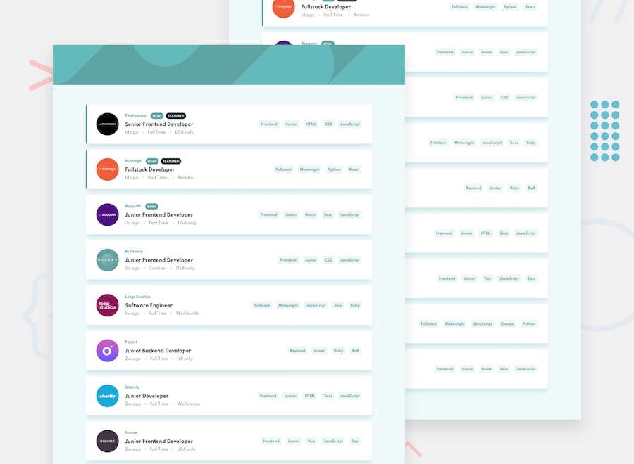
Your challenge is to build out this card listing page and get it looking as close to the design as possible.
You can use any tools you like to help you complete the challenge, apart from CSS libraries such as Bootstrap, Material-UI, etc. The idea is to capture your understanding of the DOM element. However, the likes of sass, scss, styled-component and font-awesome is an exception.
Your users should be able to:
- View the optimal layout for the site depending on their device's screen size
- See hover states for all interactive elements on the page
- Filter card listings based on the categories
Colors
Primary
- Desaturated Dark Cyan: #5BA4A4
Neutral
- Light Grayish Cyan (Background): #EFFAFA
- Light Grayish Cyan (Filter Tablets): #EEF6F6
- Dark Grayish Cyan: #7B8E8E
- Very Dark Grayish Cyan: #2C3A3A
Typography
- Family: Spartan
- Weights: 500, 700
Use the data.json file to pull the data and then dynamically add the content.
To add a filter, the user needs to click on the tablets on the right-side of the listing on desktop or the bottom on mobile. For each filter added, only listings containing all selected filters should be returned.
Your task is to build out the project to the designs inside the /design folder. You will find both a mobile and a desktop version of the design.
The designs are in JPG static format. Using JPGs will mean that you'll need to use your best judgment for styles such as font-size, padding and margin.
You will find all the required assets in the /images folder. The assets are already optimized.
- State management library such as redux
- Clean and freshly organized codebase structure
- Using functional components and React Hooks
- Having fun while completing the challenge
