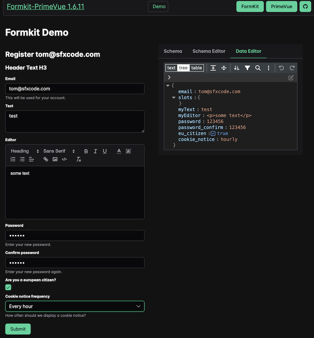
PrimeVue based FormKit Inputs for using FormKit with the PrimeVue UI Framework.
Main focus of this project is to provide configuration based forms with validation.
In addition, you can use the same pattern for data output from schema using PrimeOutputs.
Actual PrimeVue Version of the main branch is 4.x.
PrimeVue 3 is in the prime3 branch, but future development will only focus on PrimeVue 4
Add formkit.config.ts
import { defaultConfig, plugin } from '@formkit/vue'
import { primeInputs } from '@sfxcode/formkit-primevue'

app.use(plugin, defaultConfig({
  locales: { de, en },
  // Define the active locale
  locale: 'en',
  inputs: primeInputs,
}))
or if using also the output part
import { defaultConfig, plugin } from '@formkit/vue'
import { primeInputs, primeOutputs } from '@sfxcode/formkit-primevue'

app.use(plugin, defaultConfig({
  locales: { de, en },
  // Define the active locale
  locale: 'en',
    inputs: { ...primeInputs, ...primeOutputs },
}))
Important: output elements depends on vue-i18n to style numbers, dates, ...
FormKit-PrimeVue-Nuxt module available.
Features:
- add PrimeVue Nuxt Module
- add FormKit Nuxt Module
- add i18n Nuxt Module
- Default Configuration for FormKit (with PrimeVue components) is provided (can be disabled if needed)
- AutoImport of PrimeVue Form Components
- PrimeIcons are loaded by Default
- FormKit Styling of this package is loaded by default
- AutoImport of Composables
- AutoImport of Components
Prefixing of the PrimeVue component names is not supported.
useFormKitSchema provide functions to simplify the usage of elements, components, lists, ...
useInputEditorSchema provide functions for a component schema generation builder
Basic styling is provided with the formkit-primevue.scss file or the corresponding css file in the package.
Features:
- Width of all text and dropdown elements is set to 100%
- Error Color by variable (--formkit-error-color)
- Some margins, font sizes ...
You can use it or take it as base for your own styling.
- Styling outerClas, innerClass .... is provided by FormKit
- All inputs, outputs are wrapped in a div with a p-formkit class
- Most of the Prime Input Components have access to class / styles attributes
- PT and PTOptions are available (https://primevue.org/passthrough/)
- Styling and PT demo available
- Grid Demo of the provided grid styling (col-[1-12])
Some samples for common tasks are available
- Repeater Use Repeater composable for using repeating values in your schema
- Input Editor Edit FormKit schema on the based on a provided composable
- Form Editor Basic demo as starter to create Forms visually
Nuxt 3 PrimeVue Starter and Vite PrimeVue Starter with Formkit support available.
- AutoComplete
- CascadeSelect
- Checkbox
- ColorPicker
- DatePicker
- Editor (HTML Editor - if you register the editor component, make sure to import quill)
- InputMask
- InputNumber
- InputOtp
- InputText
- Knob
- Listbox
- MultiSelect
- Password
- RadioButton
- Rating
- Select
- SelectButton
- Slider
- Textarea
- ToggleButton
- ToggleSwitch
- TreeSelect
