Please follow the title links to the public, interactive dashboard on Tableau.
I am interested in the Youtube user interactions. Each record in the data is a day of trending per video. The data has also been restricted to the United States, and from a period between July 23, 2006 to March 19, 2018.
The first visualization is a map of the number of video uploads per category per state. The second is the number of times the videos were viewed, seen at 3 different levels (individual videos, the channel, and the category). The third is the number of likes, dislikes, and comments received, also at the 3 different levels.
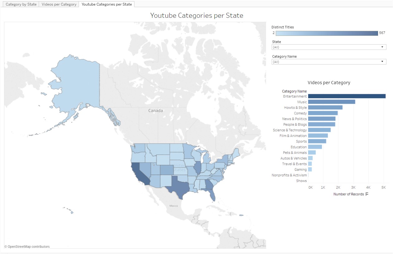
First up, I always like to map something if I can. The mapping coordinates are based on the upload location, so this is a map of the number of distinct uploaded titles per Category.
The bar chart was included for easier access to specific details; they're great for rankings. The color palette was pretty standard; gradients of blue gives enough definition to each category without being too much, and still remains a good choice for accessibility.
From the map, you'll immediately note that California (CA) has the most number of uploads (567 distinct titles). It's not really visible, but Vermont (VT) and Mississippi (MS) has the least, at 2.
From the bar chart on the right, you'll see that Entertainment is the most uploaded category (1,045), and Shows is the least (2).
If you click around, you'll see some interesting things. 3 of them are:
- Hawaii (HI) is the only upload location for Shows, meaning both Shows videos are from HI.
- Looking only at the Gaming category, Colorado (CO) has the most uploads (10), followed closely by California (8).
- If you isolate Mississippi (MS), you'll note that their sole upload category is Entertainment (2 videos).
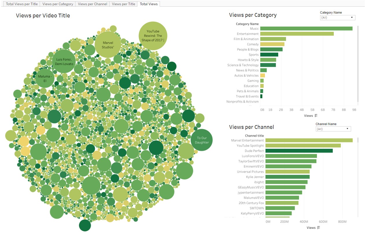
The second insight is the number of times videos have been viewed - by Category, Channel and per video's Title. The bubble chart gives an idea of the breadth of views; I wanted to emphasize how much more views there are for certain videos than the majority. Because there is so much information in it, the 2 bar charts show the Category and Channel rankings in a much more accessible way.
The categories are colored to give an idea of their distribution across the titles and channels. The palette would have been blue but since, as a set with the other visualizations, it shows different information, I thought gradients of yellow to green would be suitable while maintaining accessibility. The color legend is simply Views per Category sorted alphabetically (which you can change if you click on the tiny popup when hovering over "Views" under the Category chart).
You'll probably notice first, in the bubbles, that the majority of videos have a relatively small number of views, as well as spanning the 16 Categories. The size of the large bubbles, which correlates to the sum of views, is significant in comparison! YouTube Rewind: The Shape of 2017 looks to be the most watched video title ), followed by the Marvel Studios' Avengers: Infinity War Official Trailer (780 million and 669 million views, respectively).
The most-viewed category is Music and then Entertainment, with about 8.8 billion views and 7 billion views respectively. There's a very sharp drop after that. The channel that has the most views is Marvel Entertainment (904 million).
Interestingly:
- If you single out the Marvel Entertainment channel, there are 2 categories with that same channel name. The first is the expected Entertainment channel with 10 titles and 904 million views, the other is Autos & Vehicles, having 1 title called Marvel Comics 2018: A Fresh Start viewed 2.8 million times.
- As previously mentioned, Music is the most-viewed Category; yet, both the top 2 Channels and top 2 Titles are in the Entertainment category. In fact, hovering over these first 2 Categories, the tool tip shows that the Entertainment category has almost double the number of distinct videos (1045) than the Music category (532), suggesting that the Entertainment videos were viewed twice as many times as the Music videos!
- From the previous visualization, we know that the 2 videos in the Shows category are from Hawaii. If we isolate this category, we see the 2 titles are about Apple products from the CNET channel. When only the CNET channel is isolated (and all categories viewed), we see that all these videos are on 2 channels (Shows, and Science & Technology). If you verify with the Categories per State dashboard, you'll note that these videos are indeed all from Hawaii.
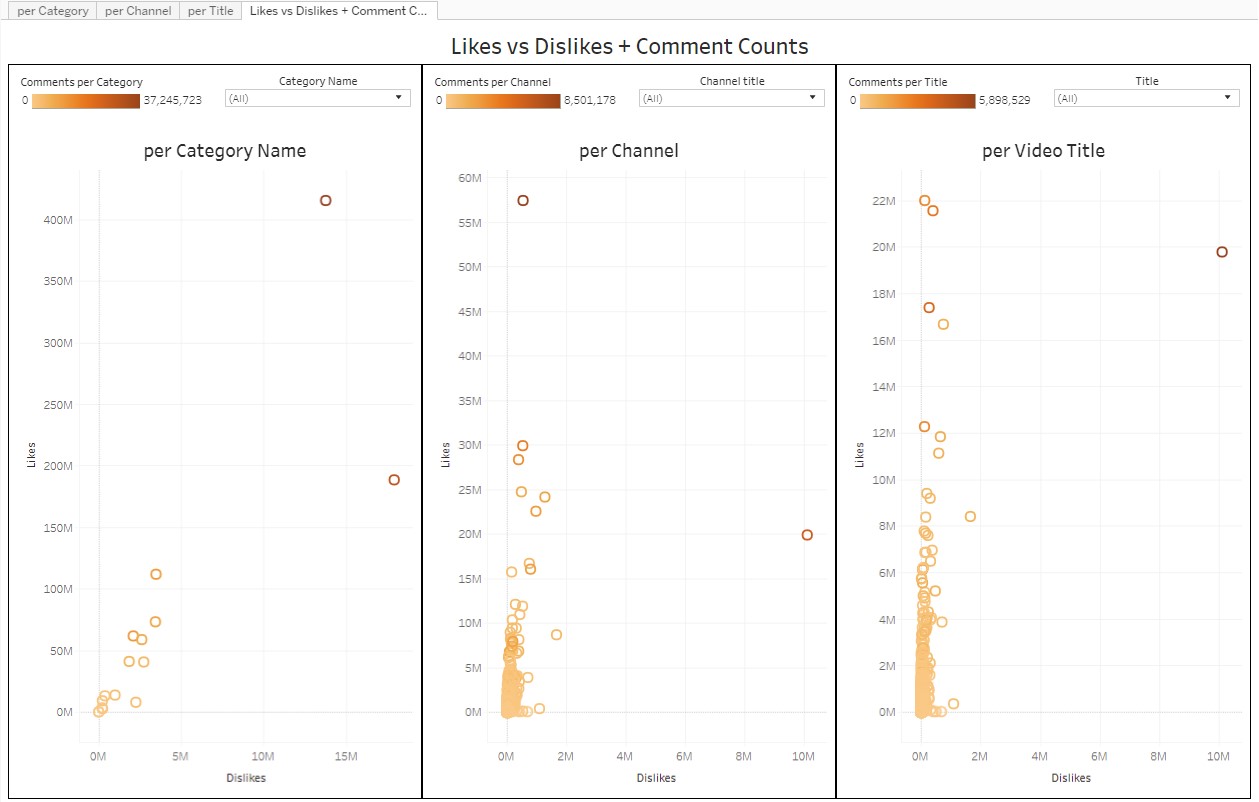
Finally, I wanted to see the ratio of likes to dislikes, as well as the number of comments per Title, Channel, and Category. I wanted to create a dashboard similar to [this one](https://public.tableau.com/shared/KMTHF8NH5?:display_count=yes), but I couldn't figure it out the hierarchy choices (yet). Instead, I opted for a scatter plot with color showing the number of comments. Again, I chose a gradient for the same reason - it presents the range of data without being too over-the-top and is good for color-blind people.
In this triple chart, you'll notice that the number of likes in all 3 charts are significantly higher than the number of dislikes. Note that the vertical axis scale goes much higher than the horizontal axis.
If you hover over the right-most point in the Video Title chart, you'll notice that the title with the most number of dislikes by far is Youtube Rewind: The Shape of 2017 at just over 10 million! The title is Katy Perry's Hey Hey Hey at 1.7 million dislikes.
Hovering over the right-most point in the Channel chart, the category is Entertainment and the channel is YouTube Spotlight. This is interesting since it's the same category and channel as the most disliked title. If you view all titles except for Youtube Rewind: The Shape of 2017, the charts all change shape and removes the right-most data point in all 3 charts, indicating that that 1 video title is a distant outlier in dislikes.
Interesting findings:
- Choose only the Comedy category: the highest number of comments is for a channel called 'jacksfilms', which does not have the most likes or dislikes in any of the Comedy channels or titles.
- Choose only the Youtube Spotlight channel: there are 2 titles in here - the Youtube Rewind that we looked at earlier, as well as a video about Veteran's Day that has 2.5 million views, 81,106 likes, about 6 thousand dislikes, and 15 thousand comments. While these numbers are very high, they are negligible next to the other title.
- Choose only the Music category: the 'ibighit' channel has both the most number of likes and comments, thanks to its 2 (of 4) titles.