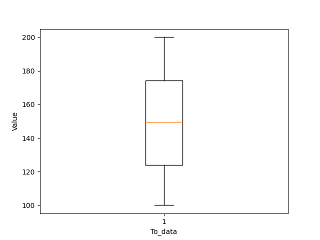
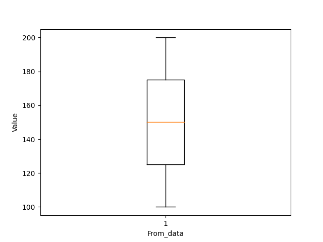
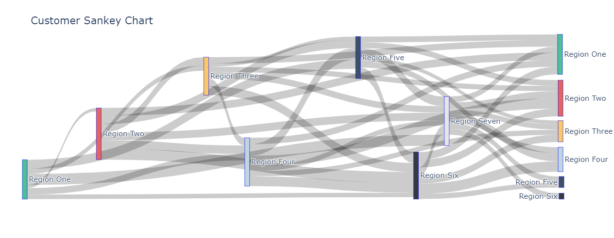
The data consists of three columns- userid, To and From. To visualize and analyze the data this data- histograms, boxplots and Sankey Chart has been.
Histograms allow us to see the frequency of data points that lie within a certain range.
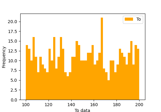
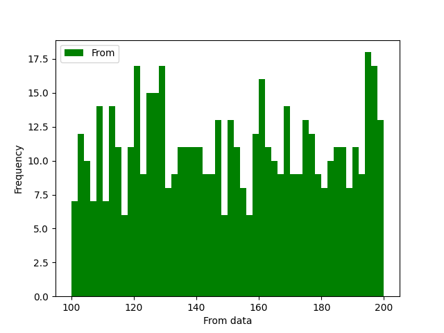
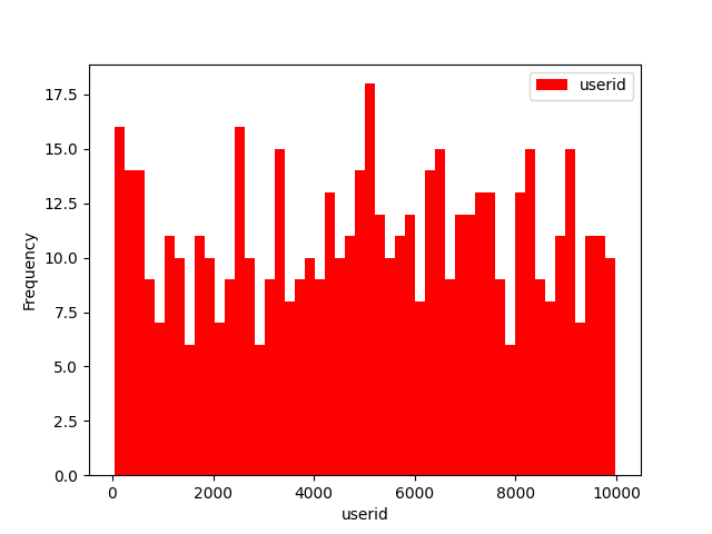
- Here, the boxplots of to and from data give us the minimum and maximum values of To and From data which will help us in Plotting the Sankey Chart
In order to plot the Sankey chart, the data points need to be divided into regions. We will be plotting will be plotting the To values from the data as source for the Sankey diagram and From values from the data as target. In order to do this, we will need to make regions so that we can label the Sankey chart. The following regions or labels have been used for these data values-
| Label | Range |
|---|---|
| Region One | 100 to 114 |
| Region Two | 115 to 129 |
| Region Three | 130 to 144 |
| Region Four | 145 to 159 |
| Region Five | 160 to 174 |
| Region Six | 175 to 189 |
| Region Seven | 190 to 204 |
As you can see, a difference of 15 is used to divide the data points into these regions. We will be using this to rank the region of both To and From data.
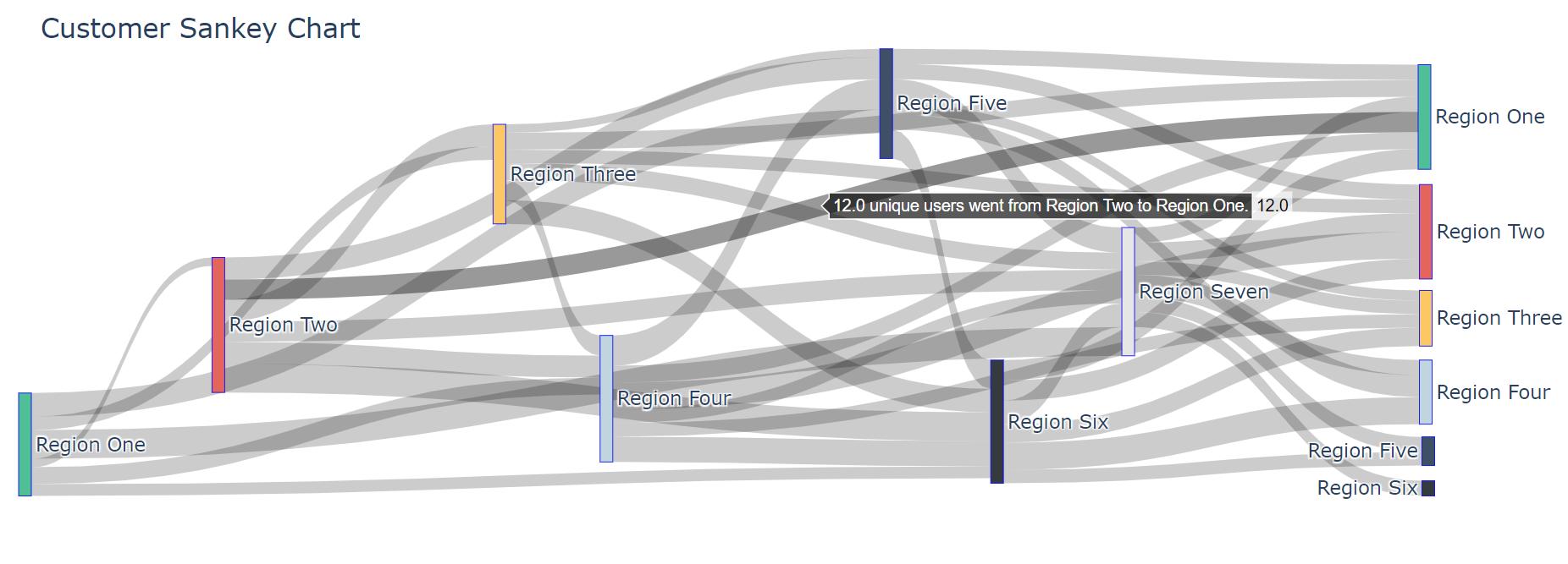
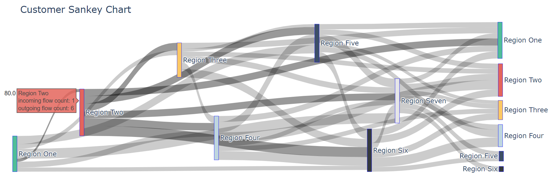
We can see the following Sankey chart below-
In order to find out the number of unique users that have gone from one region to another, just hover the arrow over the flow path. Here we can see that 12 unique users have gone from Region Two to Region One.
The incoming flow count, outgoing flow count and the total number of users passing through any region can be found out by clicking on the label itself. Here we can see that the total number of unique users passing through Region Two is 80.
- pandas
- matplotlib
- plotly
|
Shantanu Sontakke |


