Presented at NASA International Spaceapps 2019
Refer 'Team Kugelblitz.pptx' for our full work and roadmap.
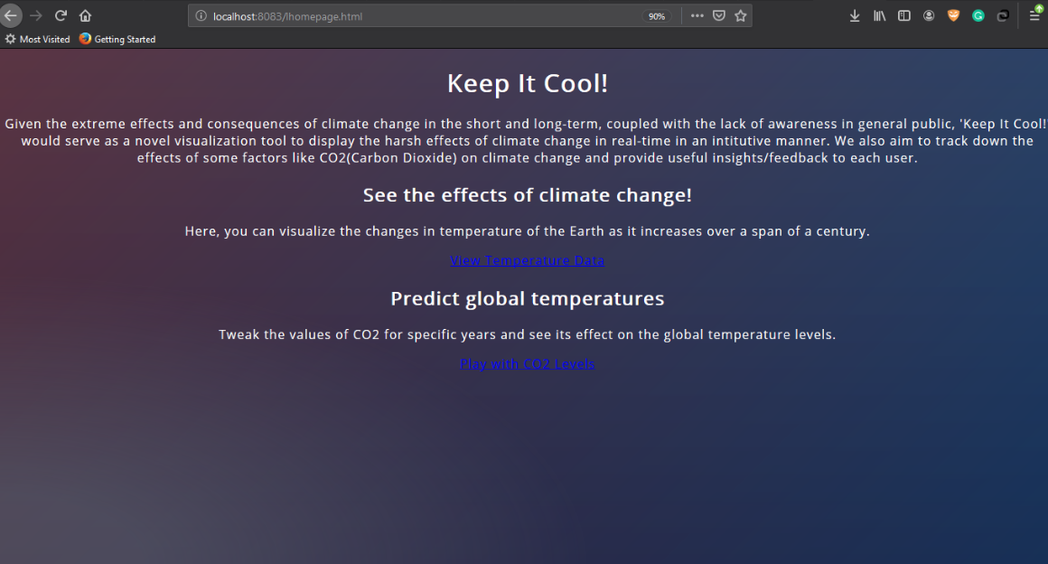
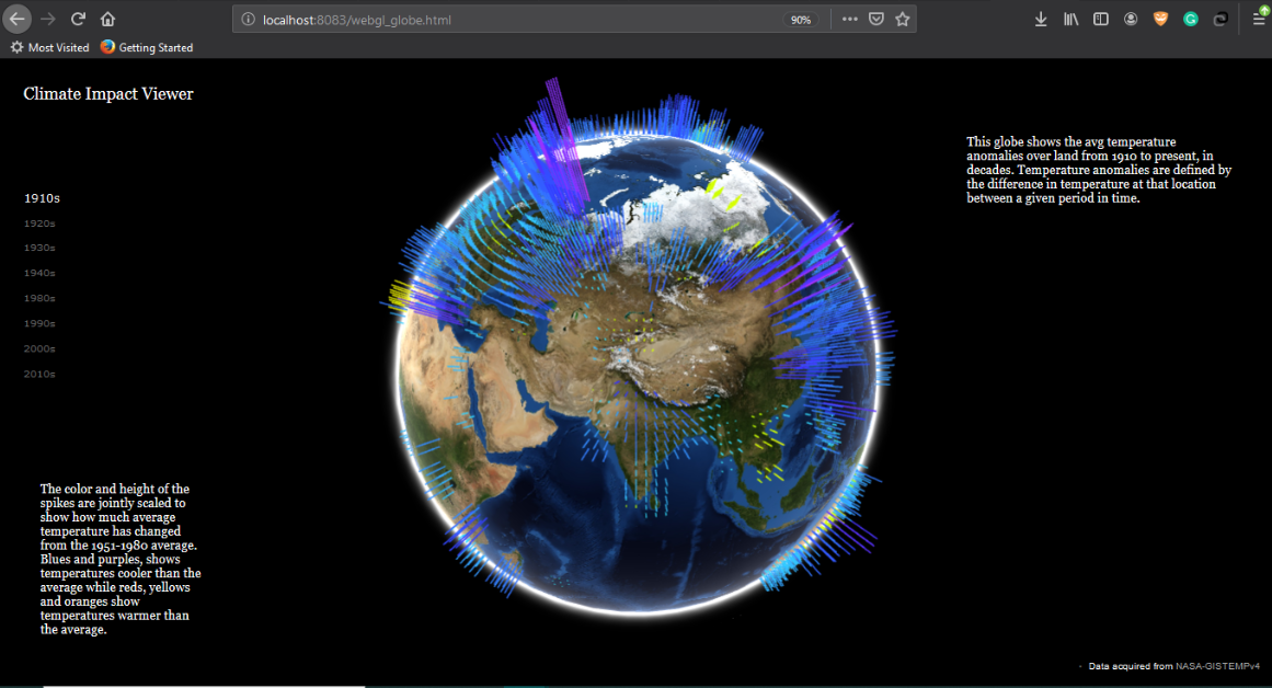
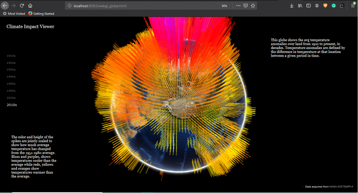
Keep it cool is visualization tool that maps NASA's GISTEMP data on a WebGL based globe, and displays the impact of climate change on global mean temperature over the past century. This visualization work was inspired by the work done by Chrome Experiments (WebGL) and people like A. Sweeney, Yoshua Bengio and many others' work in visualizing climate change.
Red/orange spikes = higher global temperatures than average (anomalies)
Blue/purple spikes = lower global temperatures than average
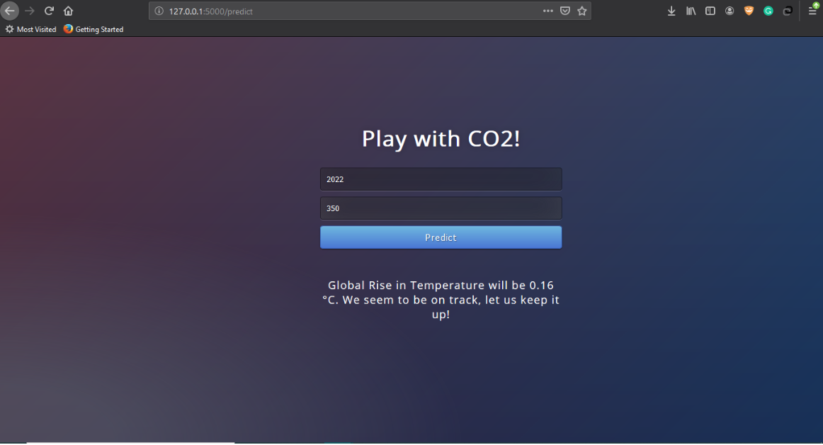
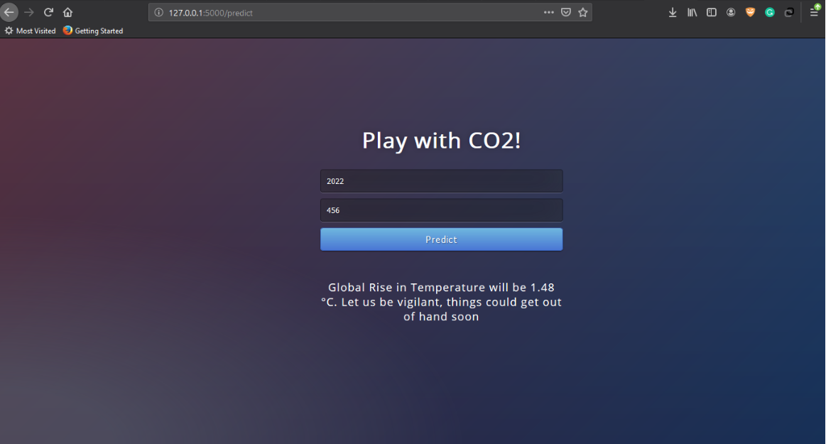
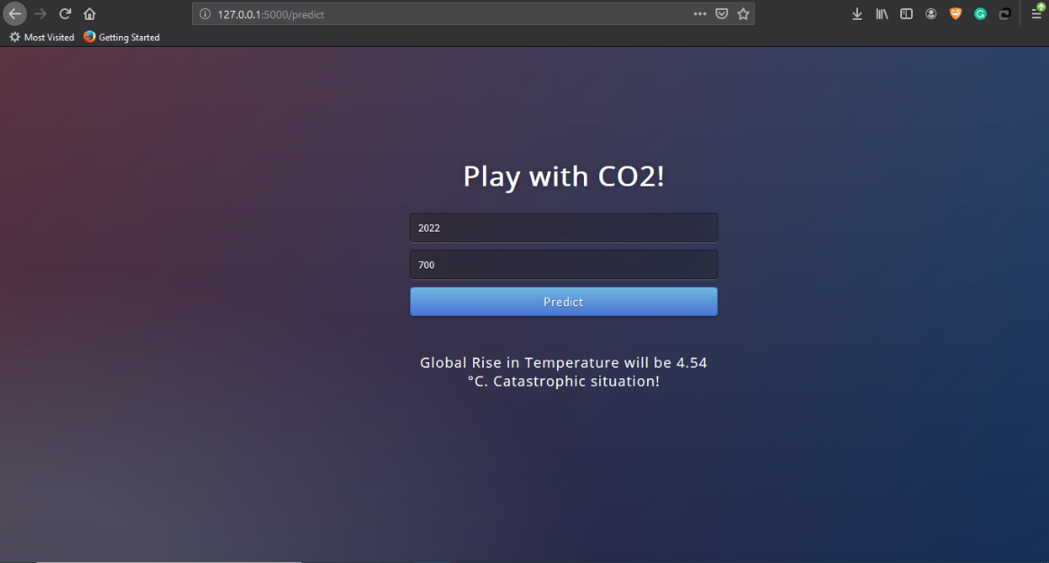
We implemented a regression model that can tell the global temperature at any time in the future, given the CO2 emissions. It provides an interactive feedback for the user to play around with and see what the effects of CO2 emissions in the future years, could mean for the global mean temperatures.
First field: Year
Second field: CO2 levels in ppm
git clone https://github.com/srivastava41099/Keep-it-cool.git
cd Keep-it-cool
python -m http.server 8088
Go to your browser and navigate to localhost:8088, then open the webapp, by simply clicking on 'lhomepage.html'. (Change port number if any errors arise - both in the http.server line, and the localhost address)
In another terminal instance, enter these commands:
cd Keep-it-cool/webanalysius
python appy.py
- Flask
- scikit-learn
- WebGL


