Data Viz Beauty - someone who is loved not only for their data viz skills, but for their personality. Overall cool person and usually has great stories. Might also have great flow.
import pandas as pd
import matplotlib.pyplot as plt
import seaborn as sns
import numpy as np
# load in data
df = pd.read_csv('nhl.csv')
df.head()
<style scoped>
.dataframe tbody tr th:only-of-type {
vertical-align: middle;
}
</style>
.dataframe tbody tr th {
    vertical-align: top;
}

.dataframe thead th {
    text-align: right;
}
| player | team | gp | g | a | tp | ppg | pim | +/- | link | season | league | playername | position | |
|---|---|---|---|---|---|---|---|---|---|---|---|---|---|---|
| 0 | Jaromír Jágr (RW) | Pittsburgh Penguins | 81 | 52 | 69 | 121 | 1.49 | 42 | 19.0 | https://www.eliteprospects.com/player/8627/jar... | 2000 | nhl | Jaromír Jágr | RW |
| 1 | Joe Sakic (C) | Colorado Avalanche | 82 | 54 | 64 | 118 | 1.44 | 30 | 45.0 | https://www.eliteprospects.com/player/8862/joe... | 2000 | nhl | Joe Sakic | C |
| 2 | Patrik Elias (LW) | New Jersey Devils | 82 | 40 | 56 | 96 | 1.17 | 51 | 45.0 | https://www.eliteprospects.com/player/8698/pat... | 2000 | nhl | Patrik Elias | LW |
| 3 | Alexei Kovalev (RW) | Pittsburgh Penguins | 79 | 44 | 51 | 95 | 1.20 | 96 | 12.0 | https://www.eliteprospects.com/player/8670/ale... | 2000 | nhl | Alexei Kovalev | RW |
| 4 | Jason Allison (C) | Boston Bruins | 82 | 36 | 59 | 95 | 1.16 | 85 | -8.0 | https://www.eliteprospects.com/player/9064/jas... | 2000 | nhl | Jason Allison | C |
# list all available matplotlib styles
plt.style.available
['Solarize_Light2',
'_classic_test_patch',
'bmh',
'classic',
'dark_background',
'fast',
'fivethirtyeight',
'ggplot',
'grayscale',
'seaborn',
'seaborn-bright',
'seaborn-colorblind',
'seaborn-dark',
'seaborn-dark-palette',
'seaborn-darkgrid',
'seaborn-deep',
'seaborn-muted',
'seaborn-notebook',
'seaborn-paper',
'seaborn-pastel',
'seaborn-poster',
'seaborn-talk',
'seaborn-ticks',
'seaborn-white',
'seaborn-whitegrid',
'tableau-colorblind10']
# use fivethirtyeight
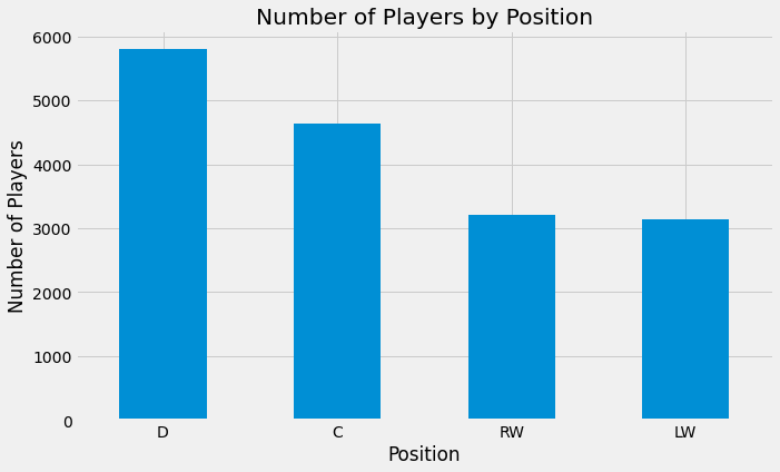
plt.style.use('fivethirtyeight')# visualize number of players at each position
# since categorical I will use a count plot
df['position'].value_counts().plot(kind = 'bar', figsize = (10, 6))
plt.xticks(rotation = 0)
plt.xlabel('Position')
plt.ylabel('Number of Players')
plt.title('Number of Players by Position');Bonus: Add counts to bar plot
df['position'].value_counts().plot(kind = 'bar', figsize = (10, 6))
plt.xticks(rotation = 0)
plt.xlabel('Position')
plt.ylabel('Number of Players')
plt.title('Number of Players by Position');
vals = list(df['position'].value_counts().values)
for i in range(len(vals)):
    plt.text(i, vals[i], vals[i], ha = 'center', fontsize = 12)
# We can also plot the percentages instead of the raw numbers
ax = df['position'].value_counts(normalize = True).plot(kind = 'bar', figsize = (10, 6))
# make y axis a percentage
vals = ax.get_yticks()
ax.set_yticklabels(['{:,.0%}'.format(x) for x in vals])
plt.xticks(rotation = 0)
plt.xlabel('Position')
plt.ylabel('Number of Players')
plt.title('Number of Players by Position');/var/folders/fz/lqw0sxh148gfqcgkqm8cqhqr0000gn/T/ipykernel_28094/2089188846.py:5: UserWarning: FixedFormatter should only be used together with FixedLocator
ax.set_yticklabels(['{:,.0%}'.format(x) for x in vals])
This means that roughly 35% of players in the NHL play Defense
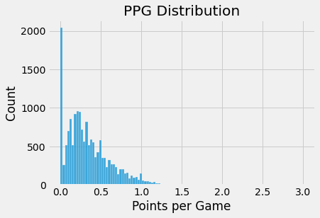
Lets look at the distribution of PPG
Note for Barb: PPG (points per game) is defined as: $$ \frac{total;points}{games;played} $$
# start with histogram
sns.histplot(df['ppg'])
plt.xlabel('Points per Game')
plt.title('PPG Distribution');
# most players have a PPG of less than 0.5 and there are some outliers with high PPG
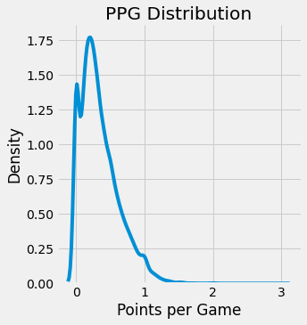
# can also use a density plot
sns.displot(df['ppg'], kind = 'kde')
plt.xlabel('Points per Game')
plt.title('PPG Distribution');
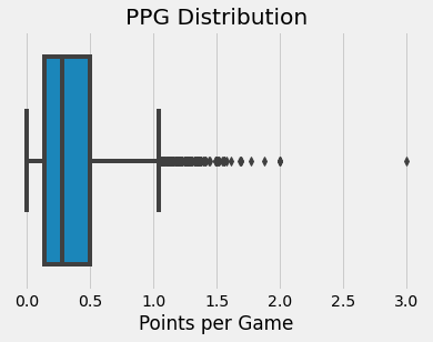
# this smooths out the distribution # boxplot
sns.boxplot(x = df['ppg'])
plt.xlabel('Points per Game')
plt.title('PPG Distribution');# plot count of player position by team for Edmonton Oilers and New Jersey Devils
# stacked bar chart
oilers = df[df['team'] == 'Edmonton Oilers']['position'].value_counts(normalize = True)
devils = df[df['team'] == 'New Jersey Devils']['position'].value_counts(normalize = True)
# make arrays with percentage for each position
defense = np.array([oilers['D'], devils['D']])
center = np.array([oilers['C'], devils['C']])
left_wing = np.array([oilers['LW'], devils['LW']])
right_wing = np.array([oilers['RW'], devils['RW']])
# add defense
plt.bar(range(2), defense, color = '#781D42', label = 'Defense')
# add center
plt.bar(range(2), center, color = '#A3423C', label = 'Center', bottom = defense)
# add left wing
plt.bar(range(2), left_wing, color = '#DE834D', label = 'Left Wing', bottom = defense + center)
# add right wing
plt.bar(range(2), right_wing, color = '#F0D290', label = 'Right Wing', bottom = defense + center + left_wing)
plt.xticks(range(2), ['Oilers', 'Devils'])
plt.legend(loc='upper left', bbox_to_anchor=(1,1), ncol=1)
plt.title('Breakdown of Players by Position for Oilers and Devils');
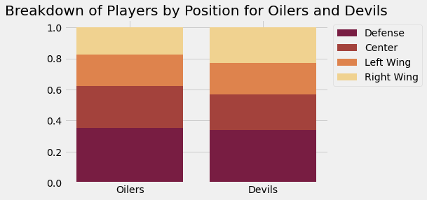
# We see the Oilers used a greater proporation of Centers and the Devils used a greater proporation of Right Wings# plot ppg (continuous) vs position (categorical )
# box plot
sns.boxplot(x = 'position', y = 'ppg', data = df)
plt.xlabel('Position')
plt.ylabel('Points per Game')
plt.title('Points per Game by Position');
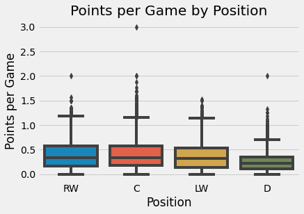
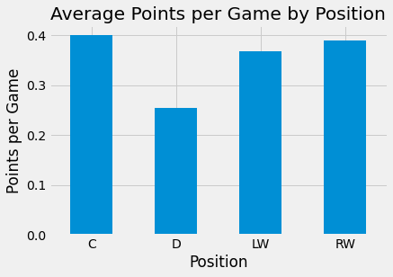
# We can see the RW, C and LW have higher PPG than D # bar plot with average
df.groupby('position')['ppg'].mean().plot(kind = 'bar')
plt.xticks(rotation = 0)
plt.xlabel('Position')
plt.ylabel('Points per Game')
plt.title('Average Points per Game by Position');Plot goals (continuous) vs total points
Note for Barb: Total Points is defined as
$$goals + assists$$
# plot goals (continuous) vs total points (continuous)

# scatter plot
df.plot.scatter(x = 'g', y = 'tp')
plt.xlabel('Goals')
plt.ylabel('Total Points')
plt.title('Goals vs Total Points');

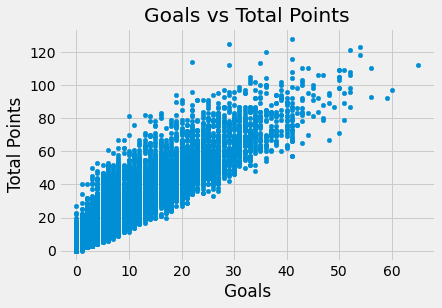
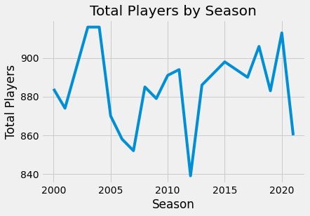
# we see a strong positive correlation between goals and total points# total players by season
# line plot
df['season'].value_counts().sort_index().plot(kind = 'line')
plt.xlabel('Season')
plt.ylabel('Total Players')
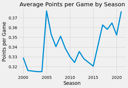
plt.title('Total Players by Season');# average ppg by season
df.groupby('season')['ppg'].mean().plot(kind = 'line')
plt.xlabel('Season')
plt.ylabel('Points per Game')
plt.title('Average Points per Game by Season');!pip install pywaffleRequirement already satisfied: pywaffle in /Users/jeffreyherman/opt/anaconda3/lib/python3.9/site-packages (0.6.4)
Requirement already satisfied: matplotlib in /Users/jeffreyherman/opt/anaconda3/lib/python3.9/site-packages (from pywaffle) (3.4.3)
Requirement already satisfied: pillow>=6.2.0 in /Users/jeffreyherman/opt/anaconda3/lib/python3.9/site-packages (from matplotlib->pywaffle) (8.4.0)
Requirement already satisfied: numpy>=1.16 in /Users/jeffreyherman/opt/anaconda3/lib/python3.9/site-packages (from matplotlib->pywaffle) (1.20.3)
Requirement already satisfied: python-dateutil>=2.7 in /Users/jeffreyherman/opt/anaconda3/lib/python3.9/site-packages (from matplotlib->pywaffle) (2.8.2)
Requirement already satisfied: pyparsing>=2.2.1 in /Users/jeffreyherman/opt/anaconda3/lib/python3.9/site-packages (from matplotlib->pywaffle) (3.0.4)
Requirement already satisfied: kiwisolver>=1.0.1 in /Users/jeffreyherman/opt/anaconda3/lib/python3.9/site-packages (from matplotlib->pywaffle) (1.3.1)
Requirement already satisfied: cycler>=0.10 in /Users/jeffreyherman/opt/anaconda3/lib/python3.9/site-packages (from matplotlib->pywaffle) (0.10.0)
Requirement already satisfied: six in /Users/jeffreyherman/opt/anaconda3/lib/python3.9/site-packages (from cycler>=0.10->matplotlib->pywaffle) (1.16.0)
from pywaffle import Waffle

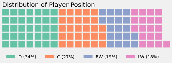
# plot distribution of player position using Waffle Chart
data = df['position'].value_counts(normalize = True).mul(100).to_dict()
fig = plt.figure(
    FigureClass=Waffle,
    title={'label': 'Distribution of Player Position', 'loc': 'left'},
    rows=5,
    values=data,
    labels=[f"{k} ({int(v)}%)" for k, v in data.items()],
    legend={'loc': 'lower left', 'bbox_to_anchor': (0, -0.4), 'ncol': len(data), 'framealpha': 0},
    figsize = (8, 4)
)
plt.show()
