Salesforce Lookup Component
About
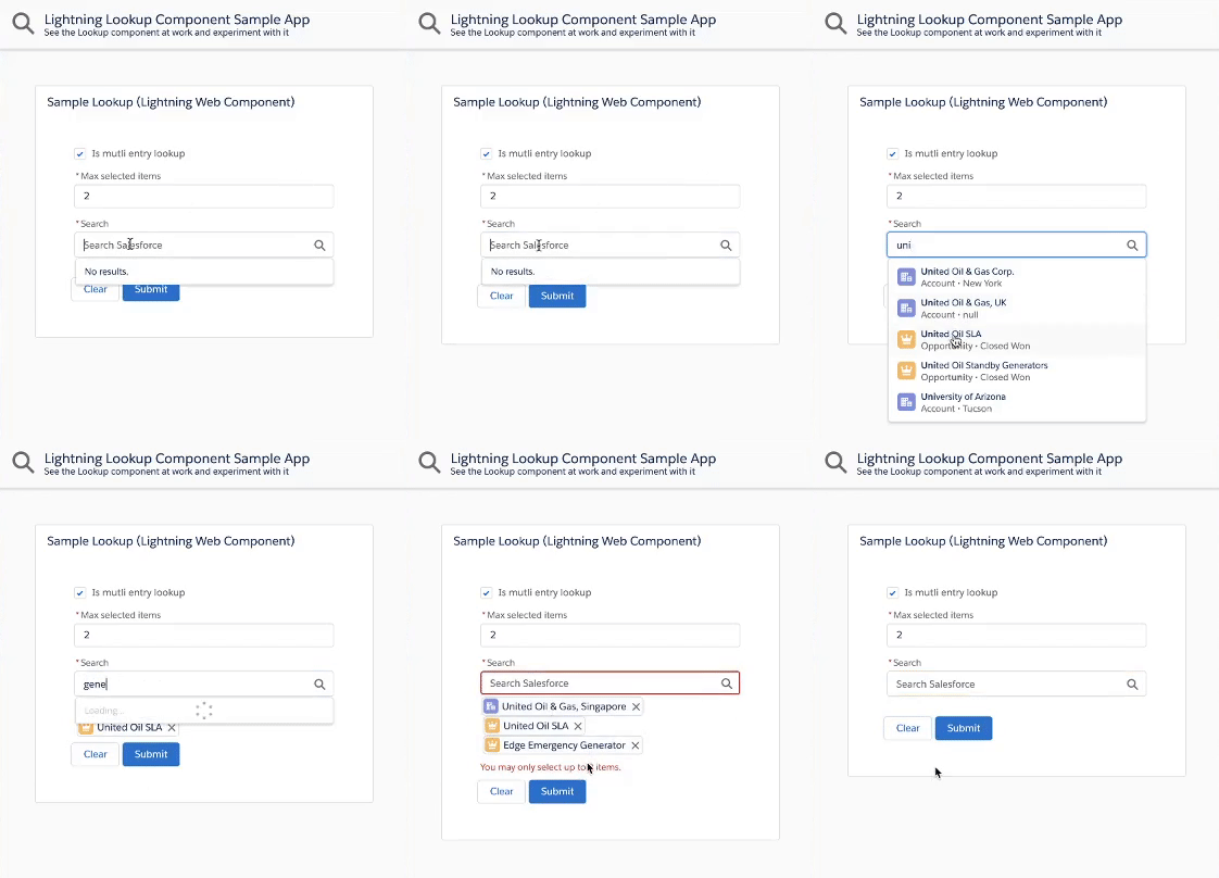
This is a generic & customizable lookup component built using Salesforce Lightning Web Components and SLDS style.
It does not rely on third party libraries and you have full control over its datasource.
Features
The lookup component provides the following features:
- customizable data source that can return mixed sObject types
- single or multiple selection mode
- client-side caching & request throttling
- great test coverage
- keyboard navigation
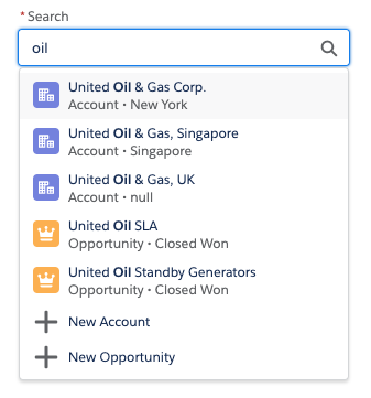
- search term highlighting
- ability to create new records
Installation
The default installation installs the lookup component and a sample application available under this URL (replace the domain):
https://YOUR_DOMAIN.lightning.force.com/c/SampleLookupApp.app
If you wish to install the project without the sample application, edit sfdx-project.json and remove the src-sample path.
Install the sample app by running this script:
MacOS or Linux
./install-dev.sh
Windows
install-dev.bat
Documentation
Getting Started
Follow these steps in order to use the lookup component:
-
Write the search endpoint
Implement an Apex
@AuraEnabled(Cacheable=true)method (SampleLookupController.searchin our samples) that returns the search results as aList<LookupSearchResult>. The method name can be different, but it needs to match this signature:@AuraEnabled(Cacheable=true) public static List<LookupSearchResult> search(String searchTerm, List<String> selectedIds) {}
-
Import a reference to the search endpoint
Import a reference to the
searchApex method in the lookup parent component's JS:import apexSearch from '@salesforce/apex/SampleLookupController.search';
-
Handle the search event and pass search results to the lookup
The lookup component exposes a
searchevent that is fired when a search needs to be performed on the server-side. The parent component that contains the lookup must handle thesearchevent:<c-lookup onsearch={handleSearch} label="Search" placeholder="Search Salesforce"> </c-lookup>
The
searchevent handler calls the Apexsearchmethod and passes the results back to the lookup using thesetSearchResults(results)function:handleSearch(event) { const lookupElement = event.target; apexSearch(event.detail) .then(results => { lookupElement.setSearchResults(results); }) .catch(error => { // TODO: handle error }); }
Handling selection changes (optional)
The lookup component exposes a selectionchange event that is fired when the selection of the lookup changes.
The parent component that contains the lookup can handle the selectionchange event:
<c-lookup onsearch={handleSearch} onselectionchange={handleSelectionChange}
    label="Search" placeholder="Search Salesforce">
</c-lookup>
The selectionchange event handler can then get the current selection form the event detail or by calling the getSelection() function:
handleSelectionChange(event) {
    // Get the selected ids from the event (same interface as lightning-input-field)
    const selectedIds = event.detail;
    // Or, get the selection objects with ids, labels, icons...
    const selection = event.target.getSelection();
    // TODO: do something with the lookup selection
}
getSelection() always return a list of selected items.
That list contains a maximum of one element if the lookup is a single-entry lookup.
Providing default search results (optional)
The lookup can return default search results with the setDefaultResults(results) function. This is typically used to return a list of recently viewed records (see sample app).
Here's how you can retrieve recent records and set them as default search results:
-
Implement an Apex endpoint that returns the recent records:
@AuraEnabled(Cacheable=true)
public static List<LookupSearchResult> getRecentlyViewed()
See the full code from the sample app
-
In your parent component, create a property that holds the default results:
recentlyViewed = [];
-
Write a utility function that sets your default search results:
initLookupDefaultResults() {
    // Make sure that the lookup is present and if so, set its default results
    const lookup = this.template.querySelector('c-lookup');
    if (lookup) {
        lookup.setDefaultResults(this.recentlyViewed);
    }
}
-
Retrieve the recent records by calling your endpoint:
@wire(getRecentlyViewed)
getRecentlyViewed({ data }) {
    if (data) {
        this.recentlyViewed = data;
        this.initLookupDefaultResults();
    }
}
-
Initialize the lookup default results when the parent component loads:
connectedCallback() {
    this.initLookupDefaultResults();
}
Note: initLookupDefaultResults() is called in two places because the wire could load before the lookup is rendered.
Saving form state when creating new records (optional)
The lookup component allows the user to create new record thanks to the optional newRecordOptions attribute. When users create a new record, they navigate away to the record edit form and they lose their current form input (lookup selection and more).
To prevent that from happening, you may provide an optional callback that lets you store the lookup state before navigating away. To do that, initialize the lookup new record options with a preNavigateCallback when the parent component loads:
connectedCallback() {
    /**
     * This callback is called before navigating to the new record form
     * @param selectedNewRecordOption the new record option that was selected
     * @return Promise - once resolved, the user is taken to the new record form
     */
    const preNavigateCallback = (selectedNewRecordOption) => {
        return new Promise((resolve) => {
            // TODO: add some preprocessing (i.e.: save the current form state)

            // Always resolve the promise otherwise the new record form won't show up
            resolve();
        });
    };

    // Assign new record options with the pre-navigate callback to your lookup
    this.newRecordOptions = [
        { value: 'Account', label: 'New Account', preNavigateCallback },
        { value: 'Opportunity', label: 'New Opportunity', preNavigateCallback }
    ];
}
Tip: consider working with cookies to store information in a temporary state.
Passing custom data to JavaScript and Apex (optional)
Sometimes, you may want to pass extra data from the lookup component to Apex. To do so, use dataset attributes:
-
In the parent component that uses the lookup, add a dataset attribute (
data-customin this example):<c-lookup selection={initialSelection} onsearch={handleLookupSearch} label="Search" is-multi-entry={isMultiEntry} data-custom="My custom value" >
-
In the parent JS, use the dataset attribute that you just added:
handleLookupSearch(event) {
    const lookupElement = event.target;

    alert(lookupElement.dataset.custom); // My custom value

    // Actual search code
}
Reference
Attributes
| Attribute | Type | Description | Default |
|---|---|---|---|
disabled |
Boolean |
Whether the lookup selection can be changed. | false |
errors |
[{ "id": String, "message": String }] |
List of errors that are displayed under the lookup. | [] |
isMultiEntry |
Boolean |
Whether the lookup is single (default) or multi entry. | false |
label |
String |
Optional lookup label. Label is hidden if attribute is omitted. | '' |
minSearchTermLength |
Number |
Mininimum number of characters required to perform a search. | 2 |
newRecordOptions |
[{ "value": String, "label": String, "defaults": String, "preNavigateCallback": Function }] |
List of options that lets the user create new records.value is an sObject API name (ie: "Account")label is the label displayed in the lookup (ie: "New Account").defaults is an optional comma-separated list of default field values (ie: "Name=Foo,Type__c=Bar")preNavigateCallback is an optional callback used for saving the form state before navigating to the new record form. |
[] |
placeholder |
String |
Lookup placeholder text. | '' |
required |
Boolean |
Whether the lookup is a required field. Note: Property can be set with <c-lookup required>. |
false |
scrollAfterNItems |
Number |
A null or integer value used to force overflow scroll on the result listbox after N number of items. Valid values are null, 5, 7, or 10.Use null to disable overflow scrolling. |
null |
selection |
[LookupSearchResult] OR LookupSearchResult |
Lookup initial selection if any. Array for multi-entry lookup or an Object for single entry lookup. | [] |
variant |
String |
Changes the appearance of the lookup. Accepted variants:label-stacked - places the label above the lookup.label-hidden - hides the label but make it available to assistive technology.label-inline - aligns horizontally the label and lookup. |
label-stacked |
Functions
| Function | Description |
|---|---|
getSelection() |
Gets the current lookup selection as an array of LookupSearchResult. |
setDefaultResults(results) |
Allows to set optional default items returned when search has no result (ex: recent items).results is an array of LookupSearchResult. |
setSearchResults(results) |
Passes a search result array back to the lookup so that they are displayed in the dropdown.results is an array of LookupSearchResult. |
Events
| Event | Description | event.detail Type |
|---|---|---|
search |
Event fired when a search needs to be performed on the server-side.searchTerm is the sanitized (lowercase, trimmed...) search term that should be sent to the server.rawSearchTerm is the unsanitized user input.selectedIds is an array of selected record Ids. |
{ searchTerm: String, rawSearchTerm: String, selectedIds: [ String ] } |
selectionchange |
Event fired when the selection of the lookup changes. The event's detail property holds the list of selected ids.You can also use target.getSelection() to retrieve the selected lookup objects. |
[ String ] |


