
ArchedImageProgressBar is a customizable progress bar library for AndroidOS that allows to add image,icon,text,arches,circles and more style features.
Arched Image Progress Bar is easy to customize with a few methods and it can be used differently.
- Android 4.2 JellyBean (API lv 17) or higher
- Your favorite IDE
Gradle
You should follow these two steps.
- Add it in your root build.gradle at the end of repositories:
	allprojects {
		repositories {
			...
			maven { url 'https://jitpack.io' }
		}
	}
- Add the dependency to your app level build.gradle:
	dependencies {
	        implementation 'com.github.smrtyvz:ArchedImageProgressBar:2.01'
	}
- Set circle size and arch size.
- Set circle color and arch color.
- Set an image,logo,icon to inside of circle.
- Set the size of image,logo,icon.
- Set a text to inside of circle.
- Set text size and text color.
- Set arch movement speed.
- Set arch width.
- Set arch length.
- Set animate direction as clockwise
1.Basic
- Add the ArchedImageProgressBar to your layout file.
    <com.mrtyvz.archedimageprogress.ArchedImageProgressBar
        android:id="@+id/linkedin_progressBar"
        android:layout_width="150dp"
        android:layout_height="150dp"
        android:layout_marginBottom="8dp"
        android:layout_marginStart="8dp"
        android:layout_marginTop="8dp"
        android:layout_marginEnd="8dp"
        app:layout_constraintBottom_toBottomOf="parent"
        app:layout_constraintStart_toStartOf="parent"
        app:layout_constraintTop_toTopOf="parent"
        app:layout_constraintEnd_toEndOf="parent"/>
- Use the following methods to style your progress bar in java class :
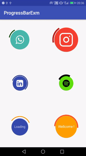
    ArchedImageProgressBar linkedinArcProgress = findViewById(R.id.linkedin_progressBar);
        Bitmap linkedinIcon = BitmapFactory.decodeResource(getResources(),R.drawable.linkedin_sign);

        linkedinArcProgress.setProgressImage(linkedinIcon,14.0f);
        linkedinArcProgress.setCircleSize(30.0f);
        linkedinArcProgress.setArchSize(32.75f);
        linkedinArcProgress.setCircleColor(Color.parseColor("#3949ab"));
        linkedinArcProgress.setArchColor(Color.parseColor("#1a237e"));
        linkedinArcProgress.setArchLength(210);
        linkedinArcProgress.setArchStroke(8.85f);
        linkedinArcProgress.setArchSpeed(5);
or if you want to use a text instead of an image :
        ArchedImageProgressBar customTextArcProgress = findViewById(R.id.yourCustomText_progressBar);

        customTextArcProgress.setProgressText(new String[]{"Loading"}, "#c5cae9");
        customTextArcProgress.setProgressTextSize(13.0f);
        customTextArcProgress.setCircleSize(35.0f);
        customTextArcProgress.setArchSize(43.0f);
        customTextArcProgress.setCircleColor(Color.parseColor("#3949ab"));
        customTextArcProgress.setArchColor(Color.parseColor("#fb8c00"));
        customTextArcProgress.setArchLength(120);
        customTextArcProgress.setArchStroke(9.0f);
        customTextArcProgress.setArchSpeed(3);
2.Method properties
- Setting text and text color
Define the text as a string array , note that color is optional ( default text color is black.)
- Text size
Recommended value : 8 to 25 (depends on the length of text)
- Image size
Recommended value : 10 to 35 (depends on the image size)
- Arch length
Recommended value : 10 to 300 (for better design)
- Arch speed
Recommended value : 1 to 15
- Clockwise feature
use .setClockwise(true)
- Mert Ayvaz - Initial work - smrtyvz
This project is licensed under the MIT License - see the LICENSE.md file for details