After completing a successful Kickstarter campaign, the client requests an analysis of how different campaigns fared in relation to their launch dates and their funding goals.
To begin the analysis of outcomes based on launch date, a pivot table was constructed from the larger Kickstarter data. The table was constructed so that it could be filtered by category (of special interest to client is theater category) and year. Outcomes (restricted to successful, failed, canceled) were chosen for the columns and the date of campaign launch was chosen for the rows and specifically sorted by month. The pivot table was then nicely automatically populated with the count of outcomes each month for the sum of all the years of data and for every category.
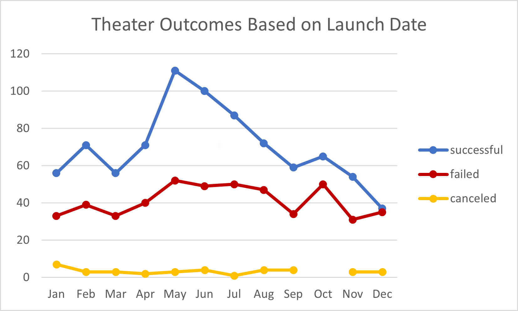
Since the client is specifically interested in theater outcomes, the pivot table was filtered with theater chosen for the category. This chart
was then created from the table displaying the total outcomes of theater campaigns and the month the Kickstarter campaign began. Each outcome is a different series on the chart. The client can easily see which time of year is most advantageous for lauching a new Kickstarter campaign.
This table was developed by creating row labels for ranges of goal dollar amounts and column labels for the number of campaigns that were successful, failed and canceled. Three additional columns were added to help normalize the data: percentage of campaigns that were successful, failed and canceled. This was done because the number of campaigns tended to decrease as the goal dollar amounts increased. The table was then populated by using the COUNTIF function with the several specified restraints for each cell and referring back to the origingal Kickstater data sheet. Data was resticted to the play subcategory.
For the cell containing the amount of failed campaigns with the goal of $5000-$9999, the formula used is: =COUNTIFS(Kickstarter!D:D, ">=5000", Kickstarter!F:F, "failed", Kickstarter!D:D, "<=9999", Kickstarter!R:R, "plays")
where column D in the Kickstarter data sheet is the goal amount, column F is the outcome and column R is the subcategory.
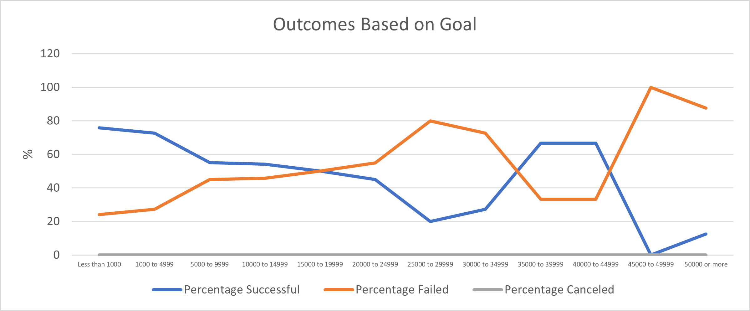
To best help the client visualize the data, this chart
was developed from the table. Successful, failed and canceled campaigns as a percentage of the total number of campaigns is plotted against the monetary range of the goals.
My main challenges were:
- in the Outcomes vs Launch Date table, it took significant effort to get the row labels in month-only format. This information on how to accompish this was freely given in the module but it still took me a little bit of time to get the desired effect.
- in the Outcomes vs. Goals table, I found the links to the original spreadsheet to be tricky to get completely correct. Then after I copied to other columns, I had to be careful all of the assignments were still correct.
These issues were resolved once I spent some time reading about proper Excel formatting. And of course, practice makes perfect!
- What are two conclusions you can draw about the Outcomes based on Launch Date?
- The months that launched the most successful Kickstarter campaigns were May and June. If possible, it would be best to begin a theater funding campaign during these months.
- The number of failed and canceled theater campaigns in fairly consistent throughtout the year. We can surmise that the reasons for this is not related to the time of year it is launched. It must be due to other factors.
- What can you conclude about the Outcomes based on Goals?
The largest difference in percentage of successful and failed campaigns is with goal amounts lower than $1000. It would be best to have a campaign fundraising goal less than a thousand dollars.
- What are some limitations of this dataset?
The data set is from the Kickstarter website. There might be other fundraising websites and/or methods to raise money successfully for a creative project. The data set is not comprehensive in regards to all fundraising methods. In addition, one factor that seems important that was not explored with our analysis is the number of backers per campaign. A family member could soley fund a campaign and it would be considered successful. This would not yield useful information for the client, however.
- What are some other possible tables and/or graphs that we could create?
Some other tables or graphs we could create are: the number of backers compared to outcomes; the length of campaign compared to outcome; the average donation per backer compared to outcomes.

