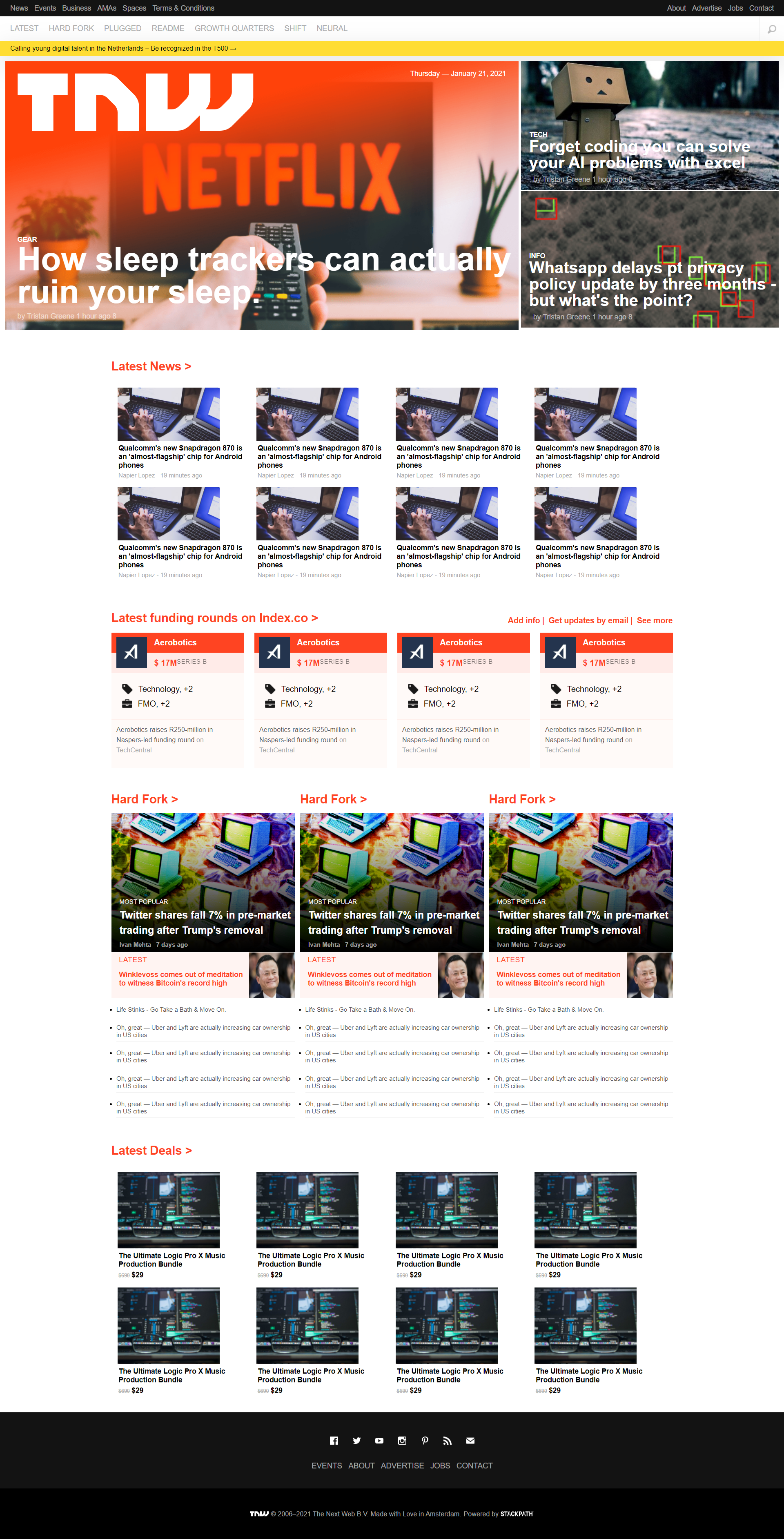
Beaufitul responsive and mobile first web-page design is the future. With mobile devices and multiple size and input devices dominating and growing exponentially, this is going to be the front-end revolution.
Skills Revived & Learned:
- Versioning & best coding practices, Github Flow.
- HTML5, CSS3 elements, semantics, features etc.
- Cloning - the hard work and skills needed to successfully make a clone.
- Linter - install & fix errors
- Collaborative learning, being patient, helping each other succeed.
- Attending Daily standup, being focused, accountable.
Learning Goals:
- Version Control, Github Flow
- Introduction to HTML5 & CSS3.
- Position, Flex, Grid, Floats, RWD
- Font, Image, Page Size manipulation with new CSS3 features.
- Major languages: HTML5, CSS3
- Frameworks: Github flow, Mobile First Approach
- Technologies used: Responsive Web Design
👤 Shabbir
- GitHub: @smy5152
- Twitter: @smy5152
- LinkedIn: Shabbir Yamani
👤 Carlos González
- GitHub: @chuckbuckethead
- Twitter: @aclerkofpomier
- LinkedIn: Carlos González
Give a ⭐️ if you like this project!
- Hat tip to anyone whose code was used
- Inspiration
- Learning
This project is MIT licensed.

