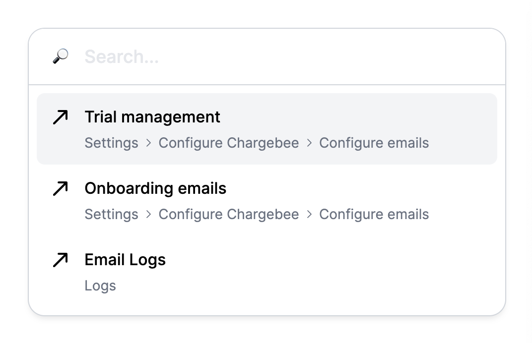
This library is a one-stop solution for building WAI-ARIA compliant navigation/command/select menus. The components provided are headless so they can be styled as per your requirement, they are also composable in nature so its easy to use. Refer the various examples below to implement the variation you want to build.
npm install svelte-select-kitSelect.Root: The root component which sets up label, context and the store:Select.Input: Combobox's input, keeps track of querySelect.Select: Use this if you're building a select only componentSelect.ListBox: Root component of the itemsSelect.Item: A single selectable item, you will have multiple of theseSelect.Separator: Just a div with role='separator'Select.NoResults: Rendered when there are no results found
Select.Button: A button to toggle the list-box
- Multiselect Support
- Type Ahead Support for 'Select Only' combobox
- Sort by score
- Some API improvements
For full examples refer the examples folder in this repo
NOTE: We use @smui/common to forward events of our components, it works similarly to the the Svelte syntax apart from one important difference: for adding event modifiers the
|should be replaced by$i.e.on:click|preventDefaultbecomeson:click$preventDefault. For information on this refer this issue.
<script lang="ts">
	import Select from 'svelte-select-kit';
</script>

<Select.Root label="Numbers">
	<Select.Input placeholder="Search something..." class="input" />
	<Select.ListBox let:open>
		{#if open}
			<Select.NoResults>No results found</Select.NoResults>
			<Select.Item onSelectItem={() => console.log('clicked one')} id="one">One</Select.Item>
			<Select.Item onSelectItem={() => console.log('clicked two')} id="two">Two</Select.Item>
			<Select.Item onSelectItem={() => console.log('clicked three')} id="three">Three</Select.Item>
			<Select.Item onSelectItem={() => console.log('clicked four')} id="four">Four</Select.Item>
		{/if}
	</Select.ListBox>
</Select.Root>ListBox supports shouldFilter prop which will disable filtering, to access the input value to perform your own filtering you may bind to the input component's value prop.
<script lang="ts">
	import Select from 'svelte-select-kit';

	let value = '';
	// Add your logic here for filtering..
</script>

<Select.Root label="Numbers">
	<Select.Input bind:value placeholder="Search something..." class="input" />
	<Select.ListBox shouldFilter={false}>...</Select.ListBox>
</Select.Root>
...<!--
Basic example with dropdown button
-->
<script lang="ts">
import Select from '$lib/index.js';
</script>
<Select.Root label="Numbers">
<Select.Input placeholder="Search something..." class="input" />
<Select.Button let:open>{open ? '⌃' : '⌄'}</Select.Button>
<Select.ListBox let:open>
{#if open}
<Select.NoResults>No results found</Select.NoResults>
<Select.Item onSelectItem={() => console.log('clicked one')} id="one">One</Select.Item>
<Select.Item onSelectItem={() => console.log('clicked two')} id="two">Two</Select.Item>
<Select.Item onSelectItem={() => console.log('clicked three')} id="three">Three</Select.Item>
<Select.Item onSelectItem={() => console.log('clicked four')} id="four">Four</Select.Item>
{/if}
</Select.ListBox>
</Select.Root>