Formula 1 Media Coverage Analysis for Data Visualization course
I chose to explore the exciting world of Formula 1 by examining the relationship between the media's coverage of each driver over the 2015 and 2016 season. The dataset I collected is comprised of 30,418 unique articles published on the web gathered from 218 news sources over a 2+ year period via a web scraping bot and filtered by articles with a published date from Jan 1, 2015 through Jun 4, 2016. Both visualizations were created with Plot.ly.
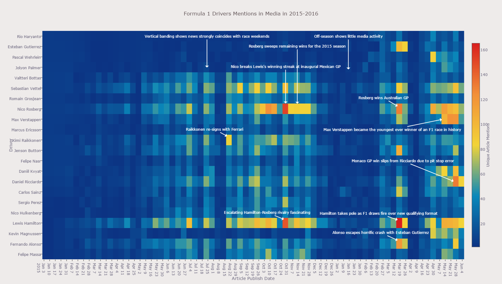
The X-axis is the ordinal variable Article Publish Date, the Y-axis is the nominal variable Driver Name, the Z-axis, is a quantitative variable Article Count which contain that drivers name, published during that week. I chose a heatmap visualization because other 3-dimensional graphs contained too much "chart junk" and high values tended to obscure data "behind" that point by visual occlusion. Though the heatmap uses Hue to quantitatively describe Article Count, it adds tremendous clarity. This dataset is both noisy and peaky, and the choice of colors in the color bar legend does a very effective job at calling attention to interesting parts of the dataset, which I cover below. The colormap serves as a legend to convey what the hues represent. I augmented the chart with textual notes to help tell a story about the data.
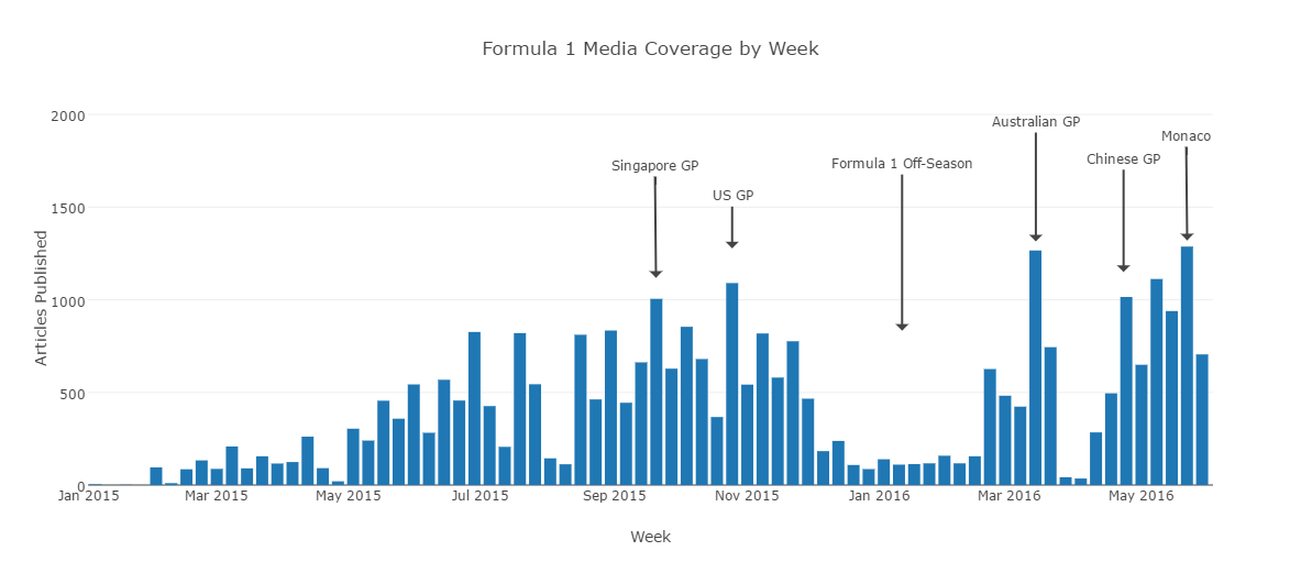
The X-axis is the ordinal variable Article Publish Date, and the Y-axis is the quantitative variable Articles Published in the media during that week. In this graph I depict the Y-Axis by position, so as to most accurately convey the quantity of articles published. Since it is not continuous data I did not use a line chart. I augmented the chart with textual notes to help tell a story about the data.
In the visualizations I point to several key discoveries made while exploring the data:
The most significant insight is that there were several very important newsworthy events that had occurred during the 2015 and 2016 season and this visualization effectively calls attention to them, expressed as regions of yellow, orange, and red, as in these cases there were over 100+ to 160+ articles published the week of that event. This effect was so strong that I have marked each instance of this occurrence with a note detailing the event. It is interesting to note the vertical banding of articles published by week, as weeks with a Grand Prix contain an overall higher mean number of articles published compared to weeks which did not contain a race. An extended period of low activity is also present between the Dec - Feb time frame which correlates with the off-season for Formula 1. This makes a lot of sense as there would be little media coverage during this time. It is evident that the media doesn't cover each driver equally. This manifests itself as a "horizontal banding" effect and is evident with Lewis Hamilton, Nico Rosberg, and Sebastian Vettel,as these drivers are usually covered quite heavily as opposed to drivers such as Marcus Ericsson, and Kevin Magnussen. Other insights that the visualization unearths is that some drivers had markedly increased activity in 2016 as compared to 2015, such as Rio Haryanto, Esteban Gutierrez, Pascal Wehrlein, and Jolyon Palmer. This is likely because they were not driving in 2015 or were backup drivers during the 2015 season.
I enjoyed creating this visualization and I hope you also enjoy exploring some of its insights.
https://plot.ly/~snives/2/formula-1-drivers-mentions-in-media-in-2015-2016/ https://plot.ly/~snives/5/formula-1-media-coverage-by-week/ (Note: Plot.ly seems to have a bug in displaying the heatmap unless you view full screen)

