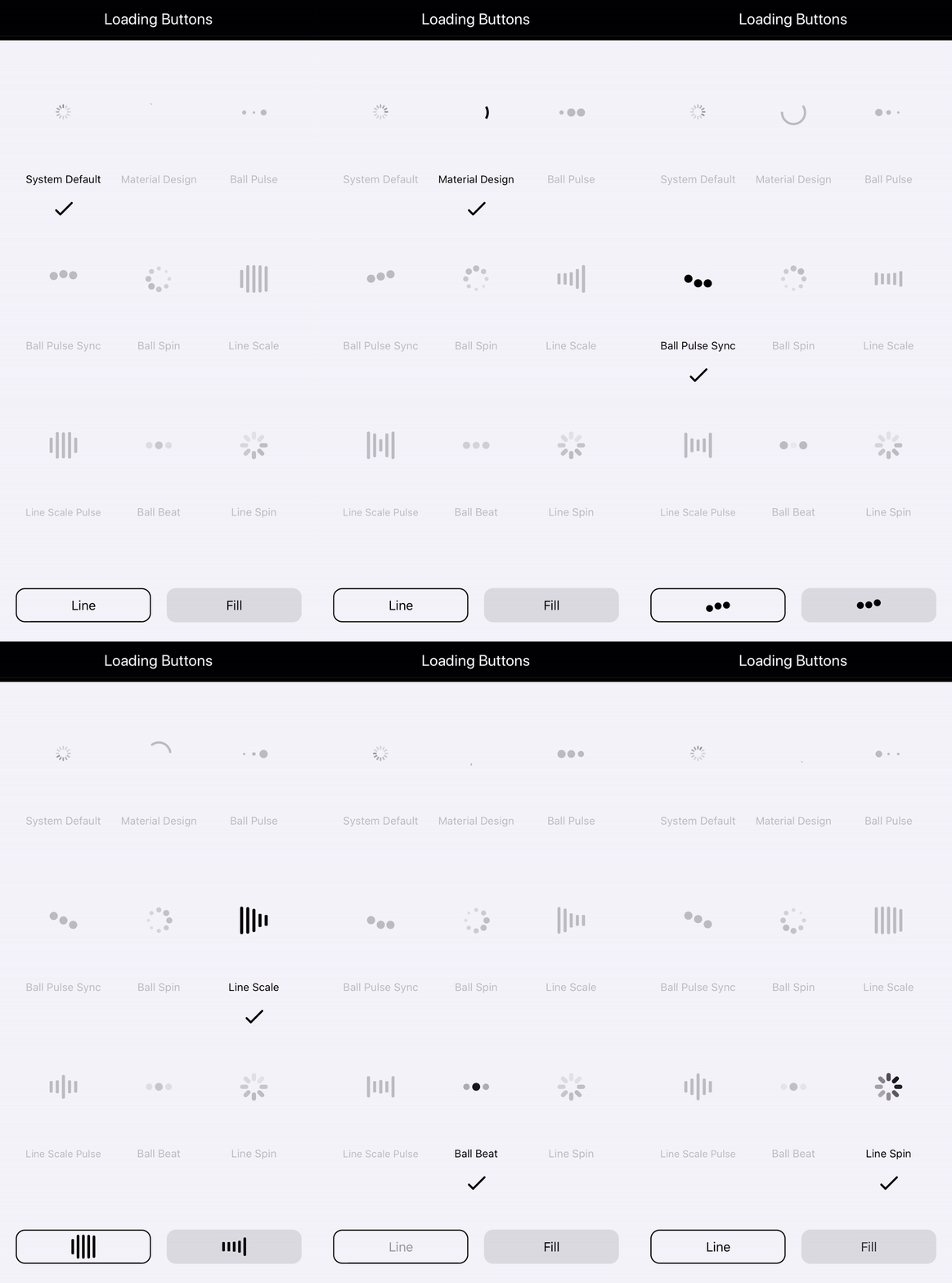
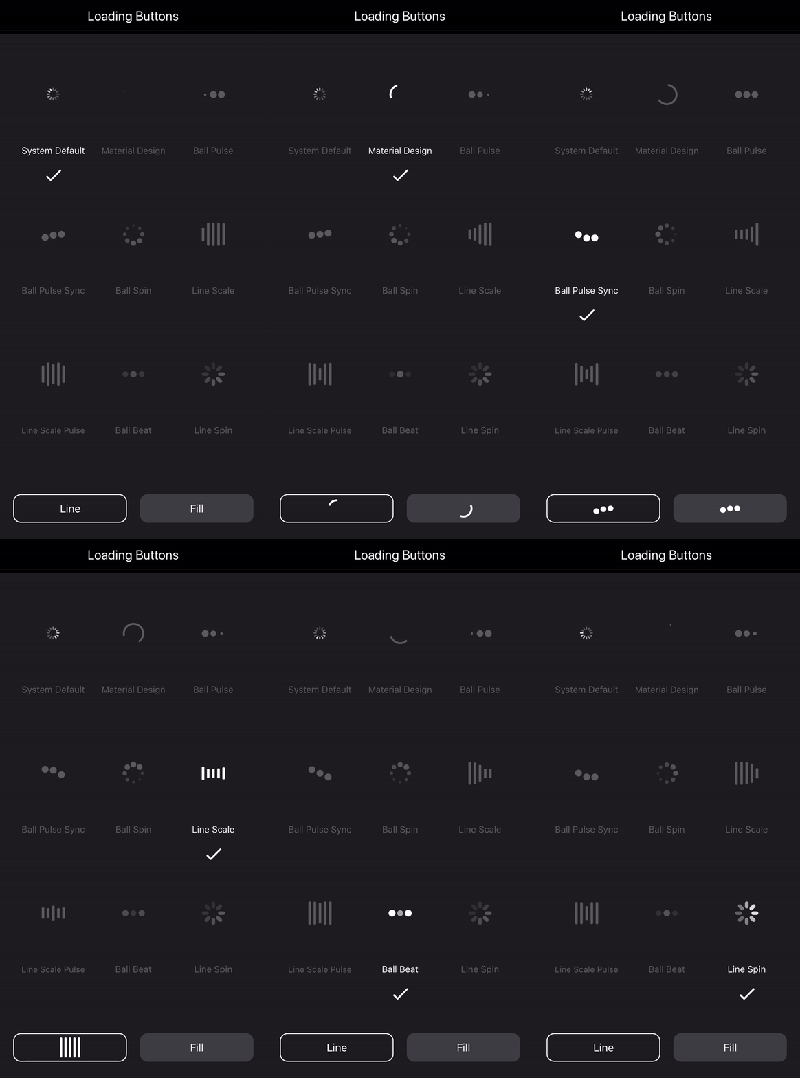
A collection of loading buttons and their styling written in Swift.


You may see the following Medium article for detailed explanation of creating loading buttons.
| Light mode |
Dark mode |
 |
 |
- The example gives you 9 choices of loading indicators with the loading button.
- The IndicatorProtocol clearly defines the functions and properties. You can refer to it and customize your own.
- The LoadingButton class is made to be open, from which you can easily inherit and create your own.
LoadingButtons project is available via CocoaPods. To install it, simply add the following line to your Podfile:
Add LoadingButtons as dependency in your Package.swift
import PackageDescription

let package = Package(
    name: "YourPackage",
    dependencies: [
        .Package(url: "https://github.com/twho/loading-buttons-ios.git", majorVersion: 0),
    ]
)
If you don't use CocoaPods or Swift Package Manager, you can download the entire project then import all the source files and use them in your project.
// The frame is default to zero. You need to use AutoLayout to resize it.
// Otherwise, you can specify the frame in initializer.
if #available(iOS 13.0, *) {
    // This is the new initializer for iOS 13 dark/light mode.
    // The syste colors will be used.
    btnLoading = LoadingButton(text: "Button", buttonStyle: .outline) // Outlined button
    btnLoading = LoadingButton(text: "Button", buttonStyle: .fill)    // Filled button
} else {
    // Custom color initializer
    btnLoading = LoadingButton(text: "Button", textColor: .black, bgColor: .white)
}btnLoading.indicator = UIActivityIndicatorView()
| Light mode |
Dark mode |
 |
 |
btnLoading.indicator = MaterialLoadingIndicator(color: .gray)
| Light mode |
Dark mode |
 |
 |
btnLoading.indicator = BallPulseSyncIndicator(color: .gray)
| Light mode |
Dark mode |
 |
 |
btnLoading.indicator = BallSpinFadeIndicator(color: .gray)
| Light mode |
Dark mode |
 |
 |
btnLoading.indicator = LineScalePulseIndicator(color: .gray)
| Light mode |
Dark mode |
 |
 |
btnLoading.indicator = LineScaleIndicator(color: .gray)
| Light mode |
Dark mode |
 |
 |
btnLoading.indicator = BallPulseIndicator(color: .gray)
| Light mode |
Dark mode |
 |
 |
btnLoading.indicator = BallBeatIndicator(color: .gray)
| Light mode |
Dark mode |
 |
 |
btnLoading.indicator = LineSpinFadeLoader(color: .gray)
| Light mode |
Dark mode |
 |
 |


