Comments Section CSS Challenge
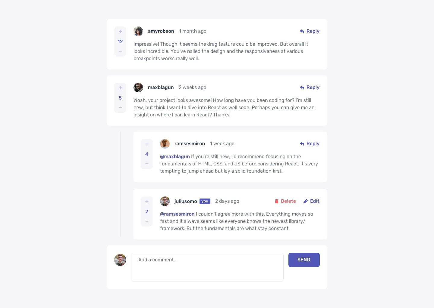
Your challenge is to build out this comments section in HTML and CSS and get it looking as close to the design as possible:
Pay especially careful attention to margin and padding, and to alignment. The app should cohesive, but not claustrophobic.
See ./design/desktop-design.jpg. Icons and images are located in ./images/.
Note that SVG images can be used just like any other image, eg:
<img alt="edit" src="./images/icon-edit.svg" />Style Guide
Active states
To see how various elements change style when you click/hover/interact with them, see ./design/active-states.jpg.
For base mode buttons should have hover and active styles. Any interactivity (eg, clicking Reply opens a form) is a stretch goal.
Colors
You can reference these colors in your CSS, eg:
.someElement {
    color: hsl(238, 40%, 52%);

    /* or */
    background-color: hsl(239, 57%, 85%);

    /* or */
    border: 1px solid hsl(211, 10%, 45%);
}
Primary
- Moderate blue: hsl(238, 40%, 52%)
- Soft Red: hsl(358, 79%, 66%)
- Light grayish blue: hsl(239, 57%, 85%)
- Pale red: hsl(357, 100%, 86%)
Neutral
- Dark blue: hsl(212, 24%, 26%)
- Grayish Blue: hsl(211, 10%, 45%)
- Light gray: hsl(223, 19%, 93%)
- Very light gray: hsl(228, 33%, 97%)
- White: hsl(0, 0%, 100%)
Typography
Body Copy
- Font size (paragraph): 16px
Font
- Family: Rubik
The font is already setup in your index.html. Example usage:
.someElement {
    font-family: 'Rubik', sans-serif;
}
Attribution
Challenge adapted from Frontend Mentor.
Frontend Mentor challenges help you improve your coding skills by building realistic projects.
If you would like the design files (we provide Sketch & Figma versions) to inspect the design in more detail, you can subscribe as a PRO member.
Want some support on the challenge? Join our Slack community and ask questions in the #help channel.
