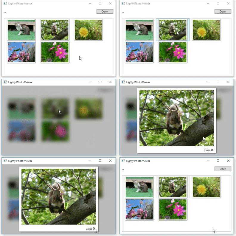
Lighty is customizable lightbox library for WPF.
- Lighty shows dialog on the same visual tree using adorner.
- Need not to create special elements for Lighty in your xaml code.
- 3way to show lightbox.
- Show(): show lightbox in modeless format.
- ShowAsync(): awaitable version of Show() method.
- ShowDialog(): Show light box modally, like a System.Windows.Window.ShowDialog() method.
- Can contain any FrameworkElement class in lightbox.(eg. Image / UserControl / etc...)
- Show/Close lightbox with animation.
- Lightbox style can be customized by setting default style of LightBox class.
Clone project and build it, then add reference to your own projects.
Or, you can install Lighty by Nuget.
Install-Package Lighty
Add using syntax for lighty namespace.
using SourceChord.Lighty;Add xmlns to xaml code.
xmlns:lighty="clr-namespace:SourceChord.Lighty;assembly=Lighty" private void OnClickButton(object sender, RoutedEventArgs e)
{
// show UserControl(SampleDialog is derived from UserControl.)
LightBox.Show(this, new SampleDialog());
// show FrameworkElement.
var image = new Image();
image.Source = new BitmapImage(new Uri("Images/1.jpg", UriKind.Relative));
LightBox.Show(this, image);
} private async void OnClickButton(object sender, RoutedEventArgs e)
{
// modeless dialog
LightBox.Show(this, new SampleDialog());
// async method
await LightBox.ShowAsync(this, new SampleDialog());
// modal dialog
LightBox.ShowDialog(this, new SampleDialog());
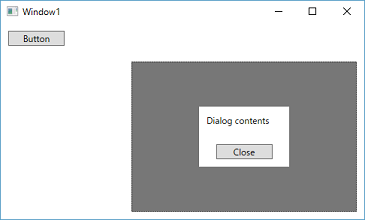
}Lighty is able to show lightbox into anywhere under xaml's visual tree.
The below is a sample code to show lightbox in Grid control.
<Window x:Class="LightySample.Window1"
        xmlns="http://schemas.microsoft.com/winfx/2006/xaml/presentation"
        xmlns:x="http://schemas.microsoft.com/winfx/2006/xaml"
        xmlns:d="http://schemas.microsoft.com/expression/blend/2008"
        xmlns:lighty="clr-namespace:SourceChord.Lighty;assembly=Lighty"
        xmlns:local="clr-namespace:LightySample"
        xmlns:mc="http://schemas.openxmlformats.org/markup-compatibility/2006"
        Title="Window1"
        Width="500"
        Height="300"
        mc:Ignorable="d">
    <Grid>
        <Button x:Name="button"
                Width="75"
                Margin="10,10,0,0"
                HorizontalAlignment="Left"
                VerticalAlignment="Top"
                Click="button_Click"
                Content="Button" />
        <Grid x:Name="subGrid"
              Width="300"
              Height="200"
              Margin="10"
              HorizontalAlignment="Right"
              VerticalAlignment="Bottom" />
    </Grid>
</Window>
private void button_Click(object sender, RoutedEventArgs e)
{
LightBox.Show(this.subGrid, new SampleDialog());
}You can customize lightbox by editing below properties.
| Property | Description |
|---|---|
| Template | |
| ItemsPanel | |
| ItemContainerStyle | |
| CloseOnClickBackground | Sets a value that indicating whether to close lightbox on click background.(dafault value is True) |
You can create your own styles for light box. The way to create style is defining default style to LightBox class.
    <Window.Resources>
        <Style TargetType="{x:Type lighty:LightBox}">
            <Setter Property="Template">
                <Setter.Value>
                    <ControlTemplate>
                        <Grid Background="#88F5F5DC">
                            <ItemsPresenter />
                        </Grid>
                    </ControlTemplate>
                </Setter.Value>
            </Setter>
        </style>
        <Setter Property="CloseOnClickBackground" Value="False" />
</Window.Resources>Lighty can customize animation by set below properties.
| Property | Description |
|---|---|
| InitializeStoryboard | Sets an animation for showing lightbox's background. |
| DisposeStoryboard | Sets an animation for hiding lightbox's background. |
| OpenStoryboard | Sets an animation for showing lightbox's content. |
| CloseStoryboard | Sets an animation for hiding lightbox's content. |
Lighty executes InitializeStoryboard & OpenStoryboard sequentially. (same as CloseStoryboard & DisposeStoryboard)
If you want to excecute InitializeStoryboard & OpenStoryboard in parallel, set IsParallelInitialize="True".
| Property | Description |
|---|---|
| IsParallelInitialize | Sets a value that determines whether InitializeStoryboard & OpenStoryboard should execute in parallel. |
| IsParallelDispose | Sets a value that determines whether CloseStoryboard & DisposeStoryboard should execute in parallel. |
Lighty provides some usefull built in styles.
| Property | Name |
|---|---|
| Template | DarkBackgroundTemplate |
| LightBackgroundTemplate | |
| DarkGlassTemplate | |
| LightGlassTemplate | |
| ItemsPanel | HorizontalPanel |
| VerticalPanel | |
| ItemContainerStyle | ClosableContainerStyle |
| PhotoCardStyle | |
| Animations | FadeInAnimation |
| FadeOutAnimation | |
| ZoomInAnimation | |
| ZoomOutAnimation |
    <Window.Resources>
        <Style TargetType="{x:Type lighty:LightBox}">
            <Setter Property="Template" Value="{StaticResource DarkBackgroundTemplate}" />
            <Setter Property="ItemsPanel" Value="{StaticResource HorizontalPanel}" />
            <Setter Property="ItemContainerStyle" Value="{StaticResource PhotoCardStyle}" />
        </Style>
    </Window.Resources>
