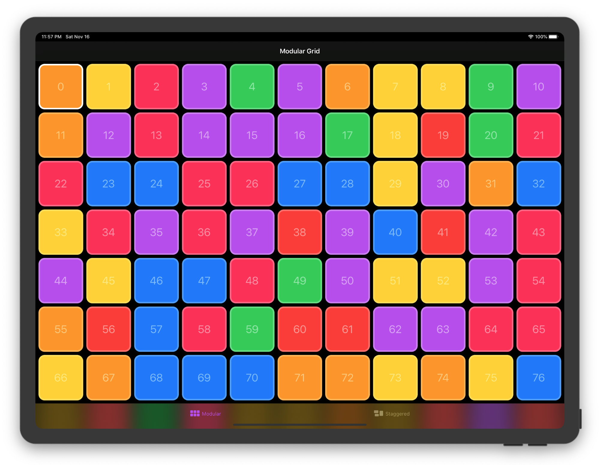
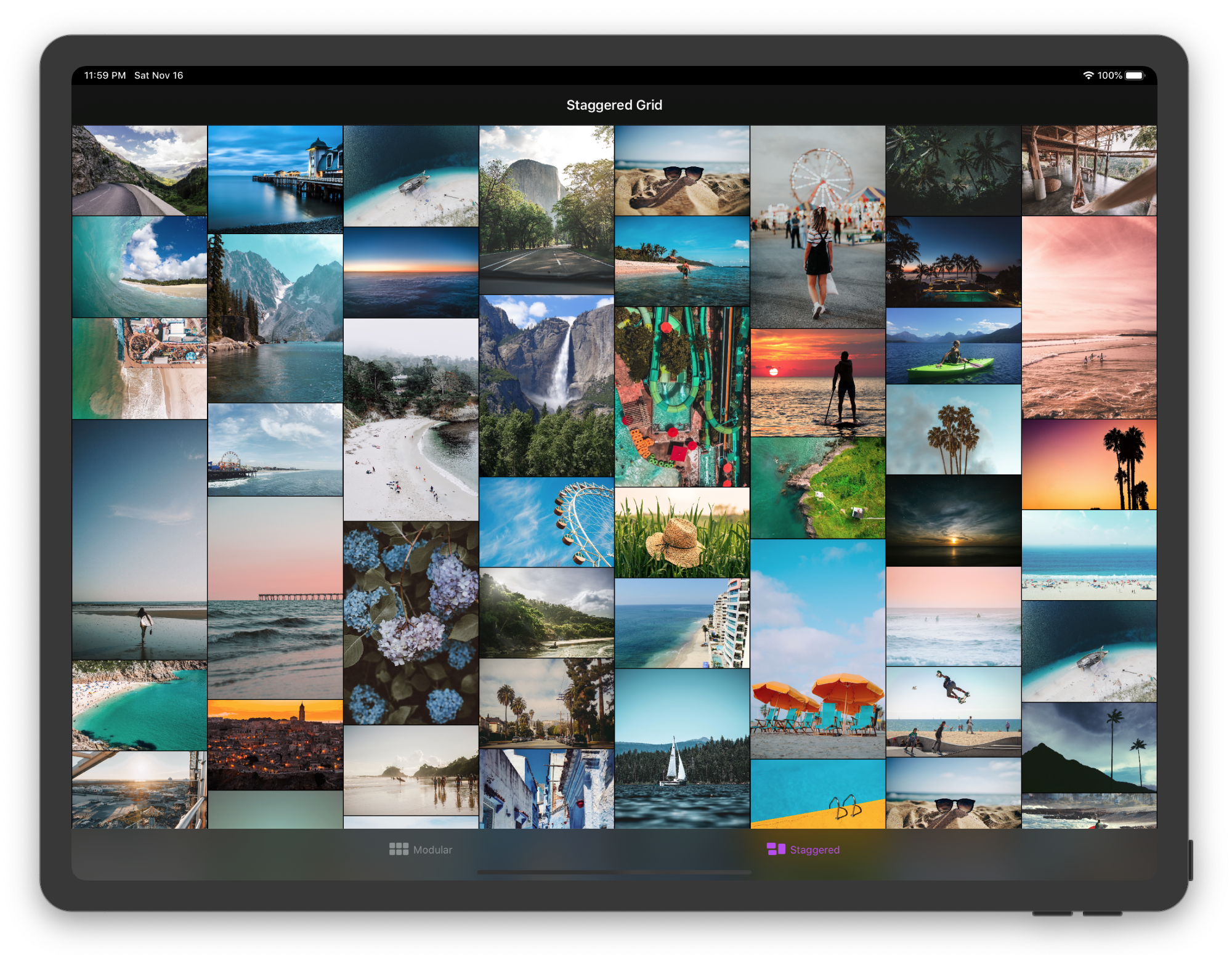
SwiftUI Grid view layout with custom styles.
- ZStack based layout
- Vertical and horizontal scrolling
- Supports all apple platforms
- Custom styles (ModularGridStyle, StaggeredGridStyle)
- SwiftUI code patterns (StyleStructs, EnvironmentValues, ViewBuilder)
- Active development for production apps
Open GridDemo.xcodeproj for more examples for iOS, macOS, watchOS and tvOS
ScrollView {
    Grid(colors) {
        Rectangle()
            .foregroundColor($0)
    }
}
.gridStyle(
    ModularGridStyle(columns: .min(100), rows: .fixed(100))
)ScrollView {
Grid(1...69, id: \.self) { index in
Image("\(index)")
.resizable()
.scaledToFit()
}
}
.gridStyle(
StaggeredGridStyle(.horizontal, tracks: 8, spacing: 4)
)Tracks setting allows you to customize grid behaviour to your specific use-case. Both Modular and Staggered grid use tracks value to calculate layout. In Modular layout both columns and rows are tracks.
public enum Tracks: Hashable {
    case count(Int)
    case fixed(CGFloat)
    case min(CGFloat)
}Grid is split into equal fractions of size provided by a parent view.
ModularGridStyle(columns: 3, rows: 3)
StaggeredGridStyle(tracks: 8)Item size is fixed to a specific width or height.
ModularGridStyle(columns: .fixed(100), rows: .fixed(100))
StaggeredGridStyle(tracks: .fixed(100))Autolayout respecting a min item width or height.
ModularGridStyle(columns: .min(100), rows: .fixed(100))
StaggeredGridStyle(tracks: .min(100))Get item size and position with preferences
struct CardsView: View {
    @State var selection: Int = 0

    var body: some View {
        ScrollView {
            Grid(0..<100) { number in
                Card(title: "\(number)")
                    .onTapGesture {
                        self.selection = number
                    }
            }
            .padding()
            .overlayPreferenceValue(GridItemBoundsPreferencesKey.self) { preferences in
                RoundedRectangle(cornerRadius: 16)
                    .strokeBorder(lineWidth: 4)
                    .foregroundColor(.white)
                    .frame(
                        width: preferences[self.selection].width,
                        height: preferences[self.selection].height
                    )
                    .position(
                        x: preferences[self.selection].midX,
                        y: preferences[self.selection].midY
                    )
                    .animation(.linear)
            }
        }
    }
}- iOS 13.1+
- Mac Catalyst 13.1+
- macOS 10.15+
- watchOS 6+
- Xcode 11.0+
- Items span
- 'CSS Grid'-like features
Feel free to contribute via fork/pull request to master branch. If you want to request a feature or report a bug please start a new issue.
If you find this project useful please consider becoming my GitHub sponsor.

