This is the repository for Microsoft Edge documentation hosted at http://dev.modern.ie.
Over the coming months we will be working on adding new sections and content to enhance the documentation experience. If you would like to see new coverage or have feedback, please consider contributing by either editing the existing content, adding new content or simply creating new issues. We’ll take a look at your suggestion and will work together to incorporate them to the docs.
Find the source code for Status.Modern.IE at: https://github.com/MicrosoftEdge/Status. Status.Modern.IE provides the latest implementation status and future plans for web platform features in Microsoft Edge.
- Docs are grouped by folders (the structure parallels the IA on the site)
- A folder can contain more folders or a readme.md
- One .md file per folder
- Folder/directory names are dash-separated (e.g., f12-tools) and lowercase. They are used in URLs on the Microsoft Edge Dev site. Don't use underscores or PascaleCase/camelCase.
- Relative links are formatted with only the folder name of the referenced readme doc. E.g., ../perfomance/ (not ../perfomance/readme.md)
- Section headers require a space after hashes, formatted as ## Section Heading (not ##Section Heading). Otherwise the markdown won't parse correctly into the site.
The following sections you an overview of what elements have been styled up for documentation in the developer portal site.
Only the h3 and the h4 elements have a faint separator line underneath them. h1 (use for main title only) and h2 are simply larger text.
Lorem ipsum dolor sit amet, consectetur adipiscing elit, sed do eiusmod tempor incididunt ut labore et dolore magna aliqua. Ut enim ad minim veniam, quis nostrud exercitation ullamco laboris nisi ut aliquip ex ea commodo consequat.
Excepteur sint occaecat cupidatat non proident, sunt in culpa qui officia deserunt mollit anim id est laborum.
Excepteur sint occaecat cupidatat non proident, sunt in culpa qui officia deserunt mollit anim id est laborum.
These other text elements have styling available:
- Unordered lists
- Have regular bullets
- You can also nest bullets
- Pretty standard
- Ordered lists
- Have regular ol' western-style numbering.
- Use these only when a list truly has order.
Horizontal rules are available to use. Would suggest using sparingly to keep things from getting overly cluttered with lines. Do not use horizontal rules consecutively with heading tags; some of them are already styled with lines for visual hierarchy.
You can use inline code Markdown syntax (with the backticks).
Or you can display blocks of code like so:
body {
	background: #fff;
}
| You can | use headers | on tables |
|---|---|---|
| Left-aligned | Unless a # | 456 |
| Text value | More text | $0.00 |
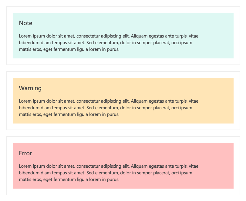
Use notes sparingly. They are bright color blocks intended to call out don't-miss-it information.
We have three different versions of notes currently styled:
>note(default styling)>note.warning>note.error
Respectively, those look like:
You precede a single line of Markdown with the >note.* syntax, like so:
>note.warning Hello yes I am a warning note that has been automagically created. My text may wrap to more than one line when the Markdown is parsed, but I am restricted to putting all my information onto one long line in the Markdown itself.
No closing tag is needed. If you try to "wrap" this custom syntax around multiple lines, it will not work!
But how do the titles ("Note", "Warning", "Error") get inserted into the note output? The custom Markdown tag actually does a lot
more than you might think. By using >note.warning, you are creating a div with class .note--warning, and adding to that div a
title "Warning".
If you were to do >note.pineapple, you would get a div with class .note--pineapple, and a title of "Pineapple". Because we have
not explicitly styled .note--pineapple, the styling would simply match the default note styling.
File an issue if you really need a custom note class to be styled to not look "default". For the most part, though, you should be using the types provided so that the documentation doesn't turn into a smorgasbord of color.
Images (like the one above) are styled to be fluid, i.e. they will scale proportionally and will never be displayed bigger than the element containing the documentation article. Currently, that containing element spans up to 875px wide at its largest, so that or similar should probably be the largest image size you use.
