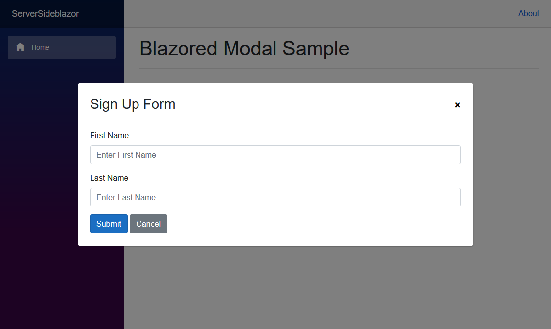
A beautiful and customizable modal implementation for Blazor applications. It's free-range, gluten-free and 100% JavaScript free.
You can install the package via the nuget package manager just search for Blazored.Modal. You can also install via powershell using the following command.
Install-Package Blazored.ModalOr via the dotnet CLI.
dotnet add package Blazored.ModalYou will need to add the following using statement and add a call to register the Blazored Modal services in your applications Startup.ConfigureServices method.
using Blazored.Modal;

public void ConfigureServices(IServiceCollection services)
{
    services.AddBlazoredModal();
}Add the following to your _Imports.razor
@using Blazored
@using Blazored.Modal
@using Blazored.Modal.ServicesAdd the <BlazoredModal /> tag into your applications MainLayout.razor.
Add the following line to the head tag of your _Host.cshtml (Blazor Server app).
<link href="_content/Blazored.Modal/blazored-modal.css" rel="stylesheet" />In order to show the modal, you have to inject the IModalService into the component or service you want to invoke the modal. You can then call the Show method passing in the title for the modal and the type of the component you want the modal to display.
For example, say I have a component called Movies which I want to display in the modal and I want to call it from the Index component on a button click.
@page "/"
@inject IModalService Modal

<h1>Hello, world!</h1>

Welcome to Blazored Modal.

<button @onclick="@(() => Modal.Show<Movies>("My Movies"))" class="btn btn-primary">View Movies</button>If you need to pass values to the component you are displaying in the modal, then you can use the ModalParameters object. Any component which is displayed in the modal has access to this object as a [CascadingParameter].
@page "/"
@inject IModalService Modal

<h1>My Movies</h1>

<ul>
    @foreach (var movie in Movies)
    {
        <li>@movie.Name (@movie.Year) - <button @onclick="@(() => ShowEditMovie(movie.Id))" class="btn btn-primary">Edit Movie</button></li>
    }
</ul>

@code {

    List<Movies> Movies { get; set; }

    void ShowEditMovie(int movieId)
    {
        var parameters = new ModalParameters();
        parameters.Add("MovieId", movieId);

        Modal.Show<EditMovie>("Edit Movie", parameters);
    }

}@inject IMovieService MovieService
@inject IModalService ModalService
<div class="simple-form">
<div class="form-group">
<label for="movie-name">Movie Name</label>
<input @bind="@Movie.Name" type="text" class="form-control" id="movie-name" />
</div>
<div class="form-group">
<label for="year">Year</label>
<input @bind="@Movie.Year" type="text" class="form-control" id="year" />
</div>
<button @onclick="@SaveMovie" class="btn btn-primary">Submit</button>
<button @onclick="@Cancel" class="btn btn-secondary">Cancel</button>
</div>
@code {
[CascadingParameter] ModalParameters Parameters { get; set; }
int MovieId { get; set; }
Movie Movie { get; set; }
protected override void OnInit()
{
MovieId = Parameters.Get<int>("MovieId");
LoadMovie(MovieId);
}
void LoadMovie(int movieId)
{
MovieService.Load(movieId);
}
void SaveMovie()
{
MovieService.Save(Movie);
ModalService.Close(ModalResult.Ok<Movie>(Movie));
}
void Cancel()
{
ModalService.Cancel();
}
}If you need to know when the modal has closed, for example to trigger an update of data. The modal service exposes a OnClose event which returns a ModalResult type. This type is used to identify how the modal was closed. If the modal was cancelled you can return ModalResult.Cancelled(). If you want to return a object from your modal you can return ModalResult.Ok(myResultObject) which can be accessed via the ModalResult.Data property. There is also a ModalResult.DataType property which contains the type of the data property, if required.
@page "/"
@inject IModalService Modal

<h1>My Movies</h1>

<button @onclick="@ShowModal" class="btn btn-primary">View Movies</button>

@code {

    void ShowModal()
    {
        Modal.OnClose += ModalClosed;
        Modal.Show<Movies>("My Movies");
    }

    void ModalClosed(ModalResult modalResult)
    {
        if (modalResult.Cancelled)
        {
            Console.WriteLine("Modal was cancelled");
        }
        else
        {
            Console.WriteLine(modalResult.Data);
        }

        Modal.OnClose -= ModalClosed;
    }

}The modals can be customized to fit a wide variety of uses. These options can be set globally or changed programatically.
A modal has a close button in the top right hand corner by default. The close button can be hidden by using the HideCloseButton parameter:
<BlazoredModal HideCloseButton="true" />
Or in the Modal.Show() method:
@code {
    void ShowModal()
    {
        var options = new ModalOptions()
        {
            HideCloseButton = false
        };

        Modal.Show<Movies>("My Movies", options);
    }
}You can disable cancelling the modal by clicking on the background using the DisableBackgroundCancel parameter.
<BlazoredModal DisableBackgroundCancel="true" />
Or in the Modal.Show() method:
@code {
    void ShowModal()
    {
        var options = new ModalOptions()
        {
            DisableBackgroundCancel = true
        };

        Modal.Show<Movies>("My Movies", options);
    }
}You can set an alternative CSS style for the modal if you want to customize the look and feel. This is useful when your web application requires different kinds of modals, like a warning, confirmation or an input form.
Use the Style parameter to set the custom styling globally:
<BlazoredModal Style="custom-modal" />
Or in the Modal.Show() method:
@code {
    void ShowModal()
    {
        var options = new ModalOptions()
        {
            Style = "blazored-modal-movies"
        };

        Modal.Show<Movies>("My Movies", options);
    }
}Modals are shown in the center of the viewport by default. The modal can be shown in different positions if needed. The positioning is flexible as it is set using CSS styling.
The following positioning styles are available out of the box: blazored-modal-center, blazored-modal-topleft, blazored-modal-topright, blazored-modal-bottomleft and blazored-modal-bottomright.
Use the Style parameter to set the custom styling globally:
<BlazoredModal Position="blazored-modal-bottomleft" />
Or in the Modal.Show() method:
@code {
    void ShowModal()
    {
        var options = new ModalOptions()
        {
            Position = "blazored-modal-bottomleft"
        };

        Modal.Show<Movies>("My Movies", options);
    }
}
