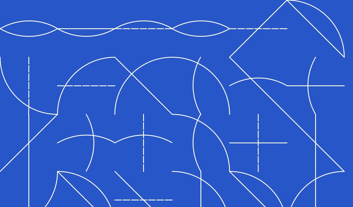
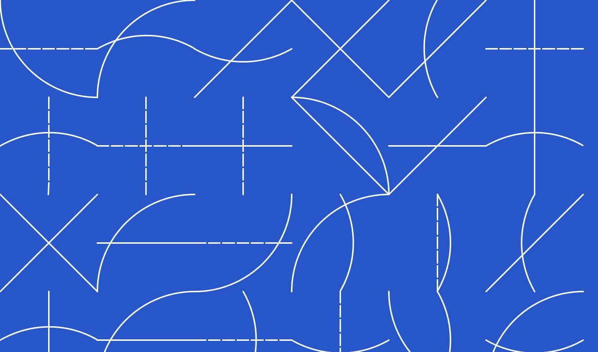
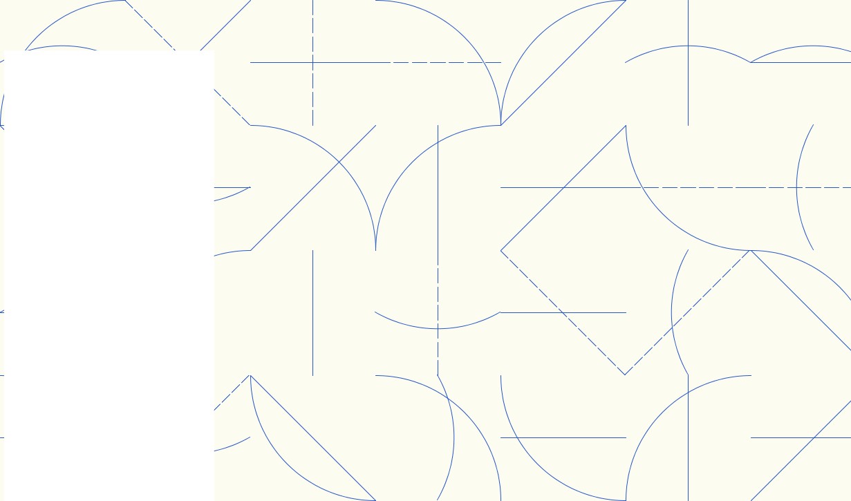
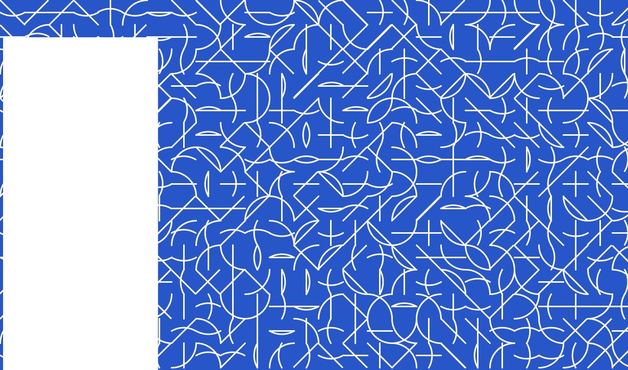
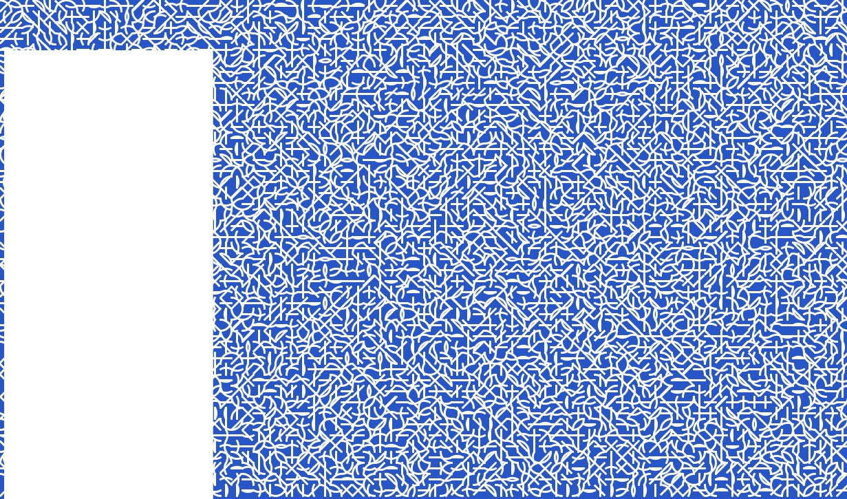
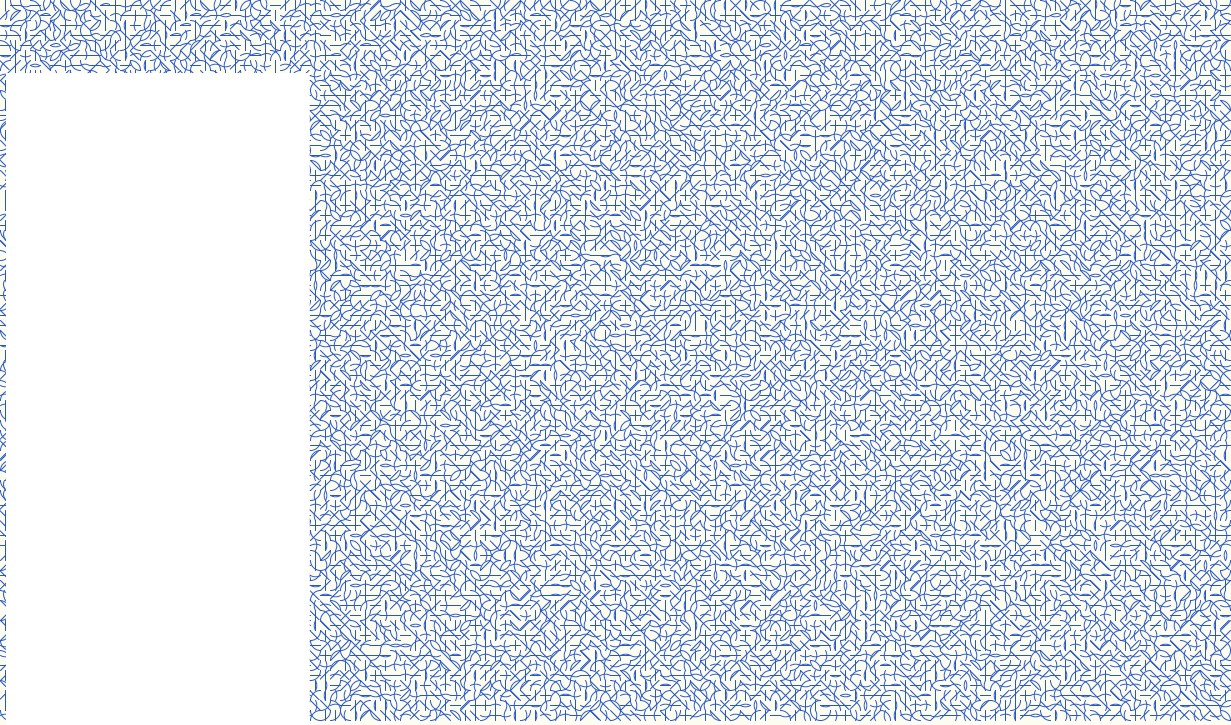
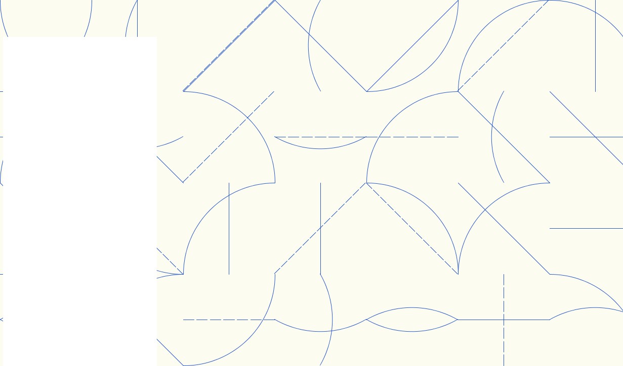
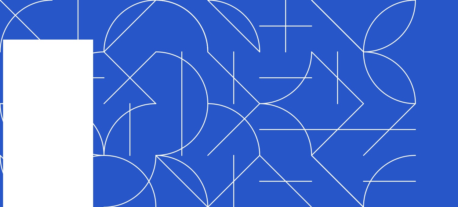
"All two-part combinations of blue arcs from corners and sides, and blue straight, not straight, and broken lines."
This project attempts to interpret and create a version of Sol LeWitt's Wall Drawing #146A in code, Processing code to be specific. The purpose of this project is to create a program that will produce any number of versions of the wall drawing as a proof-of-concept for how the wall drawing would look in a new office space.
Sol LeWitt was a prolific American artist who came to the public's attention in the 1960s for his wall drawings and structural artworks. He is considered a leader of the Minimalist and Conceptual art movements.
LeWitt provided simple and intentionally somewhat vague descriptions of his ideas for apprentices to then take and interpret in the realized art work. In doing so, the instructions themselves became the artwork and challenged the ideas of the role and authority of the artist.
More information about Sol LeWitt.
The code for this project is written in Processing 3. It is a fantastic open source language aimed at artists who are interested in quickly prototyping ideas in code. You can learn more about it here: Processing.org
The code itself is straightforwards. The logic involves setting some variables to describe the wall dimensions, grid size, colours, line thicknesses etc... There are pre-calculations done for angled lines and arcs. Then, to render the wall, two different tiles need to be chosen and some logic included to ensure that a box does not contain two of the same type of lines (or else it just looks like one line). Where it was tricky was in figuring out the math for the curves that connect from the mid-points of the grids.
One bug I decided not to fix is that the current logic allows for two lines, one solid and one dashed, to be draw that overlap one another. As a result it looks like there is just one line drawn. There's an example of this error in the Code Progression gallery below.
There is a purposeful omission from the program. There are no irregular/random/non-straight lines that are often in other representations of 146A. I excluded these wiggly lines for two reasons. One, the instructions don't explicitly include that type of line, although most of the examples I've seen of 146A include them. And secondly, I didn't trust that I would like the look of those lines on the wall.
Lastly, I chose to deviate from the instructions again to have a blue wall with off-white lines as opposed to the prescribed blue lines. This was an aesthetic decision. I really like the swath of blue on the wall.
