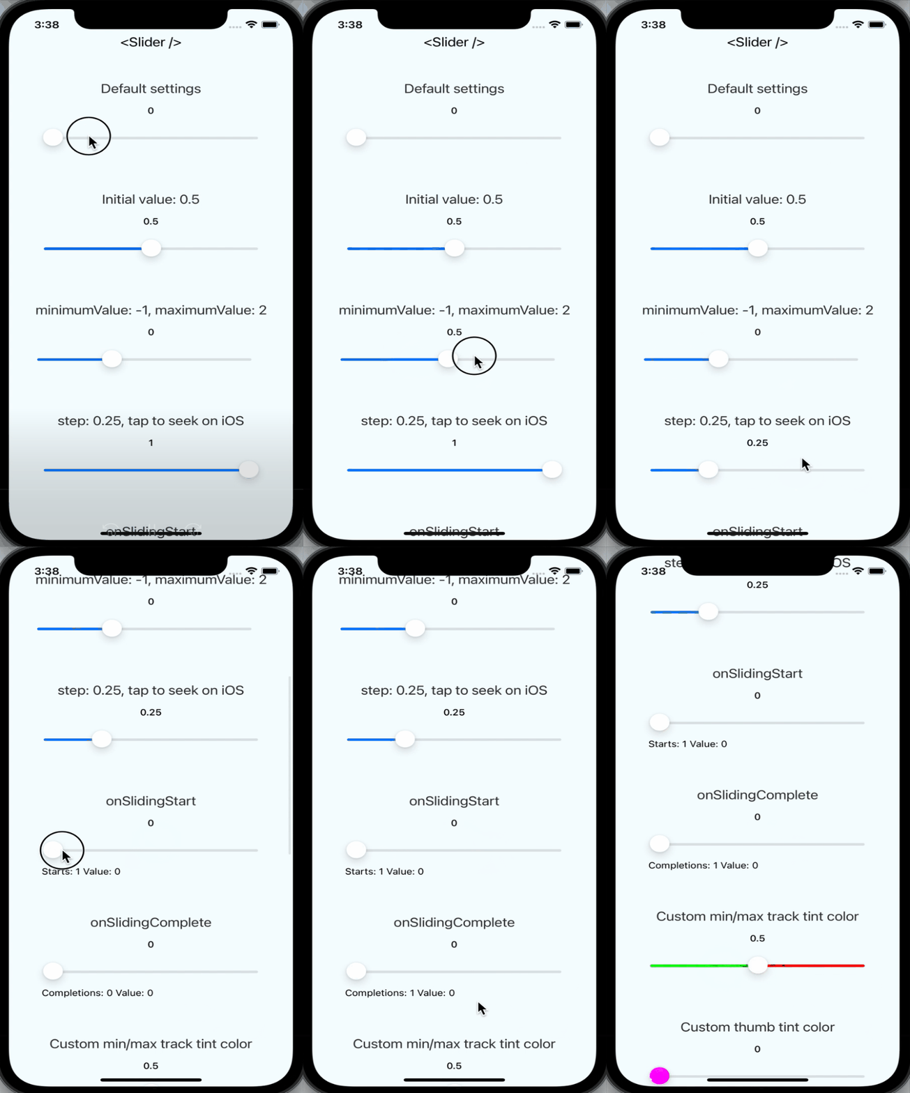
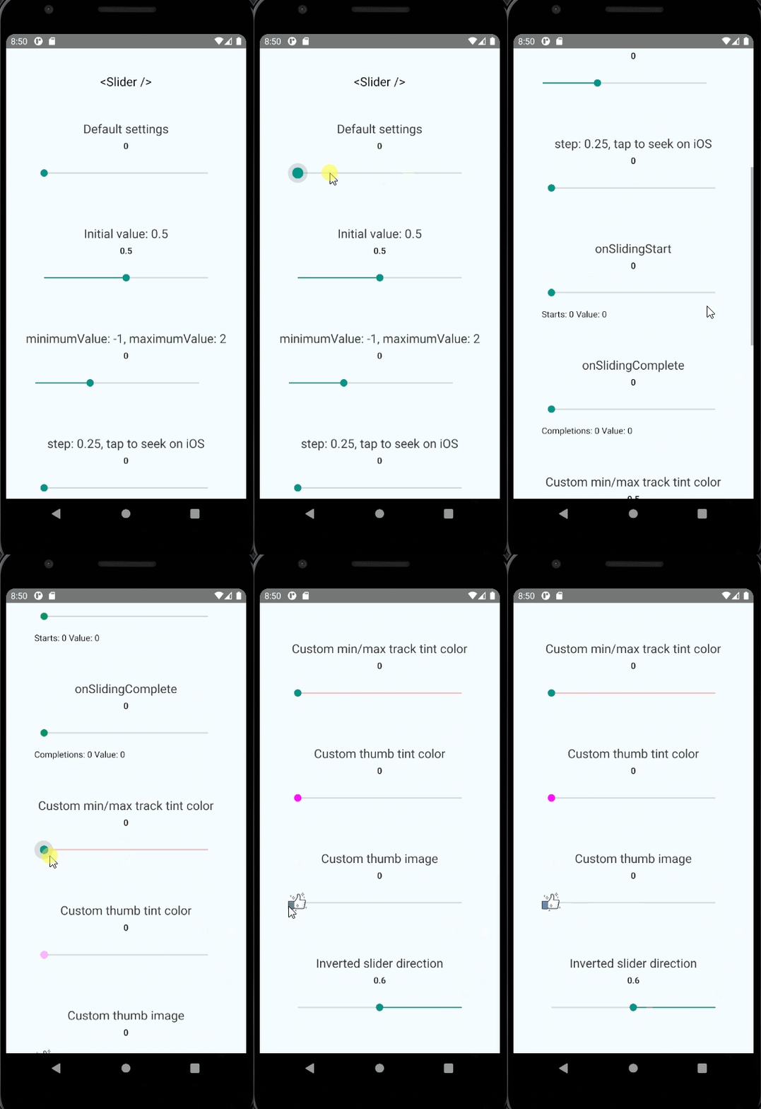
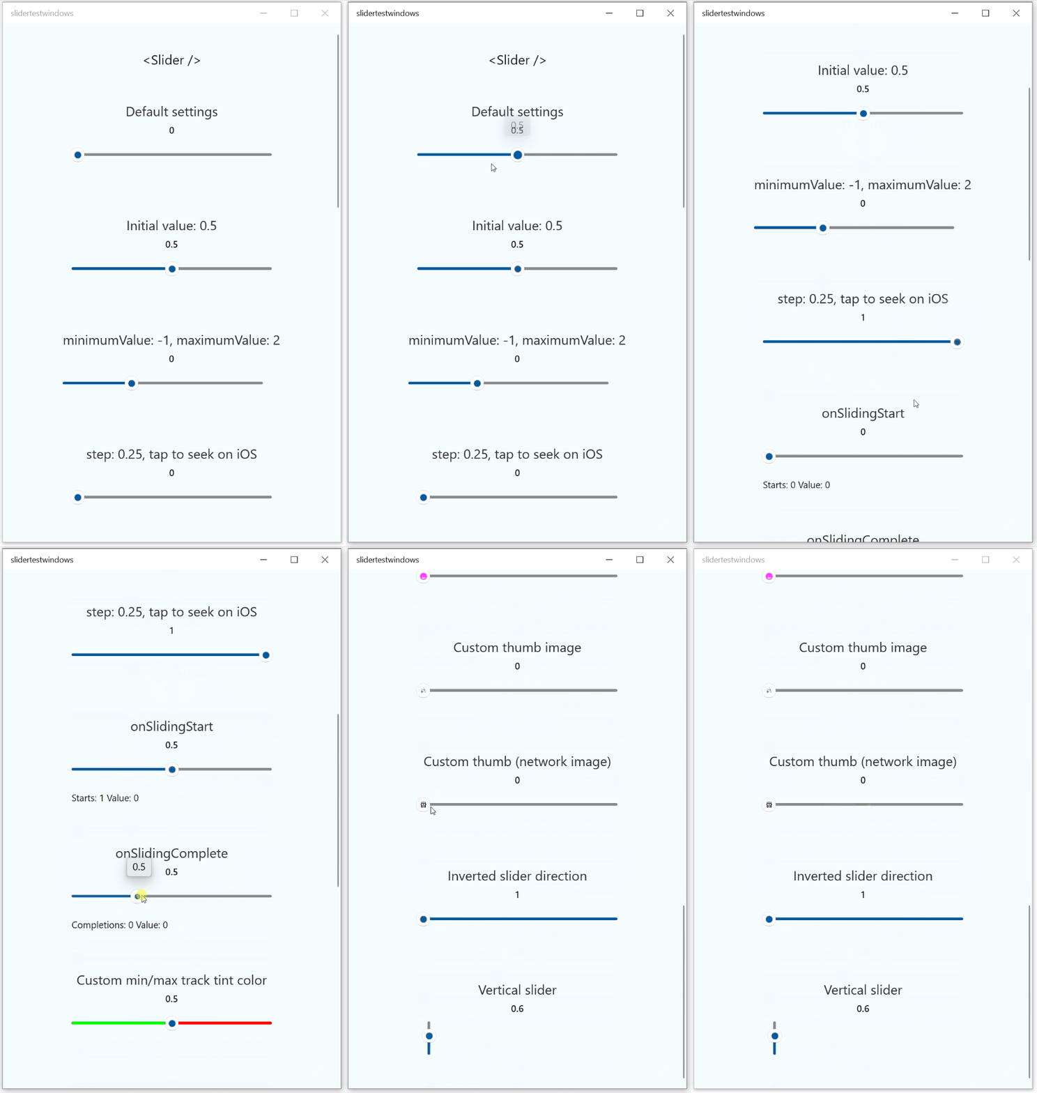
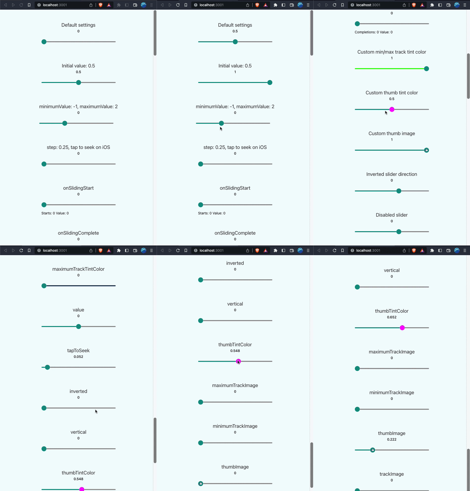
React Native component used to select a single value from a range of values.
Currently supported on following platforms:
| iOS | Android | Windows | Web |
|---|---|---|---|
 |
 |
 |
 |
To install this module cd to your project directory and enter the following command:
yarn add @react-native-community/slider
or
npm install @react-native-community/slider --save
If using iOS please remember to install cocoapods by running: npx pod-install
The following code presents the basic usage scenario of this library:
import Slider from '@react-native-community/slider';

<Slider
  style={{width: 200, height: 40}}
  minimumValue={0}
  maximumValue={1}
  minimumTrackTintColor="#FFFFFF"
  maximumTrackTintColor="#000000"
/>
Check out the example project for more examples.
Migrating from the core react-native module
This module was created when the Slider was split out from the core of React Native.
To migrate to this module you need to follow the installation instructions above and then change you imports from:
import { Slider } from 'react-native';to:
import Slider from '@react-native-community/slider';To use this library you need to ensure you are using the correct version of React Native.
@react-native-community/slider version |
Required React Native Version |
|---|---|
4.5.1 |
>=0.69 |
4.3.0 |
>=0.64 |
4.x.x |
>=0.60; >=0.62 (on Windows); |
3.1.x |
>=0.60 |
2.x.x |
>= 0.60 |
1.x.x |
<= 0.59 |
| Property | Description | Type | Required | Platform |
|---|---|---|---|---|
style |
Used to style and layout the Slider. See StyleSheet.js and ViewStylePropTypes.js for more info. |
View.style | No | |
disabled |
If true the user won't be able to move the slider. Default value is false. |
bool | No | |
maximumValue |
Initial maximum value of the slider. Default value is 1. |
number | No | |
minimumTrackTintColor |
The color used for the track to the left of the button. Overrides the default blue gradient image on iOS. |
color | No | |
minimumValue |
Initial minimum value of the slider. Default value is 0. |
number | No | |
lowerLimit |
Slide lower limit. The user won't be able to slide below this limit. | number | No | Android, iOS, Web |
upperLimit |
Slide upper limit. The user won't be able to slide above this limit. | number | No | Android, iOS, Web |
onSlidingStart |
Callback that is called when the user picks up the slider. The initial value is passed as an argument to the callback handler. |
function | No | |
onSlidingComplete |
Callback that is called when the user releases the slider, regardless if the value has changed. The current value is passed as an argument to the callback handler. |
function | No | |
onValueChange |
Callback continuously called while the user is dragging the slider. | function | No | |
step |
Step value of the slider. The value should be between 0 and (maximumValue - minimumValue). Default value is 0. On Windows OS the default value is 1% of slider's range (from minimumValue to maximumValue). |
number | No | |
maximumTrackTintColor |
The color used for the track to the right of the button. Overrides the default gray gradient image on iOS. |
color | No | |
testID |
Used to locate this view in UI automation tests. | string | No | |
value |
Write-only property representing the value of the slider. Can be used to programmatically control the position of the thumb. Entered once at the beginning still acts as an initial value. Changing the value programmatically does not trigger any event. The value should be between minimumValue and maximumValue, which default to 0 and 1 respectively. Default value is 0. This is not a controlled component, you don't need to update the value during dragging. |
number | No | |
tapToSeek |
Permits tapping on the slider track to set the thumb position. Defaults to false on iOS. No effect on Android or Windows. |
bool | No | iOS |
inverted |
Reverses the direction of the slider. Default value is false. |
bool | No | |
vertical |
Changes the orientation of the slider to vertical, if set to true.Default value is false. |
bool | No | Windows |
thumbTintColor |
Color of the foreground switch grip. NOTE: This prop will override the thumbImage prop set, meaning that if both thumbImage and thumbTintColor will be set, image used for the thumb may not be displayed correctly! |
color | No | Android |
maximumTrackImage |
Assigns a maximum track image. Only static images are supported. The leftmost pixel of the image will be stretched to fill the track. | Image .propTypes .source |
No | iOS |
minimumTrackImage |
Assigns a minimum track image. Only static images are supported. The rightmost pixel of the image will be stretched to fill the track. | Image .propTypes .source |
No | iOS |
thumbImage |
Sets an image for the thumb. Only static images are supported. Needs to be a URI of a local or network image; base64-encoded SVG is not supported. | Image .propTypes .source |
No | |
trackImage |
Assigns a single image for the track. Only static images are supported. The center pixel of the image will be stretched to fill the track. | Image .propTypes .source |
No | iOS |
StepMarker |
Component to be rendered for each step on the track, with the possibility to change the styling, when thumb is at that given step |
FC<MarkerProps>, where MarkerProps: {stepMarked: boolean} |
No | iOS, Android, Windows |
renderStepNumber |
Turns on the displaying of numbers of steps. Numbers of steps are displayed under the track |
bool | No | iOS, Android, Windows |
ref |
Reference object. | MutableRefObject | No | web |
View |
Inherited View props... |
There's a Project board available here which contains all reported issues organized into columns regarding their status.
If you are interested in knowing whether the issue you reported is handled or just to check the status of a feature you would like to have in Slider, please check the board.
The main package implementation is done in the package/ directory.
So when implementing changes there, make sure your code passes ESLint and the tests. Run the following to verify:
cd package/
npm run lint
npm run test- Remember to cover your changes with tests if possible.
When creating an issue please remember to specify the platform which the issue occurs on.
While developing, you can run the example app to test your changes.
- Clone the repository
- Run
npm installin the root directory to install dependencies. - Run
npm run example-<platform>, where platform can be:ios,android,windows
You can also do this manually by:
- Installing node modules for example app
- Installing pods for iOS app
- Running example app like always:
npx react-native run-<platform>
In order to use the new architecture some extra steps are needed.
- Install pods with new arch flag inside
example/iosfolder:RCT_NEW_ARCH_ENABLED=1 pod install - Run
npm run example-ios
- Set
newArchEnabledto true insideexample/android/gradle.properties - Run
npm run example-android
If you are using React Native version lower than 0.70, you need to setup manual linking for Android to work.
Inside example/android/app/src/main/jni/Android.mk add these lines:
+ include $(NODE_MODULES_DIR)/@react-native-community/slider/android/build/generated/source/codegen/jni/Android.mk
include $(CLEAR_VARS)
libreact_codegen_rncore \
+ libreact_codegen_ReactSlider \
libreact_debug \Inside example/android/app/src/main/jni/MainComponentsRegistry.cpp update these lines:
#include <react/renderer/components/rncore/ComponentDescriptors.h>
+ #include <react/renderer/components/ReactSlider/ComponentDescriptors.h>

...

MainComponentsRegistry::sharedProviderRegistry() {
  auto providerRegistry = CoreComponentsRegistry::sharedProviderRegistry();

  // Custom Fabric Components go here. You can register custom
  // components coming from your App or from 3rd party libraries here.
  //
  // providerRegistry->add(concreteComponentDescriptorProvider<
  //        AocViewerComponentDescriptor>());
+ providerRegistry->add(concreteComponentDescriptorProvider<RNCSliderComponentDescriptor>());

  return providerRegistry;
}This module was extracted from react-native core. Please, refer to contributors graph for the complete list of contributors.
@callstack/react-native-slider is an open source project and will always remain free to use. If you think it's cool, please star it 🌟. Callstack is a group of React and React Native geeks, contact us at hello@callstack.com if you need any help with these or just want to say hi!
Like the project? ⚛️ Join the team who does amazing stuff for clients and drives React Native Open Source! 🔥


