Jonas Schöley & Ilya Kashnitsky
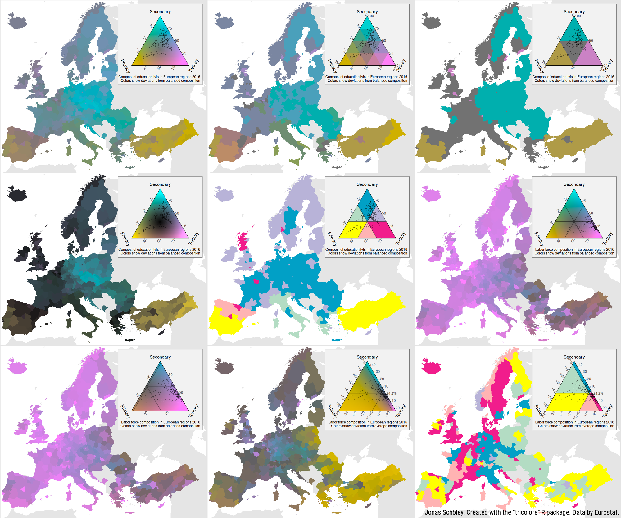
tricolore is an R library providing a flexible color scale for the
visualization of three-part (ternary) compositions. Its main
functionality is to color-code any ternary composition as a mixture of
three primary colors and to draw a suitable color-key. tricolore
flexibly adapts to different visualization challenges via
- discrete and continuous color support,
- support for unbalanced compositional data via centering,
- support for data with very narrow range via scaling,
- hue, chroma and lightness options.
install.packages('tricolore')
library(tricolore); DemoTricolore()
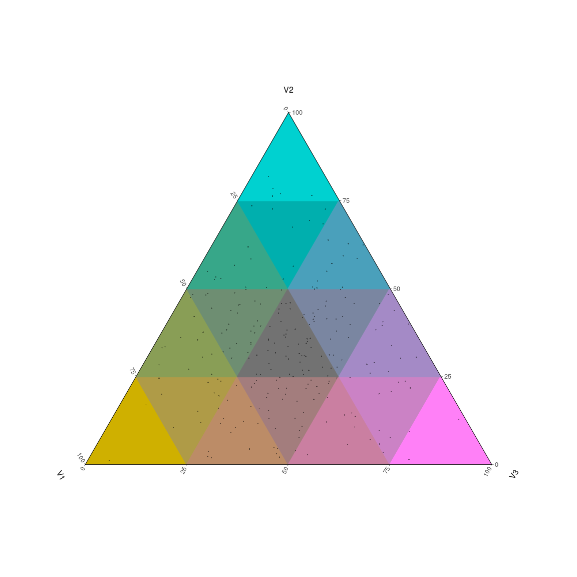
The Tricolore() function expects a dataframe of three-part
compositions, color-codes the compositions and returns a list with
elements rgb and key. The first list element is a vector of rgb
codes for the color-coded compositions, the latter element gives a plot
of the color key.
Here’s a minimal example using simulated data.
library(tricolore)

# simulate 243 ternary compositions
P <- as.data.frame(prop.table(matrix(runif(3^6), ncol = 3), 1))
# color-code each composition and return a corresponding color key
colors_and_legend <- Tricolore(P, 'V1', 'V2', 'V3')
# the color-coded compositions
head(colors_and_legend$rgb)
## [1] "#BC8C67" "#727272" "#727272" "#CA7FA1" "#A37D7D" "#6E8E72"
colors_and_legend$keyYou can familiarize yourself with the various options of tricolore by
running DemoTricolore().
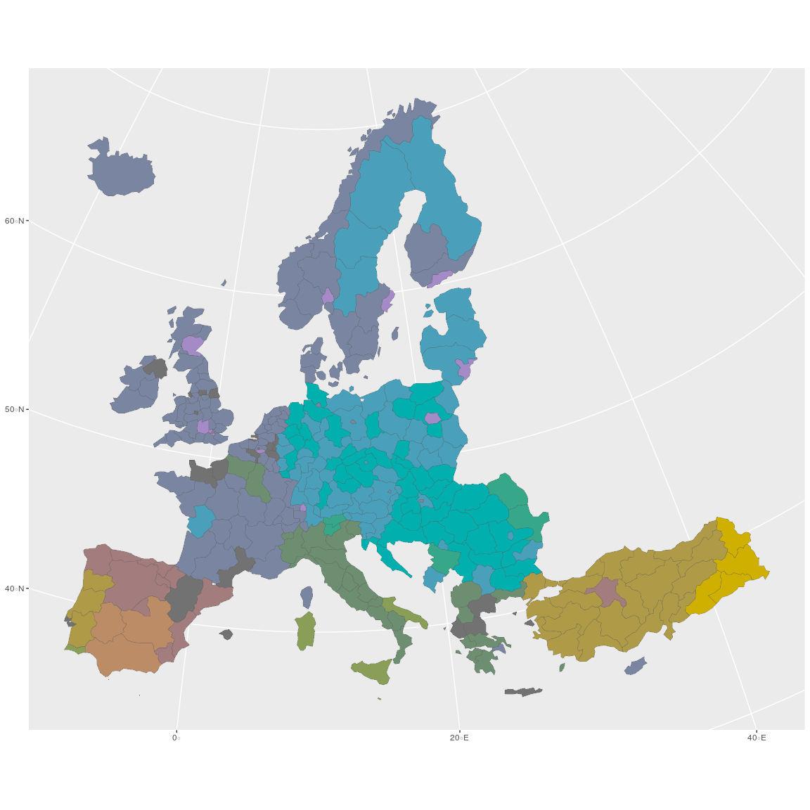
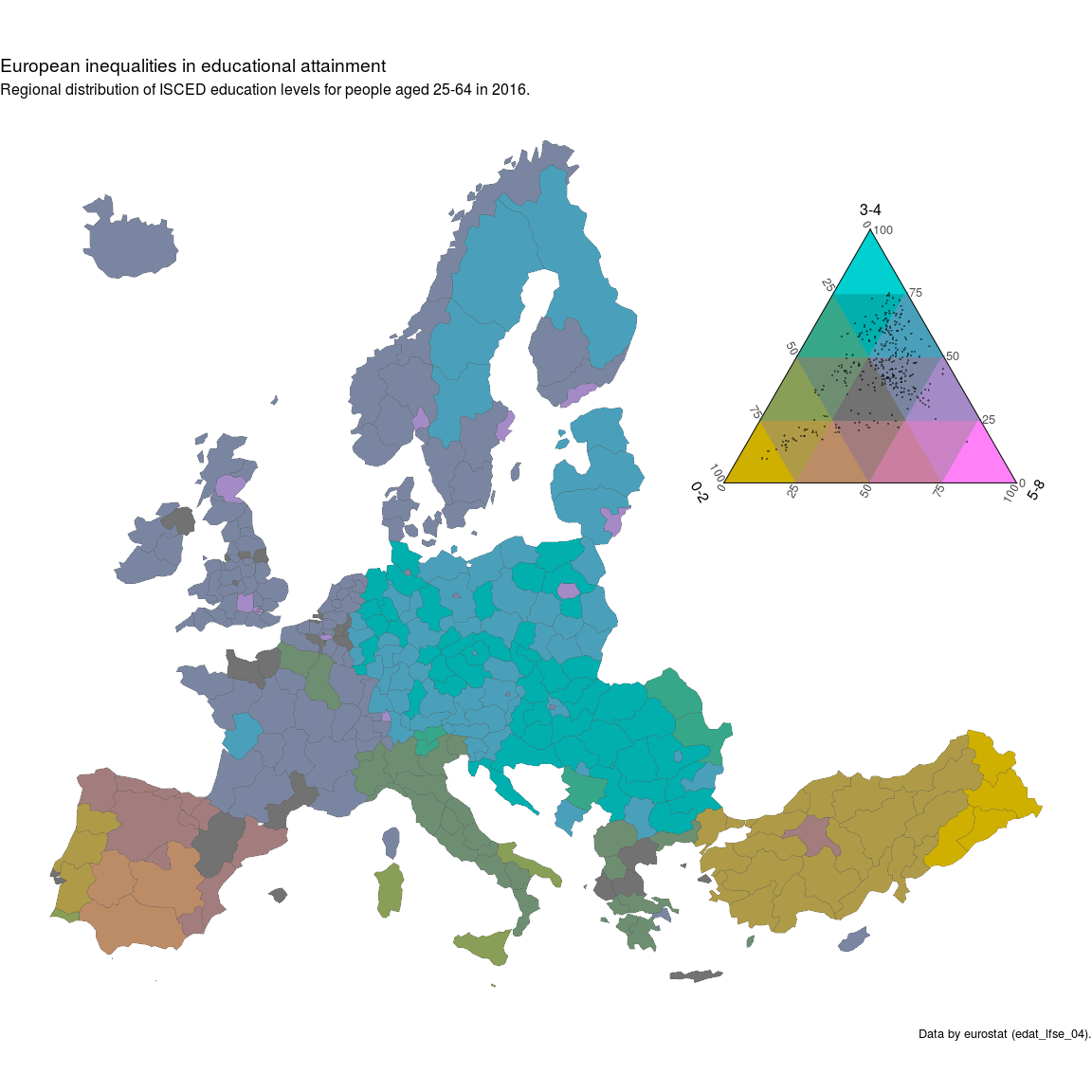
Here I demonstrate how to create a choropleth map of the regional
distribution of education attainment in Europe 2016 using ggplot2.
The data set euro_example contains the administrative boundaries for
the European NUTS-2 regions in the column geometry. This data can be
used to plot a choropleth map of Europe using the sf package. Each
region is represented by a single row. The name of a region is given by
the variable name while the respective
NUTS-2
geocode is given by the variable id. For each region some
compositional statistics are available: Variables starting with ed
refer to the relative share of population ages 25 to 64 by educational
attainment in 2016 and variables starting with lf refer to the
relative share of workers by labor-force sector in the European NUTS-2
regions 2016.
1. Using the Tricolore() function, color-code each educational
composition in the euro_example data set and add the resulting vector
of hex-srgb colors as a new variable to the dataframe. Store the color
key separately.
# color-code the data set and generate a color-key
tric_educ <- Tricolore(euro_example,
                       p1 = 'ed_0to2', p2 = 'ed_3to4', p3 = 'ed_5to8')
tric contains both a vector of color-coded compositions (tric$rgb)
and the corresponding color key (tric$key). We add the vector of
colors to the map-data.
# add the vector of colors to the `euro_example` data
euro_example$educ_rgb <- tric_educ$rgb
2. Using ggplot2 and the joined color-coded education data and
geodata, plot a ternary choropleth map of education attainment in the
European regions. Add the color key to the map.
The secret ingredient is scale_fill_identity() to make sure that each
region is colored according to the value in the educ_rgb variable of
euro_example.
library(ggplot2)

plot_educ <-
  # using data sf data `euro_example`...
  ggplot(euro_example) +
  # ...draw a choropleth map
  geom_sf(aes(fill = educ_rgb, geometry = geometry), size = 0.1) +
  # ...and color each region according to the color-code
  # in the variable `educ_rgb`
  scale_fill_identity()

plot_educ
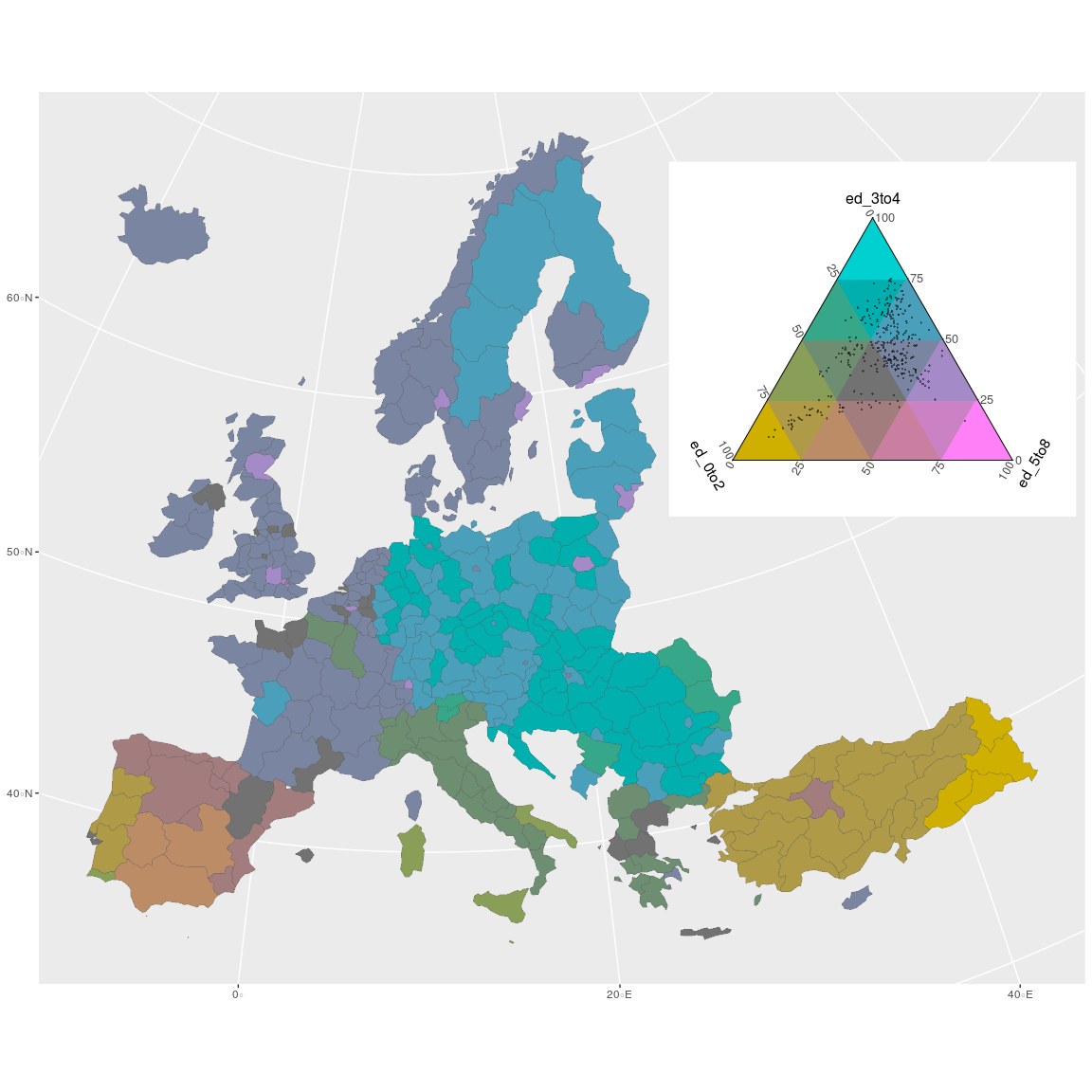
Using annotation_custom() and ggplotGrob we can add the color key
produced by Tricolore() to the map. Internally, the color key is
produced with the ggtern package. In order
for it to render correctly we need to load ggtern after loading
ggplot2. Don’t worry, the ggplot2 functions still work.
library(ggtern)
plot_educ +
  annotation_custom(
    ggplotGrob(tric_educ$key),
    xmin = 55e5, xmax = 75e5, ymin = 8e5, ymax = 80e5
  )
Because the color key behaves just like a ggplot2 plot we can change
it to our liking.
plot_educ <-
  plot_educ +
  annotation_custom(
    ggplotGrob(
      tric_educ$key +
        labs(L = '0-2', T = '3-4', R = '5-8')),
    xmin = 55e5, xmax = 75e5, ymin = 8e5, ymax = 80e5
  )
plot_educ
Some final touches…
plot_educ +
  theme_void() +
  coord_sf(datum = NA) +
  labs(title = 'European inequalities in educational attainment',
       subtitle = 'Regional distribution of ISCED education levels for people aged 25-64 in 2016.',
caption = 'Data by eurostat (edat_lfse_04).')By default tricolore uses a discrete colors scale with 16 colors. This
can be changed via the breaks parameter. A value of Inf gives a
continuous color scale…
# color-code the data set and generate a color-key
tric_educ_disc <- Tricolore(euro_example,
                            p1 = 'ed_0to2', p2 = 'ed_3to4', p3 = 'ed_5to8',
                            breaks = Inf)
euro_example$educ_rgb_disc <- tric_educ_disc$rgb

ggplot(euro_example) +
  geom_sf(aes(fill = educ_rgb_disc, geometry = geometry), size = 0.1) +
  scale_fill_identity() +
  annotation_custom(
    ggplotGrob(
      tric_educ_disc$key +
        labs(L = '0-2', T = '3-4', R = '5-8')),
    xmin = 55e5, xmax = 75e5, ymin = 8e5, ymax = 80e5
  ) +
  theme_void() +
  coord_sf(datum = NA) +
  labs(title = 'European inequalities in educational attainment',
       subtitle = 'Regional distribution of ISCED education levels for people aged 25-64 in 2016.',
       caption = 'Data by eurostat (edat_lfse_04).')
…and a breaks = 2 gives a discrete color scale with (2^2=4) colors,
highlighting the regions with an absolute majority of any part of the
composition.
# color-code the data set and generate a color-key
tric_educ_disc <- Tricolore(euro_example,
                            p1 = 'ed_0to2', p2 = 'ed_3to4', p3 = 'ed_5to8',
                            breaks = 2)
euro_example$educ_rgb_disc <- tric_educ_disc$rgb

ggplot(euro_example) +
  geom_sf(aes(fill = educ_rgb_disc, geometry = geometry), size = 0.1) +
  scale_fill_identity() +
  annotation_custom(
    ggplotGrob(
      tric_educ_disc$key +
        labs(L = '0-2', T = '3-4', R = '5-8')),
    xmin = 55e5, xmax = 75e5, ymin = 8e5, ymax = 80e5
  ) +
  theme_void() +
  coord_sf(datum = NA) +
  labs(title = 'European inequalities in educational attainment',
       subtitle = 'Regional distribution of ISCED education levels for people aged 25-64 in 2016.',
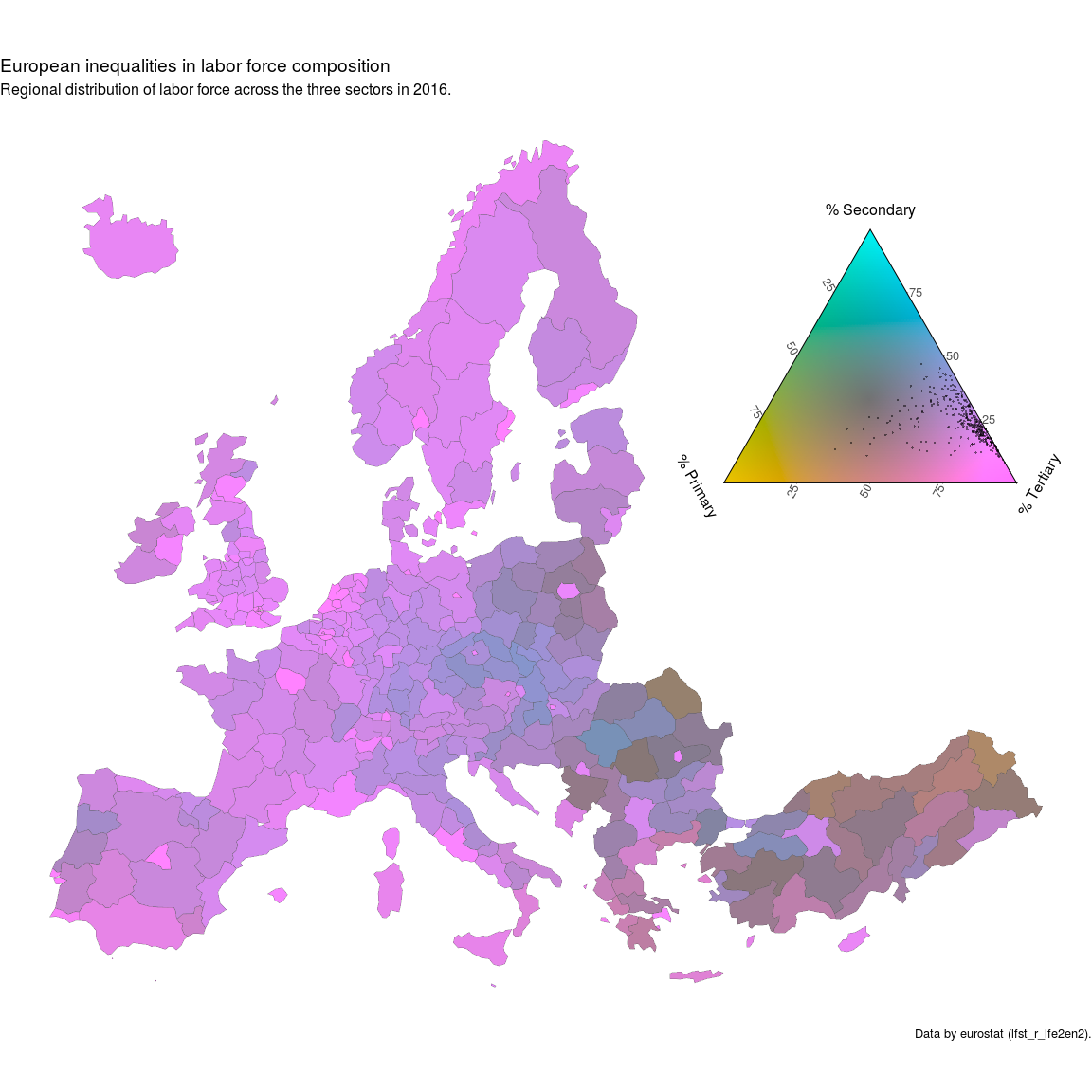
caption = 'Data by eurostat (edat_lfse_04).')While the ternary balance scheme allows for dense yet clear visualizations of well spread out ternary compositions the technique is less informative when used with highly unbalanced data. The map below shows the regional labor force composition in Europe as of 2016 in nearly monochromatic colors, the different shades of blue signifying a working population which is concentrated in the tertiary (services) sector. Regions in Turkey and Eastern Europe show a somewhat higher concentration of workers in the primary (production) sector but overall the data shows little variation with regards to the visual reference point, i.e. the greypoint marking perfectly balanced proportions.
tric_lf_non_centered <- Tricolore(euro_example, breaks = Inf,
                                  'lf_pri', 'lf_sec', 'lf_ter')

euro_example$rgb_lf_non_centered <- tric_lf_non_centered$rgb

ggplot(euro_example) +
  geom_sf(aes(fill = rgb_lf_non_centered, geometry = geometry), size = 0.1) +
  scale_fill_identity() +
  annotation_custom(
    ggplotGrob(tric_lf_non_centered$key +
                 labs(L = '% Primary', T = '% Secondary', R = '% Tertiary')),
    xmin = 55e5, xmax = 75e5, ymin = 8e5, ymax = 80e5
  ) +
  theme_void() +
  coord_sf(datum = NA) +
  labs(title = 'European inequalities in labor force composition',
       subtitle = 'Regional distribution of labor force across the three sectors in 2016.',
       caption = 'Data by eurostat (lfst_r_lfe2en2).')
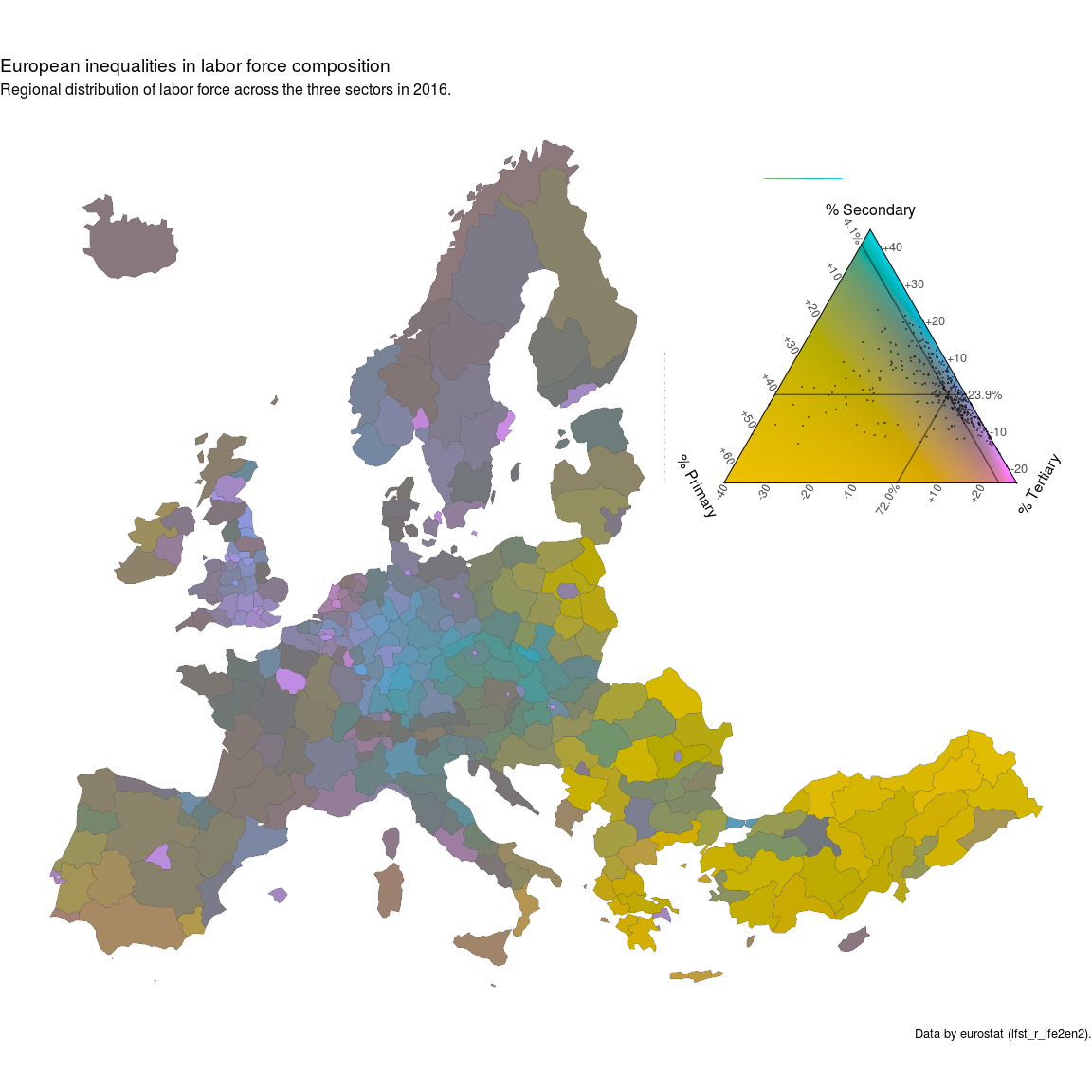
A remedy for analyzing data which shows little variation in relation to some reference point is to change the point of reference. The map below yet again shows the European regional labor force composition in 2016 but the color scale has been altered so that its greypoint – the visual point of reference – is positioned at the European annual average. Consequently the colors now show direction and magnitude of the deviation from the European average labor force composition. Pink, Green and Blue hues show a higher than average share of workers in the primary, secondary and tertiary sector respectively. The saturation of the colors show the magnitude of that deviation with perfect grey marking a region that has a labor force composition equal to the European average, i.e. the reference point.
Centering the color scale over the labor-force composition of the average European NUTS-2 region shows various patterns of deviations from the average. Metropolitan regions (Hamburg, Stockholm, Paris, Madrid) have a higher than average share of tertiary workers. Large parts of France are quite grey, indicating a labor-force composition close to the average, while Eastern Europe, the south of Spain and Italy have a higher than average share of workers active in the primary sector.
tric_lf_centered <-
  Tricolore(euro_example,
            'lf_pri', 'lf_sec', 'lf_ter',
            center = NA, crop = TRUE)

euro_example$rgb_lf_centered <- tric_lf_centered$rgb

ggplot(euro_example) +
  geom_sf(aes(fill = rgb_lf_centered, geometry = geometry), size = 0.1) +
  scale_fill_identity() +
  annotation_custom(
    ggplotGrob(
      tric_lf_centered$key +
        labs(L = '% Primary', T = '% Secondary', R = '% Tertiary')),
    xmin = 55e5, xmax = 75e5, ymin = 8e5, ymax = 80e5
  ) +
  theme_void() +
  coord_sf(datum = NA) +
  labs(title = 'European inequalities in labor force composition',
       subtitle = 'Regional distribution of labor force across the three sectors in 2016.',
caption = 'Data by eurostat (lfst_r_lfe2en2).')This software is an academic project. We welcome any issues and pull requests.
Please report any bugs you find by submitting an issue on github.com/jschoeley/tricolore/issues.
If you wish to contribute, please submit a pull request following the guidelines stated in CONTRIBUTING.md.
