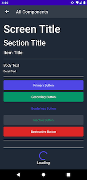
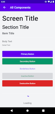
A simple library with some nice looking Jetpack Compose UI components to get your next project started 🚀
Help jump start your prototypes with some sensible default components, then come back later and customize the look and feel of your app all in one place.
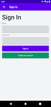
You can clone and run the example project to see examples of all the default components, plus a little sample of a more customized sign in screen.
@Composable
fun DemoView() {
    NiceComponentsTheme {
        ScreenTitle("I'm a nice big title!")
    }
}Once you're ready to start putting your own touch on components, you've got a couple options, based on what you'd like to change...
If you'd like to change all instances of a component, we recommend creating a custom config that you can set when your app first starts. Note that you once you've set this config, you'll be unable to update it.
In the case of multiple customizations applying to the same component, the most specific one will take precedence.
class MainActivity : ComponentActivity() {
    override fun onCreate(savedInstanceState: Bundle?) {
        super.onCreate(savedInstanceState)
        setContent {
            val config = Config.default.copy(
                primaryButtonStyle = Config.default.primaryButtonStyle.copy(
                    surfaceColor = Color.Red,
                    onSurfaceColor = Color.Black
                )
            )
            NiceComponentsTheme(config) {
                // your content here
            }
        }
    }
}@Composable
fun CustomPrimaryButton(text: String, onClick: () -> Unit) {
PrimaryButton(
text = text,
buttonStyle = ButtonStyle(
textStyle = CurrentConfig.typeTheme.body1,
surfaceColor = Color.Red,
onSurfaceColor = Color.Black
),
onClick = onClick
)
}NiceComponentsTheme is built on top of MaterialTheme, so all colours and typography should be applied to other Jetpack Compose Material Components within it. You can also access the current loaded configuration using the CurrentConfig object, which is provided to all children of a NiceComponentsTheme via composition local.
@Composable
fun Example() {
    PrimaryButton(
        text = "Tap me!",
        buttonStyle = ButtonStyle(
            textStyle = CurrentConfig.typeTheme.body1,
            surfaceColor = Color.Red,
            onSurfaceColor = Color.Black
        )
    ) {
        println("I've been tapped!")
    }
}We've found with Jetpack Compose it's very common to have a view whose state changes based on some content state defined in its ViewModel. With StatefulView, you can pass in your current state, and the desired loaded state and have things automatically update as your state changes. You can also update your error, loading and noData states to suit your needs.
See StatefulExampleView for a full example.
Components are colored using a theme inspired by the Material Design color system.
| Component | Text Color | Background Color |
|---|---|---|
| Primary Button | onPrimary | primary |
| Secondary Button | onSecondary | secondary |
| Inactive Button | background | secondary |
| Destructive Button | onError | error |
| Body Text | onSurface | n/a |
| Detail Text | onSurface | n/a |
class MainActivity : ComponentActivity() {
    override fun onCreate(savedInstanceState: Bundle?) {
        super.onCreate(savedInstanceState)
        setContent {
            val lightColors = NiceComponentsLightColors.copy(
                primary = colorResource(id = R.color.design_default_color_primary),
                onPrimary = colorResource(id = R.color.design_default_color_on_primary)
            )
            val darkColors = NiceComponentsDarkColors
            val config = Config(colorTheme = if (isSystemInDarkTheme()) darkColors else lightColors)
            NiceComponentsTheme(config) {
                // content
            }
        }
    }
}
Just like how you can set a colorTheme, you can also set a typeTheme that defines the default font, size and weight for all components.
| Component | Type Name |
|---|---|
| Primary Button | button |
| Secondary Button | button |
| Inactive Button | button |
| Destructive Button | button |
| Body Text | body1 |
| Detail Text | body1 |
    val config = Config.default.copy(
        primaryButtonStyle = Config.default.primaryButtonStyle.copy(
            TypeTheme.TextStyle(
                size = 16.sp,
                fontFamily = FontFamily.SansSerif,
                fontWeight = FontWeight.SemiBold
            )
        )
    )
    NiceComponentsTheme(config) {
        // content
}- Add this in your root build.gradle at the end of repositories:
allprojects {
    repositories {
        // other repositories
        maven { url 'https://jitpack.io' }
    }
}- Add the dependency in your app module's build.gradle:
dependencies {
    implementation "com.github.steamclock:compose_components:<VERSION>"
}
Most recent version can be found here
-
Sync your project gradle files
-
NiceComponents should now be available in the project.


