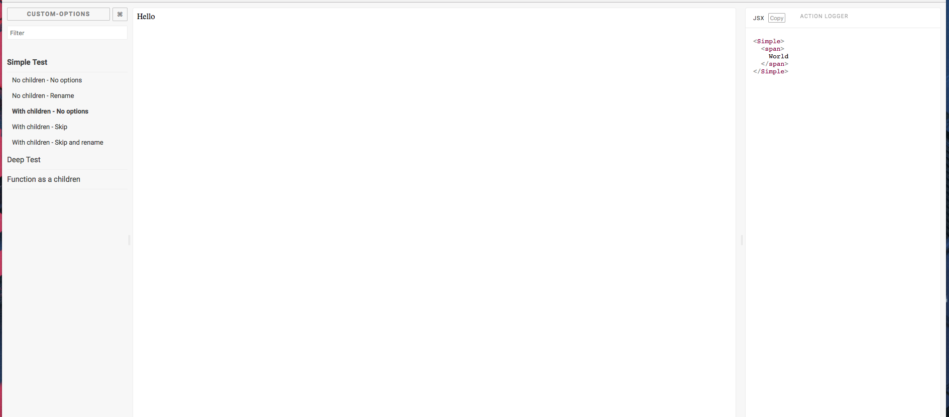
This Storybook addon shows you the JSX of the story. This preview works for Vue components as well. The outputted JSX will reflect any changes made to the storybok by knobs or controls.
First install the addon from npm:
npm i --save-dev storybook-addon-jsx
# or
yarn add --dev storybook-addon-jsxFor the latest storybook all you need to do is add the addon to your .storybook/main.js:
module.exports = {
  addons: ['storybook-addon-jsx']
};
If you are using storybook@5.x or lower you will need to add the following to .storybook/addons.js:
import 'storybook-addon-jsx/register';Import it into your stories file and then use it when you write stories:
import React from "react";
import { storiesOf } from "@storybook/react";
import { jsxDecorator } from "storybook-addon-jsx";

import { TestComponent } from './TestComponent':

export default {
  title: "Components/TestComponent",
  decorators: [jsxDecorator],
};

export const Paris = () => (
  <TestComponent fontSize={45} fontFamily="Roboto" align="center" color="#CAF200">
    Hello
  </TestComponent>
);

export const Orleans = () => <Test color="#236544">Hello</Test>;
Or to configure it globally add the jsxDecorator to your .storybook/preview.js:
const { addDecorator } = require('@storybook/react');
const { jsxDecorator } = require('storybook-addon-jsx');

addDecorator(jsxDecorator);You can also use this addon with @storybook/vue.
.storybook/preview.js
import { configure, addDecorator } from '@storybook/vue';
import { jsxDecorator } from 'storybook-addon-jsx';

addDecorator(jsxDecorator);
If a Vue story defines its view with a template string then it will be displayed.
import { storiesOf } from '@storybook/vue';

storiesOf('Vue', module).add('template property', () => ({
  template: `<div></div>`
}));This addon support all options from react-element-to-jsx-string as well as the following options.
skip(default: 0) : Skip element in your component to display
export default {
  title: 'Components/TestComponent',
  parameters: {
    jsx: { skip: 1 }
  }
};
onBeforeRender(domString: string) => string(default: undefined) : function that receives the dom as a string before render.
export default {
  title: 'Components/TestComponent',
  parameters: {
    jsx: {
      onBeforeRender: domString => {
        if (domString.search('dangerouslySetInnerHTML') < 0) {
          return '';
        }

        try {
          domString = /(dangerouslySetInnerHTML={{)([^}}]*)/.exec(domString)[2];
          domString = /(')([^']*)/.exec(domString)[2];
        } catch (err) {}

        return domString;
      }
    }
  }
};displayName(default: 0) : You can manually name the components that use useMemo or useRef.
export default {
  title: 'Components/TestComponent',
  parameters: {
    jsx: {
      displayName: () => 'CustomName'
    }
  }
};If enabled globally, the JSX addon can be disabled on individual stories:
export const Simple = () => <div>Hello</div>;

Simple.story = {
  parameters: {
    jsx: {
      disable: true
    }
  }
};enableBeautify(default: true) : Beautify the template string- All HTML options from js-beautify
To configure global options for this plugin, add the following to your config.js.
import { addParameters } from '@storybook/react';

addParameters({
  jsx: {
    // your options
  }
});If you provide a funtion to one of your props storybook-addon-jsx will display that functions toString result.
This is usaully very ugly.
To override this include the following util function that will print an easiy to read string.
/**
 * Overrides the toString on a function so that it addon-jsx prints
 * the callbacks in a copy-paste-able way.
 */
export const callback = <T extends Function>(fn: T): T => {
  /** A toString to render the function in storybook */
  // eslint-disable-next-line no-param-reassign
  fn.toString = () => '() => {}';
  return fn;
};
This works well with the @storybook/addon-actions too.
export ExampleStory = () => (
  <TestComponent onClick={callback(action('onClick'))} />
)This addon will display prop type information while hovering over a component or prop. This is accomplished through a babel plugin in the default storybook configuration. To use the docgen information for TypeScript components you must include be using a typescript docgen loader
import { addParameters } from '@storybook/react';

addParameters({
  jsx: {
    // your options
  }
});In a TypeScript monorepo you will probably be importing components through package names. In this situation storybook will load your compiled typescript and lose information about the props.
One solution to get around this is to add a unique property to your component's package.json that points directly at the TypeScript source.
We can then set storybook's webpack configuration to look for this property first, which will allow the TypeScript loader to insert docgen information.
In your component's package.json:
{
  // Can be any string you want, here we choose "source"
  "source": "src/index.tsx"
}
Then in your webpack config for storybook:
config.resolve.mainFields = ['source', 'module', 'main'];If you are using the addWithJSX method you will need to include storybook-addon-jsx in your test file.
import initStoryshots from '@storybook/addon-storyshots';
import { setAddon } from '@storybook/react';
import JSXAddon from 'storybook-addon-jsx';

setAddon(JSXAddon);

initStoryshots({
  /* configuration options */
});Some of the dependencies that this package has use APIs not available in IE11.
To get around this you can add the following to your webpack.config.js file
(your paths might be slightly different):
config.module.rules.push({
  test: /\.js/,
  include: path.resolve(__dirname, '../node_modules/stringify-object'),
  use: [
    {
      loader: 'babel-loader',
      options: {
        presets: ['env']
      }
    }
  ]
});Thanks goes to these wonderful people (emoji key):
This project follows the all-contributors specification. Contributions of any kind welcome!


