With Xamarin.RangeSlider you can pick ranges in Xamarin and Xamarin.Forms (Android, iOS, UWP, Win8 supported). Project is based on https://github.com/anothem/android-range-seek-bar (Android) and on https://github.com/muZZkat/NMRangeSlider (iOS).
You can find NuGet package here. Version without Xamarin.Forms support is available here.
If element is not displayed on a Xamarin.Forms page add this code to the startup platform-specific projects.
#if NETFX_CORE
[assembly: Xamarin.Forms.Platform.WinRT.ExportRenderer(typeof(Xamarin.RangeSlider.Forms.RangeSlider), typeof(Xamarin.RangeSlider.Forms.RangeSliderRenderer))]
#else
[assembly: Xamarin.Forms.ExportRenderer(typeof(Xamarin.RangeSlider.Forms.RangeSlider), typeof(Xamarin.RangeSlider.Forms.RangeSliderRenderer))]
#endif| Name | Description | Remarks |
|---|---|---|
| LowerValue | Current lower value | Two way binding |
| UpperValue | Current upper value | Two way binding |
| MinimumValue | Minimum value | |
| MaximumValue | Maximum value | |
| MinThumbHidden | If true lower handle is hidden | |
| MaxThumbHidden | If true upper handle is hidden | |
| StepValue | Minimal difference between two consecutive values | |
| StepValueContinuously | If false the slider will move freely with the touch. When the touch ends, the value will snap to the nearest step value. If true the slider will stay in its current position until it reaches a new step value. | |
| BarHeight | Height of the slider bar | Not supported on iOS |
| ShowTextAboveThumbs | Show current values above the thumbs | |
| TextSize | Text above the thumbs size | dp on Android, points on iOS, pixels on UWP |
| TextFormat | Format string for text above the thumbs | |
| ActiveColor | Active bar color | Not supported on iOS. Used for thumb color in Android material UI. |
| MaterialUI | Material UI | Only supported on Android |
| Name | Description |
|---|---|
| DragStarted | User started moving one of the thumbs to change value |
| DragCompleted | Thumb has been released |
| Name | Description |
|---|---|
| FormatLabel | Provide custom formatting for text above thumbs |
| Android | iOS | UWP |
|---|---|---|
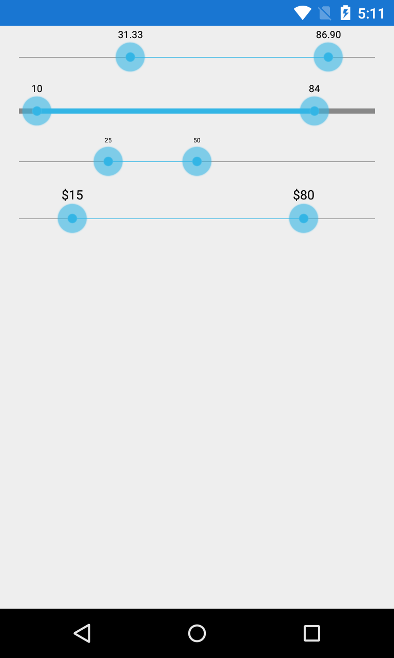 |
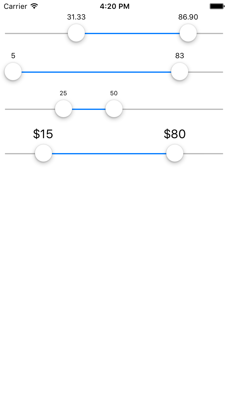 |
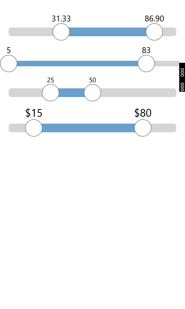 |
Sample project.
<forms:RangeSlider x:Name="RangeSlider" MinimumValue="1" MaximumValue="100" LowerValue="1" UpperValue="100" StepValue="0" StepValueContinuously="False" VerticalOptions="Center" TextSize="15" />public MainPage()
{
InitializeComponent();
RangeSlider.FormatLabel = FormaLabel;
}
private string FormaLabel(Thumb thumb, float val)
{
return DateTime.Today.AddDays(val).ToString("d");
}using Android.Graphics;
using Android.Graphics.Drawables;
using Xamarin.Forms;
using Xamarin.Forms.Platform.Android;
[assembly: ExportEffect(typeof(Droid.Effects.RangeSliderEffect), nameof(Droid.Effects.RangeSliderEffect))]
namespace Droid.Effects
{
public class RangeSliderEffect : PlatformEffect
{
protected override void OnAttached()
{
var themeColor = Xamarin.Forms.Color.Fuchsia.ToAndroid();
var ctrl = (Xamarin.RangeSlider.RangeSliderControl)Control;
ctrl.ActiveColor = themeColor;
var thumbImage = new BitmapDrawable(ctrl.ThumbImage);
thumbImage.SetColorFilter(new PorterDuffColorFilter(themeColor, PorterDuff.Mode.SrcIn));
ctrl.ThumbImage = ConvertToBitmap(thumbImage, ctrl.ThumbImage.Width, ctrl.ThumbImage.Height);
var thumbPressedImage = new BitmapDrawable(ctrl.ThumbPressedImage);
thumbPressedImage.SetColorFilter(new PorterDuffColorFilter(themeColor, PorterDuff.Mode.SrcIn));
ctrl.ThumbPressedImage = ConvertToBitmap(thumbPressedImage, ctrl.ThumbPressedImage.Width, ctrl.ThumbPressedImage.Height);
}
protected override void OnDetached()
{
}
private static Bitmap ConvertToBitmap(Drawable drawable, int widthPixels, int heightPixels)
{
var mutableBitmap = Bitmap.CreateBitmap(widthPixels, heightPixels, Bitmap.Config.Argb8888);
var canvas = new Canvas(mutableBitmap);
drawable.SetBounds(0, 0, widthPixels, heightPixels);
drawable.Draw(canvas);
return mutableBitmap;
}
}
}using Xamarin.Forms;
using Xamarin.Forms.Platform.Android;
[assembly: ExportEffect(typeof(Droid.Effects.RangeSliderEffect), nameof(Droid.Effects.RangeSliderEffect))]
namespace Droid.Effects
{
public class RangeSliderEffect : PlatformEffect
{
protected override void OnAttached()
{
var ctrl = (Xamarin.RangeSlider.RangeSliderControl)Control;
ctrl.DefaultColor = Color.Fuchsia.ToAndroid();
ctrl.ActiveColor = Color.Aqua.ToAndroid();
}
protected override void OnDetached()
{
}
}
}Just replace handle images in the Resources folder.
using Xamarin.Forms;
using Xamarin.Forms.Platform.iOS;

[assembly: ExportEffect(typeof(iOS.Effects.RangeSliderEffect), nameof(iOS.Effects.RangeSliderEffect))]

namespace iOS.Effects
{
    public class RangeSliderEffect : PlatformEffect
    {
        protected override void OnAttached()
        {
            var ctrl = (Xamarin.RangeSlider.RangeSliderControl)Control;
            ctrl.TintColor = Color.Fuchsia.ToUIColor();
        }

        protected override void OnDetached()
        {
        }
    }
}Just throw the element on your storyboard in visual editor.
protected override void OnCreate(Bundle savedInstanceState)
{
    base.OnCreate(savedInstanceState);

    // Set our view from the "main" layout resource
    SetContentView(Resource.Layout.Main);

    var slider = FindViewById<Xamarin.RangeSlider.RangeSliderControl>(Resource.Id.slider);
    slider.SetSelectedMinValue(11);
    slider.SetSelectedMaxValue(16);
}<?xml version="1.0" encoding="utf-8"?>
<LinearLayout xmlns:android="http://schemas.android.com/apk/res/android"
xmlns:local="http://schemas.android.com/apk/res-auto"
android:orientation="vertical"
android:layout_width="match_parent"
android:layout_height="match_parent"
android:minWidth="25px"
android:minHeight="25px">
<xamarin.rangeslider.RangeSliderControl
android:id="@+id/slider"
android:layout_width="match_parent"
android:layout_height="wrap_content"
local:absoluteMinValue="10"
local:absoluteMaxValue="20"
local:showRangeLabels="false"
local:barHeight="1dp"
/>
</LinearLayout>List of available attributes can be found here.