Get the slides here or check it out online here!
Simply, Figma is a digital design and prototyping tool. It is a UI and UX design application that you can use it to create websites, apps, or smaller user interface components that can be integrated into other projects
https://designshack.net/articles/software/what-is-figma-intro/
You can use Figma in two ways: in web browser or download it as desktop app
In this session, we will go with the web browser version, thou, in future you might want to use the desktop version for convenience sake.
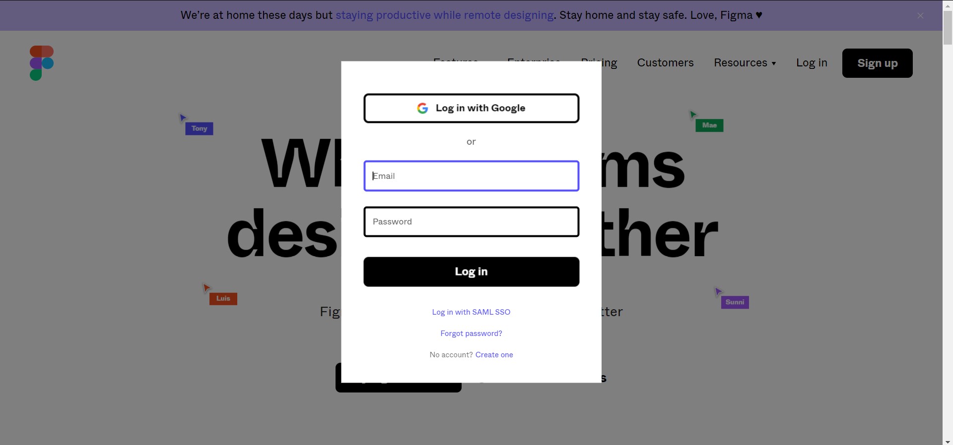
Simply go to figma.com to sign up for an account!
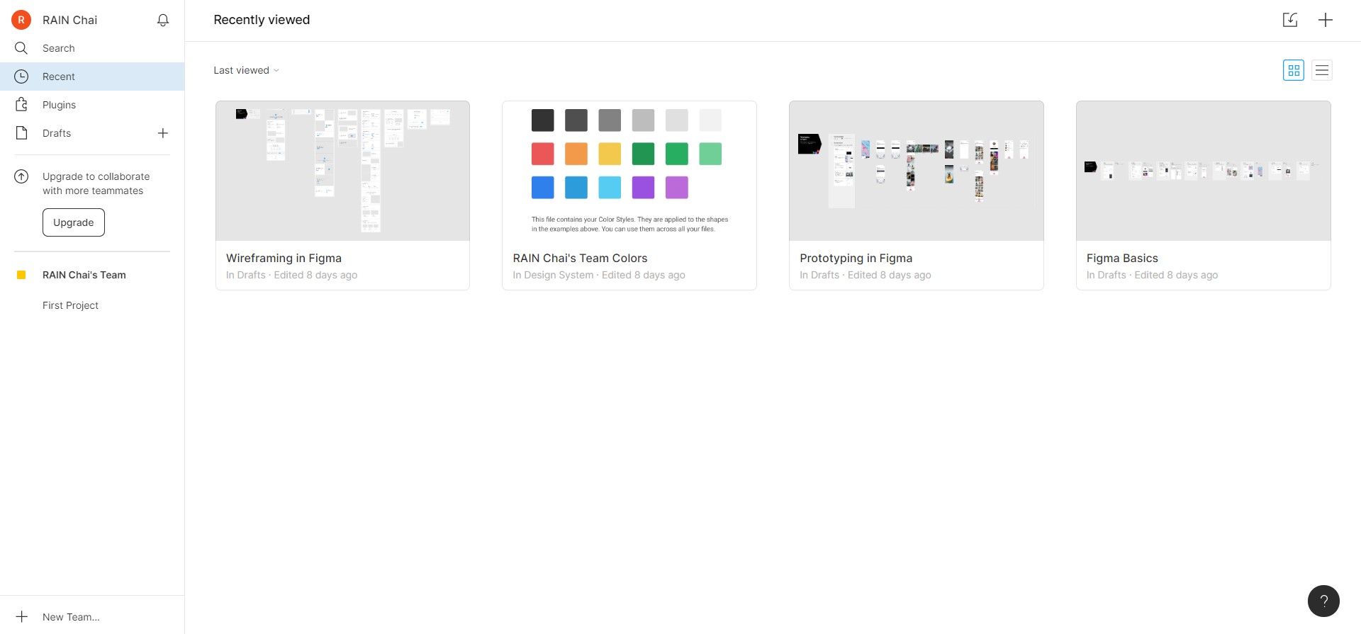
You should see this UI when you successfully created an account
On your left, this is where you can navigate between the sections.
- Search: You can search anything here (board, user, etc...)
- Recent: Your recent opened board will be shown here
- Plugins: You can install plugin here! Strongly recommend HTML to Figma thou
- Drafts: Your own draft will be shown here, we will be using this later!
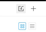
Click Drafts / Recent, on your top right border, you should be able to see this, when you hover on it, you should see "Import" and "Create" tooltips
- Import: You can import figma file here, remember this! We will use this later!
- Create: You can create a new draft using this button!
Now you have everything ready! Let's get started 🎉
In summary, Figma focuses on these 5 features as of 2020:
- Design - Draw your UI!
- Prototyping - Make navigation!
- Collaboration - Google-docs-style editing with your friends!
- Design Systems - Manage all the assets you created
- Plugin - Power-up with external functionality!
In this tutorial, we will focus on design and prototyping, feel free to explore other features!
Firstly, create a new draft:
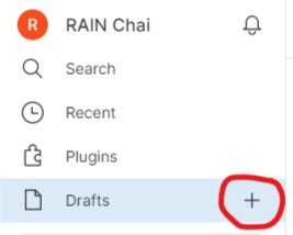
Click the plus button on your sidebar.
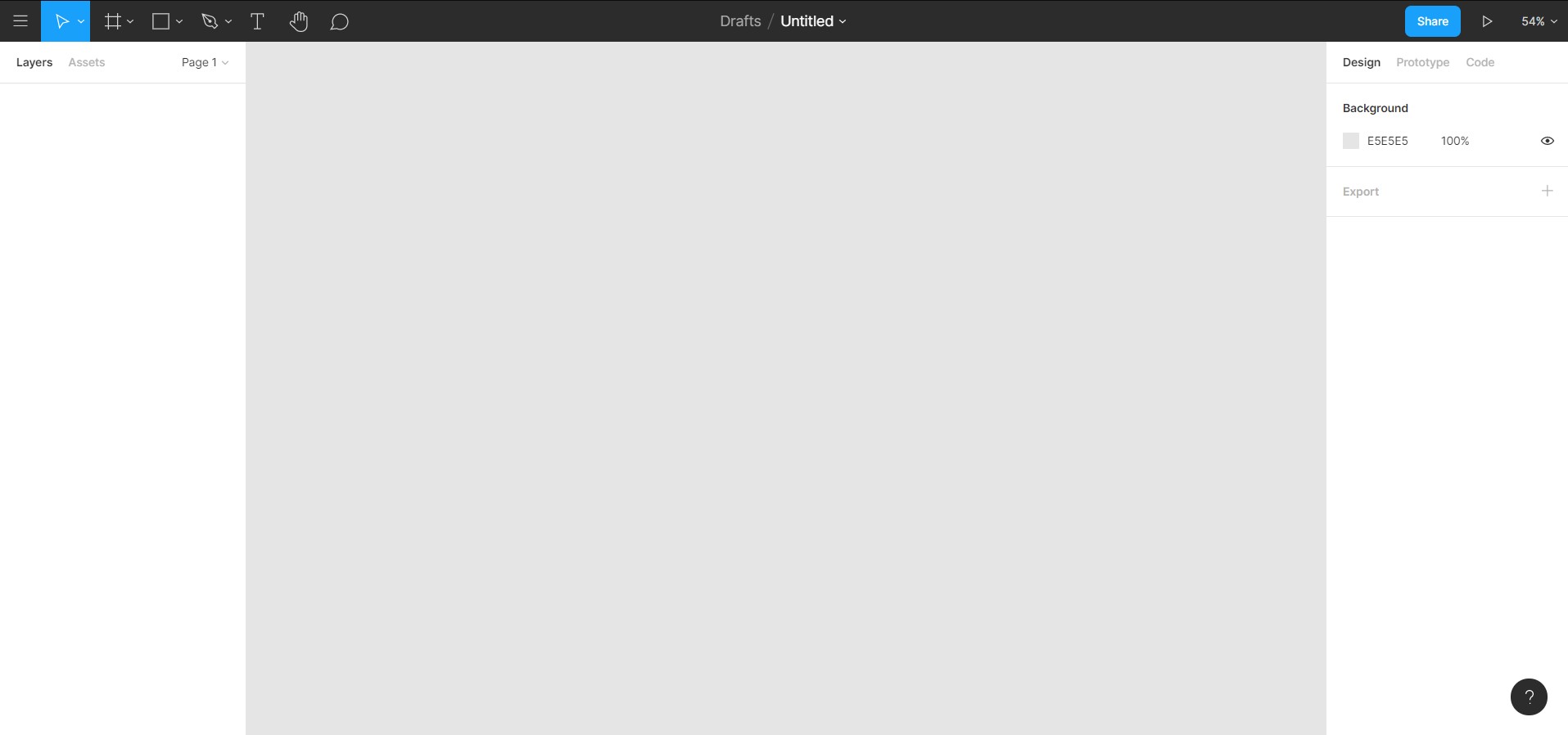
You should see this page
On your left side of the navbar
- File - Open file, edit settings here
- Move tools - Switch between move mode and scale mode
- Frame - Create new frame (desktop, mobile, custom...)
- Shape - Create new shape
- Pen - Create custom shape
- Text - Create text
- Hand tool - A tool for you to pan around
- Comment - Add comment for communication
On your right side of the navbar
- Avatar - you!
- Share - Click this to share this figma draft to your friends!
- Present - To present your prototype
- Zoom
Let's start focusing on the first and the most important feature for Figma --- Design!
Before we design an interface, we will need to set the screen size, is it a design for desktop? Mobile phone? Or tablet?
In order to do this, we can use the frame tool.
Click the # button (third one from the left)
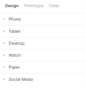
On your right panel, you can see there are different type of frames that you can use! (You can even use figma to design for your social media post!)
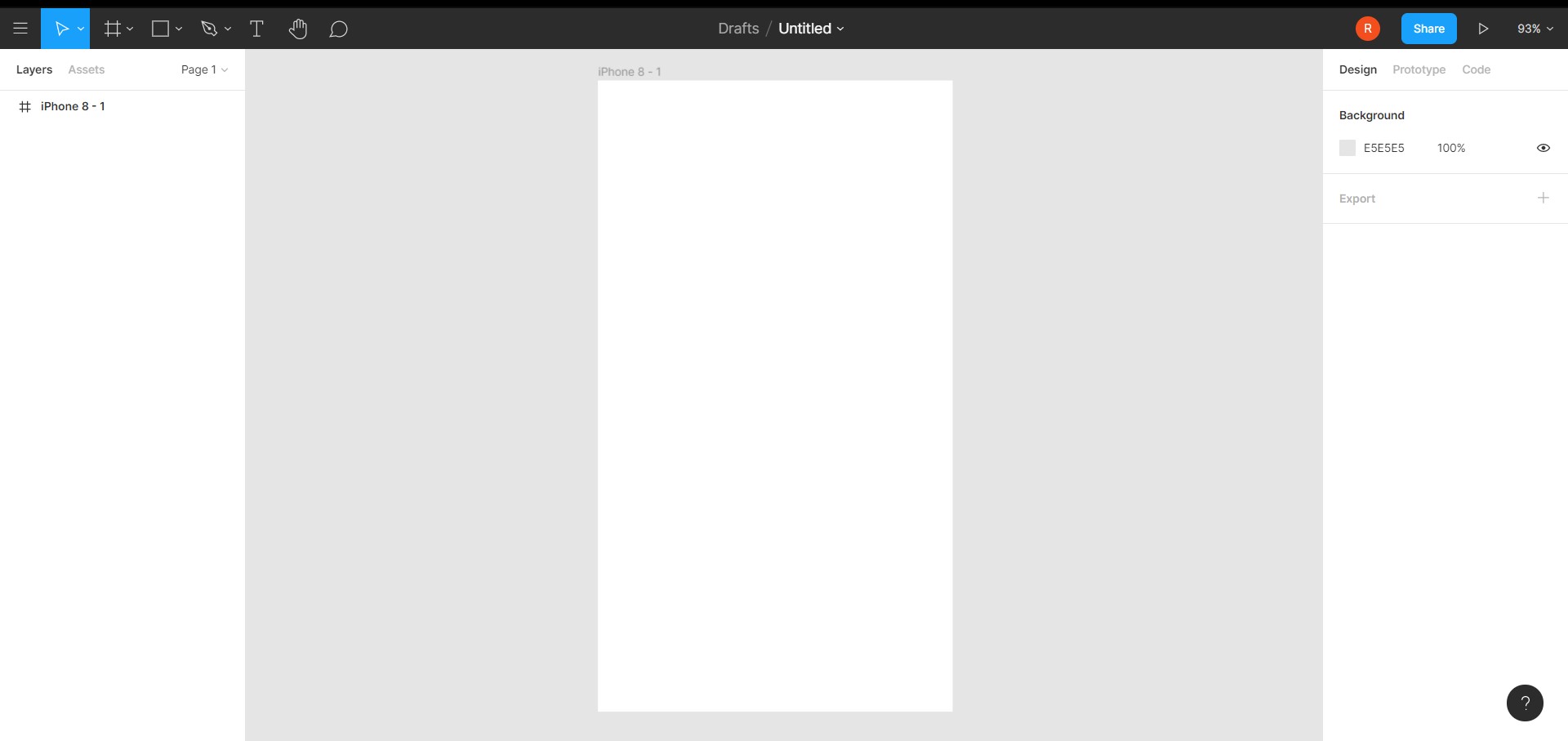
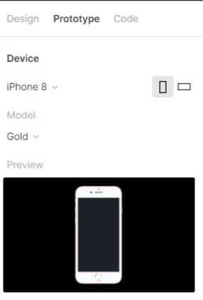
We will choose iPhone 8 frame for now, click the Phone accordion and click iPhone 8.
Now, you have successfully created a frame! Congrats 🎉! Take a coffee break!
If I still have your attention, we can continue to the next step!
Let's start by creating a simple button
Same flow, this time we choose the fourth button (rectangle, r for hotkey)
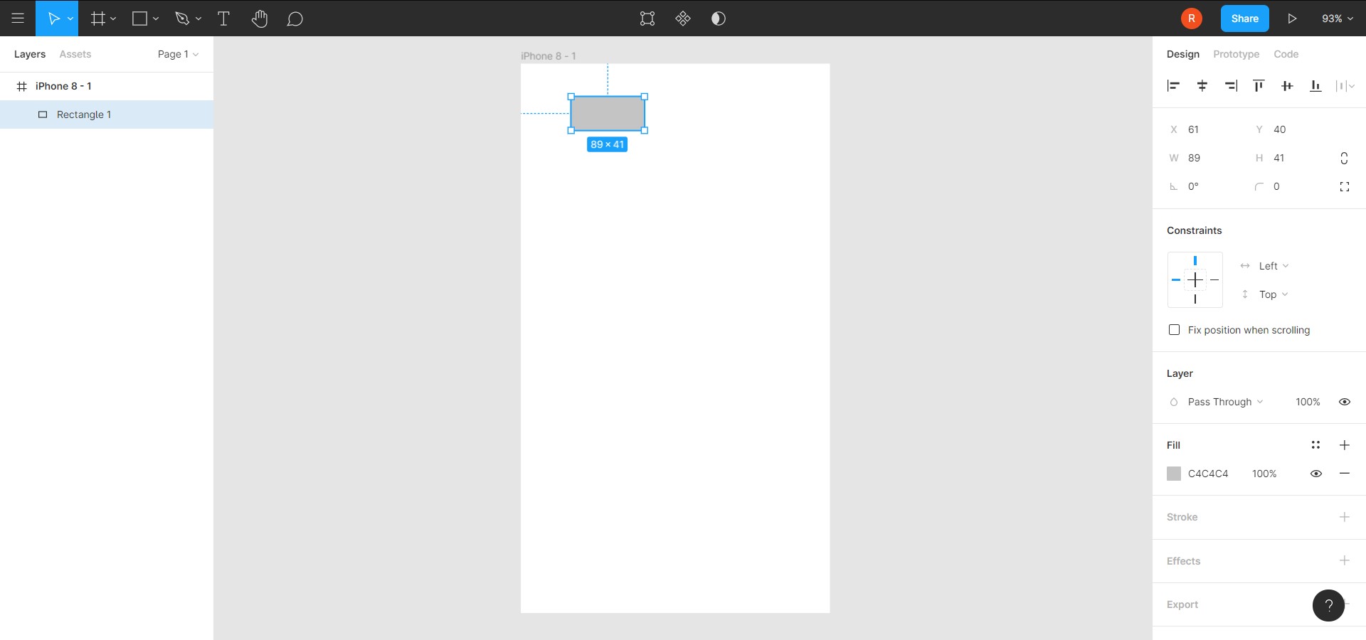
Click and drag in your iPhone frame!
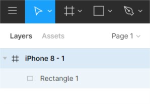
You should ensure that the rectangle is inside the iPhone, to verify, check the tree structure on your left panel
It should be a child element of the iPhone frame.
You might be wondering, why do we need frame? We can just draw a rectangle with white background, and it should achieve the same look right?
Well, the reason is simple, by using frame, it gives you extra functionality like Layout Grids, Auto Layout, Constraints, and Prototyping!
Now let's zoom in to look at a more detail view, you can do this by holding ctrl + scroll wheel (or ctrl and +)
use Hand tool (hotkey H) to pan around, or press the scroll wheel works too.
let's start by creating a simple button!
- Type
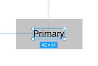
T for text(or the sixth button on the top left navbar), place it on top of the button like this
- The background color of the button is not really good, let's change it to blue!
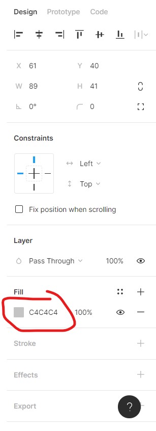
Click the rectangle, and your right panel should look like this
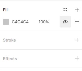
Click the fill section, change the hex color to 007bff.
Change the text color to FFFFFF too (remember to click the text)!
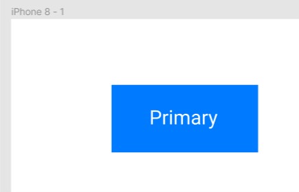
Almost there!
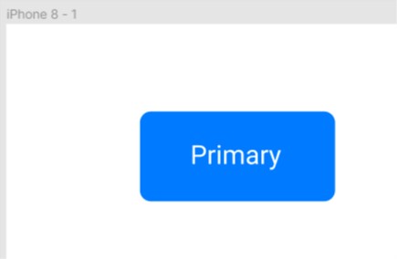
- Our target is to make a button that looks like a button from bootstrap
We are still missing something... the border radius!
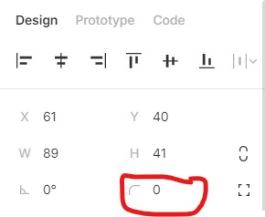
Now, click the blue rectangle, on your right panel, you should see all the values that you can change
We are looking for the border radius, you can change this by adjusting the value of the corner icon, let's change it to 5 (feel free to try out adjusting other values too)!
- We made it! 🎉
The design does not look exactly the same, but I will left that as a challenge for you --- try to create other buttons as well!
To recap, what we had done so far:
- Create a button using the shape tool
- Change the button background and border radius
- Use the text tool
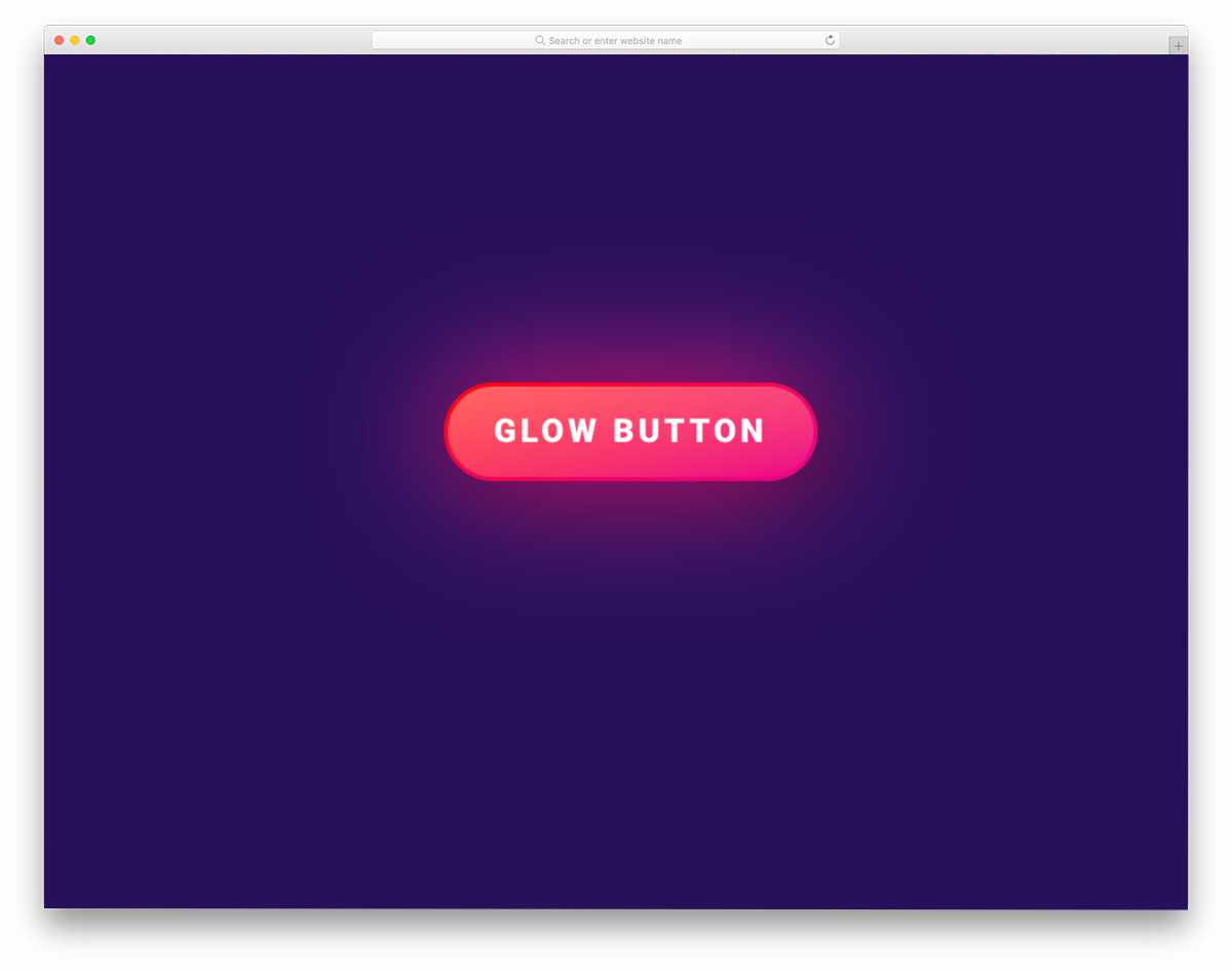
What if we want to have a cool-looking design like this
In order to do this, we need:
- Purple background (
#431462) - Button border color (
#CC0F3A) - Button background color (
#FF5E65and#F01286)
Let's make it!
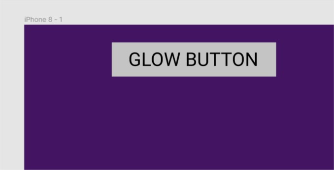
- So firstly, let's change our iPhone background to purple!
- Click the iPhone element on your left panel, you should see the border of the iPhone become blue (highlighted),
- change the fill color into purple
#431462!
- Create a button, use the rectangle tool and text tool
- rectangle width: 139
- rectangle height: 29
- font size: 16
- this will be the output so far
- Let's change the styling of the rectangle
-
Click the + button for the stroke
-
change the fill to
CC0F3A -
You should now see the red border!
- change the border radius of the button to
13 - Here comes the magic --- we need to use Linear effect on our rectangle background
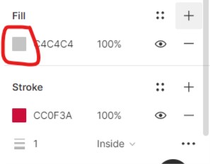
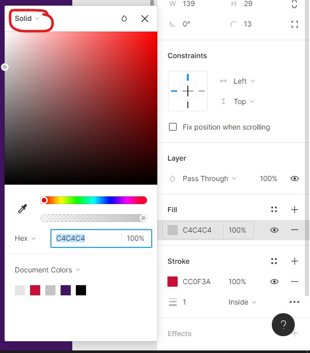
- Click on the square color icon, you should see a panel pop up
- Click the
soliddropdown button and chooselinear
Almost there! Don't give up! ☕ take a coffee break if you will!
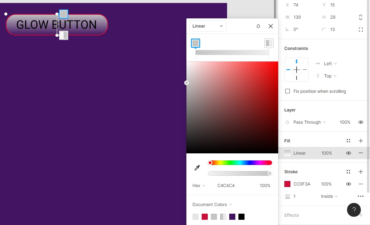
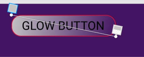
- Click and drag the white dot on top of your rectangle, drag it to the top left border of your rectangle.
- Do the same for the bottom white dot, drag to bottom right.
-
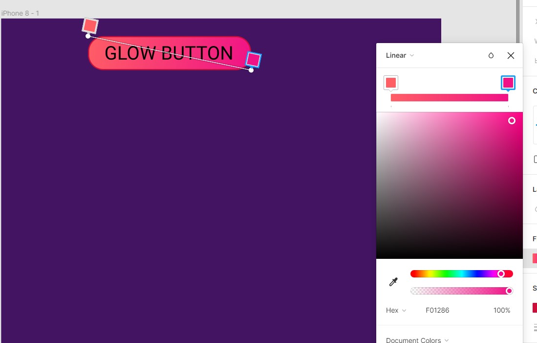
To ensure you are selecting the correct one, click the top left square color icon of the button(just like the image shown above, it should be highlighted)
-
Change the color to
FF5E65 -
Click the square color icon on the bottom right of the rectangle, change the color to
F01286 -
Ensure the opacity is set to max
Current progress
-
Change the text color to white, and font weight to medium (Roboto font)
-
Lastly, we need to apply to drop shadow effect!
-
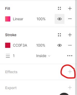
Click on the rectangle again, on your right panel, scroll down and find for
effect, click the + button again
-
You should see it applies the drop shadow effect by default, feel free to click the dropdown button and change to other! But for now we will want to achieve the similar effect from the image.
-
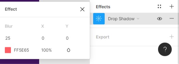
apply the below values
- Result!
🥳 Congrats, you reach another milestone! Are you ready to take the next challenge?
There are a lot of other cool buttons here, try to copy the design and practice! Google and us are your best friends when you encountered any problem, feel free to ask us!
We had learned how to create a button, adjust properties and apply cool effects, let's learn how we can group them to ease our work!
You may realized if you want to move the button, it is tedious to highlight everything and move...
Fret not! Just highlight them and press ctrl + g (or right click and choose "group")!
Now, we are able to move them around like a boss 😎
Let's move it to the middle of the iPhone, simply drag it to the middle, Figma has a built-in alignment feature to let you clip it to the middle (do zoom out, ctrl + scroll wheel if you find it's too zoom in)
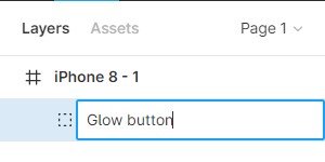
Let's rename our button to a better name rather than just group - 1!
You can do this by clicking the button, and press ctrl + r (or go to the button element on your left panel, right click to find "rename")
I will left the iPhone element for you to rename!
psst: click the Untitled in the middle of the navbar to rename the draft too!
🥳🥳🥳🥳🥳 That sums up our design part of this tutorial! Congrats!
“The secret of getting ahead is getting started.” – Mark Twain.
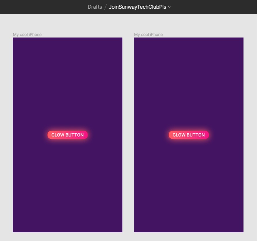
We had just created our first iPhone page, and what if we want to have another page?
Let's start by copy pasting the iPhone, click on the iPhone frame's name, copy and it paste
You should see 2 iPhones now!
We want to achieve:
- when the user click on the first page button, go to next page
We will do it step by step:
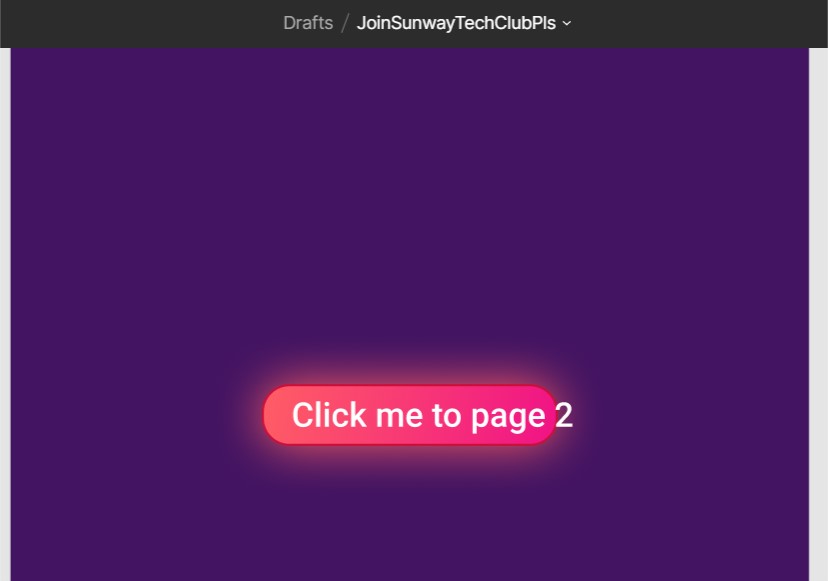
- Change the text of button in the left iPhone to
click me to page 2
GG! The text is a bit off!
We can fix this by either:
- Make the rectangle longer
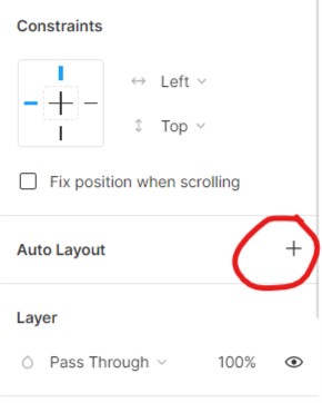
- Apply auto-layout for the button group
We will use second method!
- Roll back by pressing
ctrl + z - Select the button
- Click Auto Layout on your right panel
And try edit the text again... magic!
You can learn more about auto layout here but essentially it's just applying flex property to the element.
-
Change the text of button in the right iPhone to
click me to go back(remember to apply auto layout too!) -
Adjust both buttons to ensure it's in the middle of the iPhones
-
We have everything setup!
-
On your right panel, click on the
Prototypetab
- Now try to hover over you button of your left iPhone
"Everything starts from a dot." -- Wassily Kandinsky
- Click and drag the white dot on the right of your button, point it to the right iPhone
-
Do the same for the right iPhone button: hover, click and drag, pointing to the left iPhone
-
Remember the present button?
Click it! Have fun with the buttons 🤔
Go back to the draft, click the button again
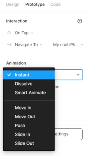
You can set an animation for the navigation!
By default it has no animation
☕🎉 You completed another module!
To collaborate, it's very simple!
You have 2 ways:
- Send link
- Send email invite
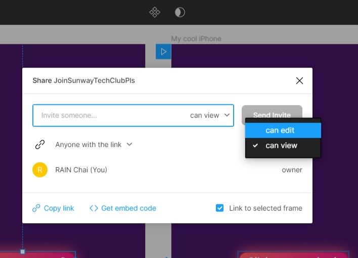
Click on the share button on the right side of your navbar!
You should see a pop-up modal!
Click on the Copy link button, and share it to any of your friend (or you can send to us if you don't have any...☹)
Remember to set the permission to can edit!
Simply enter the email and click send invite!
Sometimes, it's a bit tedious to copy and paste the button all over again, what if we can have a simpler way to do?
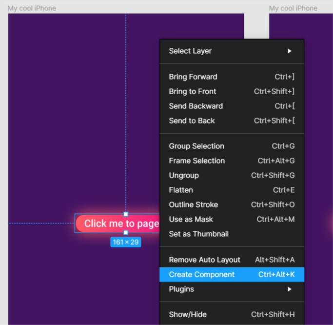
You can achieve this by converting the button into a component!
(Remember to switch to design tab on your right panel)
Click the button on your left iPhone, and right click, select the Create Component
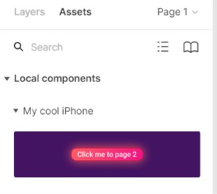
Click on the Assets tab on your left panel, you should be able to see the button here too!
Click and drag it to anywhere!
Components are reusable elements in your design. A header, footer or even a button can be a component. As you reuse a Master component multiple times, any structural change to it in the future will affect all other instances. Components are extremely flexible in Figma. https://designcode.io/figma-components-and-nesting
Now if you change the text on your left, you will see the changes is reflected to your another button too!
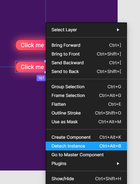
If you do not want it to reflect, you can right click the copied button, select Detach Instance
This feature is extremely useful for repeated component, like navbar, footer, etc!
There are yet more features and functionality to explore in Figma, for example, you can import this plugin HTML to Figma to convert any website into Figma draft!
If you have any question or problem regarding this tutorial, feel free to open an issue here!
Do follow and join us on social media for future events!
