GUI tool for creative coding projects Inspired from dat.GUI. Check out the demo.
npm install guigui --savevar guigui = require('guigui');
var targetObject = {x: 0};
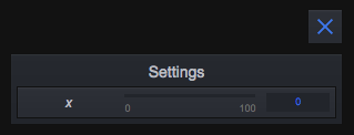
guigui.add(targetObject, 'x');A couple things happened here. First by calling the add Method of guigui, you automatically created a panel called Settings in which your component will go. Then guigui detected the type of the x property from targetObject to be a Number and picked the slider component accordingly.
When possible guigui will auto detect the targeted property type and chose which component should be used. Here are the available components.
Sliderto manipulate numerical values in a given range.Togglera button with a truthy and a falsy state to handle booleans. Equivalent to checkbox.Launchera button to launch a function.Texta text input for string modification.Selecta dropdown select component.ColorpickerTo handle colors.
The select component will be invoked for a Number or a String if the third parameter of the guigui.add() function is an array.
Also the ColorPicker cannot be invoked from the add function. Instead you need to call the guigui.addColorPicker() function.
For all components you can use a third options arguments to configure the component more precisely. See below for more explanations.
// The source object we want to control
const myObject = {
  num: 9,
  name: 'My Object',
  action: () => {},
  isActive: false,
  color: '#FF0000',
  type: 'awesome'
}

// Add some components to control myObject
guigui.add(myObject, 'num')
guigui.add(myObject, 'name')
guigui.add(myObject, 'action')
guigui.add(myObject, 'isActive')

// Special cases, Select and ColorPicker components
guigui.add(myObject, 'type', ['awesome', 'nice', 'crappy'])
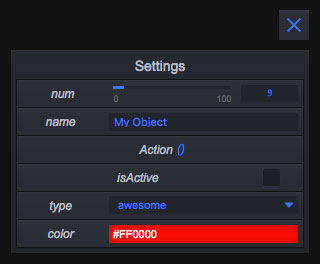
guigui.addColorPicker(myObject, 'color')If you don't do it yourself, guigui will automatically create a panel called Settings when you first use guigui.add(...). You can however create any number of panels yourself with the guigui.addPanel() method.
// manually create panels
const panel1 = guigui.addPanel('Panel1')
const panel2 = guigui.addPanel('Panel2')

// create components inside these panels
const o = {a: 0, b: 1, c: 2}
panel1.add(o, 'a')
panel1.add(o, 'b')
panel2.add(o, 'c')
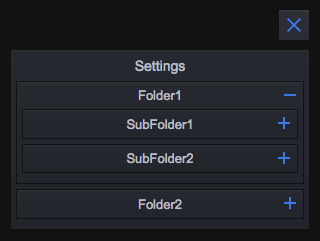
Each panel can contain components and folders. To create a folder in a panel you need to call the guigui.addFolder() method.
// creates folder in guigui default panel
const f1 = guigui.addFolder('Folder1')
const f2 = guigui.addFolder('Folder2')

// add folders to another folder
const subF1 = f1.addFolder('SubFolder1')
const subF2 = f1.addFolder('SubFolder2')Controls a number.
const o = {a: 0.6}

guigui.add(o, 'a', {
  min:      0, // default is 0
  max:      1, // default is 100
  step:   0.1, // default is 1
  label: 'foo', // default is target property's name (here "a")
  watch: false // default is false
})Controls a string.
const o = {a: 'foo'}

guigui.add(o, 'a', {
  label: 'bar' // default is target property's name (here "a")
  watch: false, // default is false
})Controls a boolean.
const o = {a: true}

guigui.add(o, 'a', {
  label: 'foo', // default is target property's name (here "a")
  watch: false // default is false
})Launches a function.
const o = {a: () => {}}

guigui.add(o, 'a', {
  label: 'foo', // default is target property's name (here "a")
  watch: false // default is false
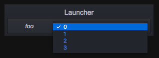
})Changes a value from an array of choices.
const choices = [0, 1, 2, 3]
const o = {a: 0}

guigui.add(o, 'a', choices, {
  label: 'foo', // default is target property's name (here "a")
  watch: false // default is false
})Controls hex colors from string or number. It's also compatible with THREE.js Color class.
const o = {
  css: '#DA5137',
  hex: '#84AF52',
  three: new THREE.Color(0x97C4E9)
}

guigui.addColorPicker(o, 'css', {
  label: 'foo', // default is target property's name (here "css"),
  watch: false // default is false
})
guigui.addColorPicker(o, 'hex')
guigui.addColorPicker(o, 'three')All components can be passed a watch option, a boolean, to specify if the component should auto update when targetObject[property] is changed outside of the Gui. This option defaults to false.
const o = {x: 0, y: 0}
gui.add(o, 'x', {watch: true})
o.x = 1
// our slider component value will be updated to 1

gui.add(o, 'y', {watch: false})
o.y = 2
// our slider component value did not change
Additionnaly all components extend EventEmitter and you can listen for value changes for custom behaviors.
gui.add(o, 'x').on('update', value => {
  // do something with value
})This library was mainly made as an exercise, and also to fill my need for a GUI tool for creative development. I also encountered various annoying behaviors with dat.GUI that i wished to avoid here :
- Slider value representation should ALWAYS be based on the
stepparam. - Sometimes the colorPicker of dat.GUI will become black when trying to edit the text input.
- Min and Max of slider should be displayed.
- Panel Scrolling
- Drag and drop
- Themes
npm install
npm startTo work on demo in local you will want to link your local version of guigui to the one used in the demo folder.
npm link
cd demo
npm link guigui
npm start