This visualization is a contribution to #VisualizeChange the World Humanitarian Summit Data Challenge 2015. The interactive visualization can be accessed here.
Background
Leading up to the first-ever World Humanitarian Summit convened by the United Nations Secretary-General Ban Ki-moon, thousands of people worldwide have shared their ideas to reduce human loss and suffering from crisis. This consultation Process resulted in over 400 Documents giving valuable recommendations. The content of these documents has been qualitatively categorized into emerging themes and sub-themes and the documents have been grouped by various criteria including authorship, national and regional origin etc.
Functionality
This application provides interactive access to data collected. It is not aimed to be an analytical tool in the first place but rather to facilitates the access to thousands of quotations from the collected documents based on the categorization of documents, themes and subthemes.However the visual representation of the data allows for basic analysis such as:
- What are the most relevant topics overall?
- What are the the key themes for specific Stakeholder Groups?
- Which document types refer to which (sub-)themes?
- Which keywords are mentioned by different actors?
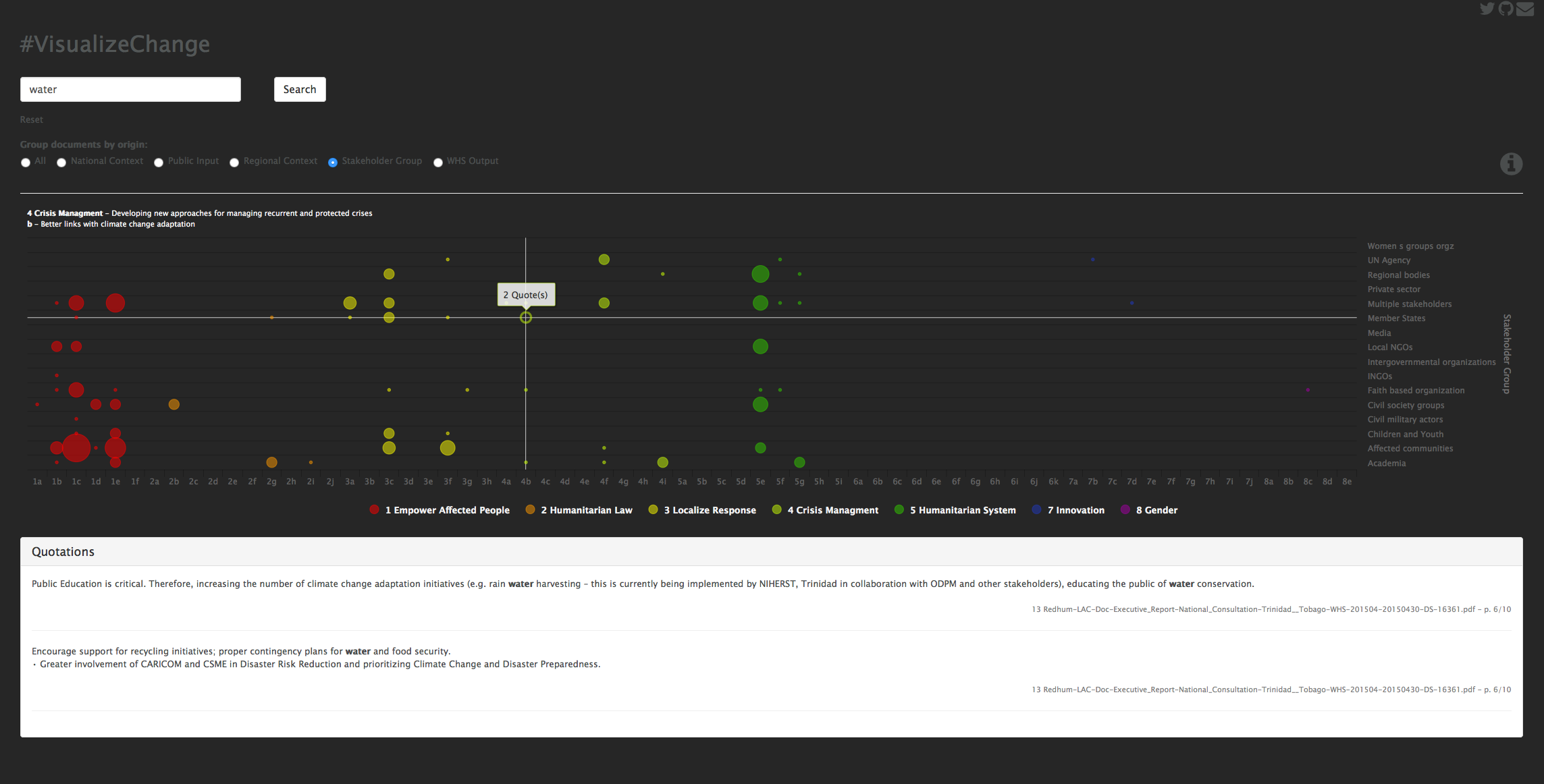
Each bubble in the chart corresponds to one or more quotations. The horizontal position of the bubble indicates the theme and subtheme these quotations are referring to and the vertical position indicates the document type. The size of each bubble corresponds to the number of quotations found. By hovering over a bubble a description of themes and subthemes is shown on top of the chart. By clicking on a bubble a window opens below the chart displaying the original quotations.
The application also provides a search functionality. Entering a keyword in the search field and hitting the search button will filter the database and update the chart based only on those quotations that contain the keyword. The latter will then be highlighted in bold letters in the quotations window. Furthermore the visualization can also be reagroupped based on the categorization of the documents. Choosing between the radio buttons on top of the chart will rearrange the vertical dimension according to the document classification. Since not all documents are assigned a category within each grouping an additional option All is availible which contains all of the documents. Dragging the mouse over a specific area of the chart will zoom into it. This is espacially usefull if there are a lot of document types (National Context) which do not fit on the Axis description.
Copyright (C) 2015  Stephan Schlögl

This program is free software: you can redistribute it and/or modify
it under the terms of the GNU Affero General Public License as published by
the Free Software Foundation, either version 3 of the License, or
(at your option) any later version.

This program is distributed in the hope that it will be useful,
but WITHOUT ANY WARRANTY; without even the implied warranty of
MERCHANTABILITY or FITNESS FOR A PARTICULAR PURPOSE.  See the
GNU Affero General Public License for more details.

You should have received a copy of the GNU Affero General Public License
along with this program.  If not, see <http://www.gnu.org/licenses/>.