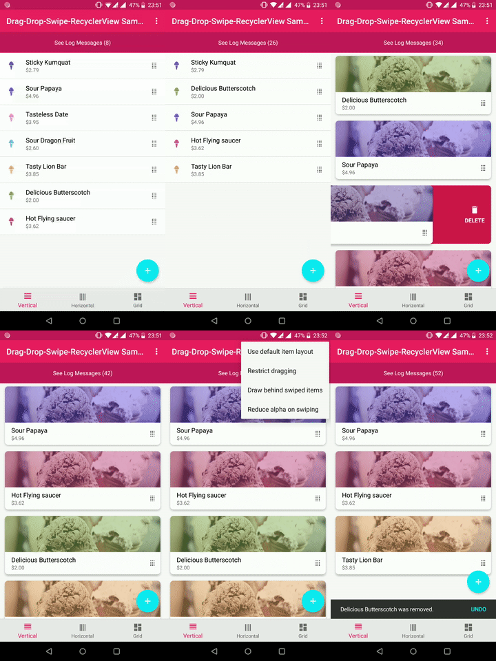
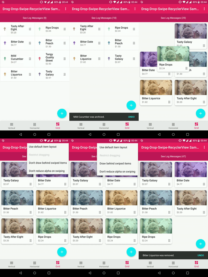
Highly customizable Android library written in Kotlin that uses AndroidX and extends RecyclerView to include extra features, such as support for drag & drop and swipe gestures, among others. It works with vertical, horizontal and grid lists.
The creation (and maintenance) of this library requires time and effort. If you find it useful and want to support it, please use the link below:
Add the library to your project via Gradle:
dependencies {
    implementation 'com.ernestoyaquello.dragdropswiperecyclerview:drag-drop-swipe-recyclerview:0.6.0'
}
NOTE: Make sure you are using AndroidX instead of the old support libraries; otherwise this library might not work.
Place the DragDropSwipeRecyclerview inside your layout using XML:
<!-- layout/view_layout.xml -->
<FrameLayout xmlns:android="http://schemas.android.com/apk/res/android"
    xmlns:app="http://schemas.android.com/apk/res-auto"
    android:layout_width="match_parent"
    android:layout_height="match_parent">

    <com.ernestoyaquello.dragdropswiperecyclerview.DragDropSwipeRecyclerView
        android:id="@+id/list"
        android:layout_width="match_parent"
        android:layout_height="match_parent"
        app:item_layout="@layout/list_item_layout"
        app:divider="@drawable/list_divider"/>

</FrameLayout>
As you can see in the code above, we specify the list item layout through the attribute item_layout. This way, the library will take care of inflating the item layout automatically, so you won't have to do it manually in the adapter.
In addition, in this example you can also see that the optional attribute divider is being used to specify the drawable that will be displayed between list items (for more information about available attributes, see Customization).
Just in case they are of any help, these are the example resource files referenced in the code above:
<!-- layout/list_item_layout.xml -->
<LinearLayout xmlns:android="http://schemas.android.com/apk/res/android"
    android:layout_width="match_parent"
    android:layout_height="wrap_content"
    android:orientation="horizontal"
    android:gravity="center"
    android:padding="16dp"
    android:background="#eeeeee">
    <TextView
        android:id="@+id/item_text"
        android:layout_width="0dp"
        android:layout_weight="1"
        android:layout_height="wrap_content"/>
    <ImageView
        android:id="@+id/drag_icon"
        android:layout_width="wrap_content"
        android:layout_height="match_parent"
        android:src="@drawable/ic_drag"/>
</LinearLayout>
<!-- drawable/list_divider.xml --> <shape xmlns:android="http://schemas.android.com/apk/res/android" android:shape="rectangle"> <size android:height="1dp" /> <solid android:color="#e1e1e1" /> </shape><!-- drawable/ic_drag.xml --> <vector xmlns:android="http://schemas.android.com/apk/res/android" android:width="24dp" android:height="24dp" android:viewportHeight="24.0" android:viewportWidth="24.0"> <path android:fillColor="#333333" android:pathData="M7,19V17H9V19H7M11,19V17H13V19H11M15,19V17H17V19H15M7,15V13H9V15H7M11,15V13H13V15H11M15,15V13H17V15H15M7,11V9H> 9V11H7M11,11V9H13V11H11M15,11V9H17V11H15M7,7V5H9V7H7M11,7V5H13V7H11M15,7V5H17V7H15Z" /> </vector>
The next step is to implement your adapter (and viewholder) by extending the class DragDropSwipeAdapter<T, U>, where T will be your item type and U will be your viewholder type:
class MyAdapter(dataSet: List<String> = emptyList())
    : DragDropSwipeAdapter<String, MyAdapter.ViewHolder>(dataSet) {

    class ViewHolder(itemView: View) : DragDropSwipeAdapter.ViewHolder(itemView) {
        val itemText: TextView = itemView.findViewById(R.id.item_text)
        val dragIcon: ImageView = itemView.findViewById(R.id.drag_icon)
    }

    override fun getViewHolder(itemLayout: View) = MyAdapter.ViewHolder(itemLayout)

    override fun onBindViewHolder(item: String, viewHolder: MyAdapter.ViewHolder, position: Int) {
        // Here we update the contents of the view holder's views to reflect the item's data
        viewHolder.itemText.text = item
    }

    override fun getViewToTouchToStartDraggingItem(item: String, viewHolder: MyAdapter.ViewHolder, position: Int): View? {
        // We return the view holder's view on which the user has to touch to drag the item
        return viewHolder.dragIcon
    }
}
This is just a basic implementation, but there are more methods in the adapter that you can override to customize the list and its behaviour (see Customization).
Finally, you should setup the list to make it work and take advantage of its features.
Inside onCreate or onCreateView, find the list and set it with a layout manager and your adapter:
val dataSet = listOf("Item 1", "Item 2", "Item 3")
mAdapter = MyAdapter(dataSet)
mList = findViewById(R.id.list)
mList.layoutManager = LinearLayoutManager(this)
mList.adapter = mAdapter
Then, specify the list orientation. For example:
mList.orientation = DragDropSwipeRecyclerView.ListOrientation.VERTICAL_LIST_WITH_VERTICAL_DRAGGINGTake into account that if and only if you want to show dividers in a list with a grid orientation, you also need to set one of these two properties:
// Set this property if your grid can be scrolled vertically
mList.numOfColumnsPerRowInGridList = <numberOfColumns>
Or:
// Set this property if your grid can be scrolled horizontally mList.numOfRowsPerColumnInGridList = <numberOfRows>In case you want to disallow dragging or swiping actions in certain directions, you can do the following right after specifying the list orientation:
// This disallows swiping items to the right
mList.disableSwipeDirection(ListOrientation.DirectionFlag.RIGHT)
Or:
// This disallows dragging items up
mList.disableDragDirection(ListOrientation.DirectionFlag.UP)
Finally, create event listeners for the events you want to handle. For example, these are the listeners for actions of swiping, dragging & dropping and scrolling:
private val onItemSwipeListener = object : OnItemSwipeListener<String> {
    override fun onItemSwiped(position: Int, direction: OnItemSwipeListener.SwipeDirection, item: String): Boolean {
        // Handle action of item swiped
        // Return false to indicate that the swiped item should be removed from the adapter's data set (default behaviour)
        // Return true to stop the swiped item from being automatically removed from the adapter's data set (in this case, it will be your responsibility to manually update the data set as necessary)
        return false
    }
}

private val onItemDragListener = object : OnItemDragListener<String> {
    override fun onItemDragged(previousPosition: Int, newPosition: Int, item: String) {
        // Handle action of item being dragged from one position to another
    }

    override fun onItemDropped(initialPosition: Int, finalPosition: Int, item: String) {
        // Handle action of item dropped
    }
}

private val onListScrollListener = object : OnListScrollListener {
    override fun onListScrollStateChanged(scrollState: OnListScrollListener.ScrollState) {
        // Handle change on list scroll state
    }

    override fun onListScrolled(scrollDirection: OnListScrollListener.ScrollDirection, distance: Int) {
        // Handle scrolling
    }
}
Then, set the listeners...
mList.swipeListener = onItemSwipeListener
mList.dragListener = onItemDragListener
mList.scrollListener = onListScrollListener
And that's it! Your list with support for swipe and drag & drop should be fully working now.
There are several XML attributes that you can set in the DragDropSwipeRecyclerView in order to customize the style of the list and its items:
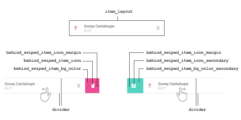
The layout that will be used to populate each list item.
It can also be set in code doing
mList.itemLayoutId = R.layout.your_layout
The drawable that will be displayed as a divider between list items. If set to null, no divider will be drawn. Null by default.
Please note that, for vertical lists, the divider drawable's height must be defined. In the same way, horizontal lists need a divider drawable with a defined width, and grid lists need a divider drawable with both width and height defined. Also note that the divider should have no transparency to be drawn correctly at all times.
It can also be set in Kotlin:
mList.dividerDrawableId = R.drawable.your_divider
The drawable of the icon to display behind an item that is being swiped in the default direction (i.e., left for horizontal swiping and down for vertical swiping). If set to null, no icon will be displayed behind swiped items. Null by default.
Please note that if there is a secondary icon defined (i.e., if behind_swiped_item_icon_secondary is defined), this icon will only be displayed when swiping in the default direction (i.e., left or down). However, if there isn't a secondary icon defined, this one will be displayed when swiping in any direction.
It can also be set in Kotlin:
mList.behindSwipedItemIconDrawableId = R.drawable.your_icon
The drawable of the icon to display behind an item that is being swiped in the secondary direction (i.e., right for horizontal swiping and up for vertical swiping). If set to null, the main icon -if defined- will be the only one to be displayed in all swipe directions. Null by default.
It can also be set in Kotlin:
mList.behindSwipedItemIconSecondaryDrawableId = R.drawable.your_icon
The distance between the icon displayed behind an item that is being swiped and the side of the item from which the swiping started. 0 if not specified; ignored if behind_swiped_item_icon_centered is true.
It can also be set in Kotlin:
mList.behindSwipedItemIconMargin = <margin_value_as_float>
Determines whether the icon displayed behind an item that is being swiped should be centered. If true, the icon will be centered; if false, the icon will be displayed near the side from which the swiping started. False by default.
It can also be set in Kotlin:
mList.behindSwipedItemCenterIcon = true
The background color to be displayed behind an item that is being swiped in the default direction (i.e., left for horizontal swiping and down for vertical swiping). If set to null, no color will be displayed behind items that are being swiped. Null by default.
Please note that if there is a secondary color defined (i.e., if behind_swiped_item_bg_color_secondary is defined), this one will only be displayed when swiping in the default direction (i.e., either left or down). However, if there isn't a secondary color defined, it will be displayed when swiping in any direction.
It can also be set in Kotlin:
mList.behindSwipedItemBackgroundColor = <color_value_as_integer>
The background color to be displayed behind an item that is being swiped in the secondary direction (i.e., right for horizontal swiping and up for vertical swiping). If set to null, the main background color -if defined- will be the only one to be displayed in all swipe directions. Null by default.
It can also be set in Kotlin:
mList.behindSwipedItemBackgroundSecondaryColor = <color_value_as_integer>
Determines whether the item that is being swiped should appear more transparent the further it gets from its original position. False by default.
It can also be set in Kotlin:
mList.reduceItemAlphaOnSwiping = true
Determines whether the start of the dragging action will be triggered by a long press or by a standard one. True for long press; false for standard press. False by default.
It can also be set in Kotlin:
mList.longPressToStartDragging = true
In case you want to create your own layouts to display behind the swiped items, you can use these two attributes:
The custom layout to be displayed behind an item that is being swiped. If it is set to null, no custom layout will be displayed behind swiped items. Null by default.
Please note that if there is a secondary layout defined (i.e., if behind_swiped_item_custom_layout_secondary is not null), this one will only be displayed when swiping in the default direction (i.e., either left or down). However, if there isn't a secondary layout defined, this one will be displayed when swiping in any direction.
It can also be set in Kotlin:
mList.behindSwipedItemLayoutId = R.layout.your_custom_layout
The custom layout to be displayed behind an item that is being swiped in the secondary direction (i.e., right for horizontal swiping and up for vertical swiping). If set to null, the main custom layout -if defined- will be the only one to be displayed in all swipe directions. Null by default.
It can also be set in Kotlin:
mList.behindSwipedItemSecondaryLayoutId = R.layout.your_custom_layout
Some of the adapter methods can be extended to customize the layout that will be displayed behind a specific item when swiped:
Called automatically to get the ID of the layout that will be displayed behind this specific item when swiped in the main direction (i.e., when swiped either left or down). If there isn't a secondary layout ID defined for this item, this one will also be displayed behind the item when swiped in the secondary direction (i.e., either right or up).
If set, the layout will be accessible for customization inside onBindViewHolder() via holder.behindSwipedItemLayout.
If null, this will be ignored and the default behind-swiped layout of the list, if any, will be used. Null by default.
itemThe item as read from the corresponding position of the data set.
viewHolderThe corresponding view holder.
positionThe position of the item within the adapter's data set.
returnsThe ID of the layout that will be displayed behind this item when swiping it.
Called automatically to get the ID of the layout that will be displayed behind this specific item when swiped in the secondary direction (i.e., when swiped either right or up).
If set, the layout will be accessible for customization inside onBindViewHolder() via holder.behindSwipedItemSecondaryLayout.
If null, this will be ignored and the main behind-swiped layout of this item, if any, will be used. If there isn't one, the default behind-swiped layout of the list, if any, will be used. Null by default.
itemThe item as read from the corresponding position of the data set.
viewHolderThe corresponding view holder.
positionThe position of the item within the adapter's data set.
returnsThe ID of the layout that will be displayed behind this item when swiping it in the secondary direction.
Some of the adapter methods can be extended to customize the behaviour of the list items:
Called automatically to get the item view on which the user has to touch to drag the item. If it returns null, the main view of the item will be used for dragging.
itemThe item as read from the corresponding position of the data set.
viewHolderThe corresponding view holder.
positionThe position of the item within the adapter's data set.
returnsThe item view on which the user has to touch to drag the item, or null if the view of the item that will be used for dragging is the main one.
Called automatically to know if the specified item can be dragged.
itemThe item as read from the corresponding position of the data set.
viewHolderThe corresponding view holder.
positionThe position of the item within the adapter's data set.
returnsTrue if the item can be dragged; false otherwise. True by default.
Called automatically to know if the specified item accepts being exchanged by another one being dropped over it.
itemThe item as read from the corresponding position of the data set.
viewHolderThe corresponding view holder.
positionThe position of the item within the adapter's data set.
returnsTrue if the item accepts to be exchanged with another one being dragged over it; false otherwise. True by default.
Called automatically to know if the specified item can be swiped.
itemThe item as read from the corresponding position of the data set.
viewHolderThe corresponding view holder.
positionThe position of the item within the adapter's data set.
returnsTrue if the item can be swiped; false otherwise. True by default.
Some of the adapter methods are callbacks that can be extended to customize the items after certain events, such as DragStarted, SwipeStarted, IsDragging, IsSwiping, DragFinished, SwipeFinished, etc. For example, you might want to update some of the item's views to change its appearance whenever the item is being dragged or swiped.
On this regard, please note that these methods are intended for item customization only. If you just want to be aware of the occurrence of basic list events (e.g., onItemDragged, onItemDropped, onItemSwiped), all you need to do is to subscribe to the listeners of the DragDropSwipeRecyclerView (see above the section How to use it).
Called when the dragging starts.
itemThe item as read from the corresponding position of the data set.
viewHolderThe view holder for which the dragging action has started.
Called when the swiping starts.
itemThe item as read from the corresponding position of the data set.
viewHolderThe view holder for which the swiping action has started.
onIsDragging(item: T?, viewHolder: U, offsetX: Int, offsetY: Int, canvasUnder: Canvas?, canvasOver: Canvas?, isUserControlled: Boolean)
Called when the dragging action (or animation) is occurring.
itemThe item as read from the corresponding position of the data set. It may be null in the unusual case when the dragged item is being momentaneously repositioned to an inexistent position by the system.
viewHolderThe view holder for which the dragging action is occurring.
offsetXThe offset in the X axis caused by the horizontal movement of the item. This offset is the distance measured from the current position of the item, which may be a different position than the one the item initially had when the dragging action started (the position of an item can change while the item is being dragged).
offsetYThe offset in the Y axis caused by the vertical movement of the item. This offset is the distance measured from the current position of the item, which may be a different position than the one the item initially had when the dragging action started (the position of an item can change while the item is being dragged).
canvasUnderA canvas positioned just in front of the recycler view and behind all its items.
canvasOverA canvas positioned just in front of the recycler view and all its items.
isUserControlledTrue if the item is still being controlled manually by the user; false if it is just being animated automatically by the system after the user has stopped touching it.
onIsSwiping(item: T?, viewHolder: U, offsetX: Int, offsetY: Int, canvasUnder: Canvas?, canvasOver: Canvas?, isUserControlled: Boolean)
Called when the swiping action (or animation) is occurring.
itemThe item as read from the corresponding position of the data set. It may be null if this method is being called because the item layout is still being animated by the system but the item itself has already been removed from the data set.
viewHolderThe view holder for which the swiping action is occurring.
offsetXThe offset in the X axis caused by the horizontal movement of the item.
offsetYThe offset in the Y axis caused by the vertical movement of the item.
canvasUnderA canvas positioned just in front of the recycler view and behind all its items.
canvasOverA canvas positioned just in front of the recycler view and all its items.
isUserControlledTrue if the item is still being controlled manually by the user; false if it is just being animated automatically by the system (which is usually the case when the system is finishing the swiping animation in order to move the item to its final position right after the user has already stopped touching it).
Called when the dragging finishes (i.e., when the item is dropped).
itemThe item as read from the corresponding position of the data set.
viewHolderThe view holder for which the dragging action has finished.
Called when the swiping animation executed by the system to complete the swiping has finished. At the time this method gets called, the item has already been removed from the data set.
viewHolderThe view holder for which the swiping animation has finished.
Check out the Sample App that is included in this repository: it has vertical lists, horizontal lists and grid lists, and it makes use of most of the library's features.
Feel free to contribute to this library, any help will be welcomed!
Licensed under the Apache License, Version 2.0 (the "License");
you may not use this file except in compliance with the License.
You may obtain a copy of the License at

   http://www.apache.org/licenses/LICENSE-2.0

Unless required by applicable law or agreed to in writing, software
distributed under the License is distributed on an "AS IS" BASIS,
WITHOUT WARRANTIES OR CONDITIONS OF ANY KIND, either express or implied.
See the License for the specific language governing permissions and
limitations under the License.


