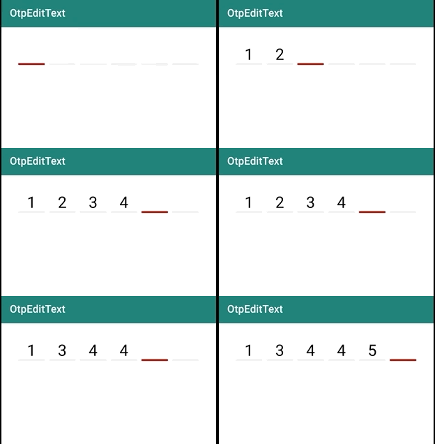
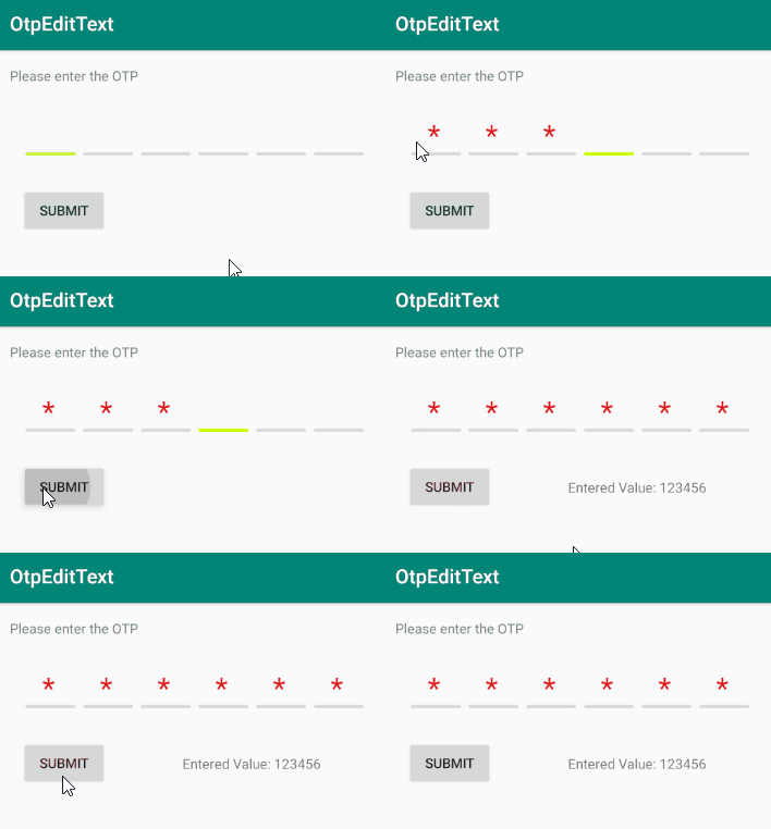
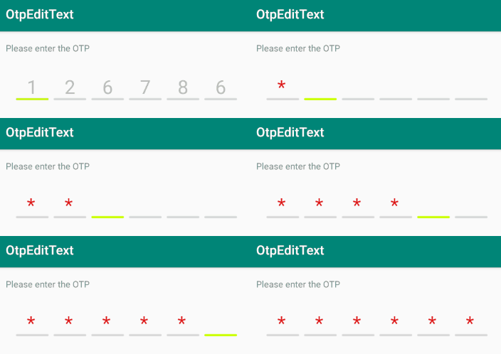
A customised EditText view serving the purpose of taking numeric One Time Password from a user. With stunning animation, and high customizability.
- Add custom character limit.
- Animation supported on wrong input
- Use your own color scheme.
- Do not allow user changing cursor position for smooth functioning.
- Hint is supported!
Step 1: Add it in your root build.gradle at the end of repositories:
allprojects {
    repositories {
        maven { url "https://jitpack.io" }
    }
}
Step 2. Add the dependency
dependencies {
    implementation 'com.github.swapnil1104:OtpEditText:{current_lib_ver}'
}
Step 3. Add OtpEditText to your layout file
<com.broooapps.otpedittext2.OtpEditText
    android:layout_width="match_parent"
    android:layout_height="wrap_content"
    android:clickable="false"
    android:cursorVisible="false"
    android:digits="0123456789"
    android:inputType="number"
    android:maxLength="6"
    android:padding="8dp"
    android:textSize="30sp"
    app:oev_primary_color="@color/red"
    app:oev_secondary_color="@color/light_gray"
    />
String otpValue = otpEditText.getOtpValue();
if (otpValue != null) {
    textDisplay.setText("Entered Value: " + otpEditText.getOtpValue());
}
This method when invoked, will either return the OTP value, in case this is invoked before the user inputs the desired length of characters, a shake animation will be triggered implicitly.
To trigger error animation for incorrect input, or any other use case, use.
OtpEditText otpEditText;
....
otpEditText = findViewById(R.id.oev_view);
....
//Invalid input, animation triggered
otpEditText.triggerErrorAnimation();
To set custom length of the OtpEditText, use
android:maxLength="{your length}"
This will automatically generate the right amount of boxes for user to input the code in.
The primary color signifies the boundary of the box that requires input from user. To change that use,
app:oev_primary_color="@color/{your_color}"
The secondary color signifies the boundary of the boxes that do not require input from user. To change that use,
app:oev_secondary_color="@color/{your_color}"
There are 4 style options that are available within the library for now.
- rounded box
- square box
- underline
- rounded underline
To use any of these styles, please add app:oev_box_style="@string\{box_style_input}"
attribue.
I have provided string resources for simpler usage.
    <string name="style_square">square_box</string>
    <string name="style_rounded">rounded_box</string>
    <string name="style_underline">underline</string>
    <string name="style_rounded_underline">rounded_underline</string>
Suppose you want the rounded underline option to be displayed. Then, please add:
app:oev_box_style="@string/style_rounded_underline" in the OtpEditText xml code.
Functionality to mask the input with any special character has been introduced. To mask the input;
app:oev_mask_input="true"
xml property must be introduced in the XML layout file.
To mask input with any character other than * you can do the following;
app:oev_mask_character="ø"
P.S. Please note that, in case of masking with a special character other than *, specify string with length one, otherwise the input string will be truncated to length 1.
To implement an OnComplete callback, use setOnCompleteListener setter method and pass on an interface implementation.
eg:
editText.setOnCompleteListener(new OnCompleteListener() {
        @Override
        public void onComplete(String value) {
            Toast.makeText(MainActivity.this, "Completed " + value, Toast.LENGTH_SHORT).show();
        }
    });
This callback will be triggered when the number of characters is equal to the android:maxLength value.
- Specify
android:textSizeaccording to your needs. - Specify
android:paddingaccording to your needs, there are no paddings drawn by default. - Specify
android:layout_heightaccording to thetextSizeyou've provided. The view will try to center the text with a vertical biasing of0.6f.


