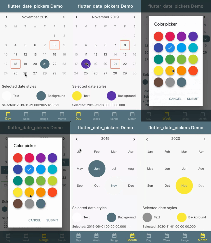
Allows to use date pickers without dialog. Provides some customizable styles for date pickers.
A set of date pickers:
DayPickerfor one dayWeekPickerfor whole weekRangePickerfor random rangeMonthPickerfor month
Every date picker constructor take a style object as a parameter (if no styles passed - defaults will be used).
For single value pickers (DayPicker, MonthPicker) it is DatePickerStyles object;
For range pickers (WeekPicker, RangePickers) it is DatePickerRangeStyles object;
Customizable styles: for all date pickers
| Property | Description |
|---|---|
| TextStyle displayedPeriodTitle | title of the date picker |
| TextStyle currentDateStyle | style for current date |
| TextStyle disabledDateStyle | style for disabled dates (before first and after last date user can pick) |
| TextStyle selectedDateStyle | style for selected date |
| BoxDecoration selectedSingleDateDecoration | decoration for selected date in case single value is selected |
| TextStyle defaultDateTextStyle | style for date which is neither current nor disabled nor selected |
only for range date pickers (WeekPicker, RangePicker)
| Property | Description |
|---|---|
| BoxDecoration selectedPeriodStartDecoration | decoration for the first date of the selected range |
| BoxDecoration selectedPeriodLastDecoration | decoration for the first date of the selected range |
| BoxDecoration selectedPeriodMiddleDecoration | Decoration for the date of the selected range which is not first date and not end date of this range |
By default only dates before firstDate and after lastDate are not selectable. But you can set custom disabled days.
DayPicker, WeekPicker and RangePicker take a SelectableDayPredicate selectableDayPredicate
where you can specify function which returns if some date is disabled or not.
If some date is disabled for selection it gets disabledDateStyle.
If selected range or week pretends to include such disabled date UnselectablePeriodException occurs.
To handle it - pass onSelectionError callback to date picker.
By default cells are decorated with datePickerStyles slyles (or default if no styles was passed to date picker).
If you need special decoration for some days use eventDecorationBuilder.
Currently only for DayPicker, WeekPicker and RangePicker.
- If date is not selected basic styles will be merged with styles from
eventDecorationBuilder. - If date is current date styles from
eventDecorationBuilderwin (if there are). - Otherwise basic styles (
datePickerStyles) win.
If one day selected:
you will get start of the day (00:00:00) by default. If selected firstDate - you will get time of it.
If range/week selected:
for start you will get start of the day (00:00:00) by default. If selected firstDate - you will get time of it.
for end you will get end of the day (23:59:59.999) by default. If selected lastDate - you will get time of it.
If month selected:
you will get start (00:00:00) of the 1 day of month by default.
If selected month same as month of the firstDate - you will get firstDate.
// Create week date picker with passed parameters
Widget buildWeekDatePicker (DateTime selectedDate, DateTime firstAllowedDate, DateTime lastAllowedDate, ValueChanged<DatePeriod> onNewSelected) {

 // add some colors to default settings
    DatePickerRangeStyles styles = DatePickerRangeStyles(
      selectedPeriodLastDecoration: BoxDecoration(
          color: Colors.red,
          borderRadius: BorderRadius.only(
              topRight: Radius.circular(10.0),
              bottomRight: Radius.circular(10.0))),
      selectedPeriodStartDecoration: BoxDecoration(
        color: Colors.green,
        borderRadius: BorderRadius.only(
            topLeft: Radius.circular(10.0), bottomLeft: Radius.circular(10.0)),
      ),
      selectedPeriodMiddleDecoration: BoxDecoration(
          color: Colors.yellow, shape: BoxShape.rectangle),
    );

  return WeekPicker(
      selectedDate: selectedDate,
      onChanged: onNewSelected,
      firstDate: firstAllowedDate,
      lastDate: lastAllowedDate,
      datePickerStyles: styles
  );
}Please checkout example.
For help getting started with Flutter, view our online documentation, which offers tutorials, samples, guidance on mobile development, and a full API reference.
