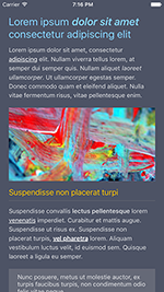
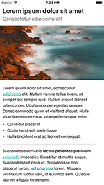
Marky Mark is a parser written in Swift that converts markdown into native views. The way it looks it highly customizable and the supported markdown syntax is easy to extend.
To run the example project, clone the repo, and run pod install from the Example directory first.
- iOS 8.0+
- Xcode 8.0+
CocoaPods 1.0.0+ is required to build MarkyMark
To integrate MarkyMark into your Xcode project using CocoaPods, specify it in your Podfile:
pod "markymark"let markDownView = MarkDownTextView()
markDownView.text = "# Header\nParagraph"Markymark has many styling options, please check the examples in the styling section of this readme. A simple example:
let markDownView = MarkDownTextView()
markDownView.styling.headingStyling.textColorsForLevels = [
	.orange, //H1 (i.e. # Title)
	.black,  //H2, ... (i.e. ## Subtitle, ### Sub subtitle)
]

markDownView.styling.linkStyling.textColor = .blue
markDownView.styling.paragraphStyling.baseFont = .systemFont(ofSize: 14)
markDownView.text = "# Header\nParagraph"Note: Different tags can be supported by either extending the ContentfulFlavor (default) or by implementing a class that comforms to Flavor and implement the required Rule's
Headings
# H1
## H2
### H3
#### H4
##### H5
###### H6
Lists
- item
- item
* item
* item
+ item
+ item
a. item
b. item
1. item
2. item
Emphasis
*Em*
_Em_
**Strong**
__Strong__
~~Strike through~~
Images

Links
[Link text](https://www.example.net)
Code
`code`
\```code```
Default Styling instance
var styling = DefaultStyling()Markdown example: Some text
styling.paragraphStyling.baseFont = .systemFont(ofSize: 14)
styling.paragraphStyling.textColor = .black
styling.paragraphStyling.contentInsets = UIEdgeInsets(top:0, left: 0, bottom: 5, right: 0)
styling.paragraphStyling.lineHeight = 4
styling.paragraphStyling.isBold = false
styling.paragraphStyling.isItalic = false
styling.paragraphStyling.textAlignment = .leftMarkdown example: # Title or ## Subtitle etc.
styling.headingStyling.fontsForLevels = [
	UIFont.boldSystemFontOfSize(24), //H1
	UIFont.systemFontOfSize(18),     //H2
	UIFont.systemFontOfSize(16)      //H3, ... (last item will be next levels as well)
]

styling.headingStyling.colorsForLevels = [
	.red, //H1
	.black, //H2, ... (last item will be next levels as well)
]

// Margins
styling.headingStyling.contentInsetsForLevels = [
	UIEdgeInsets(top: 5, left: 0, bottom: 15, right: 10), // H1
	UIEdgeInsets(top: 5, left: 0, bottom: 5, right: 10) //H2, ... (last item will be next levels as well)
]

styling.headingStyling.isBold = false
styling.headingStyling.isItalic = false
styling.headingStyling.isUnderlined = false
styling.headingStyling.textAlignment = .leftMarkdown Example [Google](http://www.google.com)
styling.linkStyling.textColor = .black
styling.linkStyling.baseFont = nil // Default: nil. Setting baseFont to nil will inherit font from paragraphStyling

styling.linkStyling.isBold = false
styling.linkStyling.isItalic = false
styling.linkStyling.isUnderlined = trueMarkdown Example:
- List item 1
- List item 2
- Nested List item
// By default a font will be used with the bullet character `•`. Use the follow properties to configure it's size and color:
styling.listStyling.bulletFont = .systemFont(ofSize: 14)
styling.listStyling.bulletColor = .black

// Bullets can also be images for more complex styling. When setting images, bullet font and color won't be used anymore
// Array of images used as bullet for each level of nested list items
styling.listStyling.bulletImages = [
	UIImage(named: "circle"),
	UIImage(named: "emptyCircle"),
	UIImage(named: "line"),
	UIImage(named: "square")
]

// Size of the images
styling.listStyling.bulletViewSize = CGSize(width: 16, height: 16)

styling.listStyling.baseFont = .systemFont(ofSize: 14)
styling.listStyling.contentInsets = UIEdgeInsets(top: 0, left:  0, bottom: 10, right: 10)

//Amount of space underneath each list item
styling.listStyling.bottomListItemSpacing = 5

// Number of pixels to indent for each nested list level
styling.listStyling.listIdentSpace = 15

styling.listStyling.textColor = .black
Styling is also possible for:
styling.paragraphStyling
styling.italicStyling
styling.boldStyling
styling.strikeThroughStyling
styling.imageStyling
styling.linkStyling
styling.horizontalLineStyling
styling.codeBlockStyling
styling.inlineCodeBlockStyling
styling.quoteStyling
Please check the DefaultStyling class for more information
Advanced usage is only needed for very specific cases. Making subsets of styling, making different styling combinations, supporting different Markdown rules (syntax) or modifying certain views after that have been generated.
struct CustomMarkyMarkStyling: Styling {
	var headerStyling = CustomHeaderStyling()
	var paragraphStyling = ParagraphStyling()
	var linkStyling = ListStyling()

	var itemStylingRules: [ItemStyling] {
		return [headerStyling, paragraphStyling, linkStyling]
	}
}
You can implement CustomHeaderStyling by checking how other Styling objects have been implemented, like ``HeaderStyling. Make sure your CustomHeaderStyling` comforms to all styling rules you'd like your custom styling to support. i.e. comform to `TextColorStylingRule` to support textStyle of your custom styling.
Each styling rule can be applied to a markDownItem by comforming to ItemStyling and implement the required method like this:
public func isApplicableOn(_ markDownItem: MarkDownItem) -> Bool {
	return markDownItem is HeaderMarkDownItem
}
This will let the mechanism know it should apply your styling to a HeaderMarkDownItem
You can inject your new styling object by passing it to the constructor of the MarkdownTextView
MarkDownTextView(styling: CustomMarkyMarkStyling())
Adding a new rule requires three new classes of based on the following protocol:
Rulethat can recoginizes the desired markdown syntaxMarkDownItemfor your new element that will be created by your new ruleLayoutBlockBuilderthat can convert your MarkDownItem to layout
Add the rule to MarkyMark
markyMark.addRule(MyCustomRule())Add the block builder to your layout converter
converter.addLayoutBlockBuilder(MyCustomLayoutBlockBuilder())If needed you can also add a custom styling class to the default styling
styling.addStyling(MyCustomStyling())The converter has a callback method which is called every time a MarkDownItem is converted to layout.
converter.didConvertElement = {
	markDownItem, view in
	// Do something with markDownItem and / or view here
}By default Markymark opens URL's using UIApplication.shared.open(url:). Markymark allows changing this behavior by passing a custom URLOpener, an object that comforms to the URLOpener protocol.
let markDownView = MarkDownTextView()
markDownTextView?.urlOpener = MyCustomerURLOpener()Markymark also supports usage the a Today extension. By default tapping url's is not working, since Extensions don't have access to UIApplication.shared, in order to support links you can pass a different url opener to a MarkyDownTextView. See the Example project for a working example:
markDownTextView?.urlOpener = ExtensionContextURLOpener(extensionContext: self.extensionContext)M2mobi, info@m2mobi.com
MarkyMark is available under the MIT license. See the LICENSE file for more info.


