Tamás Ferenci1
The study is available in PDF format. Preprint is uploaded to medRxiv.
Background: The World Health Organization (WHO)’s excess mortality estimates presented in May 2022 stirred controversy, due in part to the high estimate provided for Germany, which was later attributed to the spline model used. This paper aims to reproduce the problem using synthetic datasets, thus allowing the investigation of its sensitivity to parameters, both of the mortality curve and of the used method, thereby shedding light on the conditions that gave rise to this error and identifying possible remedies. Methods: A negative binomial model was used accounting for long-term change, seasonality, flu seasons, and heat waves. Simulated mortality curves from this model were then analysed using simple methods (mean, linear trend), the WHO method, and the method of Acosta and Irizarry. Results: The performance of the WHO’s method with its original parametrization was indeed very poor, however it can be profoundly improved by a better choice of parameters. The Acosta–Irizarry method outperformed the WHO method despite being also based on splines, but it was also dependent on its parameters. Linear extrapolation could produce very good results, but was highly dependent on the choice of the starting year, while the average was the worst in almost all cases. Conclusions: Splines are not inherently unsuitable for predicting baseline mortality, but caution should be taken. In particular, the results suggest that the key issue is that the splines should not be too flexible to avoid overfitting. Even after having investigated a limited number of scenarios, the results suggest that there is not a single method that outperforms the others in all situations. As the WHO method on the German data illustrates, whatever method is chosen, it remains important to visualize the data, the fit, and the predictions before trusting any result. It will be interesting to see whether further research including other scenarios will come to similar conclusions.
Excess mortality; Spline regression; Prediction; Robustness.
Excess mortality is the difference between the actual all-cause mortality (number of deaths) over a particular time period in a given country or (sub- or supranational) region and its ‘’expected’’ mortality, which refers to the mortality statistically forecasted from the region’s historical data. Excess mortality calculations can be used to characterize the impact of an event on mortality if the data were obtained before the onset of the event. Therefore, the prediction pertains to a counterfactual mortality that would have been observed without the event [1]. Excess mortality can thus measure the impact of the event, assuming that the prediction is correct.
Calculating excess mortality is particularly useful if the event’s impact on mortality is difficult to measure directly. For instance, one of the typical applications is characterizing the mortality associated with natural disasters [2–4], but it is also used for epidemics, such as the seasonal flu, where direct mortality registration is missing, incomplete, or unreliable [5,6].
Coronavirus disease 2019 (COVID-19) is no exception. While the mortality attributed to COVID-19 is reported in developed countries, typically daily or weekly, two drawbacks in the reporting have been realized. First, the number of reported deaths is – while to much less extent than the number of reported cases – still contingent on testing activity, which may be vastly different between countries or time periods. Second, despite efforts at standardization, the criteria for death certification may be different between countries [7]. Excess mortality resolves both of these problems because it is completely exempt from differences in testing intensity and cause-of-death certification procedures. This makes it especially suitable for between-country comparisons, which are critical to better understand the pandemic, particularly with regard to evaluating different control measures and responses [8].
This, however, comes at a price. First, and perhaps most importantly, excess mortality is inherently a gross metric, measuring both direct and indirect effects; the latter of which can be both positive (e.g., COVID-19 control measures also protect against the flu) and negative (e.g., the treatment of other diseases becomes less efficient) [9]. Second, excess mortality is the slowest indicator. The necessary data (i.e., the number of deaths) usually becomes available after 4 weeks (and even that is typically revised to some extent later) even in developed countries. This is in contrast to reported COVID-19 deaths, which are available by the following week or even the next day. Finally, the whole calculation depends on how accurate the forecast was.
The last of these issues is the focus of the current study. Given the importance of cross-country comparisons, the results should reflect true differences and should not be too sensitive to the prediction method used.
Only those methods that use the traditional regression approach are considered here. Methods using ARIMA models [10–13], the Holt-Winters method [14] or those based on Gaussian process [15] are not considered, nor are ensemble methods [16,17]. Questions concerning age or sex stratification or standardization [18], small area estimation [19,20], and inclusion of covariates (e.g., temperature) to improve modelling [16,17,19] are also not considered.
These considerations leave us with two matters of concern: the handling of seasonality and the handling of a long-term trend. For the latter, the following are the typical solutions concerning COVID-19:
- Using the last prepandemic year [16,21]. This solution is good – even if not perfect – because it uses data closest to the investigated period. However, this metric has a huge variance due to the natural year-to-year variability in mortality.
- Using the average of a few prepandemic years (typically 5 years) [22–28]. This is more reliable than the previous solution because averaging reduces variability. However, it is even more biased in case the mortality has a long-term trend (which it almost always has). For instance, if mortality is falling, this provides an overestimation; thus, excess mortality is underestimated.
- Using a linear trend extrapolation [29–31]. This approach accounts for the potential trends in mortality, removing the bias of the above-mentioned methods, at least as far as linearity is acceptable, but it depends on the selection of the starting year from which the linear curve is fitted to the data.
- Using splines [32,33]. The method of Acosta and Irizarry [34,35] is based on splines, just as many other custom implementations [16,36], which, crucially, includes the model used by the World Health Organization (WHO) [37].
While this issue has received minimal public attention, the choice of the method (and the parameters) used to handle long-term trends may have a highly relevant impact on the results of the calculation. This is evidenced by the case of excess mortality estimation by the WHO. On May 5, 2022, the WHO published its excess mortality estimates [38], which immediately raised several questions. In particular, it was noted that the estimates for Germany were surprisingly high [39]: the WHO estimated that 195,000 cumulative excess deaths occurred in Germany in 2020 and 2021, a figure that was inexplicably larger than every other previous estimate. For instance, the World Mortality Dataset reported 85,123 excess deaths in Germany for the same period [1].
This case was so intriguing, that one paper termed it as the “German puzzle” [39]. Figure 1 illustrates the “German puzzle” using actual German data, with the curves fitted on the 2015–2019 data and extrapolated to 2020 and 2021 (as done by the WHO). While the dots visually indicate a rather clear simple upward trend (as shown by the linear extrapolation), the spline prediction turns back.
fitSpline <- mgcv::gam(outcome ~ s(Year, k = 5) + s(WeekScaled, bs = "cc"),
                       data = RawData[Year>=2015&Year<=2019,],
                       family = mgcv::nb(), method = "REML")
fitLin <- mgcv::gam(outcome ~ Year + s(WeekScaled, bs = "cc"),
                    data = RawData[Year>=2015&Year<=2019,],
                    family = mgcv::nb(), method = "REML")

predgrid <- CJ(Year = seq(2015, 2022, length.out = 100), WeekScaled = 0.5)

predSpline <- predict(fitSpline, newdata = predgrid, newdata.guaranteed = TRUE, se.fit = TRUE,
                      type = "terms")
predSpline <- data.frame(fit = predSpline$fit[, 1] + attr(predSpline, "constant"),
                         se.fit = predSpline$se.fit[,1])
predLin <- predict(fitLin, newdata = predgrid, se.fit = TRUE, type = "terms")
predLin <- data.frame(fit = predLin$fit[, 1] + attr(predLin, "constant"), se.fit = predLin$se.fit[,1])

predgrid <- rbind(cbind(predgrid, Type = "Spline", predSpline),
                  cbind(predgrid, Type = "Linear", predLin))

ggplot(predgrid, aes(x = Year, y = exp(fit),  color = Type, fill = Type)) +
  geom_line() + geom_point(data = RawDataYearly[Year>=2015&Year<=2019,],
                           aes(x = Year, y = (outcome/52.25)), inherit.aes = FALSE) +
  labs(y = "Predicted mortality [/week]")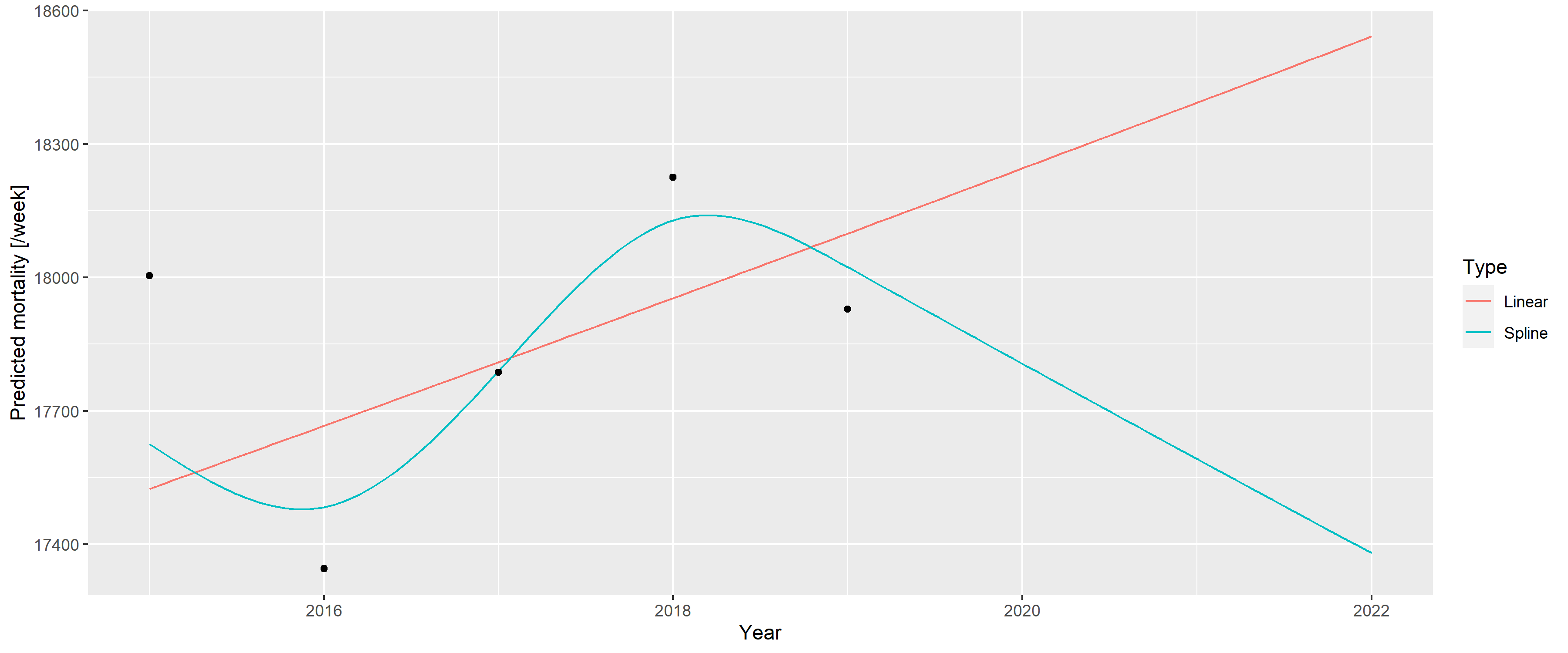
Figure 1: A linear trend and a spline fitted on the 2015–2019 German mortality data and extrapolated to 2020 and 2021.
The WHO [37] later explained that the problem resulted from two issues. First, the WHO rescaled the raw data to compensate for underreporting (caused by late registration, for instance), but this approach was unnecessary in the case of Germany, which had excellent death registration. Figure 1 shows the unadjusted German data avoiding this problem to focus on the second issue; that is, the usage of splines, which is the subject of the current investigation.
As described above, the WHO method uses a spline to capture the long-term trend. However, the lower data of 2019 had a very high impact on the spline, and this single observation turned the entire spline despite earlier points showing an upward trend. Too much weight seems to have been placed on this – likely short-term, random, noise-like – fluctuation; hence, the extrapolation was too sensitive for this. The culprit was quickly identified as the spline regression itself, with one commentator saying that “[e]xtrapolating a spline is a known bad practice” [39].
However, questions have emerged as to whether splines are really to be blamed. Motivated by the intention to better understand the ‘’German puzzle,’’ this study aims to investigate the following questions: 1) Are splines really the culprit per se?, 2) What were the particular characteristics, both of the scenario and of the used spline regression used that gave rise to the problem?, and 3) Is there a better way to predict the baseline for the excess mortality calculation to avoid this problem?
To answer these questions, we first needed to devise a model that could generate mortality curves that capture the relevant features exhibited by the real-life German example. Thus, calculating the accuracy of a forecast would be possible because the ground truth is now known, and we could investigate how the parameters of the simulation influence it. By averaging several simulations, the mean accuracy can be approximated, allowing for a comparison of the methods and investigation of its dependence on the parameters – both for the mortality curve and for the method – thereby hopefully resolving the ‘’German puzzle.’’
This investigation focuses on the errors of prediction. However, as excess mortality is defined as the difference between actual and predicted mortality, any error in the prediction directly translates to the same error in the estimation of excess mortality (given any actual mortality). Thus, the current study equivalently covers the errors in the estimation of excess mortality itself.
It should be noted that the present study does not use age or sex stratification or consider the size and composition of the background population. While these parameters are important, the WHO’s original study also did not take these factors into account.
Data on weekly all-cause mortalities for Germany were obtained from the European Statistical Office (Eurostat) database demo_r_mwk_ts. We applied no additional pre-processing or correction such as that for late registration, as part of the problem with the WHO’s approach was caused by upscaling, and we wanted to focus solely on the modelling aspect. Additional File 1 shows a detailed comparison of the possible data sources.
Figure 2 illustrates the basic properties of the data (raw weekly values, yearly trend, and seasonal pattern).
p1 <- ggplot(RawData[Year<=2019], aes(x = date, y = outcome)) + geom_line() +
  labs(x = "Week/year", y = "Mortality [/week]")
p2 <- ggplot(RawDataYearly[Year<=2019], aes(x = Year, y = outcome)) + geom_point() +
  geom_line() + geom_smooth(formula = y ~ x, method = "loess", se = FALSE) +
  labs(x = "Year", y = "Mortality [/year]")
p3 <- ggplot(RawData[Year<=2019], aes(x = Week, y = outcome, group = Year)) +
  geom_line(alpha = 0.2) + labs(x = "Week of year", y = "Mortality [/week]")

egg::ggarrange(p1, p2, p3, ncol = 1)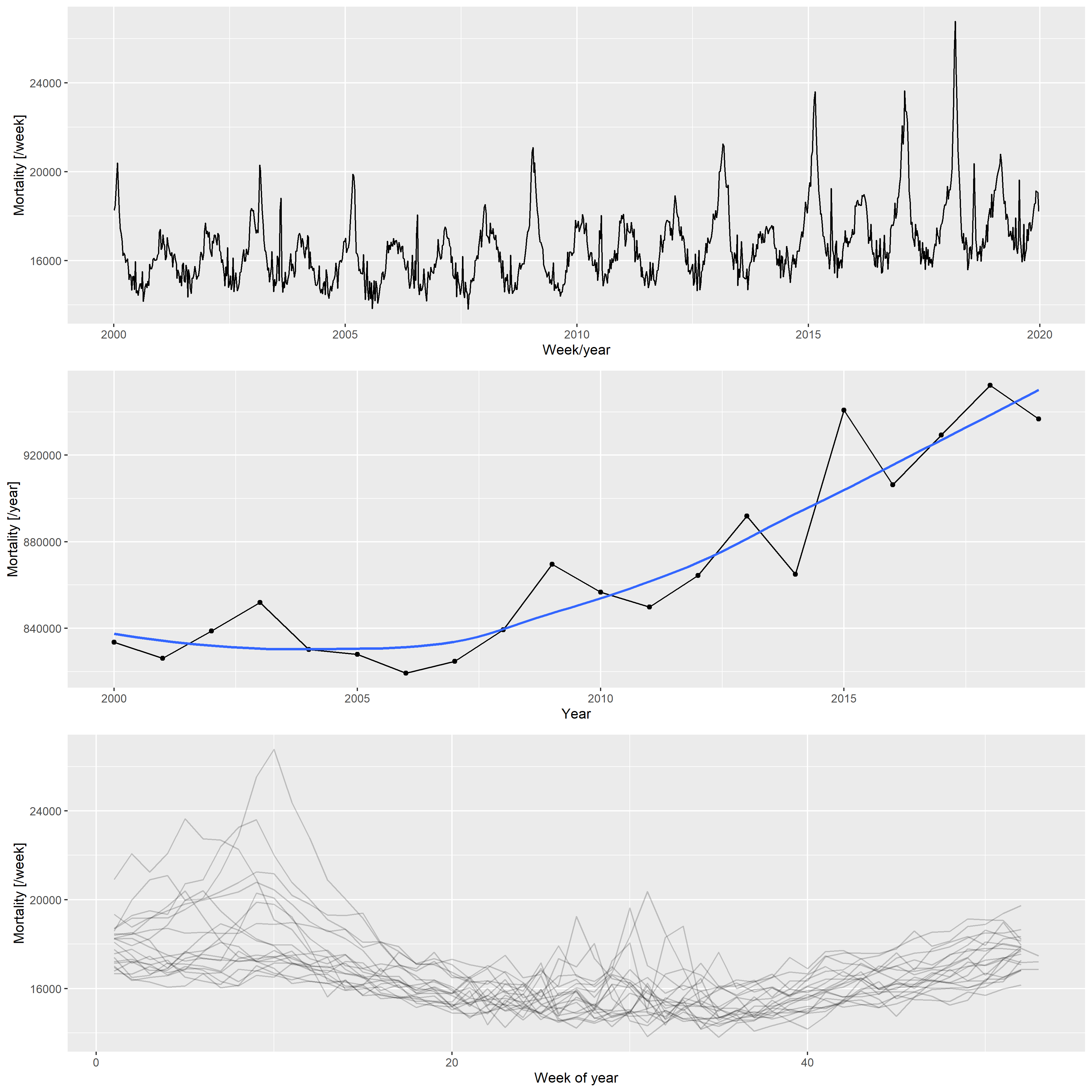
Figure 2: Weekly mortalities (upper), yearly mortalities with the LOESS-smoother (middle), and the seasonal pattern (bottom) for the German mortality data, 2000–2019.
Based on the patterns shown in 2, the following three components were used to create the synthetic datasets:
- Long-term change, modelled with a quadratic trend; described by three parameters (constant, linear, and quadratic terms)
- Deterministic seasonality, modelled with a single harmonic (sinusoidal) term; described by two parameters (amplitude and phase)
- Random additional peaks during winter (i.e., flu season) and summer (i.e., heat waves); described in each season by five parameters (probability of the peak, minimum and maximum values of the peak height, and minimum and maximum values of the peak width)
These components governed the expected value; the actual counts were obtained from a negative binomial distribution with a constant size and log link function.
Thus, the number of deaths at time
Additional File 2 describes in detail how the above-mentioned model is built (including the estimation from the actual German data that resulted in these parameters, and an example of the simulated data along with the real data).
We predicted mortality by using four methods: the WHO method, an advanced alternative method developed by Acosta and Irizarry in 2020 that also uses splines [34], and two simple methods for comparison. These latter methods cover classical statistical methods that are widely used for predicting baseline mortality in excess mortality studies. The methods are detailed below:
- Average: after accounting for seasonality with a single cyclic cubic regression spline, the average of the preceding years was used as the constant, predicted value. The response distribution is assumed to be negative binomial (with the overdispersion parameter estimated from the data) with a log link function. Parameter: starting year (i.e., how many previous years were used for averaging). Some studies used the last prepandemic year (2019) as the predicted baseline mortality, this is just the special case of this method, with the starting year set to 2019.
- Linear: after accounting for seasonality with a single cyclic cubic regression spline, the long-term trend was modelled with a linear trend. The response distribution is assumed to be negative binomial (with the overdispersion parameter estimated from the data) with a log link function. Parameter: starting year (from which the model was fitted).
- WHO method: this method was reconstructed according to the description
mentioned above [37]. Briefly, seasonality was accounted for with a
single cyclic cubic regression spline (as done in previous cases), and
the long-term trend was accounted for with a thin plate regression
spline. The only deviation compared with WHO’s study is that the
actual time (number of days since January 1, 1970) was used as the
predictor of the long-term trend, not the abruptly changing year. The
response distribution is assumed to be negative binomial (with the
overdispersion parameter estimated from the data) with a log link
function, and the model was estimated with restricted maximum
likelihood. Second derivative penalty was used for constructing the
spline; thus, the forecasting would be a linear extrapolation.
Parameters: starting year (from which the model is fitted) and
$k$ , which is the dimension of the basis of the spline used for capturing the long-term trend. - Acosta–Irizarry (AI) method: the method described in [34] using
their reference implementation. It offers many advantages when
estimating excess mortality, however, these advantages partly appear
only in the second stage (i.e., calculating the excess after the
expected is forecasted). Regarding baseline prediction, the method is
similar to that of the WHO in using splines, with three differences.
First, for capturing seasonality, two harmonic terms are used (with
prespecified frequencies of 1/365 and 2/365 as default, and arbitrary
phase estimated from the data) instead of the cyclic cubic regression
spline. Second, the spline to capture the long-term trend is a natural
cubic spline, not a thin plate regression spline, with the number of
knots selectable. If the number of years in the training data is less
than 7, a linear trend is used instead of the spline. Finally, the
response distribution is quasi-Poisson (with a log link function).
Parameters: starting year (from which the model is fitted) and
$tkpy$ , which denotes the number of trend knots per year. Other parameters are left on their default values (i.e., two harmonic terms are used).
The equations presented in Table 1 provide an overview of these modelling approaches.
Table 1. Overview of the models used to create predictions.
| Name | Model |
|---|---|
| Average |
|
| Linear |
|
| WHO |
|
| Acosta-Irizarry |
$\log\left(\mu_t\right) = \begin{cases} \beta_0 + f_{nc}\left(t\right) + \sum_{k=1}^2 \left[\sin\left(2\pi\cdot k \cdot w\left[t\right]\right) + \cos\left(2\pi\cdot k \cdot w\left[t\right]\right)\right] \quad * \ \beta_0 +\beta_1 t + \sum_{k=1}^2 \left[\sin\left(2\pi\cdot k \cdot w\left[t\right]\right) + \cos\left(2\pi\cdot k \cdot w\left[t\right]\right)\right] \quad ** \end{cases}$ |
Legend. cc: cyclic cubic regression spline, tp: thin plate regression
spline, nc: natural cubic spline, *: >7 years training data, **:
As already noted, population size is not included in the models, consistent with what the WHO did for the analysis of countries with frequently available data. Thus, changes in the population size are absorbed into the changes in death counts without explicit modelling, clearly suggesting potential room for improvement.
First, a synthetic dataset was randomly generated from the model
described above using the investigated parameters (parameters of the
scenario). This dataset simulated mortalities recorded from 2000 to
2023. We then applied the investigated prediction method with the
investigated parametrization (parameters of the method), and after
fitting on the 2000–2019 data, we obtained a prediction for 2020–2023,
where it can be contrasted with the simulation’s actual values, which
represent the ground truth in this case. Denoting the actual number of
deaths in the simulated dataset for year
The investigated parameters of the prediction methods were the following:
- Average: starting years 2000, 2005, 2010, 2015, 2019
- Linear: starting years 2000, 2005, 2010, 2015
- WHO method: all possible combination of starting years 2000, 2005,
2010, 2015 and
$k$ (basis dimension) 5, 10, 15, 20 - AI method: all possible combination of starting years 2000, 2005,
2010, 2015 and
$tkpy$ (trend knots per year) 1/4, 1/5, 1/7, 1/9, 1/12
For the scenario, simulations were run with the optimal parameters to
mimic the real-life German situation, as discussed previously (base case
scenario), and three further parameter sets, describing a scenario where
the long-term trend is linear (
This framework also enables us to investigate any further scenarios, including varying parameters other than the long-term trend, or varying several in a combinatorial fashion (although the latter has a very high computational burden).
Additional File 3 details the simulation.
All calculations were performed using the R statistical program package
version 4.3.1 [40] with the packages data.table [41] (version
1.14.8), ggplot2 [42] (version 3.4.3), excessmort (version 0.6.1),
mgcv (version 1.8.42), scorepeak (version 0.1.2), parallel
(version 4.3.1) lubridate (version 1.9.3), ISOweek (version 0.6.2)
and eurostat (version 3.8.2).
The full source code allowing for complete reproducibility is openly available at: https://github.com/tamas-ferenci/MortalityPrediction.
Figure 3 illustrates the 2020–2023 predictions for the base case scenario by showing the estimated yearly deaths for 200 randomly selected simulations together with the ground truth for all four methods with all possible parameters.
p1 <- ggplot() + xlim(c(2018, 2023)) + #ylim(c(0.5, 1.5)) +
  geom_line(data = predLongs$WHO[rep<=200&parsim==1],
            aes(x = Year, y = value/1e6, group = rep), alpha = 0.1) +
  geom_line(data = predLongs$WHO[parsim==1, .(outcome = mean(outcome)), .(Year)],
            aes(x = Year, y = outcome/1e6), color = "red") +
  facet_grid(rows = vars(k), cols = vars(startyear), scales = "free") +
  labs(y = "Outcome [million death / year]", title = "A) WHO's method")

p2 <- ggplot() + xlim(c(2018, 2023)) + #ylim(c(0.5, 1.5)) +
  geom_line(data = predLongs$AI[rep<=200&parsim==1],
            aes(x = Year, y = value/1e6, group = rep), alpha = 0.1) +
  geom_line(data = predLongs$AI[parsim==1, .(outcome = mean(outcome)), .(Year)],
            aes(x = Year, y = outcome/1e6), color = "red") +
  facet_grid(rows = vars(tkpy), cols = vars(startyear), scales = "free") +
  labs(y = "Outcome [million death / year]", title = "B) Acosta-Irizarry method")

p3 <- ggplot() + xlim(c(2018, 2023)) + #ylim(c(0.5, 1.5)) +
  geom_line(data = predLongs$Lin[rep<=200&parsim==1],
            aes(x = Year, y = value/1e6, group = rep), alpha = 0.1) +
  geom_line(data = predLongs$Lin[parsim==1, .(outcome = mean(outcome)), .(Year)],
            aes(x = Year, y = outcome/1e6), color = "red") +
  facet_grid(cols = vars(startyear), scales = "free") +
  labs(y = "Outcome [million death / year]", title = "C) Linear trend")

p4 <- ggplot() + xlim(c(2018, 2023)) + #ylim(c(0.5, 1.5)) +
  geom_line(data = predLongs$Average[rep<=200&parsim==1],
            aes(x = Year, y = value/1e6, group = rep), alpha = 0.1) +
  geom_line(data = predLongs$Average[parsim==1, .(outcome = mean(outcome)), .(Year)],
            aes(x = Year, y = outcome/1e6), color = "red") +
  facet_grid(cols = vars(startyear), scales = "free") +
  labs(y = "Outcome [million death / year]", title = "D) Average")

egg::ggarrange(p1, p2, p3, p4, ncol = 1, heights = c(1, 1, 0.4, 0.4))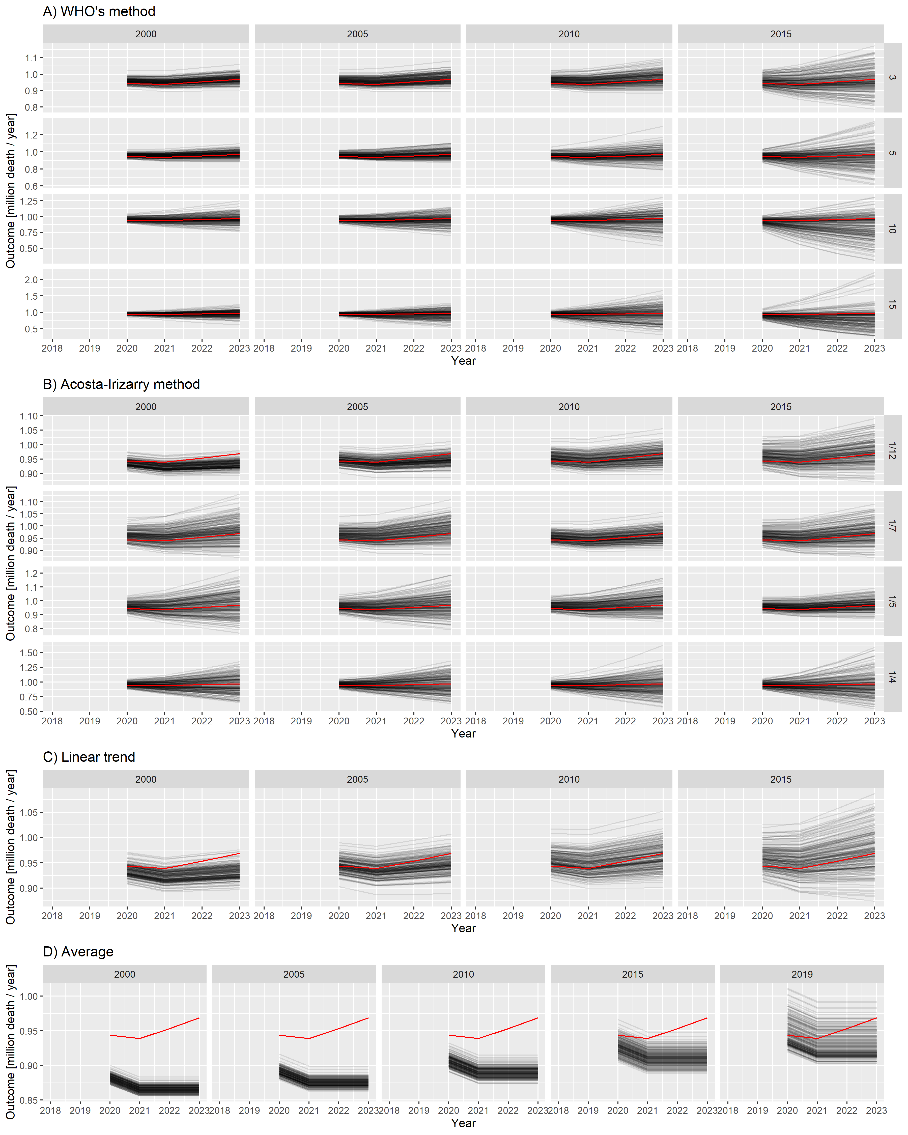
Figure 3: Estimated yearly deaths (for 2020–2023) for 200 randomly selected simulations (black lines) together with the ground truth (red line). A) WHO method, B) Acosta–Irizarry method, C) Linear trend, D) Average. Parameters of the methods are shown in column and row headers, and parameters of the scenario are set to the base case values. Note that 2020 is a long year with 53 weeks; therefore, higher values are expected for that year.
Figure 3 already strongly suggests some tendencies but, for a precise evaluation, we needed to calculate the error metrics. Figure 4 shows the three error metrics for all methods and all possible parametrizations. As shown in the figure, the ordering of the methods according to different criteria is largely consistent.
pd <- melt(rbind(
  predLongs$WHO[parsim==1, .(Type = "WHO", rep, Year, outcome, value, startyear, param = k)],
  predLongs$AI[parsim==1, .(Type = "AI", rep, Year, outcome, value, startyear, param = as.character(tkpy))],
  predLongs$Lin[parsim==1, .(Type = "Linear", rep, Year, outcome, value, startyear, param = NA)],
  predLongs$Average[parsim==1, .(Type = "Average", rep, Year, outcome, value, startyear, param = NA)])[
    , .(logMSE = log10(mean((value-outcome)^2)), MAPE = mean(abs(value-outcome)/outcome)*100,
        Bias = mean(value-outcome)), .(Type, startyear, param)], id.vars = c("Type", "startyear", "param"))
pd$param <- factor(pd$param, levels = c(sort(unique(predLongs$WHO$k)), levels(predLongs$AI$tkpy)))

ggplot(pd, aes(x = startyear, y = value, color = param)) +
  facet_grid(variable ~ factor(Type, levels = c("WHO", "AI", "Linear", "Average")), scales = "free") +
  geom_point() + geom_line() + labs(x = "Starting year", y = "", color = "Parameter") +
  scale_color_discrete(breaks = levels(pd$param)) + guides(color = guide_legend(ncol = 2))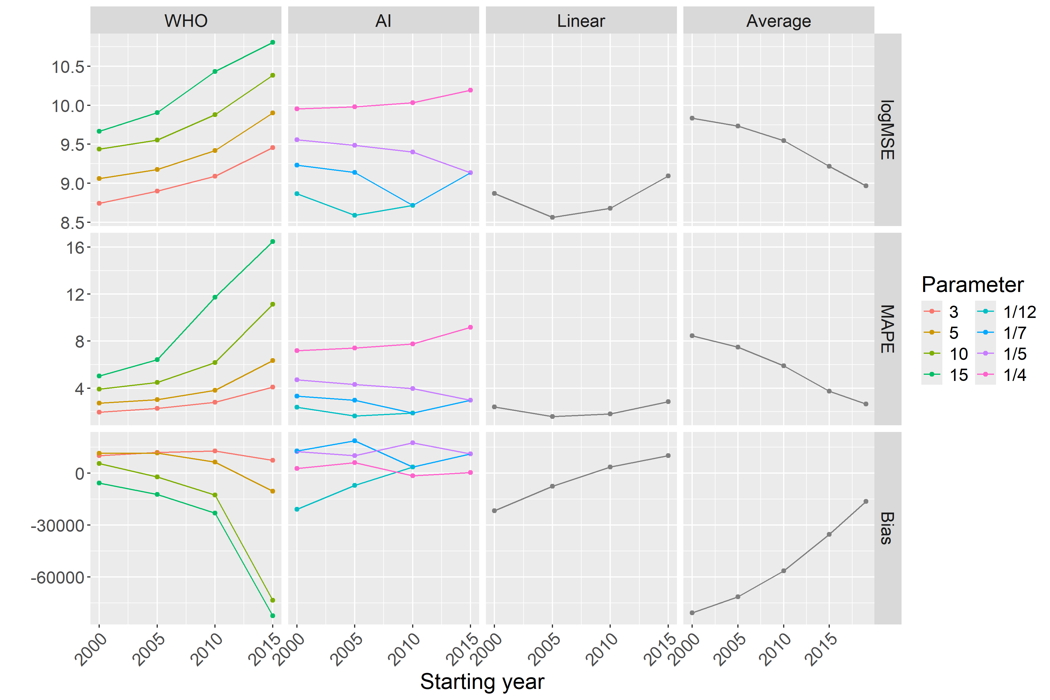
Figure 4: Different error metrics (logMSE, MAPE, and Bias) for all methods and all possible parameter combinations of all methods. Parameters of the scenario are set to the base case values.
As suggested in Figure 3, this confirms that
Figures 3 and 4 shed light on the nature of error. The linear trend and average methods are particularly clear in this respect: early starting ensured low variance, but it was highly biased. Conversely, later starting reduced the bias but increased the variance. Thus, this observation is a typical example of a bias-variance trade-off.
All the above-mentioned investigations used the base case scenario for
the simulated mortality curve. Figure
5 shows the MSEs achievable with each
method in the further investigated scenarios representing four distinct
types of the long-term trend of simulated mortality as a function of the
starting year (with
ggplot(rbind(predLongs$WHO[k==3,.(Method = "WHO", MSE = mean((value-outcome)^2)/1e6),
                           .(startyear, parsimName)],
             predLongs$AI[invtkpy==7,.(Method = "AI", MSE = mean((value-outcome)^2)/1e6),
                          .(startyear, parsimName)],
             predLongs$Lin[,.(Method = "Linear", MSE = mean((value-outcome)^2)/1e6),
                           .(startyear, parsimName)],
             predLongs$Average[,.(Method = "Average", MSE = mean((value-outcome)^2)/1e6),
                               .(startyear, parsimName)]),
       aes(x = startyear, y = log10(MSE), color = Method, group = Method)) + geom_point() + geom_line() +
  facet_grid(cols = vars(factor(parsimName, levels = c("Constant", "Linear trend",
                                                       "Quadratic trend", "Non-monotone")))) +
  labs(x = "Starting year", y = "logMSE")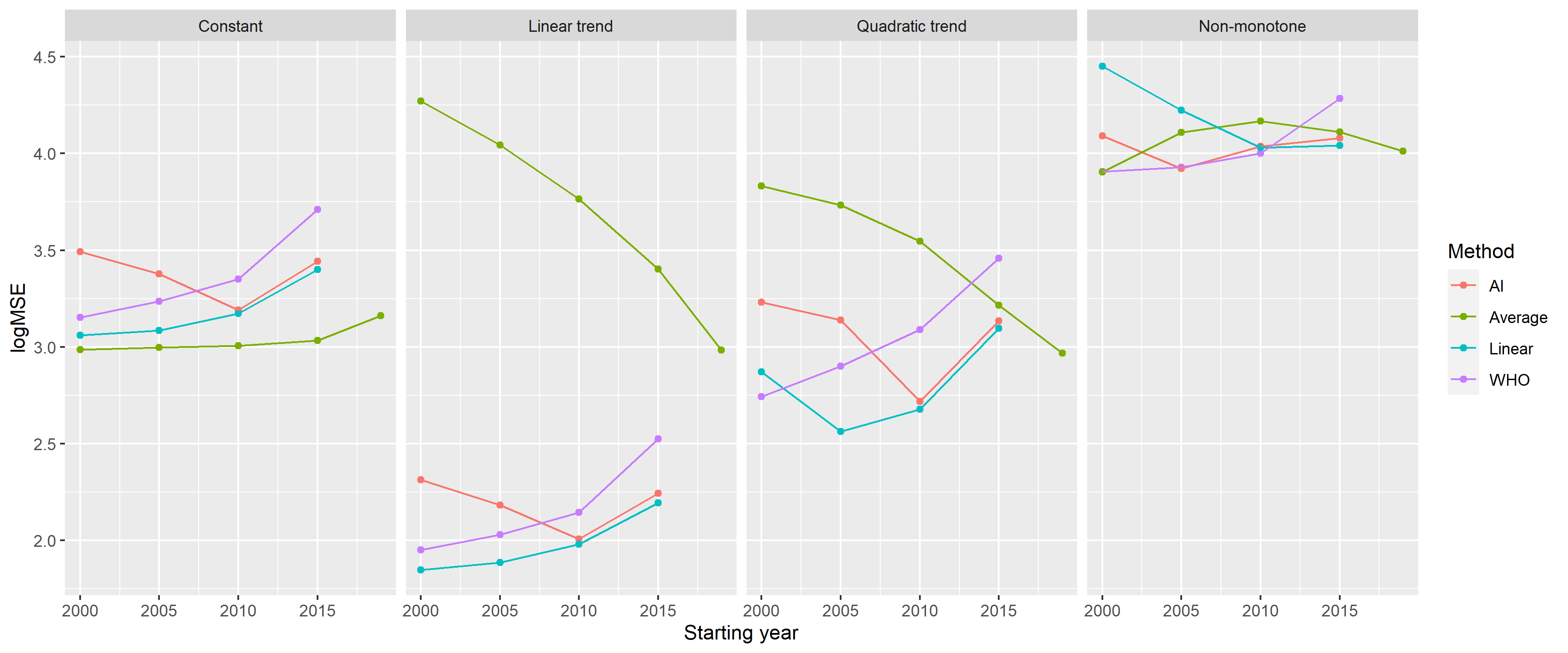
Figure 5: Mean squared errors of the investigated methods by starting year on a logarithmic scale (with k = 3 for the WHO method and tkpy = 1/7 for the AI approach) for the four defined scenarios.
Table 2 summarizes the error metrics of all four methods.
Table 2. Mean squared errors of the investigated methods, using the parametrization with the lowest MSE for each scenario (data shown as mean ± standard deviation).
knitr::kable(dcast(rbind(
  predLongs$WHO[, .(meanMSE = mean((value-outcome)^2)/1e6, sdMSE = sd((value-outcome)^2)/1e6),
                .(parsimName, parmethod)][,.SD[which.min(meanMSE)] , .(parsimName)][
                  , .(Method = "WHO", parsimName, MSE = paste0(round(meanMSE, 1), " ± ", round(sdMSE, 1)))],
  predLongs$AI[, .(meanMSE = mean((value-outcome)^2)/1e6, sdMSE = sd((value-outcome)^2)/1e6),
               .(parsimName, parmethod)][,.SD[which.min(meanMSE)] , .(parsimName)][
                 , .(Method = "AI", parsimName, MSE = paste0(round(meanMSE, 1), " ± ", round(sdMSE, 1)))],
  predLongs$Lin[, .(meanMSE = mean((value-outcome)^2)/1e6, sdMSE = sd((value-outcome)^2)/1e6),
                .(parsimName, parmethod)][,.SD[which.min(meanMSE)] , .(parsimName)][
                  , .(Method = "Linear", parsimName, MSE = paste0(round(meanMSE, 1), " ± ",
                                                                  round(sdMSE, 1)))],
  predLongs$Average[, .(meanMSE = mean((value-outcome)^2)/1e6, sdMSE = sd((value-outcome)^2)/1e6),
                    .(parsimName, parmethod)][,.SD[which.min(meanMSE)] , .(parsimName)][
                      , .(Method = "Average", parsimName, MSE = paste0(round(meanMSE, 1), " ± ",
                                                                       round(sdMSE, 1)))]),
  Method ~ parsimName, value.var = "MSE")[, c("Method", "Constant", "Linear trend",
"Quadratic trend", "Non-monotone")])| Method | Constant | Linear trend | Quadratic trend | Non-monotone |
|---|---|---|---|---|
| AI | 1182.2 ± 1273.6 | 73.3 ± 77.4 | 388.2 ± 553.5 | 8380.2 ± 14478 |
| Average | 969 ± 596 | 961.3 ± 753.1 | 929.6 ± 1039.6 | 8013.8 ± 4529.7 |
| Linear | 1150 ± 1213.7 | 70.3 ± 73.1 | 365.5 ± 524 | 10702.6 ± 11901.7 |
| WHO | 1418.4 ± 2075.1 | 89.1 ± 123.8 | 552.5 ± 824.5 | 8067.2 ± 9866.4 |
Finally, considering that different methods were evaluated on the same simulated dataset for each simulation, we could directly compare not only the averages but also the errors themselves. Additional File 4 presents this possibility.
The results of this study demonstrate that we could reliably reproduce the “German puzzle” using synthetic datasets. This approach allowed us to investigate how the results depend on the method used, its parameters, and the parameters of the scenario.
As expected, prediction with averaging had the highest error, except for very poor parametrizations of the spline-based methods, and it was highly biased. Its performance was improved by a later starting year; that is, a smaller bias offsets the larger variability. Naturally, it performs well in a practically very unlikely case when even true mortality is constant.
Linear extrapolation seemed to be a very promising alternative, comparable to the considerably more sophisticated spline-based methods. The only problem was that it was very sensitive to the appropriate selection of the starting year; the phase where the change in historical mortality is linear should be covered. Linear extrapolation is prone to subjectivity and may not work at all if the linear phase is too short (thereby limiting the available information), but it depends on how wiggly the historical curve is. Naturally, it works best if the true mortality is linear, but it can perform very poorly with non-monotone curves when the starting year is not selected to match the last section that can be approximated with a linear curve, consistent with the previous remark.
Theoretically, splines can work well even in cases of non-monotone mortality. The spline-based method can use all historical data. It is not abruptly cut off as with linear extrapolation, but more weight is placed on the trends suggested by recent observations. At first glance, this method seems to be the ideal solution, delivering the benefits of linear extrapolation but without the need to ‘’guess’’ the good starting point. However, as this study reveals, the definitions of ‘’more weight’’ and ‘’recent’’ are crucial, and certain parameter choices can result in very poor extrapolations, despite the tempting theoretical properties.
In selecting the optimal parameters, as confirmed by the results of the two spline-based methods (the WHO method and the AI method), the splines should be quite simple in baseline mortality prediction for excess mortality calculations. This finding is in line with the experiences both with the WHO method (where increasing the basis dimension decreased the performance) and the AI method (where increasing the trend knots per year decreased the performance).
One possible explanation is that mortality curves exhibit only slow changes, so high flexibility is not required. As with any regression model, excessively high model capacity can be downright detrimental, as it allows the model to pick up noise, which can cause overfitting.
Importantly, the AI method only uses splines to model the long-term trend if it has more than 7 years of data. Otherwise, it switches into a simple linear trend. This finding is completely in line with the above-mentioned remarks. That is, flexibility is useful but can backfire with small amounts of training data.
In Germany, the 2019 data were quite lower, likely because of simple random fluctuation, but the spline was flexible enough to be ‘’able to take this bend.’’ Data are presented using the ISO 8601 year definition; thus, the year can be either 52 or 53 weeks long [43]. From 2015 to 2019, every year was 52 weeks long, except for 2015, which was 1 week longer. This definition adds to the reasons why the value for 2015 is higher, increasing the German data’s wiggliness and thereby potentially contributing to the problem. The increased wiggliness of the data forces the thin plate regression spline used in the WHO method to be more flexible. (This was not a problem with the WHO’s original analysis because it used monthly data, but it could be if the WHO method is directly applied to weekly data.)
The WHO method is only acceptable if
Between the two spline-based methods, when using rigidity parameters that are optimal in this particular scenario, the WHO method performed better with longer fitting periods, whereas the AI method performed better with shorter ones. However, the performance of the AI method was considerably less dependent on the starting year.
Perhaps one of the most important lessons learned, especially from
Figures 4 and
5, is that there is no ‘’one size fits
all’’ optimal choice. In other words, a method that performs well for a
given true mortality curve can exhibit extremely poor performance for
another shape of mortality. Moreover, the optimal choice of parameters
even for one given method can substantially depend on the scenario, and
a parameter that works well for one situation might be poor for another.
Hence, while there are ‘’safer choices,’’ recommending a universally
‘’optimal’’ parameter is not possible. In selecting a good parameter for
a particular case, perhaps the most important is to examine the fit of
the model on historical data. Figure 6
provides an example using the German data. The figure shows the
prediction for 3 years (2020–2022) from the historical data, using all
methods and all parameters. A quick visual inspection immediately
reveals relevant and likely meaningless predictions. The latter,
unfortunately, includes that of the WHO (2015 as the starting year,
pargridWHO <- expand.grid(startyear = c(2000, 2005, 2010, 2015), k = c(3, 5, 10, 15))
pargridWHO$parmethod <- paste0("WHO", seq_len(nrow(pargridWHO)))
pargridAI <- expand.grid(startyear = c(2000, 2005, 2010, 2015), invtkpy = c(4, 5, 7, 12))
pargridAI <- merge(pargridAI, data.table(invtkpy = c(4, 5, 7, 12),
                                         tkpy = c("1/4", "1/5", "1/7", "1/12")))
pargridAI$parmethod <- paste0("AI", seq_len(nrow(pargridAI)))
pargridAI$tkpy <- factor(pargridAI$tkpy, levels = c("1/12", "1/7", "1/5", "1/4"))
pargridAverage <- data.frame(startyear = c(2000, 2005, 2010, 2015, 2019))
pargridAverage$parmethod <- paste0("Average", seq_len(nrow(pargridAverage)))
pargridLin <- data.frame(startyear = c(2000, 2005, 2010, 2015))
pargridLin$parmethod <- paste0("Lin", seq_len(nrow(pargridLin)))

GERpredWHO <- sapply(1:nrow(pargridWHO), function(i)
  predict(mgcv::gam(outcome ~ s(NumTrend, k = pargridWHO$k[i]) + s(WeekScaled, bs = "cc"),
                    data = RawData[Year>=pargridWHO$startyear[i]&Year<=2019,],
                    family = mgcv::nb(), method = "REML"),
          newdata = RawData[Year>=2020&Year<=2022], type = "response"))
GERpredAI <- sapply(1:nrow(pargridAI), function(i)
  with(excessmort::compute_expected(
    cbind(RawData[Year>=pargridAI$startyear[i],], population = 1),
    exclude = seq(as.Date("2020-01-01"), max(RawData$date), by = "day"),
    frequency = nrow(RawData)/(as.numeric(diff(range(RawData$date)))/365.25),
    trend.knots.per.year = 1/pargridAI$invtkpy[i], verbose = FALSE),
    expected[date>=as.Date("2019-12-30")&date<=as.Date("2022-12-26")]))
GERpredAverage <- sapply(1:nrow(pargridAverage), function(i)
  predict(mgcv::gam(outcome ~ s(WeekScaled, bs = "cc"),
                    data = RawData[Year>=pargridAverage$startyear[i]&Year<=2019,],
                    family = mgcv::nb(), method = "REML"),
          newdata = RawData[Year>=2020&Year<=2022], type = "response"))
GERpredLin <- sapply(1:nrow(pargridLin), function(i)
  predict(mgcv::gam(outcome ~ NumTrend + s(WeekScaled, bs = "cc"),
                    data = RawData[Year>=pargridLin$startyear[i]&Year<=2019,],
                    family = mgcv::nb(), method = "REML"),
          newdata = RawData[Year>=2020&Year<=2022], type = "response"))

GERpred <- setNames(data.frame(RawData[Year>=2020&Year<=2022, c("date", "outcome")], GERpredWHO,
                               GERpredAI, GERpredAverage, GERpredLin, row.names = NULL),
                    c("date", "outcome", pargridWHO$parmethod, pargridAI$parmethod,
                      pargridAverage$parmethod, pargridLin$parmethod))

GERpred$Year <- lubridate::isoyear(GERpred$date)
GERpred$date <- NULL

GERpredYearly <- as.data.table(GERpred)[, lapply(.SD, sum), .(Year)]

GERpredLongs <- lapply(
  list(WHO = pargridWHO, AI = pargridAI, Average = pargridAverage,
       Lin = pargridLin),
  function(pg)
    merge(melt(GERpredYearly[, c("outcome", "Year", pg$parmethod), with = FALSE],
               id.vars = c("outcome", "Year"), variable.name = "parmethod"), pg))


GERpd <- rbind(GERpredLongs$WHO[, .(Type = "WHO", Year, value, startyear, param = k)],
               GERpredLongs$AI[, .(Type = "AI", Year, value, startyear, param = as.character(tkpy))],
               GERpredLongs$Lin[, .(Type = "Linear", Year, value, startyear, param = NA)],
               GERpredLongs$Average[, .(Type = "Average", Year,  value, startyear, param = NA)])
GERpd$param <- factor(GERpd$param, levels = c(sort(unique(GERpredLongs$WHO$k)),
                                              levels(GERpredLongs$AI$tkpy)))

ggplot(RawDataYearly[Year<2020, .(Year, outcome)], aes(x = Year, y = outcome/1e6)) + geom_point() +
  geom_line() +
  geom_point(data = GERpd, aes(x = Year, y = value/1e6, color = factor(param)), inherit.aes = FALSE) +
  geom_line(data = GERpd, aes(x = Year, y = value/1e6, color = factor(param)), inherit.aes = FALSE) +
  facet_grid(factor(Type, levels = c("WHO", "AI", "Linear", "Average"))~startyear) +
  scale_color_discrete(breaks = levels(GERpd$param)) + guides(color = guide_legend(ncol = 2)) +
  labs(y = "Predicted mortality [M/year]", color = "Parameter")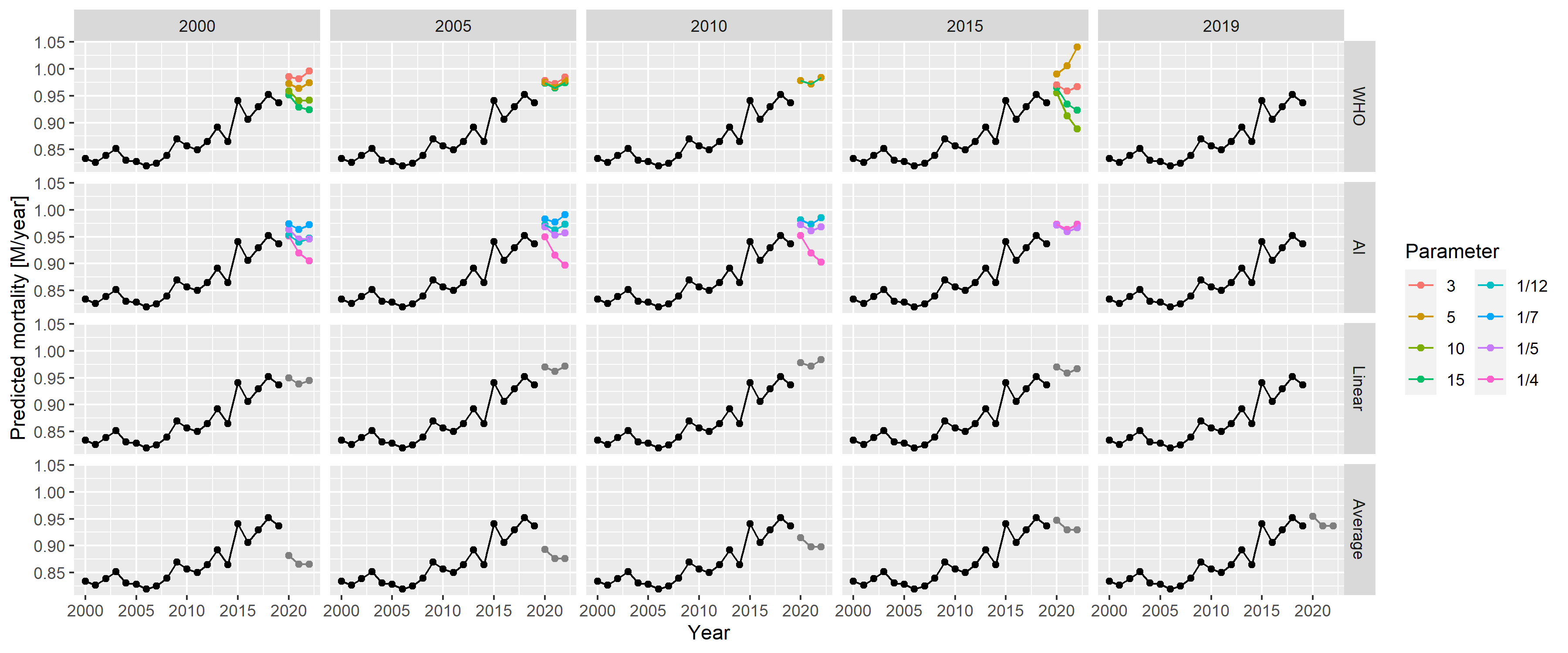
Figure 6: Predictions for 2020–2022 from all methods with all possible parameters, using historical German data.
Two studies conducted by Nepomuceno et al. [44] and Shöley [45] are similar to ours. They used several models, partly overlapping those that are presented in our study but, importantly, neither of them considered splines for a long-term trend. Nepomuceno et al. did not try to evaluate the methods and compared these methods without having ground truth to determine any concordance. In contrast, Shöley conducted an objective evaluation but, contrary to the synthetic dataset simulation approach used in the present study, time-series cross-validation with historical data was applied to measure accuracy. Cross-validation is guaranteed to be realistic as opposed to a simulation, but it has less freedom; in this method, investigators are bound to the empirical data with limited possibilities in varying the parameters.
We did not investigate the impact of using the population and modelling death rates instead of death counts directly. We also did not examine the potential impact of data frequency. In our study, we used weekly data, which may be unavailable in developing countries but are almost universally available in developed countries. Therefore, using the most frequent data seems logical (with the appropriate handling of seasonality). Furthermore, because our focus was on developed countries, we did not consider adjusting for late registration and imputing missing data, which may be needed when full data are unavailable.
Another limitation of our study is that it only analysed point estimates. The applied prediction models can provide prediction intervals; thus, investigating their validity (e.g., coverage properties) could be a relevant future research direction.
Finally, this study did not consider the age and sex structures of the population (consistent with the WHO’s approach). However, the inclusion of these structures together with an explicit modelling of the population size might improve predictions by capturing and separating mechanisms that govern the change of population size and structure in the models. To explore whether and to which extent predictions could be improved by taking these structures into account is an important matter that requires further research.
The performance of the WHO’s method with its original parametrization is indeed very poor, as revealed by extensive simulations. Thus, the ‘’German puzzle’’ was not just an unfortunate mishap, but it could have been profoundly improved by selecting better parameters. The performance of the WHO method is similar to that of the AI method, with the former being slightly better for longer fitting periods and the latter for shorter ones. Despite its simplicity, linear extrapolation can exhibit a favourable performance, but this depends highly on the choice of the starting year. Conversely, the AI method exhibits relatively stable performance (considerably more stable than the WHO method) irrespective of the starting year. The performance of the average method is almost always the worst, except for very special circumstances.
This study also shows that splines are not inherently unsuitable for predicting baseline mortality, but caution should be taken, with the key issue being that the splines should not be too flexible to avoid overfitting. In general, no single method outperformed the others in the investigated scenarios. Regardless of the approach or parametrization used, it is essential to have a proper look at the data, and to visualize the fit and the predictions produced by the method used. Further research is warranted to see if these statements can be confirmed on the basis of other scenarios.
For a country like Germany, four data sources come into consideration for weekly mortality data: Eurostat [46], the Short-Term Mortality Fluctuations (STMF) dataset of the Human Mortality Database (WMD) [47], the World Mortality Database [1] and the national data provider (in this case, the Federal Statistical Office of Germany). The last is usually more complicated, limits extension to other countries and is unnecessary for developed countries, so it’ll be avoided in this case. Also, for Germany, WMD simply copies the data of the STMF (“We collect the weekly STMF data for the following countries: […] Germany, […].”) leaving us with two options.
We shall compare whether these two report identical data (Figure 7).
RawDataEurostat <- as.data.table(eurostat::get_eurostat("demo_r_mwk_ts", time_format = "raw"))
RawDataEurostat <- RawDataEurostat[geo=="DE"&sex=="T"]
RawDataEurostat$Year <- as.numeric(substring(RawDataEurostat$time, 1, 4))
RawDataEurostat$Week <- as.numeric(substring(RawDataEurostat$time, 6, 7))

RawDataSTMF <- fread("https://www.mortality.org/File/GetDocument/Public/STMF/Outputs/stmf.csv")
RawDataSTMF <- RawDataSTMF[CountryCode=="DEUTNP"&Sex=="b"]

RawDataEurostatSTMF <- merge(RawDataEurostat[, .(Year, Week, ES = values)],
                             RawDataSTMF[, .(Year, Week, STMF = DTotal)])

ggplot(RawDataEurostatSTMF, aes(x = ES, y = STMF)) + geom_point() + geom_abline(color = "red") +
  labs(x = "Eurostat value [/week]", y = "STMF value [/week]")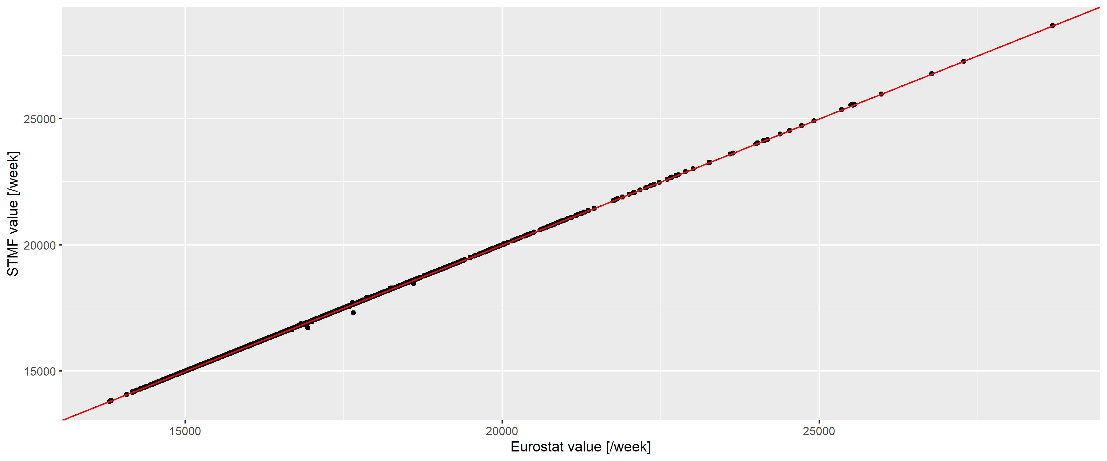
Figure 7: Weekly number of deaths according to the Eurostat (horizontal axis) and the STMF database (vertical axis) in Germany. Red line indicates the line of equality.
The two are almost identical (with a correlation of 0.9999781), with differences only occuring for the latest data and of minimal magnitude, so we can safely use the Eurostat database.
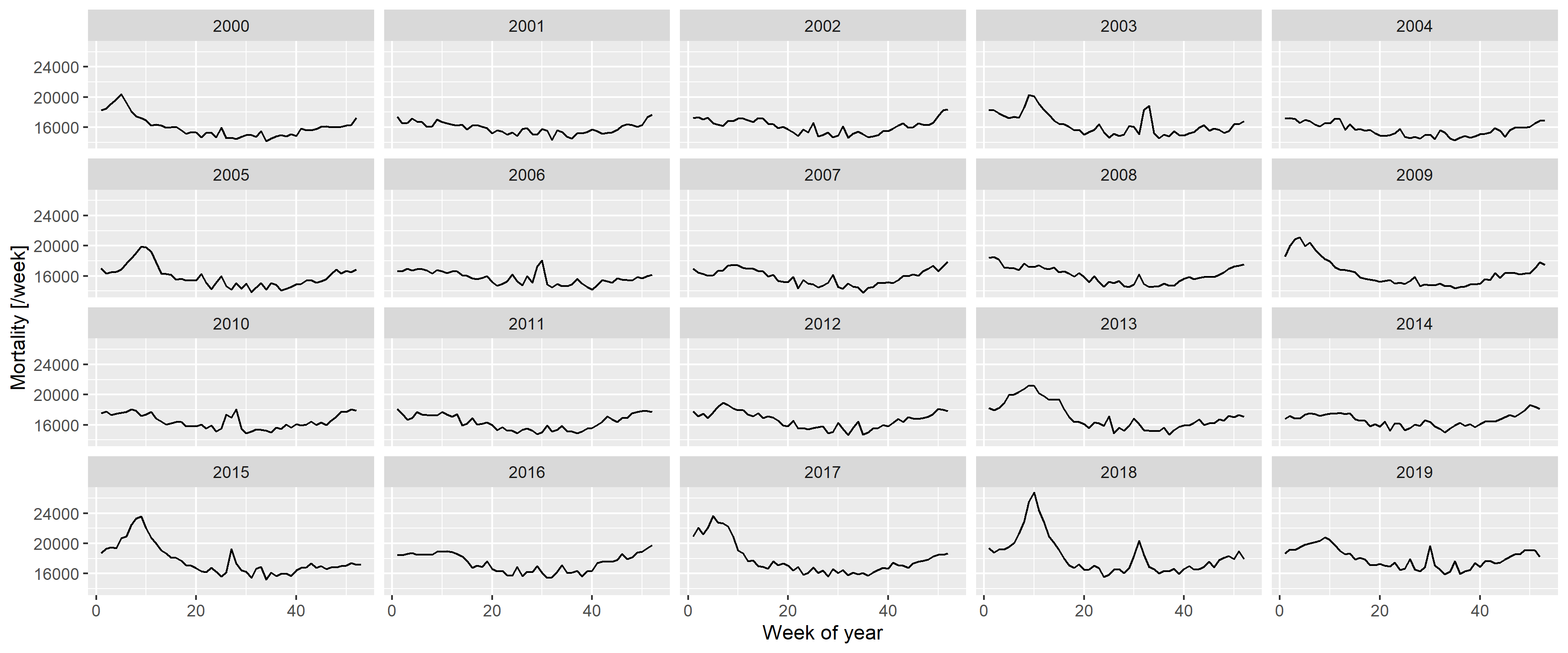
First, Figure 2 should be inspected, as it already gives important clues on the setup of a realistic model from which synthetic datasets could be generated. Figure 8 gives further insight by plotting each year separately.
RawData2019 <- RawData[Year<=2019]

ggplot(RawData2019, aes(x = Week, y = outcome)) + geom_line() + facet_wrap(~Year) +
labs(x = "Week of year", y = "Mortality [/week]")The following observations can be made:
- There is a long-term trend, seemingly quadratic.
- There is a strong seasonality with winter peak and summer trough.
- There are peaks – in addition to the seasonality – in the winter and also during the summer (although the shape seems to be different, with winter peaks seeming to be broader and higher).
To investigate these, first a spline-smoothing – with thin plate regression spline [32] – is applied to obtain the long-term trend, and a single harmonic term is included as a covariate to remove seasonality. No interaction is assumed between the two, i.e., it is assumed that the seasonal pattern is the same every year. (The peaks are not accounted for at this stage which means that the curve is above the true one, but the difference is likely has minimal due to the rarity and short duration of the peaks. This will be later corrected, after the peaks were identified.) All analysis will be carried out on the log scale (meaning the effect of covariates is multiplicative) using negative binomial response distribution to allow for potential overdispersion [48].
Figure 9 shows the results, overplotted with the model where the long-term trend is a completely parametric quadratic trend. One can observe very good fit between the two, so all subsequent investigation will use the quadratic trend which is much easier to handle. This is only meaningful for short-term extrapolation, but this is what will be needed now (two years of extrapolation will be used in the present study); also it is not possible to better differentiate between functional forms at this sample size.
fitSpline <- mgcv::gam(outcome ~ s(NumTrend) + cos(2*pi*WeekScaled) + sin(2*pi*WeekScaled),
                       data = RawData2019, family = mgcv::nb(), method = "REML")
fit <-  mgcv::gam(outcome ~ poly(NumTrend, 2, raw = TRUE) + cos(2*pi*WeekScaled) + sin(2*pi*WeekScaled),
                  data = RawData2019, family = mgcv::nb(), method = "REML")

fitTrendMinPoint <- -coef(fit)["poly(NumTrend, 2, raw = TRUE)1"]/
  (2*coef(fit)["poly(NumTrend, 2, raw = TRUE)2"])
fitTrendMinValue <- coef(fit)["(Intercept)"]-
  coef(fit)["poly(NumTrend, 2, raw = TRUE)1"]^2/(4*coef(fit)["poly(NumTrend, 2, raw = TRUE)2"])
fitTrend2020End <- coef(fit)["poly(NumTrend, 2, raw = TRUE)2"]*18624^2 +
  coef(fit)["poly(NumTrend, 2, raw = TRUE)1"]*18624 + coef(fit)["(Intercept)"]
fitSeasonAmplitude <- sqrt(coef(fit)["sin(2 * pi * WeekScaled)"]^2 +
                             coef(fit)["cos(2 * pi * WeekScaled)"]^2)
fitSeasonPhase <- atan(-coef(fit)["sin(2 * pi * WeekScaled)"]/coef(fit)["cos(2 * pi * WeekScaled)"])

predgrid <- data.frame(NumTrend = seq(min(RawData2019$NumTrend),
                                      max(RawData2019$NumTrend), length.out = 100),
                       WeekScaled = rep(0.5, 100))
predgrid <- rbind(cbind(predgrid, Type = "Spline",
                        with(predict(fitSpline, newdata = predgrid, newdata.guaranteed = TRUE,
                                     se.fit = TRUE), data.frame(fit, se.fit))),
                  cbind(predgrid, Type = "Quadratic",
                        with(predict(fit, newdata = predgrid, newdata.guaranteed = TRUE, se.fit = TRUE),
                             data.frame(fit, se.fit))))

ggplot(predgrid, aes(x = lubridate::as_date(NumTrend), y = exp(fit), ymin = exp(fit - 1.96*se.fit),
                     ymax = exp(fit + 1.96*se.fit), color = Type, fill = Type)) +
  geom_line() + geom_ribbon(alpha = 0.2, linetype = 0) +
  labs(x = "Date", y = "Predicted number of weekly deaths (adjusted to June-30)")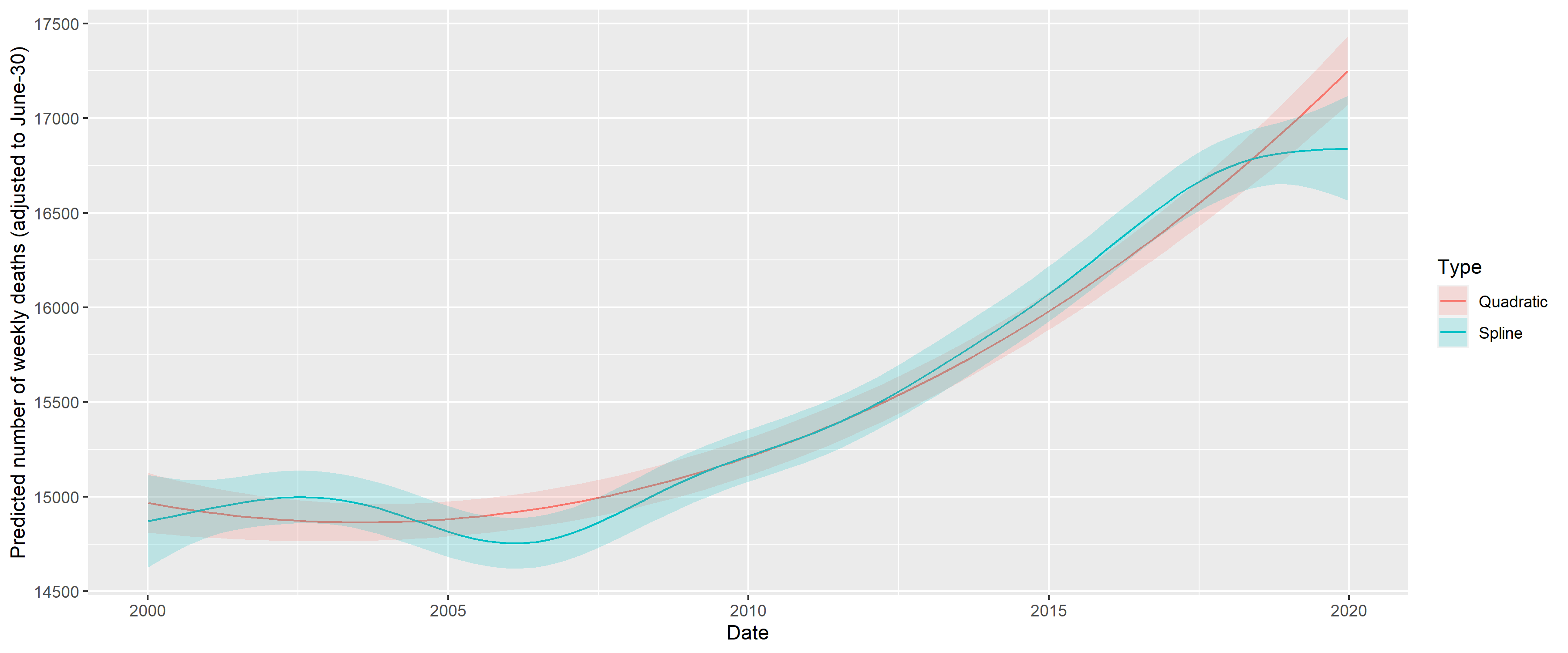
Figure 9: Fitting long-term trend as spline (black) and as quadratic trend (red); shaded area indicated 95% confidence interval. Seasonality is removed by including a single harmonic term in the regression in both cases.
The coefficients can be transformed to equivalent forms that are more meaningful. Thus, the three parameters of the quadratic trend can be expressed as a minimum point (2003-07-15), value at the minimum (15918.54) and value at the end of 2020 (18825.83). (This differs from the value seen on Figure 9, as that also includes the effect of the harmonic term.) The two parameters of the harmonic regression can be expressed as an amplitude, a multiplier (9.4%) and a phase shift (-0.7, i.e., minimum at week 32 of the year).
Figure 10 shows the predictions of the above model.
RawData2019$pred <- predict(fit)

ggplot(RawData2019, aes(x = Week, y = outcome)) +
  geom_line() + geom_line(aes(y = exp(pred)), color = "red") + facet_wrap(~Year) +
  labs(x = "Week of year", y = "Mortality [/week]")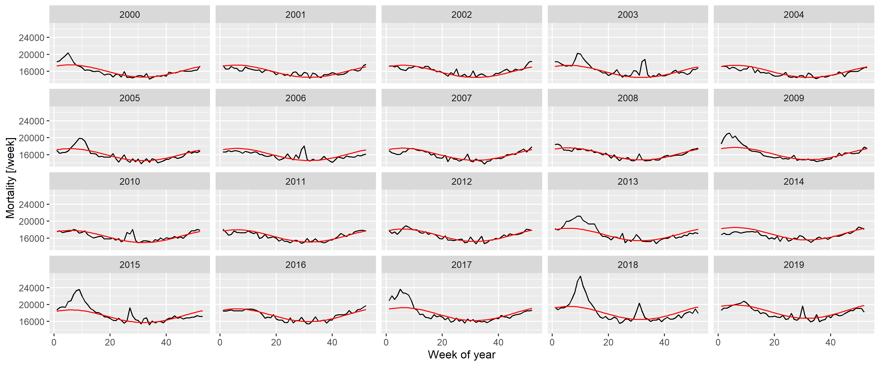
Figure 10: Weekly number of deaths in Germany, separated according to year, showing the predictions from the model with quadratic long-term trend and a single, fixed harmonic term.
A good fit can be observed, apart from summer and winter peaks. Thus, to capture them, the predictions are subtracted; with the results shown on Figure 11.
RawData2019$resid <- residuals(fit, type = "working")

peakdet <- scorepeak::detect_localmaxima(RawData2019$resid, 35) &
  scorepeak::score_type1(RawData2019$resid, 35)>0.1315
peaks <- data.table(x = RawData2019$NumTrend[peakdet], y = RawData2019$resid[peakdet])
peaks$peakDate <- lubridate::as_date(peaks$x)
peaks$Year <- lubridate::isoyear(peaks$peakDate)
peaks$peakWeek <- lubridate::isoweek(peaks$peakDate)
peaks$peakID <- 1:nrow(peaks)

ggplot(RawData2019, aes(x = Week, y = resid)) +  geom_line() + facet_wrap(~Year) +
  geom_point(data = peaks, aes(x = peakWeek, y = y)) +
  labs(x = "Week of the year", y = "Working residual (log scale)")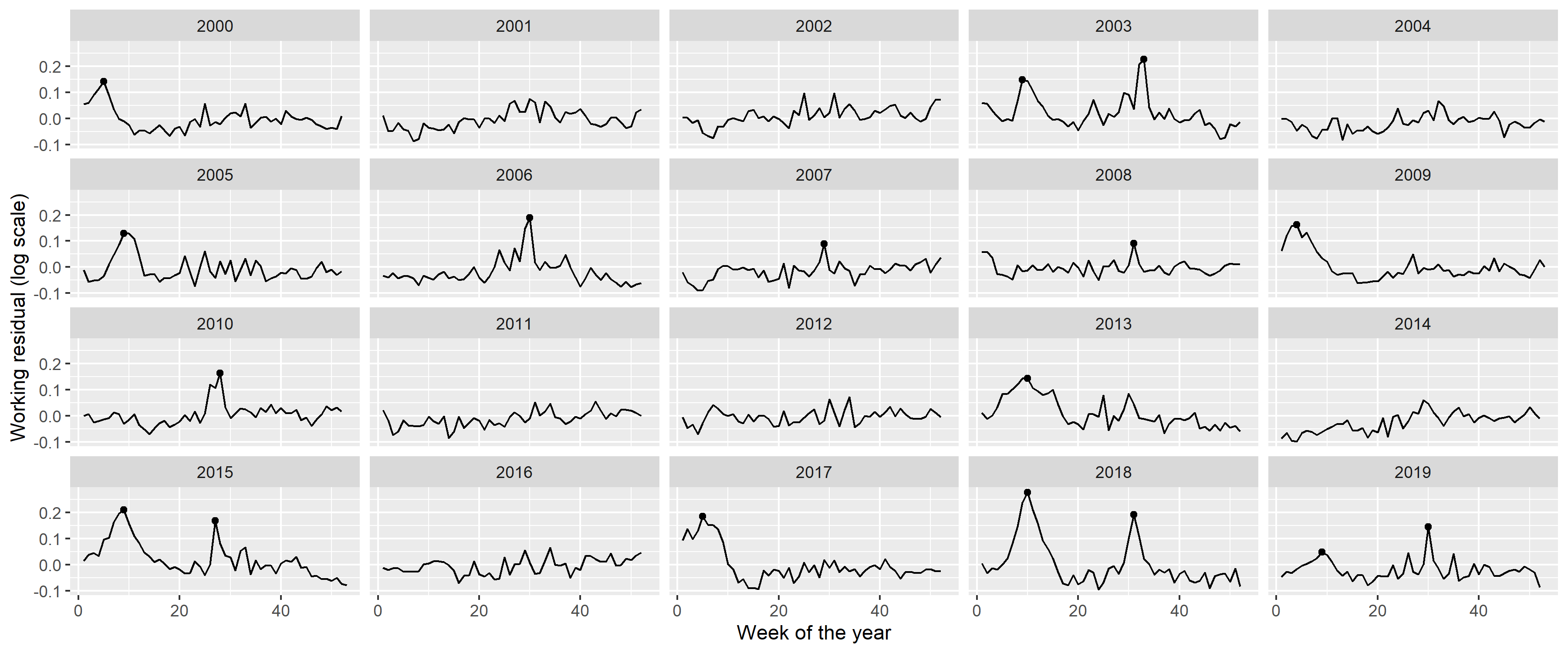
Figure 11: Residuals of the fitted model with quadratic long-term trend and a single, fixed harmonic term. Dots indicate identified peaks.
Peaks in the residuals were identified with the peak detector of Palshikar [49] using parameters that were empirically tuned to identify to visually clear peaks. Results are shown on Figure 11 with black dots; an indeed good identification of the unequivocal peaks can be seen.
Figure 12 shows the peaks themselves with a
RawData2019$peakID <- sapply(1:nrow(RawData2019),
                             function(i) which.min(abs(RawData2019$NumTrend[i]-peaks$x)))
RawData2019$peakdist <- sapply(1:nrow(RawData2019),
                               function(i) RawData2019$NumTrend[i]-peaks[RawData2019$peakID[i],]$x)

RawData2019 <- merge(RawData2019, peaks[, .(peakID, peakWeek)])
RawData2019$peakText <- paste0(RawData2019$peakID, " (Week: ", RawData2019$peakWeek, ")")
RawData2019$peakText <- factor(RawData2019$peakText, levels = unique(RawData2019$peakText))

minfun <- function(x, data) sum((data$resid-(x["a"]*dcauchy(data$peakdist, x["x0"], exp(x["s"]))+x["b"]))^2)

RawData2019[, c("fitpeak", "x0", "s", "a", "b") :=
              with(optim(c(a = 10, x0 = 0, s = 0, b = 0), minfun,
                         data = .SD[abs(peakdist)<100, .(resid = resid, peakdist)]),
                   list(dcauchy(peakdist, par["x0"], exp(par["s"]))*par["a"],
                        par["x0"], exp(par["s"]), par["a"],par["b"])), .(peakID)]

ggplot(RawData2019[abs(peakdist)<100], aes(x = peakdist, y = resid)) + geom_line() +
  geom_point() + facet_wrap(~peakText) + geom_line(aes(y = fitpeak + b), color = "red") +
  labs(x = "Distance from the peak [day]", y = "Working residual (log scale)")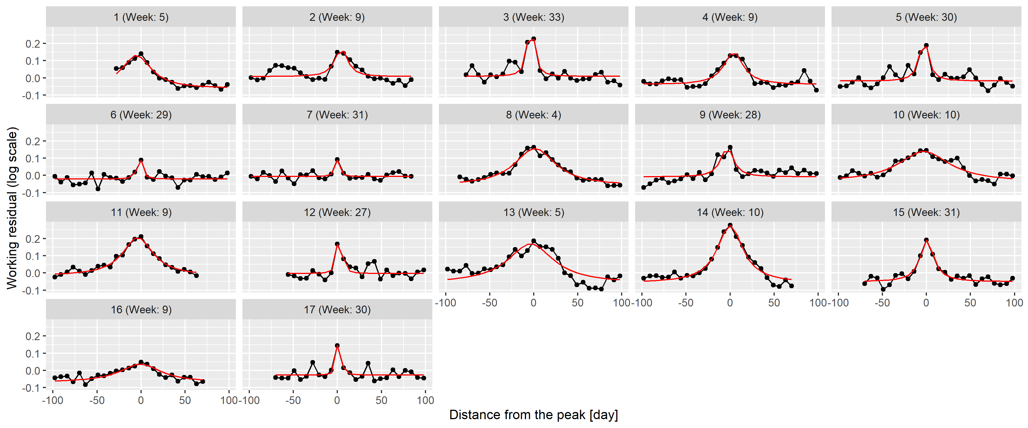
Figure 12: 100-day width neighbourhood of the identified peaks. Red line indicates the best fitting rescaled Cauchy density.
To check this theory, the best fitting function was found for each peak individually using the Nelder-Mead method [50] with mean squared error objective function. Results are shown on 12 as red lines; an almost perfect fit can be observed for all peaks confirming the initial idea of using Cauchy density.
This now puts us in a position to investigate the distribution of the
parameters (i.e.,
peaks <- merge(peaks, unique(RawData2019[, .(peakID, x0, s, a, b)]))
peaks$Summer <- peaks$peakWeek>10 & peaks$peakWeek<35
peaks$amplitude <- peaks$a/(pi*peaks$s*(1+peaks$x0^2/peaks$s^2))

fitWinterAmplitudeMin <- min(peaks[Summer==FALSE]$amplitude)
fitWinterAmplitudeMax <- max(peaks[Summer==FALSE]$amplitude)
fitWinterSigmaMin <- min(peaks[Summer==FALSE]$s)
fitWinterSigmaMax <- max(peaks[Summer==FALSE]$s)
fitWinterProb <- sum(!peaks$Summer)/(diff(range(RawData2019$Year)) + 1)

fitSummerAmplitudeMin <- min(peaks[Summer==TRUE]$amplitude)
fitSummerAmplitudeMax <- max(peaks[Summer==TRUE]$amplitude)
fitSummerSigmaMin <- min(peaks[Summer==TRUE]$s)
fitSummerSigmaMax <- max(peaks[Summer==TRUE]$s)
fitSummerProb <- sum(peaks$Summer)/(diff(range(RawData2019$Year)) + 1)

ggplot(melt(peaks[, .(peakID, Summer, s, a, peakWeek, amplitude)], id.vars = c("peakID", "Summer")),
       aes(x = value, y = Summer)) + facet_wrap(~variable, scales = "free") + geom_point()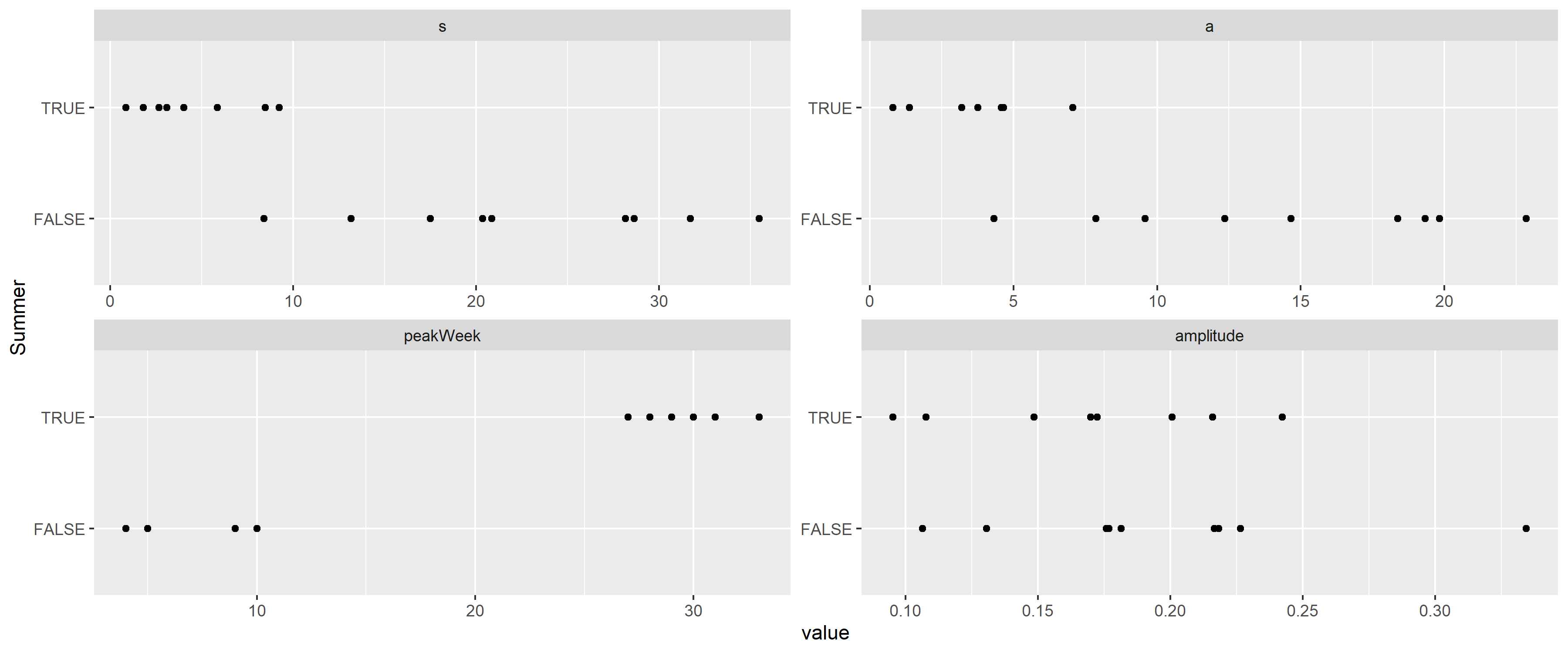
Figure 13: Distribution of the parameters of the best fitting rescaled Cauchy densities for each peak, separated according to whether the peak is during the summer.
This verifies that the width is indeed different, with the
This allows the removal of the peaks (Figure 14), and, after these peaks are removed, it is possible to re-estimate trend and seasonality, now without the biasing effect of the peaks. This “bootstrap” procedure is adequate after this second iteration, as no further peaks can be seen after the removal of the re-estimated trend and seasonality.
ggplot(RawData2019, aes(x = Week, y = log(outcome))) + geom_line() + facet_wrap(~Year) +
  geom_line(aes(y = log(outcome) - fitpeak), color = "red") +
  labs(x = "Week of the year", y = "Outcome (log scale)")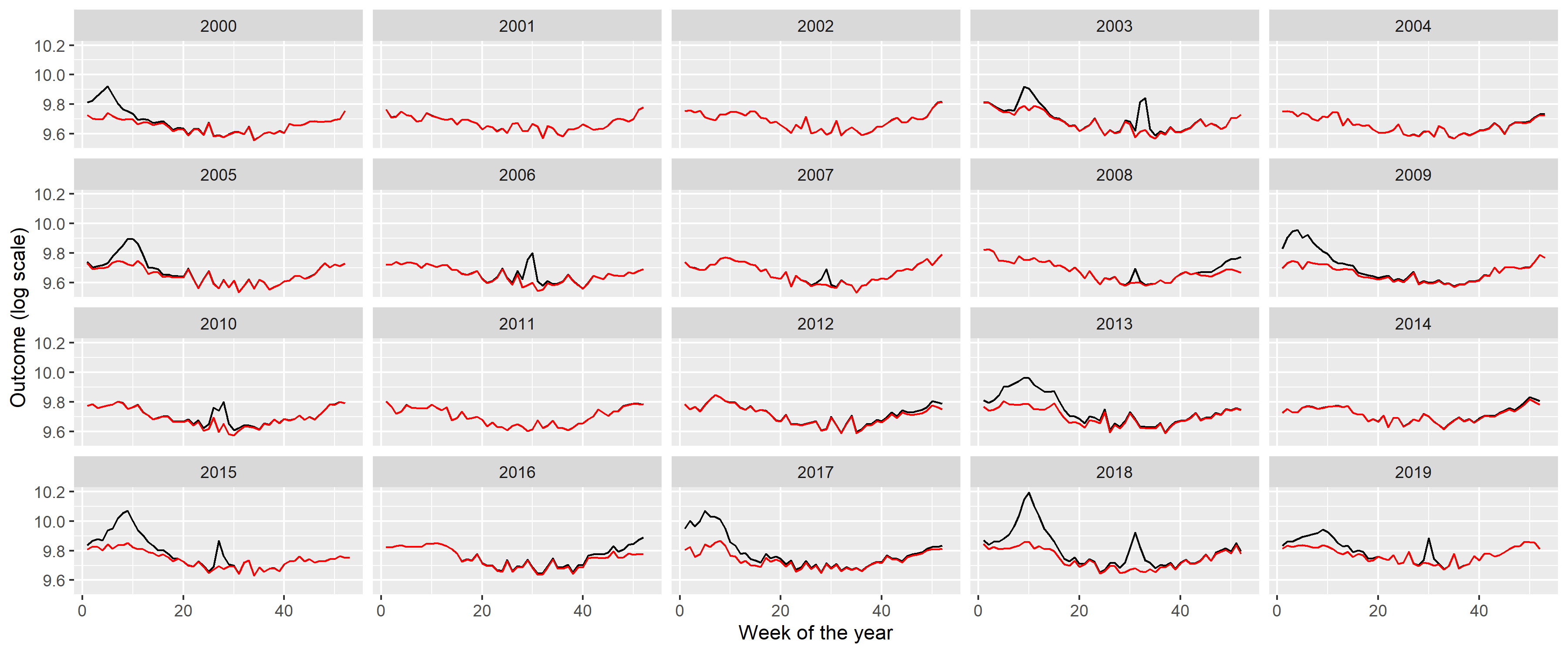
Figure 14: Weekly number of deaths in Germany, separated according to year (black) and with peaks removed (red).
Creating the appropriate model to simulate such peaks is not
straightforward: there is stochasticity in the position of the peaks and
in its shape, i.e., height and width. (Actually, even the presence of a
peak is stochastic.) The following procedure will be used: the presence
is generated as a Bernoulli random variate (with the probabilities
described above, different for summer and winter), the onset date is
uniformly distributed (from 0 to 0.2 in scaled weeks for the winter peak
and from 0.5 to 0.7 for the summer peak), i.e., the position itself is
random, but the parameters of the underyling distribution are fixed. The
The following table summarizes the parameters:
fit <- mgcv::gam(I(log(outcome)-fitpeak) ~ poly(NumTrend, 2, raw = TRUE) + cos(2*pi*WeekScaled) +
                   sin(2*pi*WeekScaled), data = RawData2019,  method = "REML")

fitSeasonAmplitude <- sqrt(coef(fit)["sin(2 * pi * WeekScaled)"]^2 +
                             coef(fit)["cos(2 * pi * WeekScaled)"]^2)
fitSeasonPhase <- atan(-coef(fit)["sin(2 * pi * WeekScaled)"]/coef(fit)["cos(2 * pi * WeekScaled)"])

fittedpars <- setNames(c(coef(fit)[1:3], fitSeasonAmplitude, fitSeasonPhase,
                         fitWinterAmplitudeMin, fitWinterAmplitudeMax, fitWinterSigmaMin,
                         fitWinterSigmaMax, fitWinterProb,
                         fitSummerAmplitudeMin, fitSummerAmplitudeMax, fitSummerSigmaMin,
                         fitSummerSigmaMax, fitSummerProb),
                       c("TrendConst", "TrendLin", "TrendQuadr",
                         "SeasonAmplitude", "SeasonPhase",
                         "WinterAmplitudeMin", "WinterAmplitudeMax", "WinterSigmaMin",
                         "WinterSigmaMax", "WinterProb",
                         "SummerAmplitudeMin", "SummerAmplitudeMax", "SummerSigmaMin",
                         "SummerSigmaMax", "SummerProb"))
knitr::kable(data.table(
  Parameter = c("Constant term of the trend", "Linear term of the trend",
                "Quadratic term of the trend", "Amplitude of seasonality (log scale)",
                "Phase of seasonality", "Minimum of winter peak amplitude (log scale)",
                "Maximum of winter peak amplitude (log scale)", "Minimum of winter peak width",
                "Maximum of winter peak width", "Probability of winter peak",
                "Minimum of summer peak amplitude (log scale)",
                "Maximum of summer peak amplitude (log scale)",
                "Minimum of summer peak width", "Maximum of summer peak width",
                "Probability of summer peak", "Size parameter of the negative binomial distribution"),
  Value = paste0("$", gsub("e", "\\\\cdot 10^{", format(c(fittedpars, 1000), scientific = TRUE, digits = 3,
trim = TRUE)), "}$")))| Parameter | Value |
|---|---|
| Constant term of the trend | |
| Linear term of the trend | |
| Quadratic term of the trend | |
| Amplitude of seasonality (log scale) | |
| Phase of seasonality | |
| Minimum of winter peak amplitude (log scale) | |
| Maximum of winter peak amplitude (log scale) | |
| Minimum of winter peak width | |
| Maximum of winter peak width | |
| Probability of winter peak | |
| Minimum of summer peak amplitude (log scale) | |
| Maximum of summer peak amplitude (log scale) | |
| Minimum of summer peak width | |
| Maximum of summer peak width | |
| Probability of summer peak | |
| Size parameter of the negative binomial distribution |
saveRDS(fittedpars, "fittedpars.rds")Given the mechanism described above, the procedure to simulate synthetic datasets can easily be created. Of course, as every calculation is carried out on the log scale, the mean should be exponentiated at the last step.
simdat <- function(TrendConst, TrendLin, TrendQuadr, SeasonAmplitude, SeasonPhase,
                   WinterAmplitudeMin, WinterAmplitudeMax, WinterSigmaMin, WinterSigmaMax, WinterProb,
                   SummerAmplitudeMin, SummerAmplitudeMax, SummerSigmaMin, SummerSigmaMax, SummerProb) {

  SimData <- data.frame(date = seq(as.Date("2000-01-03"), as.Date("2023-12-25"), by = 7))
  SimData$NumTrend <- as.numeric(SimData$date)
  SimData$WeekScaled <- lubridate::isoweek(SimData$date)/
    lubridate::isoweek(paste0(lubridate::isoyear(SimData$date), "-12-28"))

  SimData$logmu <- TrendConst + TrendLin*SimData$NumTrend + TrendQuadr*SimData$NumTrend^2 +
    SeasonAmplitude*cos(SimData$WeekScaled*2*pi + SeasonPhase)

  SimData$logmu <- SimData$logmu + rowSums(sapply(2000:2019, function(y) {
    if(rbinom(1, 1, WinterProb)==0) return(rep(0, nrow(SimData))) else {
      amplitude <- runif(1, WinterAmplitudeMin, WinterAmplitudeMax)
      sigm <- runif(1, WinterSigmaMin, WinterSigmaMax)
      dcauchy(SimData$NumTrend,
              as.numeric((as.Date(paste0(y, "-01-01")) + runif(1, 0, 0.2)*7*52.25)),
              sigm)*(pi*sigm*amplitude)
    }
  }))

  SimData$logmu <- SimData$logmu + rowSums(sapply(2000:2019, function(y) {
    if(rbinom(1, 1, SummerProb)==0) return(rep(0, nrow(SimData))) else {
      amplitude <- runif(1, SummerAmplitudeMin, SummerAmplitudeMax)
      sigm <- runif(1, SummerSigmaMin, SummerSigmaMax)
      dcauchy(SimData$NumTrend,
              as.numeric((as.Date(paste0(y, "-01-01")) + runif(1, 0.5, 0.7)*7*52.25)),
              sigm)*(pi*sigm*amplitude)
    }
  }))

  SimData$outcome <- rnbinom(nrow(SimData), mu = exp(SimData$logmu), size = 1000)

  SimData
}
Figure 15 illustrates the synthetic data set creation with a single simulation. (Of course, to assess the correctness of the simulation, several realizations have to be inspected.) In addition to the plots of 2, it also gives the autocorrelation function so that it can also be compared. (The simulated outcomes are themselves independent – meaning that effects like the increased probability of a flu season if the previous year did not have one are neglected –, but the trend, seasonality and the peaks induce a correlation structure.)
set.seed(1)

SimData <- as.data.table(do.call(simdat, as.list(fittedpars)))
SimData$Type <- "Simulated"
SimData$Week <- lubridate::isoweek(SimData$date)
SimData$Year <- lubridate::isoyear(SimData$date)

SimDataYearly <- SimData[, .(outcome = sum(outcome)), .(Year, Type)]

p1 <- ggplot(rbind(SimData[Year<=2019], RawData[Year<=2019]),
             aes(x = date, y = outcome, group = Type, color = Type)) + geom_line() +
  labs(x = "Date", y = "Mortality [/week]")

p2 <- ggplot(rbind(SimDataYearly[Year<=2019], RawDataYearly[Year<=2019]),
             aes(x = Year, y = outcome, group = Type, color = Type)) + geom_point() +
  geom_line() + labs(y = "Mortality [/year]")

p3 <- ggplot(rbind(SimData[Year<=2019], RawData[Year<=2019]),
             aes(x = Week, y = outcome, group = Year)) + facet_wrap(~Type) +
  geom_line(alpha = 0.2) + labs(x = "Week of the year", y = "Mortality [/week]")

p4 <- ggplot(rbind(with(acf(RawData$outcome, plot = FALSE),
                        data.table(Type = "Actual", acf = acf[, 1, 1], lag = lag[, 1, 1])),
                   with(acf(SimData$outcome, plot = FALSE),
                        data.table(Type = "Simulated", acf = acf[, 1, 1], lag = lag[, 1, 1]))),
             aes(x = lag - 1/4 + as.numeric(Type=="Simulated")/2,
                 xend = lag - 1/4 + as.numeric(Type=="Simulated")/2, y = acf, yend = 0, color = Type)) +
  geom_line() + geom_point() + geom_hline(yintercept = 0, col = "black") +
  labs(x = "Lag", y = "Autocorrelation")

egg::ggarrange(p1, p2, p3, p4, ncol = 1)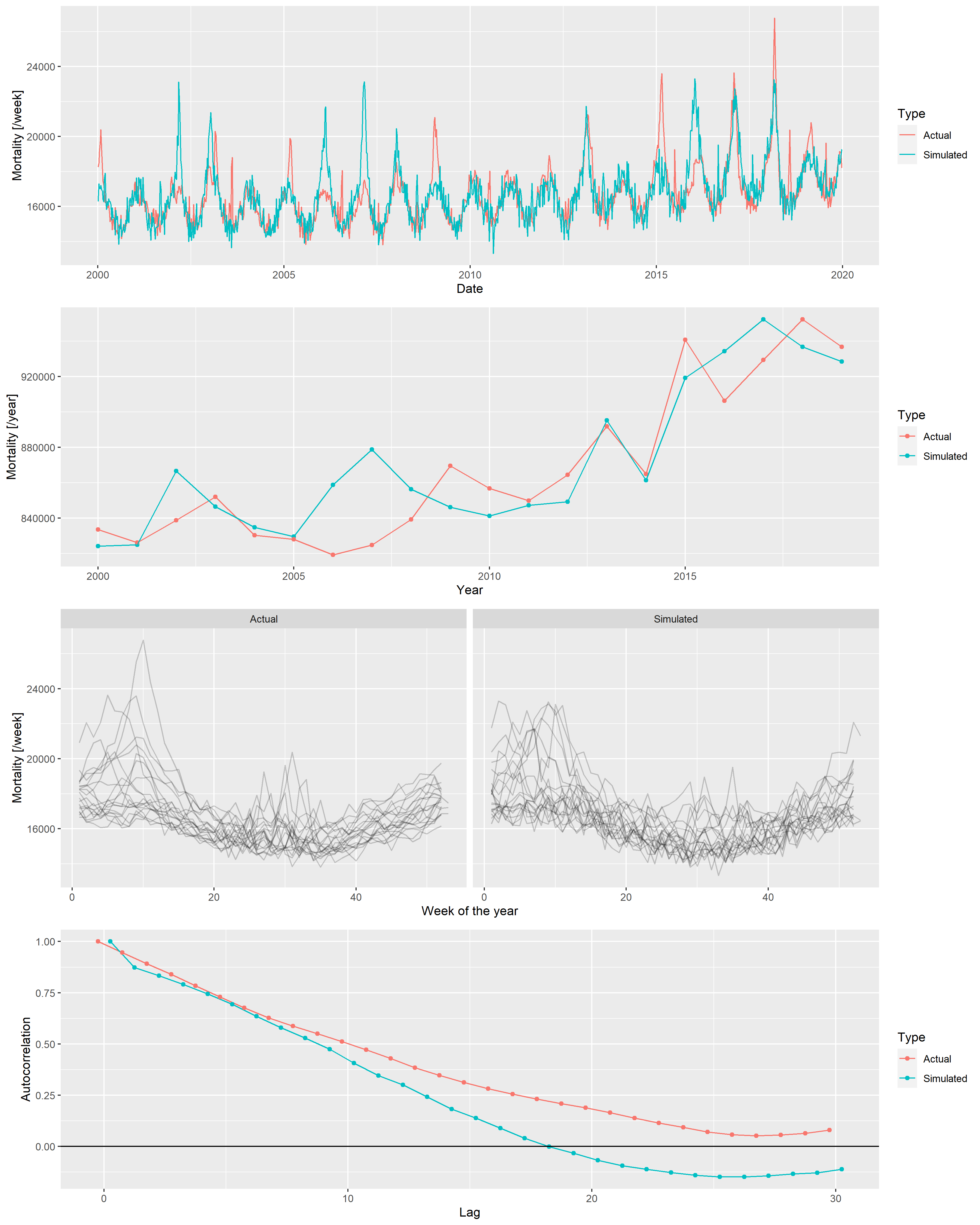
Figure 15: From top to bottom: weekly mortalities, yearly mortalities, seasonal pattern and autocorrelation function of the actual German mortality data and a single simulated dataset, 2000-2019.
Several simulations confirm an overall good fit between the actual data set and the simulated ones. Thus, it is now possible to investigate the properties of the mortality prediction on algorithms using simulated datasets, where the actual outcome is known, and the parameters can be varied.
Two sets of parameters have to be set up: parameters of the simulation (i.e., parameters of the scenario, on which the methods will be run) and parameters of the methods. They’re set up as given in the main text.
pargridSim <- as.data.table(t(fittedpars))
pargridSim <- rbind(pargridSim,
                    data.table(TrendConst = pargridSim$TrendConst, TrendLin = pargridSim$TrendLin,
                               TrendQuadr = 0, pargridSim[, -(1:3)]),
                    data.table(TrendConst = pargridSim$TrendConst, TrendLin = 0,
                               TrendQuadr = 0, pargridSim[, -(1:3)]),
                    data.table(TrendConst = 10, TrendLin = 9.5e-05,
                               TrendQuadr = -3e-09, pargridSim[, -(1:3)]))
One thousand simulation will be run for each parameter of the scenario, and for each of the 1000 simulated data set all 4 methods with all possible parameters of the methods will be evaluated. To increase the speed, simulations will be run in parallel. (The problem is embarrassingly parallel, as different simulations are completely independent of each other [51].)
if(!file.exists("predLongs.rds")) {
  cl <- parallel::makeCluster(parallel::detectCores()-1)
  parallel::clusterExport(cl, c("pargridSim", "pargridWHO", "pargridAI",
                                "pargridAverage", "pargridLin", "simdat"), envir = environment())

  pred <- do.call(rbind, parallel::parLapply(cl, 1:1000, function(j) {
    do.call(rbind, lapply(1:nrow(pargridSim), function(k) {
      SimData <- do.call(simdat, as.list(pargridSim[k, ]))
      SimData$Year <- lubridate::isoyear(SimData$date)

      predWHO <- sapply(1:nrow(pargridWHO), function(i)
        predict(mgcv::gam(outcome ~ s(NumTrend, k = pargridWHO$k[i]) + s(WeekScaled, bs = "cc"),
                          data = SimData[SimData$Year>=pargridWHO$startyear[i]&SimData$Year<=2019,],
                          family = mgcv::nb(), method = "REML"),
                newdata = SimData[SimData$Year>=2020,], type = "response"))

      predAI <- sapply(1:nrow(pargridAI), function(i)
        with(excessmort::compute_expected(
          cbind(SimData[SimData$Year>=pargridAI$startyear[i],], population = 1),
          exclude = seq(as.Date("2020-01-01"), max(SimData$date), by = "day"),
          frequency = nrow(SimData)/(as.numeric(diff(range(SimData$date)))/365.25),
          trend.knots.per.year = 1/pargridAI$invtkpy[i], verbose = FALSE),
          expected[date>=as.Date("2019-12-30")]))

      predAverage <- sapply(1:nrow(pargridAverage), function(i)
        predict(mgcv::gam(outcome ~ s(WeekScaled, bs = "cc"),
                          data = SimData[SimData$Year>=pargridAverage$startyear[i]&SimData$Year<=2019,],
                          family = mgcv::nb(), method = "REML"),
                newdata = SimData[SimData$Year>=2020,], type = "response"))

      predLin <- sapply(1:nrow(pargridLin), function(i)
        predict(mgcv::gam(outcome ~ NumTrend + s(WeekScaled, bs = "cc"),
                          data = SimData[SimData$Year>=pargridLin$startyear[i]&SimData$Year<=2019,],
                          family = mgcv::nb(), method = "REML"),
                newdata = SimData[SimData$Year>=2020,], type = "response"))

      setNames(data.frame(j, k, SimData[SimData$Year>=2020, c("date", "outcome")], predWHO,
                          predAI, predAverage, predLin, row.names = NULL),
               c("rep", "parsim", "date", "outcome", pargridWHO$parmethod, pargridAI$parmethod,
                 pargridAverage$parmethod, pargridLin$parmethod))
    }))
  }))

  parallel::stopCluster(cl)

  pred$Year <- lubridate::isoyear(pred$date)
  pred$date <- NULL

  predYearly <- as.data.table(pred)[, lapply(.SD, sum), .(rep, parsim, Year)]

  predLongs <- lapply(
    list(WHO = pargridWHO, AI = pargridAI, Average = pargridAverage,
         Lin = pargridLin),
    function(pg)
      merge(merge(melt(predYearly[, c("rep", "parsim", "outcome", "Year", pg$parmethod), with = FALSE],
                       id.vars = c("rep", "parsim", "outcome", "Year"), variable.name = "parmethod"), pg),
            data.table(parsim = 1:4,
                       parsimName = c("Quadratic trend", "Linear trend", "Constant", "Non-monotone")),
            by = "parsim"))

  saveRDS(predLongs, "predLongs.rds")
} else predLongs <- readRDS("predLongs.rds")As different methods were evaluated on the same simulated dataset for each simulation, it is possible to compare not only the averages, but directly compare the errors themselves. Figure 16 shows direct comparison between the best parametrization of the WHO’s method and the Acosta-Irizarry method for 200 randomly selected simulations in each scenario, with 2015 as the starting year. In the base case scenario, Acosta-Irizarry performed better in 55.4% of the cases.
ggplot(merge(predLongs$WHO[startyear==2015&k==3, .(errorWHO = mean((value-outcome)^2)),
                           .(rep, parsimName)],
             predLongs$AI[startyear==2015&invtkpy==7, .(errorAI = mean((value-outcome)^2)),
                          .(rep, parsimName)])[rep<=200],
       aes(x = errorWHO, y = errorAI, color = factor(parsimName))) +
  geom_point() + geom_abline(color = "red") +
  scale_x_log10(labels = scales::label_log()) + scale_y_log10(labels = scales::label_log()) +
  annotation_logticks() +
  labs(x = "Mean squared error, WHO method (starting year: 2015, k = 3)",
       y = "Mean squared error, Acosta-Irizarry method (starting year: 2015, trend knots per year = 1/7)",
       color = "Scenario") + scale_color_discrete()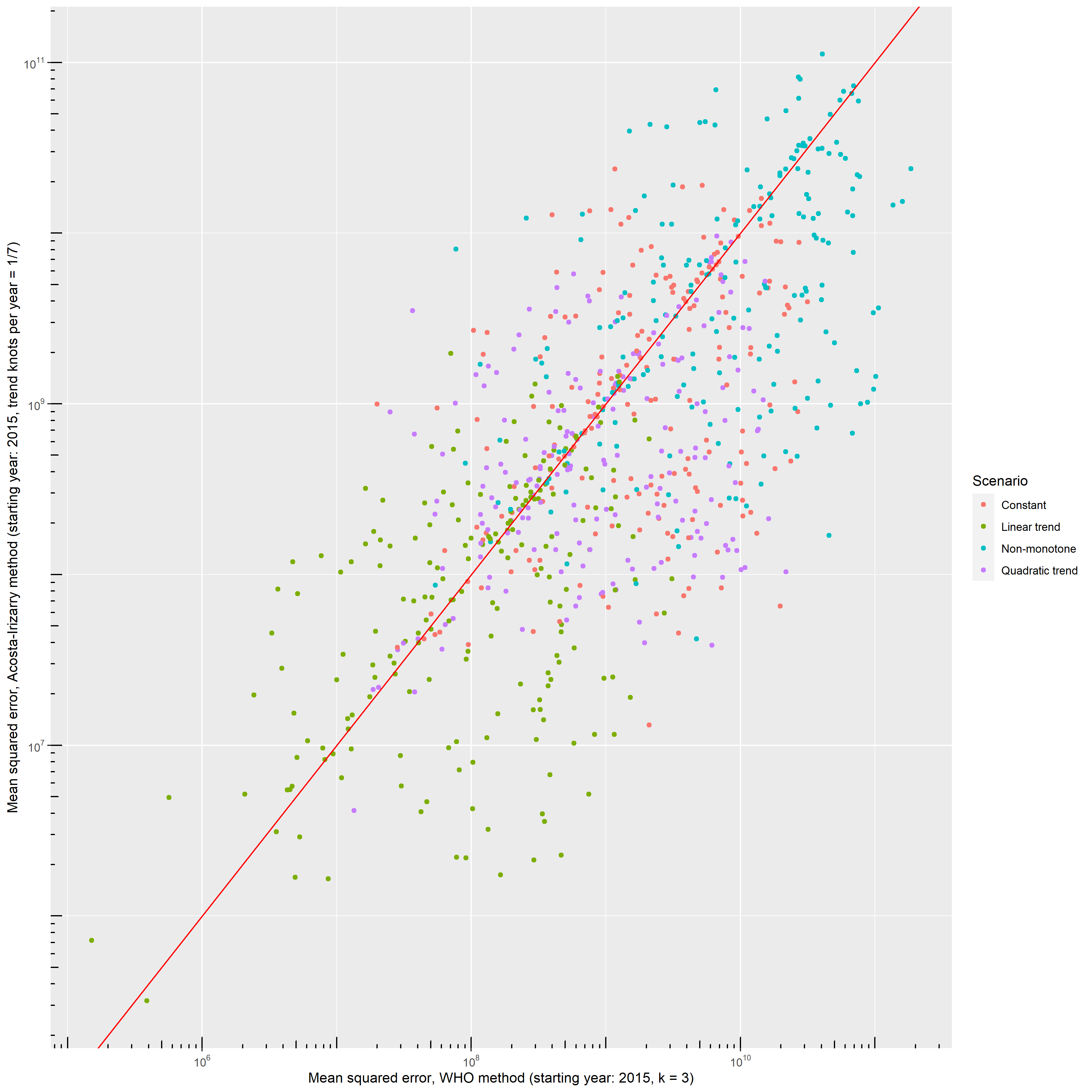
Figure 16: Errors – squared distance of the predicted outcome from its true value – of the WHO’s method and the Acosta-Irizarry method (under best parametrization) on the same simulated datasets for 200 randomly selected simulations with different scenarios; black dots indicate the base case scenario, scenario \#1 to \#5 represent varying the parameter shown on the panel from half of its base case value to twice (with the exception of the constant term where it is varied from 90% to 110%), and probabilities are limited to be below 100%.
1. Karlinsky A, Kobak D. Tracking excess mortality across countries during the COVID-19 pandemic with the World Mortality Dataset. eLife [Internet]. 2021 [cited 2022 Jun 28];10:e69336. Available from: https://elifesciences.org/articles/69336
2. Santos-Burgoa C, Sandberg J, Suárez E, Goldman-Hawes A, Zeger S, Garcia-Meza A, et al. Differential and persistent risk of excess mortality from Hurricane Maria in Puerto Rico: A time-series analysis. The Lancet Planetary Health [Internet]. 2018 [cited 2022 Jul 13];2:e478–88. Available from: https://linkinghub.elsevier.com/retrieve/pii/S2542519618302092
3. Rivera R, Rolke W. Modeling excess deaths after a natural disaster with application to Hurricane Maria. Statistics in Medicine [Internet]. 2019 [cited 2022 Jul 13];38:4545–54. Available from: https://onlinelibrary.wiley.com/doi/10.1002/sim.8314
4. Morita T, Nomura S, Tsubokura M, Leppold C, Gilmour S, Ochi S, et al. Excess mortality due to indirect health effects of the 2011 triple disaster in Fukushima, Japan: A retrospective observational study. J Epidemiol Community Health [Internet]. 2017 [cited 2022 Jul 13];71:974–80. Available from: https://jech.bmj.com/lookup/doi/10.1136/jech-2016-208652
5. Simonsen L, Clarke MJ, Williamson GD, Stroup DF, Arden NH, Schonberger LB. The impact of influenza epidemics on mortality: Introducing a severity index. Am J Public Health [Internet]. 1997 [cited 2022 Jul 13];87:1944–50. Available from: https://ajph.aphapublications.org/doi/full/10.2105/AJPH.87.12.1944
6. Rosano A, Bella A, Gesualdo F, Acampora A, Pezzotti P, Marchetti S, et al. Investigating the impact of influenza on excess mortality in all ages in Italy during recent seasons (2013/14–2016/17 seasons). International Journal of Infectious Diseases [Internet]. 2019 [cited 2022 Jul 13];88:127–34. Available from: https://linkinghub.elsevier.com/retrieve/pii/S1201971219303285
7. Leon DA, Shkolnikov VM, Smeeth L, Magnus P, Pechholdová M, Jarvis CI. COVID-19: A need for real-time monitoring of weekly excess deaths. The Lancet [Internet]. 2020 [cited 2022 Jul 13];395:e81. Available from: https://linkinghub.elsevier.com/retrieve/pii/S0140673620309338
8. Pearce N, Lawlor DA, Brickley EB. Comparisons between countries are essential for the control of COVID-19. International Journal of Epidemiology [Internet]. 2020 [cited 2022 Jul 13];49:1059–62. Available from: https://academic.oup.com/ije/article/49/4/1059/5864919
9. Beaney T, Clarke JM, Jain V, Golestaneh AK, Lyons G, Salman D, et al. Excess mortality: The gold standard in measuring the impact of COVID-19 worldwide? J R Soc Med [Internet]. 2020 [cited 2022 Jul 13];113:329–34. Available from: http://journals.sagepub.com/doi/10.1177/0141076820956802
10. Faust JS, Krumholz HM, Du C, Mayes KD, Lin Z, Gilman C, et al. All-Cause Excess Mortality and COVID-19–Related Mortality Among US Adults Aged 25-44 Years, March-July 2020. JAMA [Internet]. 2021 [cited 2022 Jul 14];325:785. Available from: https://jamanetwork.com/journals/jama/fullarticle/2774445
11. Kirpich A, Shishkin A, Weppelmann TA, Tchernov AP, Skums P, Gankin Y. Excess mortality in Belarus during the COVID-19 pandemic as the case study of a country with limited non-pharmaceutical interventions and limited reporting. Sci Rep [Internet]. 2022 [cited 2022 Jul 14];12:5475. Available from: https://www.nature.com/articles/s41598-022-09345-z
12. Faust JS, Du C, Liang C, Mayes KD, Renton B, Panthagani K, et al. Excess Mortality in Massachusetts During the Delta and Omicron Waves of COVID-19. JAMA [Internet]. 2022 [cited 2022 Jul 14];328:74. Available from: https://jamanetwork.com/journals/jama/fullarticle/2792738
13. Rossen LM, Ahmad FB, Anderson RN, Branum AM, Du C, Krumholz HM, et al. Disparities in Excess Mortality Associated with COVID-19 — United States, 2020. MMWR Morb Mortal Wkly Rep [Internet]. 2021 [cited 2022 Jul 14];70:1114–9. Available from: http://www.cdc.gov/mmwr/volumes/70/wr/mm7033a2.htm?s_cid=mm7033a2_w
14. Bradshaw D, Dorrington RE, Laubscher R, Moultrie TA, Groenewald P. Tracking mortality in near to real time provides essential information about the impact of the COVID-19 pandemic in South Africa in 2020. S Afr Med J [Internet]. 2021 [cited 2022 Jul 14];111:732. Available from: http://www.samj.org.za/index.php/samj/article/view/13304
15. Modi C, Böhm V, Ferraro S, Stein G, Seljak U. Estimating COVID-19 mortality in Italy early in the COVID-19 pandemic. Nat Commun [Internet]. 2021 [cited 2022 Jul 14];12:2729. Available from: http://www.nature.com/articles/s41467-021-22944-0
16. Wang H, Paulson KR, Pease SA, Watson S, Comfort H, Zheng P, et al. Estimating excess mortality due to the COVID-19 pandemic: A systematic analysis of COVID-19-related mortality, 2020–21. The Lancet [Internet]. 2022 [cited 2022 Jul 14];399:1513–36. Available from: https://linkinghub.elsevier.com/retrieve/pii/S0140673621027963
17. Kontis V, Bennett JE, Rashid T, Parks RM, Pearson-Stuttard J, Guillot M, et al. Magnitude, demographics and dynamics of the effect of the first wave of the COVID-19 pandemic on all-cause mortality in 21 industrialized countries. Nat Med [Internet]. 2020 [cited 2022 Jul 14];26:1919–28. Available from: https://www.nature.com/articles/s41591-020-1112-0
18. Stang A, Standl F, Kowall B, Brune B, Böttcher J, Brinkmann M, et al. Excess mortality due to COVID-19 in Germany. Journal of Infection [Internet]. 2020 [cited 2022 Jul 16];81:797–801. Available from: https://linkinghub.elsevier.com/retrieve/pii/S016344532030596X
19. Konstantinoudis G, Cameletti M, Gómez-Rubio V, Gómez IL, Pirani M, Baio G, et al. Regional excess mortality during the 2020 COVID-19 pandemic in five European countries. Nat Commun [Internet]. 2022 [cited 2022 Jul 14];13:482. Available from: https://www.nature.com/articles/s41467-022-28157-3
20. Davies B, Parkes BL, Bennett J, Fecht D, Blangiardo M, Ezzati M, et al. Community factors and excess mortality in first wave of the COVID-19 pandemic in England. Nat Commun [Internet]. 2021 [cited 2022 Jul 14];12:3755. Available from: http://www.nature.com/articles/s41467-021-23935-x
21. Joy M, Hobbs FR, Bernal JL, Sherlock J, Amirthalingam G, McGagh D, et al. Excess mortality in the first COVID pandemic peak: Cross-sectional analyses of the impact of age, sex, ethnicity, household size, and long-term conditions in people of known SARS-CoV-2 status in England. Br J Gen Pract [Internet]. 2020 [cited 2022 Jul 14];70:e890–8. Available from: https://bjgp.org/lookup/doi/10.3399/bjgp20X713393
22. Alicandro G, Remuzzi G, La Vecchia C. Italy’s first wave of the COVID-19 pandemic has ended: No excess mortality in May, 2020. The Lancet [Internet]. 2020 [cited 2022 Jul 13];396:e27–8. Available from: https://linkinghub.elsevier.com/retrieve/pii/S0140673620318651
23. Haklai Z, Aburbeh M, Goldberger N, Gordon E-S. Excess mortality during the COVID-19 pandemic in Israel, March–November 2020: When, where, and for whom? Isr J Health Policy Res [Internet]. 2021 [cited 2022 Jul 14];10:17. Available from: https://ijhpr.biomedcentral.com/articles/10.1186/s13584-021-00450-4
24. Modig K, Ahlbom A, Ebeling M. Excess mortality from COVID-19: Weekly excess death rates by age and sex for Sweden and its most affected region. European Journal of Public Health [Internet]. 2021 [cited 2022 Jul 14];31:17–22. Available from: https://academic.oup.com/eurpub/article/31/1/17/5968985
25. Krieger N, Chen JT, Waterman PD. Excess mortality in men and women in Massachusetts during the COVID-19 pandemic. The Lancet [Internet]. 2020 [cited 2022 Jul 14];395:1829. Available from: https://linkinghub.elsevier.com/retrieve/pii/S0140673620312344
26. Michelozzi P, de’Donato F, Scortichini M, Pezzotti P, Stafoggia M, De Sario M, et al. Temporal dynamics in total excess mortality and COVID-19 deaths in Italian cities. BMC Public Health [Internet]. 2020 [cited 2022 Jul 14];20:1238. Available from: https://bmcpublichealth.biomedcentral.com/articles/10.1186/s12889-020-09335-8
27. Vieira A, Peixoto VR, Aguiar P, Abrantes A. Rapid Estimation of Excess Mortality during the COVID-19 Pandemic in Portugal -Beyond Reported Deaths: JEGH [Internet]. 2020 [cited 2022 Jul 14];10:209. Available from: https://www.atlantis-press.com/article/125941684
28. Statistics | Eurostat [Internet]. [cited 2022 Jul 14]. Available from: https://ec.europa.eu/eurostat/databrowser/view/demo_mexrt/default/table?lang=en
29. Ghafari M, Kadivar A, Katzourakis A. Excess deaths associated with the Iranian COVID-19 epidemic: A province-level analysis. International Journal of Infectious Diseases [Internet]. 2021 [cited 2022 Jul 13];107:101–15. Available from: https://linkinghub.elsevier.com/retrieve/pii/S120197122100326X
30. Kobak D. Excess mortality reveals Covid’s true toll in Russia. Significance [Internet]. 2021 [cited 2022 Jul 13];18:16–9. Available from: https://onlinelibrary.wiley.com/doi/10.1111/1740-9713.01486
31. Scortichini M, Schneider dos Santos R, De’ Donato F, De Sario M, Michelozzi P, Davoli M, et al. Excess mortality during the COVID-19 outbreak in Italy: A two-stage interrupted time-series analysis. International Journal of Epidemiology [Internet]. 2021 [cited 2022 Jul 14];49:1909–17. Available from: https://academic.oup.com/ije/article/49/6/1909/5923437
32. Wood SN. Generalized additive models: An introduction with R. Second edition. Boca Raton: CRC Press/Taylor & Francis Group; 2017.
33. Jaroslaw H, David R, Matt W. Semiparametric regression with R. New York, NY: Springer Science+Business Media; 2018.
34. Acosta RJ, Irizarry RA. A Flexible Statistical Framework for Estimating Excess Mortality. Epidemiology [Internet]. 2022 [cited 2022 Jul 13];33:346–53. Available from: https://journals.lww.com/10.1097/EDE.0000000000001445
35. Islam N, Shkolnikov VM, Acosta RJ, Klimkin I, Kawachi I, Irizarry RA, et al. Excess deaths associated with covid-19 pandemic in 2020: Age and sex disaggregated time series analysis in 29 high income countries. BMJ [Internet]. 2021 [cited 2022 Jul 13];n1137. Available from: https://www.bmj.com/lookup/doi/10.1136/bmj.n1137
36. Rivera R, Rosenbaum JE, Quispe W. Excess mortality in the United States during the first three months of the COVID-19 pandemic. Epidemiol Infect [Internet]. 2020 [cited 2022 Jul 14];148:e264. Available from: https://www.cambridge.org/core/product/identifier/S0950268820002617/type/journal_article
37. Knutson V, Aleshin-Guendel S, Karlinsky A, Msemburi W, Wakefield J. Estimating Global and Country-Specific Excess Mortality During the COVID-19 Pandemic. 2022 [cited 2022 Jul 14]; Available from: https://arxiv.org/abs/2205.09081
38. Adam D. 15 million people have died in the pandemic, WHO says. Nature [Internet]. 2022 [cited 2022 Jul 15];605:206–6. Available from: https://www.nature.com/articles/d41586-022-01245-6
39. Van Noorden R. COVID death tolls: Scientists acknowledge errors in WHO estimates. Nature [Internet]. 2022 [cited 2022 Jul 15];606:242–4. Available from: https://www.nature.com/articles/d41586-022-01526-0
40. R Core Team. R: A Language and Environment for Statistical Computing [Internet]. Vienna, Austria: R Foundation for Statistical Computing; 2022. Available from: https://www.R-project.org/
41. Dowle M, Srinivasan A. Data.table: Extension of ‘data.frame‘ [Internet]. 2021. Available from: https://CRAN.R-project.org/package=data.table
42. Wickham H. Ggplot2: Elegant Graphics for Data Analysis [Internet]. Springer-Verlag New York; 2016. Available from: https://ggplot2.tidyverse.org
43. International Organization for Standardization. ISO 8601. 2019.
44. Nepomuceno MR, Klimkin I, Jdanov DA, Alustiza‐Galarza A, Shkolnikov VM. Sensitivity Analysis of Excess Mortality due to the COVID‐19 Pandemic. Population & Development Rev [Internet]. 2022 [cited 2022 Jul 17];48:279–302. Available from: https://onlinelibrary.wiley.com/doi/10.1111/padr.12475
45. Schöley J. Robustness and bias of European excess death estimates in 2020 under varying model specifications [Internet]. Epidemiology; 2021 Jun. Available from: http://medrxiv.org/lookup/doi/10.1101/2021.06.04.21258353
46. Eurostat - Data Explorer [Internet]. [cited 2022 Jun 28]. Available from: https://appsso.eurostat.ec.europa.eu/nui/show.do?dataset=demo_r_mwk_ts&lang=en
47. Jdanov DA, Galarza AA, Shkolnikov VM, Jasilionis D, Németh L, Leon DA, et al. The short-term mortality fluctuation data series, monitoring mortality shocks across time and space. Sci Data [Internet]. 2021 [cited 2022 Jun 28];8:235. Available from: https://www.nature.com/articles/s41597-021-01019-1
48. Hilbe JM. Negative Binomial Regression [Internet]. 2nd ed. Cambridge University Press; 2011 [cited 2022 Jul 15]. Available from: https://www.cambridge.org/core/product/identifier/9780511973420/type/book
49. Palshikar G. Simple algorithms for peak detection in time-series. Proc 1st Int Conf Advanced Data Analysis, Business Analytics and Intelligence. 2009.
50. Nelder JA, Mead R. A Simplex Method for Function Minimization. The Computer Journal [Internet]. 1965 [cited 2022 Jul 15];7:308–13. Available from: https://academic.oup.com/comjnl/article-lookup/doi/10.1093/comjnl/7.4.308
51. Matloff NS. The art of R programming: Tour of statistical software design. San Francisco: No Starch Press; 2011.
Footnotes
-
Physiological Controls Research Center, Óbuda University and Department of Statistics, Corvinus University of Budapest, ferenci.tamas@nik.uni-obuda.hu ↩
