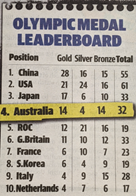
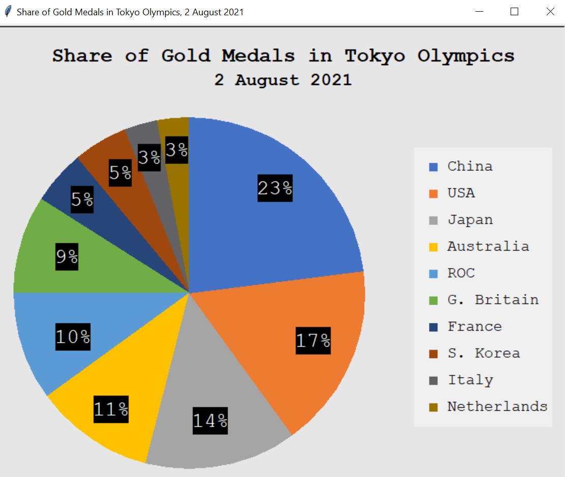
Use Turtle graphics (turtle module) to draw a pie chart representing the share of gold medals at the Olympic Games Tokyo as of 2 August 2021.
Source: Adelaide Advertiser 3 August 2021
To begin, I convert the numbers of gold medals into percentages in order to draw the pie chart’s segments. The corresponding percentage is converted by dividing the number of gold medals by 360%.
| Number of Gold Medals | Segment Percentages (%) |
|---|---|
| 28 | 82.8 |
| 21 | 61.2 |
| 17 | 50.4 |
| 14 | 39.6 |
| 12 | 36 |
| 11 | 32.4 |
| 6 | 18 |
| 6 | 18 |
| 4 | 10.8 |
| 4 | 10.8 |
The percentage in 100% is converted by dividing the number of gold medals the total of gold medals (119) and multiplied by 100.
| Segment Percentages (%) | Percentages in 100% (%) |
|---|---|
| 28 | 23 |
| 21 | 17 |
| 17 | 14 |
| 14 | 11 |
| 12 | 10 |
| 11 | 9 |
| 6 | 5 |
| 6 | 5 |
| 4 | 3 |
| 4 | 3 |
Following that, I import the turtle module, after which I define all of the functions I am going to use in the code. I then set the window for the project by setting the height and width, with suitable background colour. For almost every element, I specify it with an appropriate name, such as pie, label, and country using Turtle() method.
Inside the label(x, y, percentage) function (with the three arguments begin the x- and y- coordinates and the percentage – in the 100% scale), I use an if statement to categorising the labels into two groups: two characters (e.g., 3%) and three characters (e.g., 23%). The reason for categorisation is to make the black box of each label fits well with the percentage inside. Afterwards, a short for loop is used to draw that black box. Finally, I use the write() function to draw the percentages.
Inside the country(colour, y2, name) function (with the three arguments being the colour, y coordinate, and country name), I again use a short for loop to draw a small bullet before each country name. The reason for this is to add bullets to the list of legends.
I write the heading using suitable colour, font, size, and style. Following this, I draw the big circle illustrating the pie chart by first defining and moving the turtle. I then draw the first segment of the pie, Netherlands, and group the other nine segments by using a fop loop. The reason for grouping is that the remaining segments can be drawn with the same method, only theirs position and colour are different. Thus, I create the degree and the colour list, each of which contains nine arguments for nine segments. I have defined the segment(degree) function to draw each segment after specifying its position and colour.
I write the labels by using label(x, y, percentage) functions defined at the beginning of the code. Next, I draw the legend border on the right-hand side using a simple for loop. After this, I sequentially write the name of every country from having the highest portion, China, to having the lowest portion, Netherlands. The writing is done with the corresponding colour using the defined country(colour, y2, name) function.

