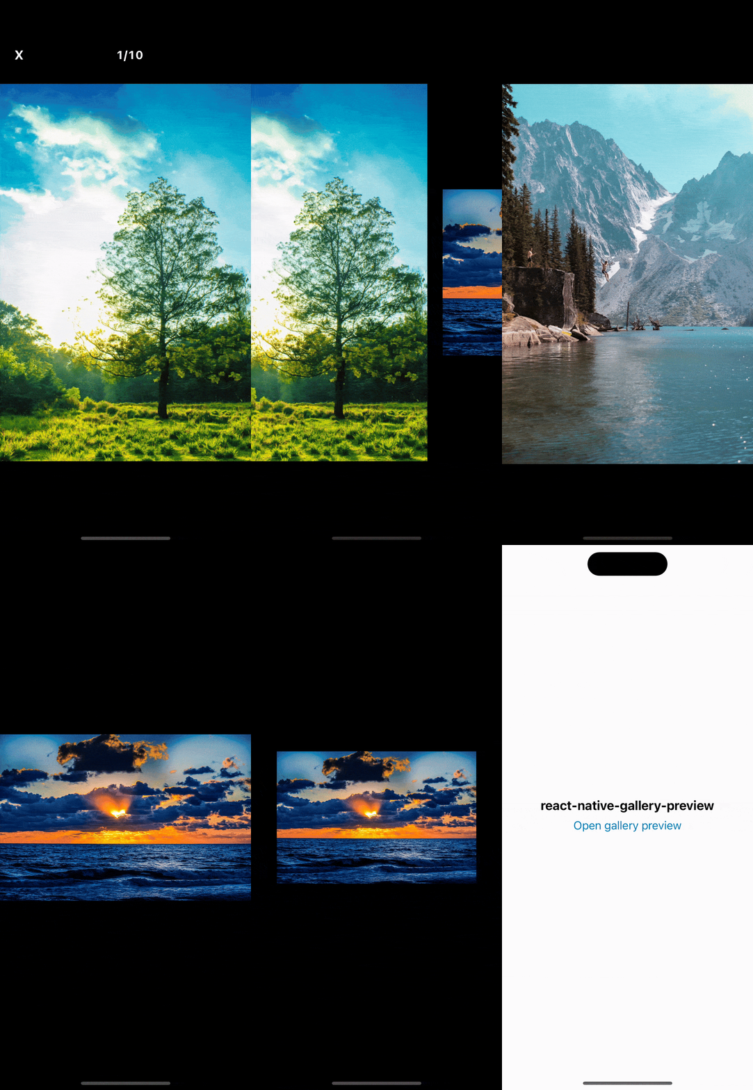
GalleryPreview is a flexible modal component for easy gallery previews with full gesture support. Using Reanimated and React Native Gesture Handler, it gives a smooth and simple user experience for both iOS and Android.
- ⚡ Smooth Gesture Interactions and Animations: Experience fluid and responsive animations and gestures for a delightful user interface.
- 🔍 Double Tap and Pinch to zoom: Users can effortlessly zoom in and out of images with simple double-tap and pinch gestures
- 👆 Pull down to close: Intuitive pull-down gesture to close the gallery preview, making navigation seamless.
↔️ RTL Support- 📱 Supports both
iOSandAndroid: Fully compatible with both iOS and Android devices, ensuring a consistent experience across platforms. - 📱 Compatible with
Expo
Before you can use GalleryPreview, you need to set up react-native-reanimated and react-native-gesture-handler. Follow the links below for detailed installation guides:
- Setting up Reanimated
- Setting up React Native Gesture Handler
Once the dependencies are installed, you can add react-native-gallery-preview to your project:
npm install react-native-gallery-preview
# or
yarn add react-native-gallery-preview
import React, { useState } from 'react';
import { Button, View } from 'react-native';
import GalleryPreview from 'react-native-gallery-preview';

export const App = () => {
  const [isVisible, setIsVisible] = useState(false);

  const images = [
    { uri: 'https://example.com/image1.jpg' },
    { uri: 'https://example.com/image2.jpg' },
    // Add more images here
  ];

  return (
    <View>
      <Button title="Open Gallery Preview" onPress={() => setIsVisible(true)} />
      <GalleryPreview
        isVisible={isVisible}
        onRequestClose={() => setIsVisible(false)}
        images={images}
      />
    </View>
  );
};| Prop Name | Type | Description | Default |
|---|---|---|---|
isVisible |
boolean |
Controls the visibility of the image viewer modal. | - |
onRequestClose |
() => void |
Function to close the image viewer modal. | - |
images |
ImageItemURI[] |
Array of image URIs to be displayed. | - |
initialIndex? |
number |
The initial index of the image to be displayed when the viewer is opened. | 0 |
gap? |
number |
The gap between images in the viewer. | 24 |
simultaneousRenderedImages? |
number |
The number of images rendered simultaneously for optimization. | 6 |
OverlayComponent? |
(props: GalleryOverlayProps) => React.ReactNode |
Optional component to be rendered above the image viewer. | - |
ImageComponent? |
(props: GalleryImageComponentProps) => React.JSX.Element |
Optional custom component to render each image. | - |
springConfig? |
SpringConfig |
Spring configuration for animations. | { damping: 1000, mass: 1, stiffness: 250, restDisplacementThreshold: 0.02, restSpeedThreshold: 4 } |
doubleTabEnabled? |
boolean |
Enable or disable double-tap to zoom functionality. | true |
pinchEnabled? |
boolean |
Enable or disable pinch to zoom functionality. | true |
swipeToCloseEnabled? |
boolean |
Enable or disable swipe to close functionality. | true |
backgroundColor? |
string |
The background color of the modal, DefaultHeader, and StatusBar. | #000 |
headerTextColor? |
string |
Color of text in the header. | #fff |
