Rich text field for use in Amplience Dynamic Content
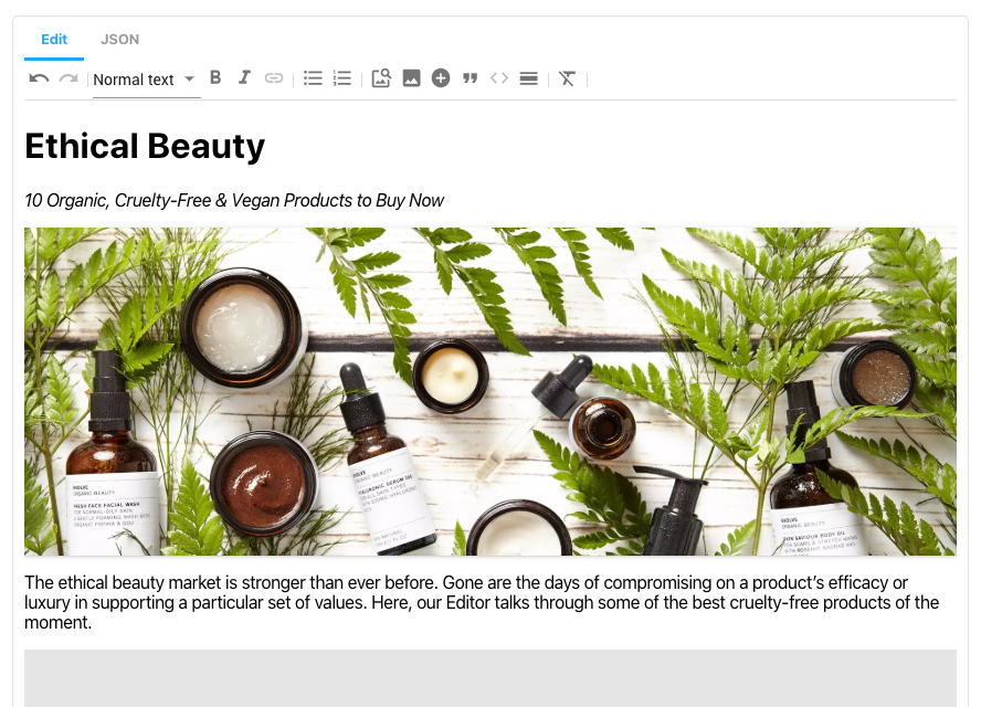
This extension is designed to replace the built in rich text editor with additional features and customization options.
- Markdown output
- Paragraphs
- Headings
- Bold text
- Italic text
- Soft hyphens
- Hyperlinks
- Anchors
- Text alignment
- Bullet lists
- Numeric lists
- External images
- Block quotes
- Code snippets
- Horizontal rules
- Inline styles
- JSON output
- Markdown Blocks
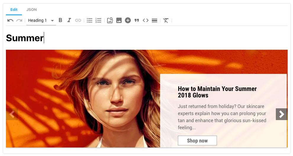
- Content Blocks
- Image Blocks
- User friendly editor based on ProseMirror
- Cut/copy/paste content
- Formatting when copying content from other tools
- Keyboard shortcuts
- Undo/Redo
- Customizability
- Enable/disable tools
- Change toolbar layout
- Custom styles
More details on the available features can be found on the Features page, whilst further information on how to configure and customise these features can be found in the Configuration section.
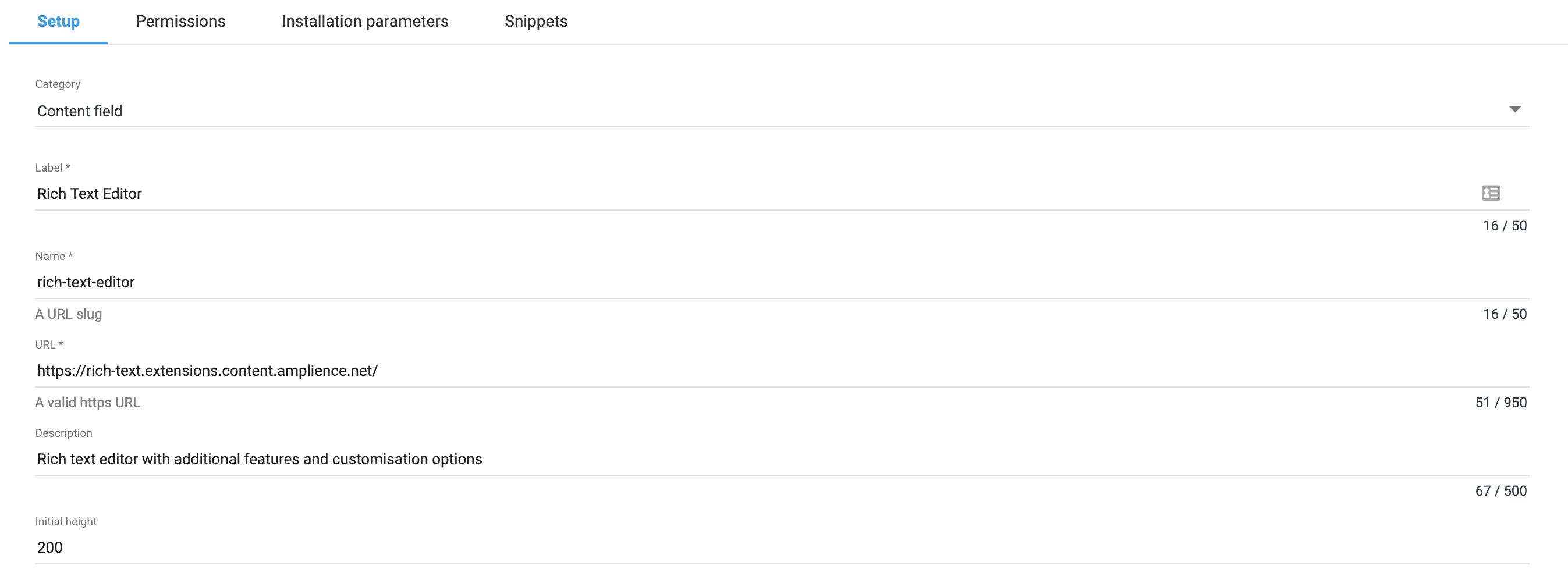
This extension needs to be registered against a Hub with in the Dynamic Content application (Developer -> Extensions), for it to load within that Hub.
- Category: Content Field
- Label: Rich Text
- Name: dc-extension-rich-text (needs to be unique with the Hub)
- URL: https://rich-text.extensions.content.amplience.net
- Description: Rich text editor (can be left blank, if you wish)
- Initial height: 500
Note: You can use our deployed version of this extension (builds from the "production" branch) -
https://rich-text.extensions.content.amplience.net
As this is an open source project you're welcome to host your own "fork" of this project. You can use any standard static hosting service (Netlify, Amplify, Vercel, etc.) if you wish. Further information can be found on the Hosting page.
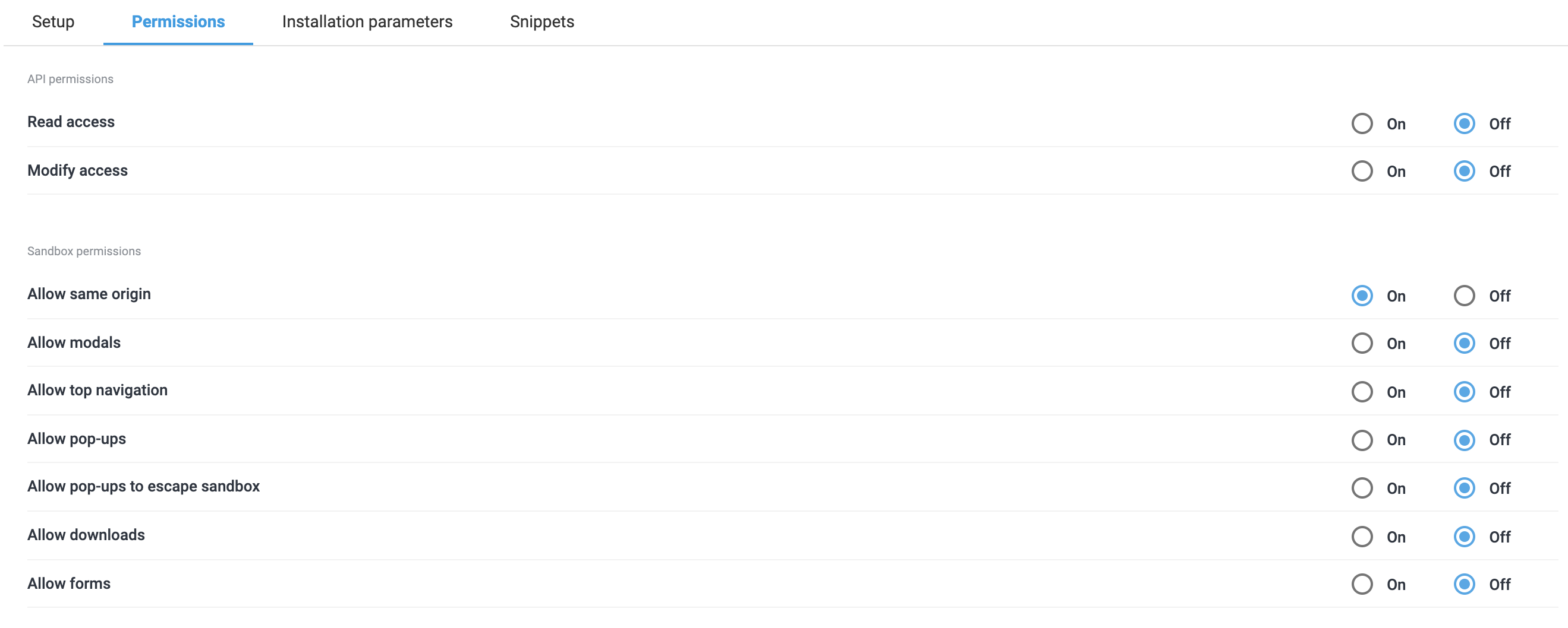
Sandbox permissions:
- Allow same origin
To use the rich text editor, you simply need to add a field to your content type schema that is configured to use the rich text editor extension.
{
  "type": "string",
  "ui:extension": {
    "url": "https://rich-text.extensions.content.amplience.net",

    "params": {
      "language": "markdown"
    }
  }
}
Examples with the Rich Text extension included can also be found within the Extensions section of our example schemas in Dynamic Content.
Using markdown output:
{
  "type": "string",
  "ui:extension": {
    "url": "https://rich-text.extensions.content.amplience.net",

    "params": {
      "language": "markdown"
    }
  }
}
The markdown language will output standard CommonMark markdown, e.g.
# Heading 1

## Heading 2

Paragraph
Using JSON output:
{
  "type": "array",
  "ui:extension": {
    "url": "https://rich-text.extensions.content.amplience.net",

    "params": {
      "language": "json"
    }
  }
}
This will output an array of "blocks". Each block has a type and associated data so your application can render the data, e.g.
[
  {
    "type": "markdown",
    "data": "# Ethical Beauty\n\n*10 Organic, Cruelty-Free & Vegan Products to Buy Now*"
  },
  {
    "type": "dc-content-link",
    "data": {
      "id": "e9248f05-ec46-4558-8a18-b6b881597695",
      "contentType": "https://github.com/amplience/dc-accelerators-content-types/blob/master/banner.json",
      "_meta": {
        "schema": "http://bigcontent.io/cms/schema/v1/core#/definitions/content-link"
      }
    }
  },
  {
    "type": "markdown",
    "data": "The ethical beauty market is stronger than ever before. Gone are the days of compromising on a product’s efficacy or luxury in supporting a particular set of values. Here, our Editor talks through some of the best cruelty-free products of the moment."
  }
]You can customize the rich text editor by providing "params" in your content type schema. The examples below should be added to the "params" object in your "ui:extension".
You can set a whitelist of tools which the user can choose from:
{
  "tools": {
    "whitelist": [
      "undo",
      "redo",
      "strong",
      "em",
      "code",
      "link",
      "lift",
      "bullet_list",
      "ordered_list",
      "image",
      "blockquote",
      "heading",
      "paragraph",
      "code_block",
      "horizontal_rule",
      "clear_formatting",
      "dc-image-link",
      "dc-content-link"
    ]
  }
}
You can also blacklist individual tools:
{
  "tools": {
    "blacklist": ["code", "code_block", "inline_styles"]
  }
}The default toolbar layout can be overridden as follows:
{
  "toolbar": {
    "layout": [
      { "type": "button", "toolName": "undo" },
      { "type": "button", "toolName": "redo" },
      {
        "type": "group",
        "children": [
          { "type": "button", "toolName": "strong" },
          { "type": "button", "toolName": "em" }
        ]
      },
      {
        "type": "dropdown",
        "toolNames": [
          "heading_1",
          "heading_2",
          "heading_3",
          "heading_4",
          "heading_5",
          "heading_6"
        ]
      },
      { "type": "button", "toolName": "ai" }
    ]
  }
}
You can choose from "button", "dropdown" or "group" when creating your menu.
You can modify the default text styles to match your brand styles.
Using inline styles:
{
  "styles": "h1 { color: 'red' }"
}
Using an external stylesheet:
{
  "stylesheet": "https://maxcdn.bootstrapcdn.com/bootstrap/3.3.7/css/bootstrap.min.css"
}| WARNING: Custom styles are loaded into the extension and may impact the styling of the UI. You can prefix styles with .ProseMirror to only target the editor area. |
|---|
If you want to prevent non-technical users modifying the raw markdown or JSON, you can either hide the code view or make it read only:
{
  "codeView": {
    "disabled": true
  }
}
Or
{
  "codeView": {
    "readOnly": true
  }
}The JSON version of the editor supports embedding content items. These will appear in the JSON output as a content link and will be published automatically and returned via the content delivery API.
To enable this tool, you must provide a list of content types that the user can choose from.
{
  "tools": {
    "dc-content-link": {
      "contentTypes": ["<schema-id>"]
    }
  }
}
By default, an icon will be displayed for embedded content items. You can provide custom icons as follows:
{
  "tools": {
    "dc-content-link": {
      "contentTypes": ["<schema-id>"],
      "contentTypeSettings": [
        {
          "id": "<schema-id>",
          "icon": "<icon-url>"
        }
      ]
    }
  }
}
"*" can be used in place of the schema id to apply the icon to all content types.
If you wish to display a card / visualization, provide a templated URL in the params:
{
  "contentTypeSettings": [
    {
      "id": "<schema-id>",
      "card": "http://myapp.com/visualization?vse={{vse.domain}}&content={{content.sys.id}}"
    }
  ]
}
The URL format matches the format used to define cards and visualizations in Dynamic Content.
Finally, you can also provide a custom aspect ratio for each content type.
{
  "contentTypeSettings": [
    {
      "id": "<schema-id>",
      "aspectRatio": "3:1"
    }
  ]
}
When using multiple of these properties, use them on the same object:
{
  "contentTypeSettings": [
    {
      "id": "<schema-id>",
      "icon": "<icon-url>",
      "card": "http://myapp.com/visualization?vse={{vse.domain}}&content={{content.sys.id}}",
      "aspectRatio": "3:1"
    }
  ]
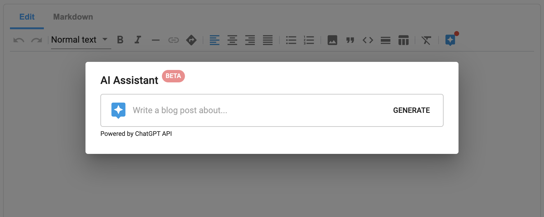
}Powered by ChatGPT, the AI Assistant allows users to quickly generate and edit content using natural language prompts.
To get started, you will need to provide your own OpenAI API key which will be used by the extension to communicate with the ChatGPT API. Note, ChatGPT is not affiliated with Amplience and therefore any impact to ChatGPT services such as updates, busy periods, or outages are outside of Amplience control.
By using this feature, you are solely responsible for ensuring that AI generated content complies with internal company policies, applicable laws and OpenAI's Terms.
To create your key, you first need an OpenAI account which you can create here. Once you have an account you can create an API key here.
Once you have your API key, you can enable the AI Assistant feature by adding your API key to the extension parameters as follows:
{
  "tools": {
    "ai": {
      "key": "<OpenAI key>"
    }
  }
}If you have access to ChatGPT 4 or wish to use a different OpenAI model, you can choose the specific model the system should use as follows:
{
  "tools": {
    "ai": {
      "key": "<OpenAI key>",
      "model": "gpt-4"
    }
  }
}
A detailed list of avaliable models can be found here.
When text is selected, preset edit prompts are displayed which save users needing to type out common prompts multiple times. These can be customized to add or remove your preferred prompts.
{
  "tools": {
    "ai": {
      "key": "<OpenAI key>",
      "editPrompts": [
        {
          "label": "Improve this",
          "prompt": "Improve this"
        },
        {
          "label": "Shorten this",
          "prompt": "Shorten this"
        },
        {
          "label": "Elaborate on this",
          "prompt": "Elaborate on this"
        }
      ]
    }
  }
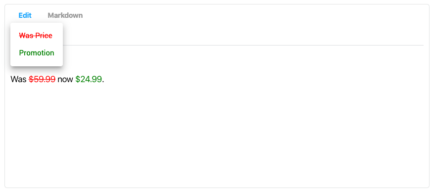
}Inline styles is an experimental feature which lets you provide a list of CSS class names that users can apply to text.
To enable this feature:
- Create CSS rules for your inline styles within
params:
{
  "styles": ".was-price { color: red; }"
}- Within
params.tools, remove the feature from the blacklist. This feature is blacklisted by default, you can enable it by passing in an empty blacklist.
{
  "blacklist": []
}- Within
params.tools, provide settings for each inline style you wish to use.
{
  "inline_styles": {
    "classNames": [
      {
        "className": "was-price",
        "label": "Was Price"
      }
    ]
  }
}- Within
params, add your inline styles to the toolbar. Each style must be defined in thetoolNamesarray, prefixed withinline_styles_classname_and ending with each style'sclassNameproperty.
{
  "toolbar": {
    "layout": [
      {
        "type": "dropdown",
        "label": "Styles",
        "toolNames": ["inline_styles_className_was-price"]
      },
      {
        "type": "button",
        "toolName": "clear_formatting"
      }
    ]
  }
}An example of configured parameters for inline styles combining each the previous steps can be seen below:
{
  "rich-text": {
    "type": "string",
    "ui:extension": {
      "url": "https://rich-text.extensions.content.amplience.net",
      "params": {
        "tools": {
          "blacklist": [],
          "inline_styles": {
            "classNames": [
              {
                "className": "was-price",
                "label": "Was Price"
              }
            ]
          }
        },
        "toolbar": {
          "layout": [
            {
              "type": "dropdown",
              "label": "Styles",
              "toolNames": ["inline_styles_className_was-price"]
            },
            {
              "type": "button",
              "toolName": "clear_formatting"
            }
          ]
        }
      }
    }
  }
}yarn installyarn buildcd packages/extensionyarn start- Head to
http://localhost:3000for the locally running extension
