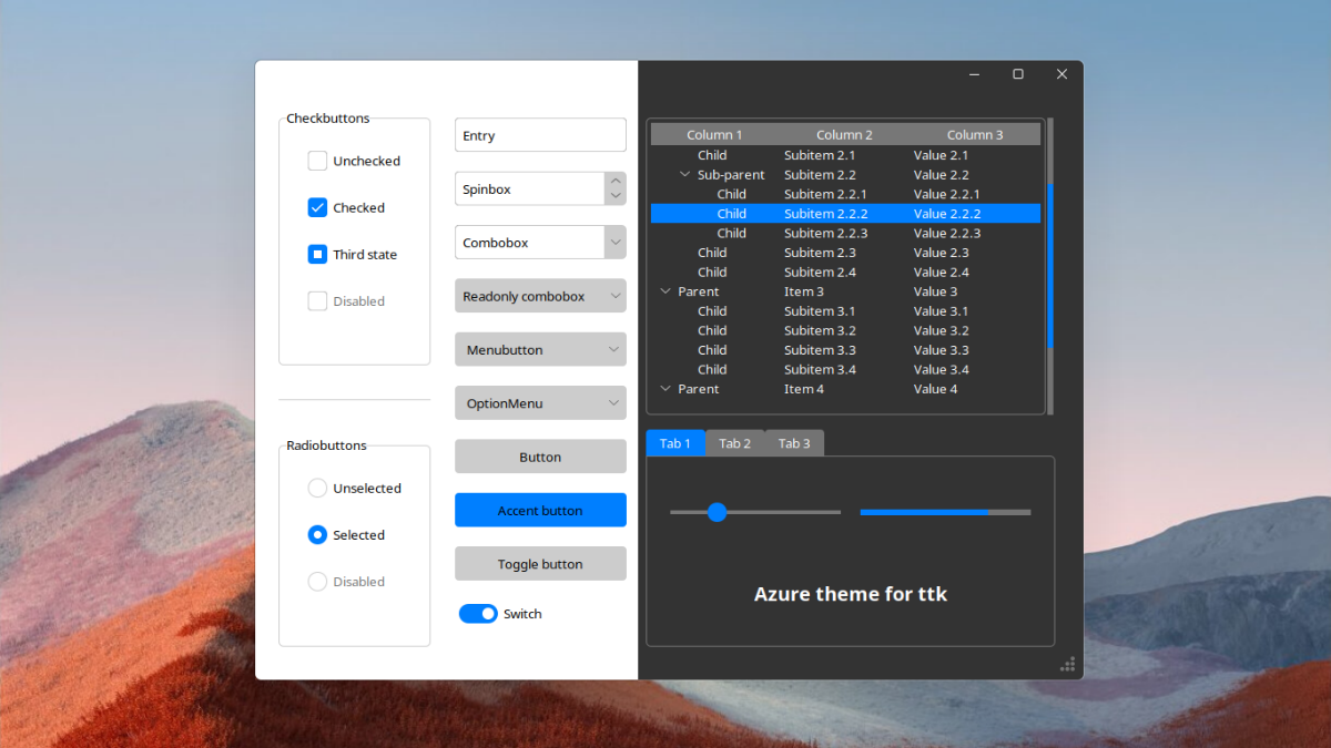
Just like for my Sun Valley theme in version 2.0 I wanted to make usage of the theme very simple, so the theme setting is handled by a separate tcl script. This way whether you want to use a dark or light theme, you need to import just a single file. The other thing that makes this a good solution is that normally switching between light and dark theme is not entirely perfect, and the colors are not correct.
# Just simply import the azure.tcl file
widget.tk.call("source", "azure.tcl")

# Then set the theme you want with the set_theme procedure
widget.tk.call("set_theme", "light")
# or
widget.tk.call("set_theme", "dark")Normally changing between themes isn't that easy, because then the colors aren't correct. See this Stackoverflow question. However, with my current solution, you can change theme at any time, without any color issues.
import tkinter as tk
from tkinter import ttk

root = tk.Tk()

# Pack a big frame so, it behaves like the window background
big_frame = ttk.Frame(root)
big_frame.pack(fill="both", expand=True)

# Set the initial theme
root.tk.call("source", "azure.tcl")
root.tk.call("set_theme", "light")

def change_theme():
    # NOTE: The theme's real name is azure-<mode>
    if root.tk.call("ttk::style", "theme", "use") == "azure-dark":
        # Set light theme
        root.tk.call("set_theme", "light")
    else:
        # Set dark theme
        root.tk.call("set_theme", "dark")

# Remember, you have to use ttk widgets
button = ttk.Button(big_frame, text="Change theme!", command=change_theme)
button.pack()

root.mainloop()Azure theme has a style for every ttk widget, but there are some new widget styles, such as an accent button, toggle switch, toggle button, tickscale, and card. You can apply these with the style parameter.
If you need a highlighted button, use Accent.TButton:
accent_button = ttk.Button(root, text='Accent button', style='Accent.TButton', command=callback)To create a toggle button you need a checkbutton, to which you can apply the Toggle.TButton style:
toggle_button = ttk.Checkbutton(root, text='Toggle button', style='Toggle.TButton', variable=var)The use of switches instead of checkboxes is becoming more common these days, so this theme has a Switch.TCheckbutton style, that can be applied to checkbuttons:
switch = ttk.Checkbutton(root, text='Switch', style='Switch.TCheckbutton', variable=var)If you don't like the big circle on the scale, you prefer something more solid, then use the Tick.TScale style:
tick_scale = ttk.Scale(root, style='Tick.TScale', variable=var)If you only want a border around your widgets, not an entire LabelFrame then apply the Card.TFrame style to a Frame:
card = ttk.Frame(root, style='Card.TFrame', padding=(5, 6, 7, 8))- Tk isn't really good at displaying
pngimages, so if your program is laggy with the theme, please check out the gif-based branch! - When you change the theme, the window resizes. This is a quite strange bug that applies to all ttk themes.
If you scrolled down here, please check out my other themes!
- Sun Valley ttk theme a theme that looks like Windows 11!
- Forest ttk theme a theme inspired by Excel's look.
