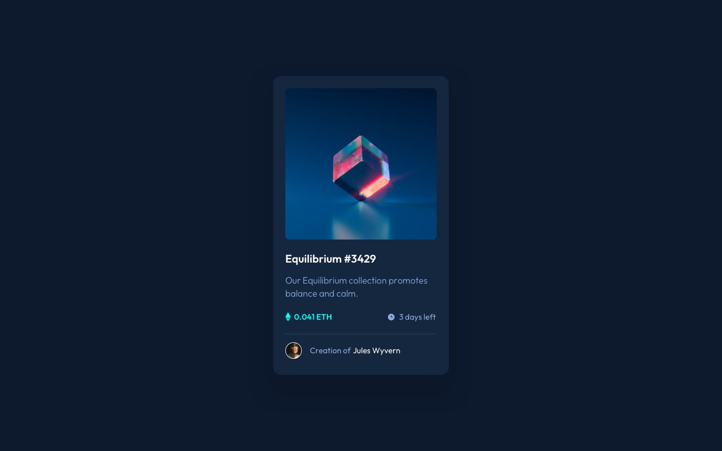
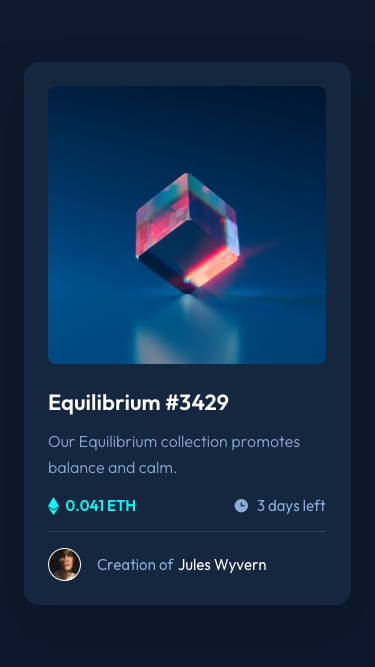
This is a solution to the NFT preview card component challenge on Frontend Mentor. Frontend Mentor challenges help you improve your coding skills by building realistic projects.
Users should be able to:
- View the optimal layout depending on their device's screen size
- See hover states for interactive elements
- Solution URL: Click here
- Live Site URL: Click here
- Semantic HTML5 markup
- CSS custom properties
- Flexbox
- CSS Grid
- Mobile-first workflow
Here's the following snippets of the elements in the project:
  <div class="box">
    <div class="image">
      <img class="inside-img"src="./images/image-equilibrium.jpg" alt="Equilibrium #3429">
    </div>

    <div class="text-box">
      <h1>Equilibrium #3429</h1>
      <p>Our Equilibrium collection promotes balance and calm.</p>
      <div class="left">
        <img src="./images/icon-ethereum.svg" alt="ethereum">
        0.041 ETH
      </div>
      <div class="right">
        <img src="./images/icon-clock.svg" alt="time">
        3 days left
      </div>
    </div>

    <hr>

    <div class="creator">
      <span><img src="./images/image-avatar.png" alt="author"></span>
      <p class="creator-details">Creation of <bold>Jules Wyvern</bold></p>
    </div>
</div>.box{
width: 325px;
height: 530px;
background-color: hsl(216, 50%, 16%);
border-radius: 10px;
margin: 50px auto 30px auto;
justify-content: center;
box-shadow: 0px 0px 10px -5px rgba(0,0,0,0.43);
}
.inside-img{
margin: 22px 22px 0 22px;
width: 280px;
border-radius: 10px;
height: auto;
box-shadow: 0px 0px 10px -5px rgba(0,0,0,0.43);
}
.text-box{
height: auto;
}
.text-box h1{
margin: 20px auto 20px 22px;
font-size: 20px;
color: hsl(0, 0%, 100%);
}
.text-box p{
width: 300px;
padding: 0 0 0 20px;
margin: 0 0 0 1px;
color: hsl(215, 51%, 70%);
}
.left{
width: 100px;
height: auto;
padding: 0px 0 0px 20px;
color: hsl(178, 100%, 50%);
transform: translate(1px, 10px);
}
.right{
display: inline-block;
width: 100px;
height: auto;
padding: 0px 20px 0px 0;
transform: translate(210px, -12px);
color: hsl(215, 51%, 70%);
}
hr{
margin: 0 65px 0 auto;
width:200px;
justify-content: center;
border: 0.025em solid hsl(215, 32%, 27%);
transform: translate(0px, 12px);
}
.creator img{
border: 1px solid white;
border-radius: 50px;
width: 33px;
height: auto;
margin: 20px 0 0 20px;
}
.creator-details{
width: 200px;
transform: translate(65px, -43px);
color: hsl(215, 51%, 70%);
}
.creator-details bold{
color: hsl(0, 0%, 100%);
font-weight: 400;
}- Frontend Mentor - @thedefiantone17
I was inspired by my supportive friends @Aaryan-kapur, @aniketbiprojit and @AbhinavRobinson, wherever i faced any difficulty they were there to help me out.
I would also like to thank frontend Mentor for giving such opportunity to do such interesting challenges, and would also like to thanks GreatLearning for guiding me with an educative journey towards IT industry.

