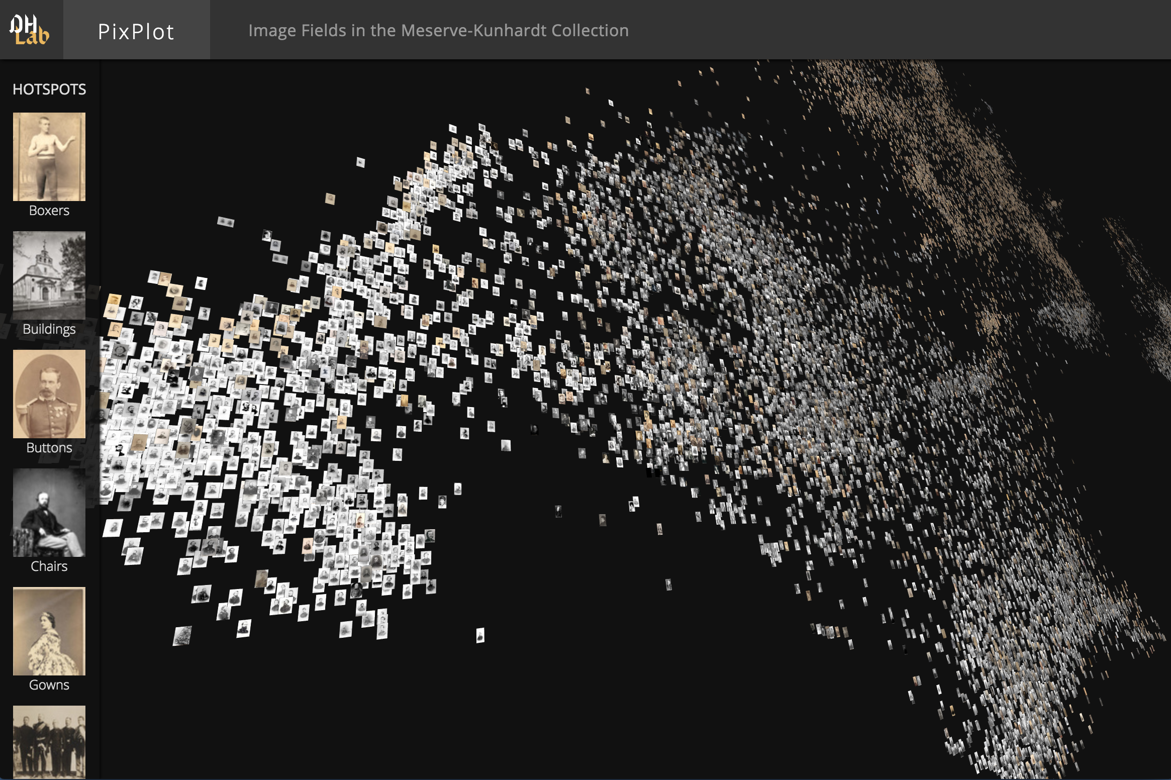
This repository contains code that can be used to visualize tens of thousands of images in a two-dimensional projection within which similar images are clustered together. The image analysis uses (by default) a pre-trained captioning neural network from Google called Inception, discarding the final labels and using the penultimate layer to provide 2,048-dimensional visual features. The visualization layer uses a custom WebGL viewer.
To install the Python dependencies, you can run (ideally in a virtual environment):
pip install -r utils/requirements.txtIf you have an NVIDIA GPU, consider replacing tensorflow with tensorflow-gpu in requirements.txt. You'll need to have CUDA and CUDNN working as well.
Image resizing utilities require ImageMagick compiled with jpg support:
brew uninstall imagemagick && brew install imagemagickThe html viewer requires a WebGL-enabled browser.
If you have a WebGL-enabled browser and a directory full of images to process, you can prepare the data for the viewer by installing the dependencies above then running:
git clone https://github.com/YaleDHLab/pix-plot && cd pix-plot
python utils/process_images.py "path/to/images/*.jpg"
To see the results of this process, you can start a web server by running:
# for python 3.x
python -m http.server 5000

# for python 2.x
python -m SimpleHTTPServer 5000
The visualization will then be available on port 5000.
Some users may find it easiest to use the included Docker image to visualize a dataset.
To do so, you must first install Docker. If you are on Windows 7 or earlier, you may need to install Docker Toolbox instead.
Once Docker is installed, start a terminal, cd into the folder that contains this README file, and run:
# build the container
docker build --tag pixplot --file Dockerfile .

# process images - use the `-v` flag to mount directories from outside
# the container into the container
docker run \
  -v $(pwd)/output:/pixplot/output \
  -v /Users/my_user/Desktop/my_images:/pixplot/images \
  pixplot \
  bash -c "cd pixplot && python3.6 utils/process_images.py images/*.jpg"

# run the web server
docker run \
  -v $(pwd)/output:/pixplot/output \
  -p 5000:5000 \
  pixplot \
  bash -c "cd pixplot && python3.6 -m http.server 5000"
Once the web server starts, you should be able to see your results on localhost:5000.
By default, PixPlot uses k-means clustering to find twenty hotspots in the visualization. You can adjust the number of discovered hotspots by changing the n_clusters value in utils/process_images.py and re-running the script.
After processing, you can curate the discovered hotspots by editing the resulting output/plot_data.json file. (This file can be unwieldy in large datasets -- you may wish to disable syntax highlighting and automatic wordwrap in your text editor.) The hotspots will be listed at the very end of the JSON data, each containing a label (by default 'Cluster N') and the name of an image that represents the centroid of the discovered hotspot.
You can add, remove or re-order these, change the labels to make them more meaningful, and/or adjust the image that symbolizes each hotspot in the left-hand Hotspots menu. Hint: to get the name of an image that you feel better reflects the cluster, click on it in the visualization and it will appear suffixed to the URL.
| Collection | # Images | Collection Info | Image Source |
|---|---|---|---|
| Per Bagge | 29,782 | Bio | Lund University |
| Meserve-Kunhardt | 27,000 | Finding Aid | Beinecke (Partial) |
The DHLab would like to thank Cyril Diagne, a lead developer on the spectacular Google Arts Experiments TSNE viewer, for generously sharing ideas on optimization techniques used in this viewer.
PixPlot was inspired by the approach shown by Benoit Seguin et al in:
di Lenardo, I., Seguin, B., Kaplan, F. (2016). Visual Patterns Discovery in Large Databases of Paintings. In Digital Humanities 2016: Conference Abstracts. Jagiellonian University & Pedagogical University, Kraków, pp. 169-172.
