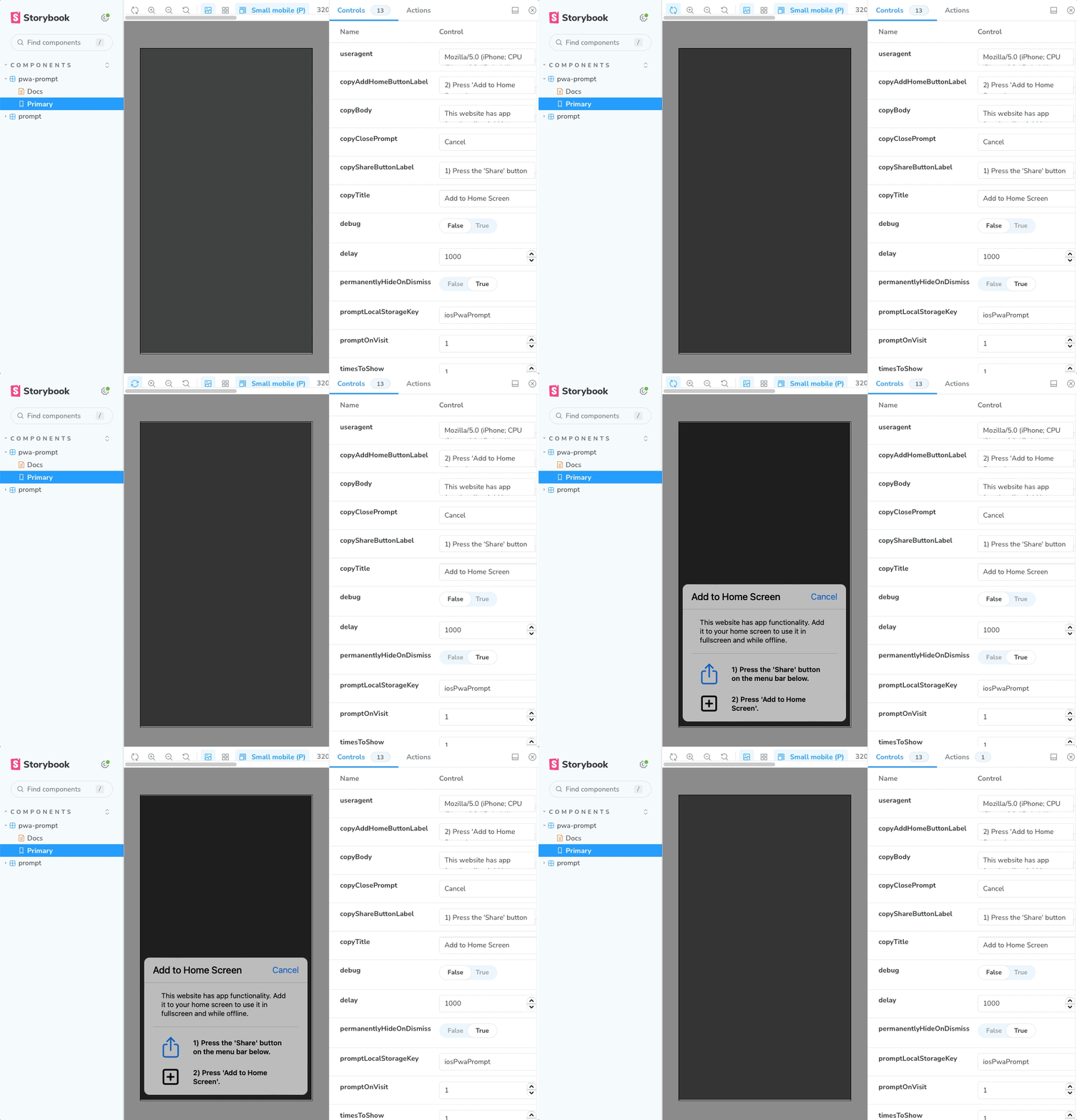
Forked with care from react-ios-pwa-prompt, this package is revamped using Vite, Styled Components, and TypeScript.
Enhancing PWAs for iOS
See the interactive Storybook Demo!
A React component that provides a customisable Progressive Web App (PWA) prompt telling the user to 'Add to Home Screen'. The prompt behaviour is baked in to Android devices, yet iOS is still lagging behind. This component aims to provide a simple way to provide this functionality on iOS for websites that are PWA-ready. The prompt styles closely match iOS designs for both light and dark UI modes to appear native to the user.
- 🛠 Fully configurable: Set the frequency and conditions for displaying the prompt.
- 📃 Customize prompt content based on PWA availability and full-screen mode.
- ⚡️ Efficient: Minimal overhead for non-iOS devices, optimizing each page load.
- 🌕 Dark mode support: Adapts to iOS 13 and 14 settings.
- 🎨 Supports custom styling with
styled-components
- Add
react-ios-pwa-prompt-tsas a dependency:
npm install react-ios-pwa-prompt-ts
- Add peer dependencies if not already included in your application:
npm i react styled-components
- Import into your project:
import { PwaPrompt } from 'react-ios-pwa-prompt-ts'
- Render the component:
<PwaPrompt />
- Optional configuration props:
className: Add a custom class name to the prompt component, for use withstyled-components.copyAddHomeButtonLabel: pass a string to customise label of add to home instruction. Defaults to2) Press 'Add to Home Screen'.copyBody: pass a string to customise the body of the prompt. Defaults toThis website has app functionality. Add it to your home screen to use it in fullscreen and while offline..copyClosePrompt: pass a string to customise label of close button. Defaults toCancel.copyShareButtonLabel: pass a string to customise label of share button. Defaults to1) Press the 'Share' button.copyTitle: pass a string to customise the title of the prompt. Defaults toAdd to Home Screen.debug: pass a boolean to put the prompt into debug mode, showing it on any device at all times. Defaults tofalse(production-mode).delay: pass an integer in ms to add a delay to the prompt. Defaults to1000.onClose: pass a function to call upon closing the prompt. Passes the event object as the function argument. Defaults to a noop.permanentlyHideOnDismiss: pass a boolean to configure whether to never show the prompt again once dismissed. Defaults totrue(hide forever).promptLocalStorageKey: Provide a custom key for storing prompt data in local storage. Defaults toiosPwaPrompt.promptOnVisit: pass an integer for the when to start showing the prompt. Defaults to1(the first page visit).timesToShow: pass an integer to configure how many times to show the prompt. Defaults to1.
Storybook is a development environment for UI components. Follow the steps below to run the Storybook demo for this project:
- Clone this repository to your machine, and install project dependencies by running the following command in your project directory:
npm install
- Once the installation is complete, run the following command to start Storybook:
npm run storybook
- Open your web browser and go to http://localhost:6006 to view the interactive Storybook demo.
You can now explore stories, make changes to the components, and see the live updates in Storybook!
Feel free to open discussions, issues, and pull requests. Contributions are welcome!
