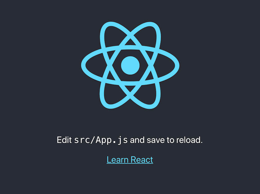
An (more) animated version of Create React App’s default template.
🌍 Here’s a live version.
🗄️ Don’t want to download and run this? 📦 Try the CodeSandbox version.
This is a common Create React App project (with Framer Motion added as a dependency).
To run from this project, you:
- download the ZIP archive or clone the repository;
- navigate inside the project’s directory in the Terminal and type:
npm install
… to reinstall the Node packages.
And then you’re ready to kick off the development server:
npm start
… which will open the project on http://localhost:3000 in your browser.
Note that you must have Node.js and NPM installed.
In Framer Motion, you use motion components instead of common HTML and SVG elements. The SVG with the logo contains three <motion.path>s (the ovals) and a <motion.circle> (or two) in the center.
You can animate most of an element’s attributes, and a <motion.path> even has a few extra properties:
pathLengthpathSpacingpathOffset
Here’s the first one of the ovals:
<motion.path
    d="M 538.429 94.524 …"
    initial={{
        stroke: "url(#initialColor)",
        pathLength: 1,
        pathOffset: 0,
        pathSpacing: 1,
    }}
    ref={scopeOval1}
/>
Framer Motion’s useAnimate() hook is used to run a sequence of animations on the three <motion.path>s.
The first animation shortens the path (to 5%) by changing its pathLength. At the same time, the pathOffset is moved forward so that the animation runs clockwise.
    function sequence(scope, animate, delay = 0) {
        animate([
            [
                scope.current,
                {
                    pathLength: 0.05,
                    pathOffset: 1,
                    pathSpacing: 0.95
                },
                {
                    delay: delay,
                    duration: 1,
                    ease: "easeIn"
                }
            ],
            …
(The change to pathSpacing is needed to make the dash reappear at the beginning of the path.)
Speeding the dash along the path is easy: you just animate the pathOffset.
            …
            [
                scope.current,
                { pathOffset: [0, 1] },
                { duration: 0.5, ease: "linear" }
            ],
            [
                scope.current,
                { pathOffset: [0, 1] },
                { duration: 0.5, ease: "linear" }
            ],
            …
This animation runs twice.
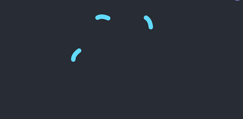
Change pathLength to 100% to make the dash grow back to the full length of the path.
            …
            [
                scope.current,
                {
                    pathOffset: [0, 0],
                    pathSpacing: [1, 1],
                    pathLength: [0.05, 1]
                },
                { duration: 1.5, ease: "easeOut" }
            ]
        ]);
The <motion.circle> in the center contains the same animated gradient as the paths and rotates continuously.
<motion.circle
    r="46"
    cx="422"
    cy="297"
    fill="url(#motionGradientAnimated)"
    animate={{ rotate: 360 }}
    transition={{
        repeat: Infinity,
        ease: "linear",
        duration: 8
    }}
/>
It’s only not visible initially because it’s covered by another <motion.circle> in React blue that fades out after a delay.
<motion.circle
    r="46"
    cx="422"
    cy="297"
    fill="#61dafb"
    initial={{ fillOpacity: 1 }}
    animate={{ fillOpacity: 0 }}
    transition={{
        delay: 3,
        duration: 2,
    }}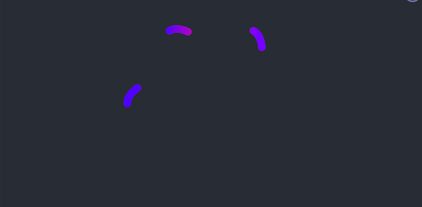
/>Yes, the SVG <linearGradient> is also animated! Or rather: its <motion.stop>s are. Each stop runs through an array (keyframes) of colors.
<linearGradient id="motionGradientAnimated">
    <motion.stop
        offset="5%"
        animate={{
            stopColor: [
                colors.motionBlue,
                colors.motionMagenta,
                colors.motionPurple,
            ],
        }}
        transition={{
            repeat: Infinity,
            repeatType: "reverse",
            ease: "linear",
            duration: 8,
        }}
    />
    …
</linearGradient>While all this happens, the whole icon spins.
That’s not a Framer Motion animation. The original CRA template has a CSS @keyframes animation applied to the <svg>’s App-logo class, which I just left in.
@media (prefers-reduced-motion: no-preference) {
    .App-logo {
        animation: App-logo-spin infinite 20s linear;
    }
}

@keyframes App-logo-spin {
    from {
        transform: rotate(0deg);
    }
    to {
        transform: rotate(360deg);
    }
}That’s the gist of it. There are more detailed explanations in the Framer book (paid subscription):