Visualize evolution of the number of people hospitalized in French departments due to COVID-19 infection
COVID-19 and geographical data come from the French open data portal
Data are stored as pandas / GeoPandas dataframes
The map background is built with contextily
The animated gif is built with matplotlib
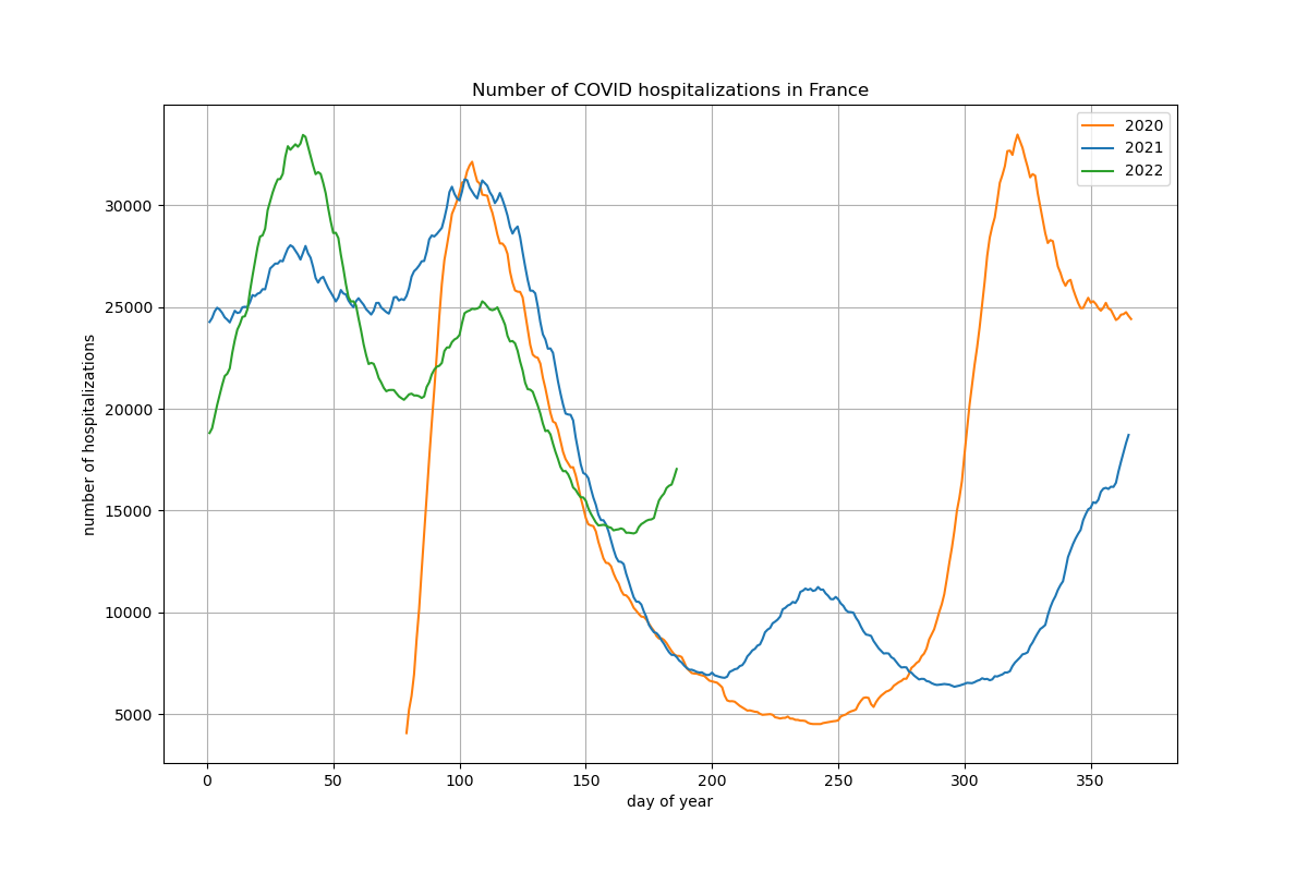
Example: hospitalizations year after year (latest update: 05/07/22)
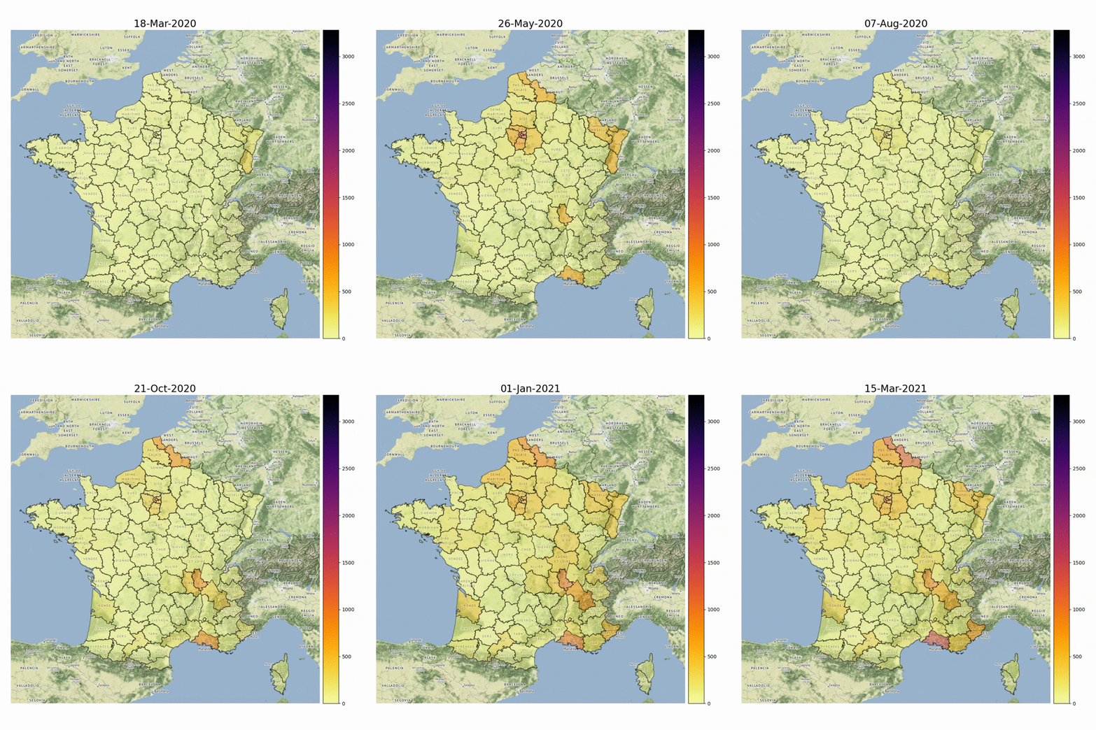
Example: Evolution of the number of people hospitalized in French departments due to COVID-19 infection (one year of data)
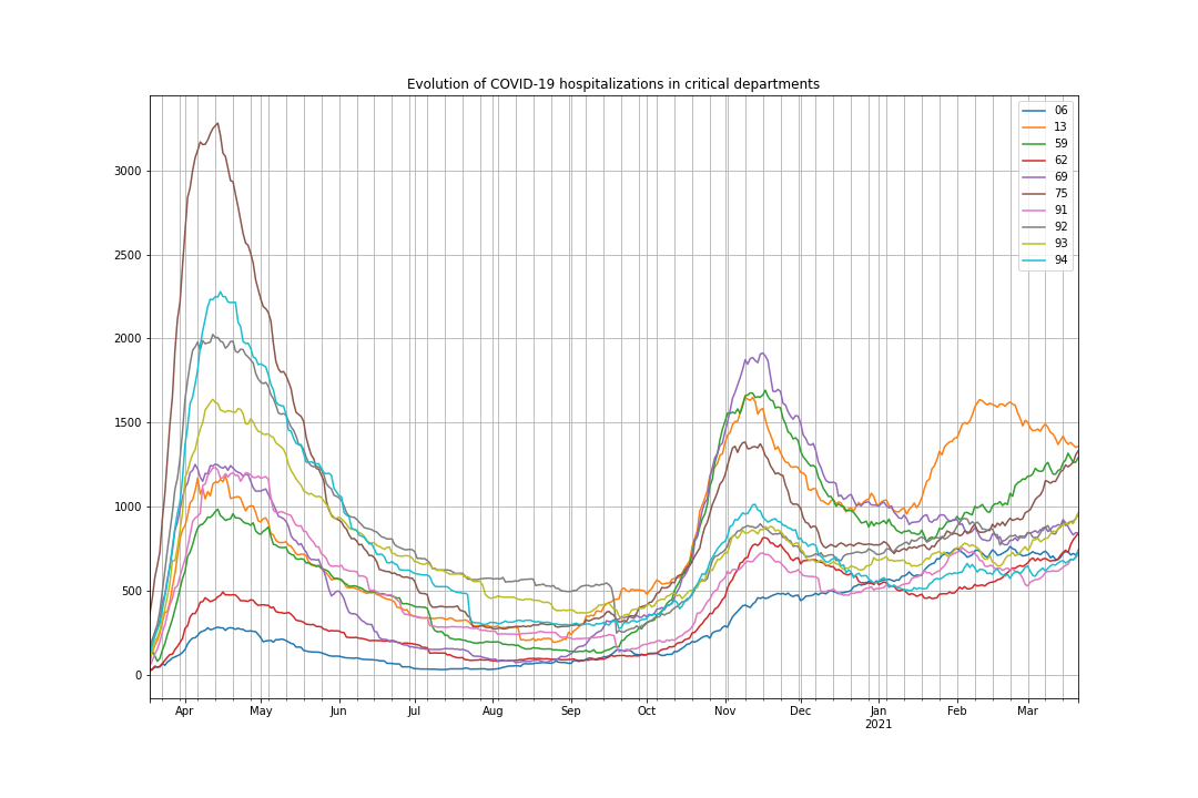
Example: Evolution of hospitalizations in critical departments (one year of data)
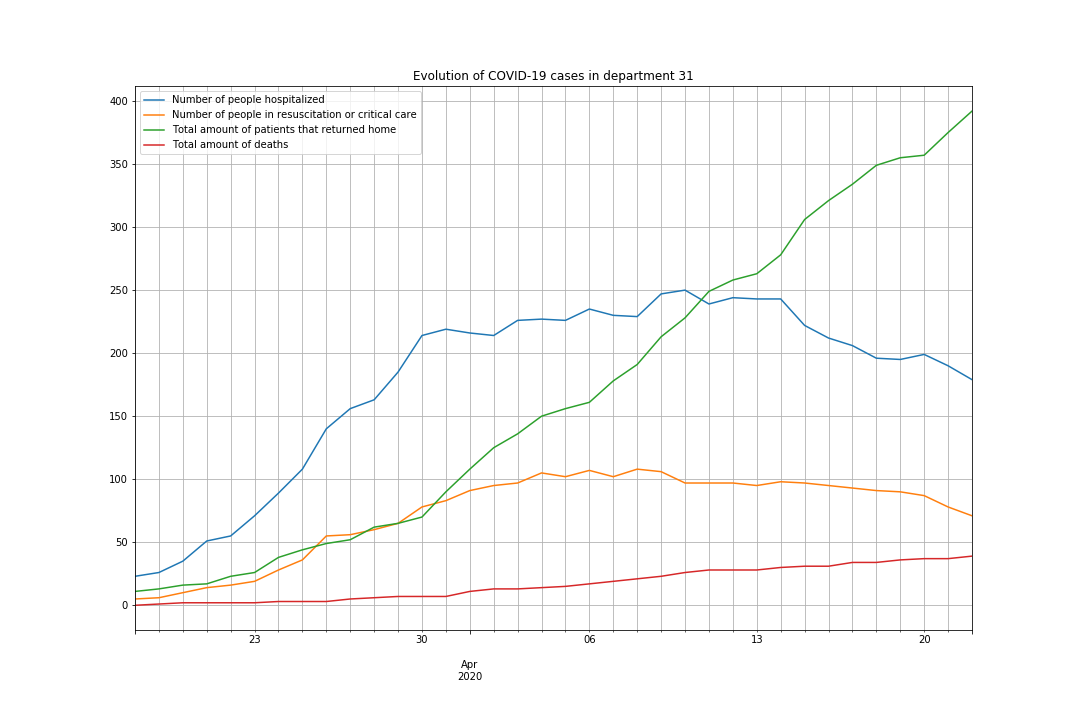
Example: Plot data of one specific French department (e.g. 31 - Haute-Garonne)
Run the different notebooks to generate curves and map:
-
year-after-year: visualize hospitalizations for each day year after year
-
demo-2021-vs-2020: hospitalizations and deaths of 2020 and 2021 on the same plot
-
demo-covid-v2: build the animated gif with the map of France (demo-covid is deprecated)
-
demo-stats: basic stats on COVID-19 data
-
demo-plot-alldepts: plot evolution curves of most critical departments
-
demo-31: plot the data of a specific department (e.g. 31)
-
pandas - Python Data Analysis Library
-
GeoPandas - GeoPandas is an open source project which extends the datatypes used by pandas to allow spatial operations on geometric types.
-
contextily - Context geo-tiles in Python
Code executed with: Python 3.8.5, geopandas 0.8.1, pyproj 3.0.0
Warning: you have to create folders tmp and img at the root to save images for demo-covid
- Thomas Dubot
This project is licensed under the MIT License - see the LICENSE.md file for details
Data are provided by the French open data portal. More information here:
https://www.data.gouv.fr/fr/datasets/donnees-relatives-a-lepidemie-du-covid-19/
https://www.data.gouv.fr/fr/datasets/contours-des-departements-francais-issus-d-openstreetmap/


