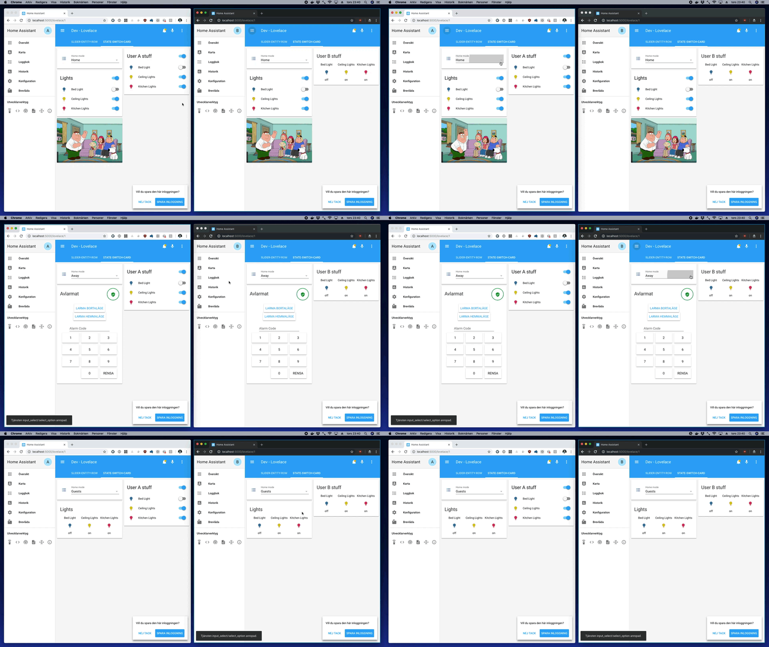
Dynamically replace lovelace cards depending on occasion.
Note in the animation above that the two browser windows have two different users logged in, which changes the rightmost card.
For installation instructions, see this guide.
Install state-switch.js as a module.
resources:
  - url: /local/state-switch.js
type: moduletype: custom:state-switch
entity: <entity>
default: <default>
transition: <transition>
transition_time: <transition_time>
states:
<state 1>:
<card 1>
<state 2>:
<card 2>
...When the state of <entity> is <state 1>, <card 1> will be displayed, when it's <state 2>, <card 2> will be displayed.
If the state of <entity> doesn't match any <state>, the <card> for the <default> state will be displayed.
<entity>Required An entity id orhash,user,group,deviceID,mediaquery<default>State to use as default fallback<state N>The state to match<card N>Lovelace card configuration<transition>Animated transition to use (slide-left,slide-right,swap-left,swap_rightorflip). Default:none<transition_time>The time for an animated transition in ms. Default: 500
If the entity parameter is set to an entity id, which card is displayed will depend on the state of that entity.
cards:
  - type: entities
    entities:
      - input_select.home_mode
  - type: custom:state-switch
    entity: input_select.home_mode
    states:
      Home:
        type: vertical-stack
        cards:
          - type: entities
            title: Lights
            entities:
              - light.bed_light
              - light.ceiling_lights
              - light.kitchen_lights
          - type: picture-glance
            camera_image: camera.demo_camera
            entities: []
      Away:
        type: alarm-panel
        entity: alarm_control_panel.alarm
      Guests:
        type: glance
        title: Lights
        entities:
          - light.bed_light
          - light.ceiling_lights
          - light.kitchen_lights
Note that the words on and off are magic in yaml, so if the entity is e.g. a switch, you need to quote the keys in the states: mapping:
states:
  "on":
    type: markdown
    content:>
      Light is on
  "off":
    type: markdown
    content:>
Light is offIf the entity parameter is set to hash, which card is displayed will depend on the "hash" part of the current URL - i.e. whatever comes after an optional # symbol in the current page URL.
This allows for controlling the view on a browser-window to browser-window basis, and without needing a controlling entity.
- type: horizontal-stack
  cards:
    - type: entity-button
      entity: light.my_dummy
      tap_action:
        action: navigate
        navigation_path: "#p1"
    - type: entity-button
      entity: light.my_dummy
      tap_action:
        action: navigate
        navigation_path: "#p2"
    - type: entity-button
      entity: light.my_dummy
      tap_action:
        action: navigate
        navigation_path: "#p2"
- type: custom:state-switch
  entity: hash
  default: p1
  states:
    p1:
      type: markdown
      content: |
        # Page 1
    p2:
      type: markdown
      content: |
        # Page 2
    p3:
      type: markdown
      content: |
# Page 3If the entity parameter is set to user, which card is displayed will depend on the currently logged in users Display Name.
type: custom:state-switch
entity: user
default: default
states:
  A:
    type: entities
    title: User A stuff
    entities:
      - light.bed_light
      - light.ceiling_lights
      - light.kitchen_lights
  B:
    type: glance
    title: User B stuff
    entities:
      - light.bed_light
      - light.ceiling_lights
      - light.kitchen_lights
  default:
    type: markdown
    content: >
      ## Unknown user
group can take one of two values - admin or user depending on whether the currently logged in user is in the Administrators group or not.
If the entity parameter is set to deviceID, which card is displayed will depend on the device-browser combination which is currently displaying the page.
See browser_mod for a description on how deviceIDs work.
type: custom:state-switch
entity: deviceID
states:
  "9c2aaf6f-ed26e3c1":
    type: markdown
    content: >
      Desktop
  "c8a4981c-d69c5e3c":
    type: markdown
    content: >
MobileIf the entity parameter is set to mediaquery, the card that is displayed will be the first one that matches a CSS @media rule.
type: custom:state-switch
entity: mediaquery
states:
  "(min-width: 1000px)":
    type: markdown
    content: more than 1000 px
  "(min-width: 500px)":
    type: markdown
    content: 500 to 1000 px
  "all":
    type: markdown
content: "Really small"If the entity parameter is set to template, the card that is displayed will be the one that matches the jinja template's result.
type: custom:state-switch
entity: template
template: "{% if is_state('switch.night_mode', 'on') and now().weekday() < 5 %} day {% else %} night {% endif %}"
states:
  day:
    type: markdown
    content: Where do you want to go today?
  night:
    type: markdown
    content: Sleep tight!
You may also simply define the entity parameter as a jinja template string.
type: custom:state-switch
entity: "{% if is_state('switch.night_mode', 'on') and now().weekday() < 5 %} day {% else %} night {% endif %}"
states:
  day:
    type: markdown
    content: Where do you want to go today?
  night:
    type: markdown
    content: Sleep tight!
Note: Jinja2 templating is not cheap. Avoid it for simple things that can be solved with just an entity.
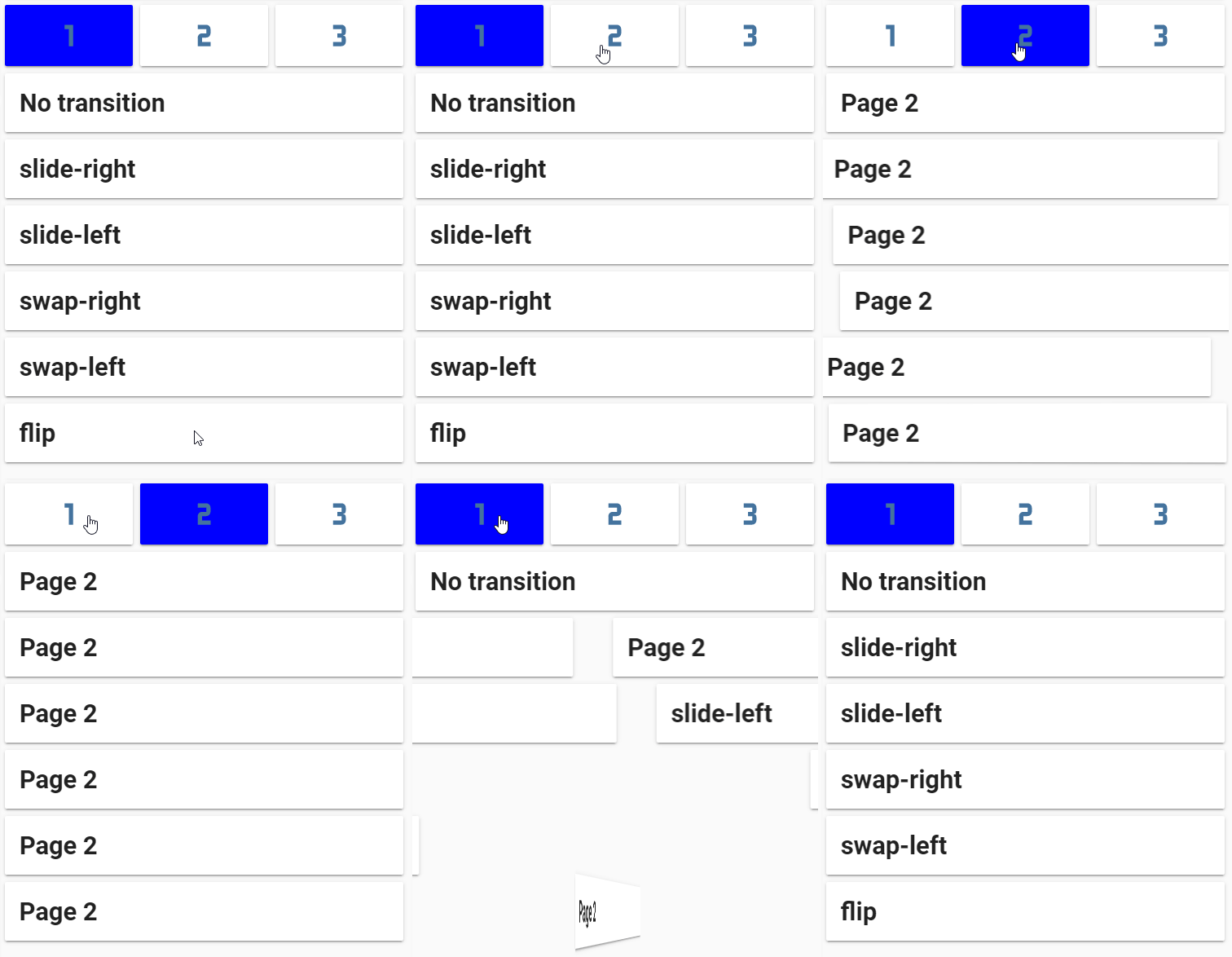
The switch from one card to another can be animated by setting the <transition> option.
The speed of the transition is set by <transition_time> (milliseconds). Note that some animations do two things, and thus take two times <transition_time> to complete.
Available transitions are:
slide-downslide-upslide-leftslide-rightswap-downswap-upswap-leftswap-rightflip-xflip-y
- To replace more than one card at a time, use e.g.
vertical-stack,horizontal-stackorlayout-card.


