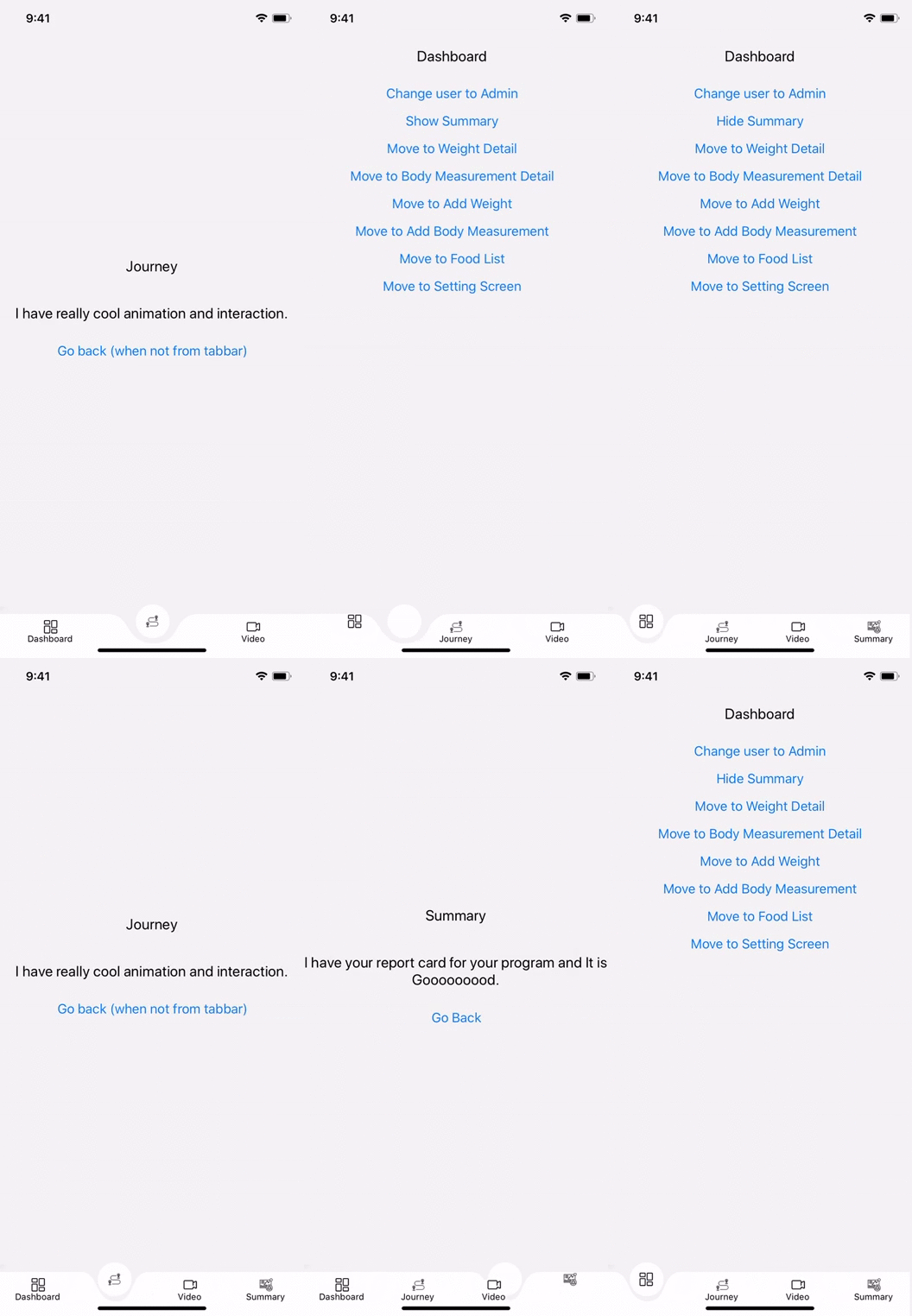
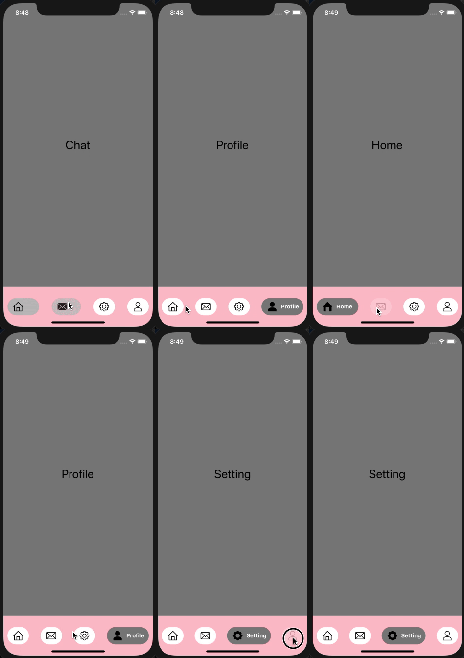
This library is designed to be fully compatible with popular react-navigation library and can be attached to tabBarComponent prop provided by BottomBarNavigation
This library uses SVG and Lottie library to render beautiful animation and support all the customization options you may require to best fit it for your use-case.
npm i react-native-animating-bottom-tab-bar
Apart from it you also need to install Svg and Lottie library
npm i react-native-svg
npm i lottie-react-native
npm i lottie-ios@3.1.3
Note: Right now I have tested this library with react-navigation@3.x and planning to release 4.x and 5.x compatible in a month or so.
Step 1: Set up basic navigation bar with react-navigation
const TabBar = createBottomTabNavigator({
  [RouteName.Home]: Home,
  [RouteName.Chat]: Chat,
  [RouteName.Setting]: Setting,
  [RouteName.Profile]: Profile,
});

const AppContainer = createAppContainer(TabBar);
Step 2: Import getAnimatingBottomBar, AnimationType from react-native-animating-bottom-tab-bar
import {getAnimatingBottomBar, AnimationType} from 'react-native-animating-bottom-tab-bar';
getAnimatingBottomBar function create a TabBar which you can directly passed to createAppContainer(). It accepts an object. Various supported property of the object are
- Animation Type (type)
- NavigationScreens (navigationScreens)
- NavigationParameter (navigationParameter)
- Object (configData) (Optional)
const BottomBarStack = getAnimatingBottomBar({
  type: AnimationType.ExpandingLabel,
  navigationScreens: NavigationScreens,
  navigationParameter: NavigationParameter,
  configData: {
    bottomBarConfig,
    extraTabs,
  },
});
Step 3: Pass result of getAnimatingBottomBar to createAppContainer
const AppContainer = createAppContainer(BottomBarStack);
This parameter is an object in which we specify our Component(screen) correspoding to a route or simply first argument we passed in createBottomTabNavigator
while setting up our basic navigation without any navigation options.
const NavigationScreens = {
  [RouteName.Home]: Home,
  [RouteName.Chat]: Chat,
  [RouteName.Setting]: Setting,
  [RouteName.Profile]: Profile,
};
This argument is an array to specify argument to be used by individual tab. For example, in the NavigationScreens, we have 4 routes defined so we will also create an array of 4 object for NavigationParameter -- 1 for each tab in the same order.
const NavigationParameter = [
  {
    label: RouteName.Home,
    routeName: RouteName.Home,
    icons: TabBarIcons.Home,
  },

  {
    label: RouteName.Chat,
    routeName: RouteName.Chat,
    icons: TabBarIcons.Conversation,
  },

  {
    label: RouteName.Setting,
    routeName: RouteName.Setting,
    icons: TabBarIcons.HealthCard,
  },

  {
    label: RouteName.Profile,
    routeName: RouteName.Profile,
    icons: TabBarIcons.Timeline,
  },
];
This argument is used to pass any extra configuration data like bottom bar background color or height of bottom bar. It support one basic property bottomBarConfig. bottomBarConfig is used to customize bottom bar.
Various property available are :-
| Property | Description | Default |
|---|---|---|
| backgroundColor | Background color of the bottom bar and circular selected view in tab | white |
| height | Height of the bottom bar | 100 |
const bottomBarConfig = {
  backgroundColor: 'pink',
  height: 100,
};


...

const BottomBarStack = getAnimatingBottomBar({
  type: AnimationType.ExpandingLabel,
  navigationScreens: NavigationScreens,
  navigationParameter: NavigationParameter,
  configData: {
    bottomBarConfig,
  },
});
- SvgBottomBar
- ExpandingLabel
- Pass
AnimatonType.SvgBottomBarin type property of the argument of getAnimatingBottomBar
Various navigation property supported are
| Property | Description | Default |
|---|---|---|
| label | Title of the tabbar | empty |
| icons | Object of active and inactive icons | {selected: null, unselected: null} |
| route | Route to navigate to | null |
| activeTintColor | Tint color when tab is selected | null |
| inactiveTintColor | Tint color when tab is not selected | null |
| activeTextStyle | Label style when tab is selected | null |
| inactiveTextStyle | Label style when tab is not selected | null |
| activeIconScale | Image scale when tab is selected. Image scale is 1 when not selected | 1 |
| yTranslation | Image translation from its initial position when tab is selected | 28 |
| lottieSource | Animation file | null |
| isLottieTab | Enabling Lottie tab | false |
It only accepts one property configData. Various property of configData available are :-
| Property | Description | Default |
|---|---|---|
| backgroundColor | Background color of the bottom bar and circular selected view in tab | white |
| height | Height of the bottom bar | 100 |
| bottom | Bottom padding of the tabbar content. It don't change height of the bottom bar nor it create any distance between bottom of the screen and tabbar | 0 |
| curveWidth | Total width of the curve of the selected tab | 82 |
| curveDepth | Depth of the curve. Deeper the curve steeper the curve will be | 43 |
| animationDuration | Animation duration of the slide animation in milliseconds | 400 |
| tabCircleDiameter | Diameter of the circular shape behind selected tab. Common for all tabs | 44 |
| extraMarginBetweenTabIconAndLabel | Margin between tab icon and tab label | 0 |
- Pass
AnimatonType.ExpandingLabelin type property of the argument of getAnimatingBottomBar
Various navigation property supported are
| Property | Description | Default |
|---|---|---|
| label | Title of the tabbar | empty |
| icons | Object of active and inactive icons | {selected: null, unselected: null} |
| route | Route to navigate to | null |
| activeBGColor | Background when tab is selected | white |
| inactiveBGColor | Background when tab is not selected | white |
| activeTintColor | Tint color when tab is selected | null |
| inactiveTintColor | Tint color when tab is not selected | null |
| activeTextStyle | Label style when tab is selected | null |
| inactiveTextStyle | Label style when tab is not selected | null |
| lottieSource | Animation file | null |
| isLottieTab | Enabling Lottie Tab | false |
It only accepts one property configData. Various property of configData available are :-
| Property | Description | Default |
|---|---|---|
| backgroundColor | Background color of the bottom bar and circular selected view in tab | white |
| height | Height of the bottom bar | 100 |
| animationDuration | Animation duration of the slide animation in milliseconds | 400 |
| labelMarginLeft | margin between label and icon | 10 |
| containerHorizontalPadding | Horizontal padding of the tab container | 10 |
| containerVerticalPadding | Vertical padding of the tab container | 10 |

