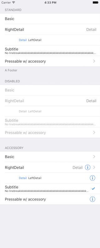
NOTE: This component is WIP. Use it with caution!
This component is a copy of the iOS-TableView made with pure CSS. The intention is to provide a flexible and lightweight alternative to a bridged component.
The focus is set on the presentation. The component is therefore not intended to render large data sets.
A possible use case might be an about- or a settings-screen with a few rows.
Have a look at the Examples below! :-)
npm i react-native-tableview-simple --save- Add components
import {TableView, Section, Cell} from 'react-native-tableview-simple'
This component provides you with some predefined CSS-styles, inspired by the native TableView.
You can always mix the Cell-instances inside a Section, with some Custom-Components.
Therefore the Cell-Component itself can't be manipulated. If you aren't satisfied with a component, feel free to create a PR or just create and use a custom component. Get inspired by the predefined cellstyles.
Maybe you want to add your lovely designed Cell-Component to the project.
Just move your component to the folder components and choose a meaningful name! :-)
Currently TableView doesn't support any properties.
| Prop | Default | Type | Description |
|---|---|---|---|
| header | - | string |
Header value |
| footer | - | string |
Footer value |
| sectionTintColor | #EFEFF4 | string |
Background color of section |
| headerTintColor | #6d6d72 | string |
Text color of header |
| footerTintColor | #6d6d72 | string |
Text color of footer |
| hideSeparator | false | bool |
Hide separators |
| separatorTintColor | #c8c7cc | string |
Color of separator |
| separatorInsetLeft | 15 | number |
Left inset of separator |
| separatorInsetRight | 0 | number |
Right inset of separator |
The cellstyles are inspired by the native ones. Just like the available accessories.
| Prop | Default | Type | Description |
|---|---|---|---|
| cellstyle | Basic | string |
Predefined styles: Basic, RightDetail, LeftDetail, Subtitle |
| title | - | string |
Title value |
| detail | - | string |
Detail value |
| cellTintColor | #fff | string |
Background color of cell |
| titleTintColor | #000 | string |
Text color of title |
| isDisabled | false | bool |
Cell is disabled. onPress will not get triggered |
| accessory | - | string |
Predefined accessory: DisclosureIndicator, Detail, DetailDisclosure, Checkmark |
| onPress | - | func or false |
If set, cell will be automaticaly initialized with TouchableHighlight |
| highlightActiveOpacity | 0.8 | number |
Opacity of cell when touch is active |
| highlightUnderlayColor | 'black' | string |
Color of underlay that will show through when touch is active |
CustomCells allow you to define the whole content on your own.
This makes it possible to use components like ActivityIndicatorIOS or SwitchIOS as seen in the example below.
| Prop | Default | Type | Description |
|---|---|---|---|
| cellTintColor | #fff | string |
Background color of cell |
| isDisabled | false | bool |
Cell is disabled. onPress will not get triggered |
| onPress | - | func or false |
If set, cell will be automaticaly initialized with TouchableHighlight |
| highlightActiveOpacity | 0.8 | number |
Opacity of cell when touch is active |
| highlightUnderlayColor | 'black' | string |
Color of underlay that will show through when touch is active |
The following examples can be found in the folder example.
To run the example project, follow these steps:
git clone https://github.com/Purii/react-native-tableview-simplecd examplenpm i- run
/example/ios/example.xcodeprojvia Xcode
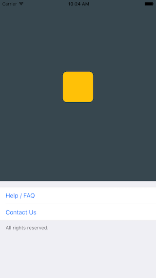
import React, { AppRegistry, Component, PropTypes, StyleSheet, ScrollView, View, Text, ActivityIndicatorIOS, SwitchIOS } from 'react-native';
import {TableView, Section, Cell, CustomCell} from 'react-native-tableview-simple';

/**
 * Sample React Native App
 * https://github.com/facebook/react-native
 */

class Example extends Component {
  render() {
    return (
      <ScrollView contentContainerStyle={styles.stage}>
          <View style={{
            backgroundColor: '#37474F',
            height: 500,
            alignItems: 'center',
            justifyContent: 'center'
          }}>
            <View style={{
              backgroundColor: '#ffc107',
              width: 80,
              height: 80,
              borderRadius: 10
            }}></View>
          </View>
          <TableView>
            <Section footer="All rights reserved.">
              <Cell title="Help / FAQ" titleTintColor="#007AFF" onPress={() => console.log('open Help/FAQ')}/>
              <Cell title="Contact Us" titleTintColor="#007AFF" onPress={() => console.log('open Contact Us')}/>
            </Section>
          </TableView>
      </ScrollView>
    );
  }
};

var styles = StyleSheet.create({
  stage: {
    backgroundColor: '#EFEFF4',
    paddingBottom: 20,
    flex: 1
  },
});

AppRegistry.registerComponent('example', () => Example);The left screen is build using react-native-tableview-simple. The right one is native.
react-native-tableview-simple |
Native iOS |
|---|---|
 |
 |
import React, { AppRegistry, Component, PropTypes, StyleSheet, ScrollView, View, Text, ActivityIndicatorIOS, SwitchIOS } from 'react-native';
import {TableView, Section, Cell, CustomCell} from 'react-native-tableview-simple';

/**
 * Sample React Native App
 * https://github.com/facebook/react-native
 */

class Example extends Component {
  render() {
    return (
      <ScrollView contentContainerStyle={styles.stage}>
        <TableView>
          <Section header="STANDARD" footer="A Footer">
            <Cell cellstyle="Basic" title="Basic"/>
            <Cell cellstyle="RightDetail" title="RightDetail" detail="Detail" />
            <Cell cellstyle="LeftDetail" title="LeftDetail" detail="Detail"/>
            <Cell cellstyle="Subtitle" title="Subtitle" detail="No linebreakkkkkkkkkkkkkkkkkkkkkkkkkkkkkkkkkkkkkkkkkkkkkkkkkkkkkkkkkkkkkkkkkkkk"/>
            <Cell cellstyle="Basic" title="Pressable w/ accessory" accessory="DisclosureIndicator" onPress={() => console.log('Heyho!')}/>
          </Section>
          <Section header="DISABLED">
            <Cell cellstyle="Basic" isDisabled={true} title="Basic"/>
            <Cell cellstyle="RightDetail" isDisabled={true} title="RightDetail" detail="Detail" />
            <Cell cellstyle="LeftDetail" isDisabled={true} title="LeftDetail" detail="Detail"/>
            <Cell cellstyle="Subtitle" isDisabled={true} title="Subtitle" detail="No linebreakkkkkkkkkkkkkkkkkkkkkkkkkkkkkkkkkkkkkkkkkkkkkkkkkkkkkkkkkkkkkkkkkkkk"/>
            <Cell cellstyle="Basic" isDisabled={true} title="Pressable w/ accessory" accessory="DisclosureIndicator" onPress={() => {console.log('Heyho!')}}/>
          </Section>
          <Section header="ACCESSORY">
            <Cell cellstyle="Basic" accessory="DisclosureIndicator" title="Basic"/>
            <Cell cellstyle="RightDetail" accessory="DetailDisclosure" title="RightDetail" detail="Detail" />
            <Cell cellstyle="LeftDetail" accessory="Detail" title="LeftDetail" detail="Detail"/>
            <Cell cellstyle="Subtitle" accessory="Checkmark" title="Subtitle" detail="No linebreakkkkkkkkkkkkkkkkkkkkkkkkkkkkkkkkkkkkkkkkkkkkkkkkkkkkkkkkkkkkkkkkkkkk"/>
            <Cell cellstyle="Basic" accessory="Detail" title="Pressable w/ accessory" onPress={() => console.log('Heyho!')}/>
          </Section>
          <Section header="CUSTOMCELLS">
            <CustomCell>
              <Text style={{flex: 1, fontSize: 16}}>Loading</Text>
              <ActivityIndicatorIOS/>
            </CustomCell>
            <CustomCell>
              <Text style={{flex: 1, fontSize: 16}}>Switch</Text>
              <SwitchIOS/>
            </CustomCell>
          </Section>
        </TableView>
      </ScrollView>
    );
  }
};

var styles = StyleSheet.create({
  stage: {
    backgroundColor: '#EFEFF4',
    paddingTop: 20,
    paddingBottom: 20,
  },
});

AppRegistry.registerComponent('example', () => Example);
